Charts screen examples
Charts screen design examples from SaaS apps. Explore how SaaS apps use charts to present patterns in data. Look at how labels, legends, time ranges, and supporting figures give context to the…
Explore the examples
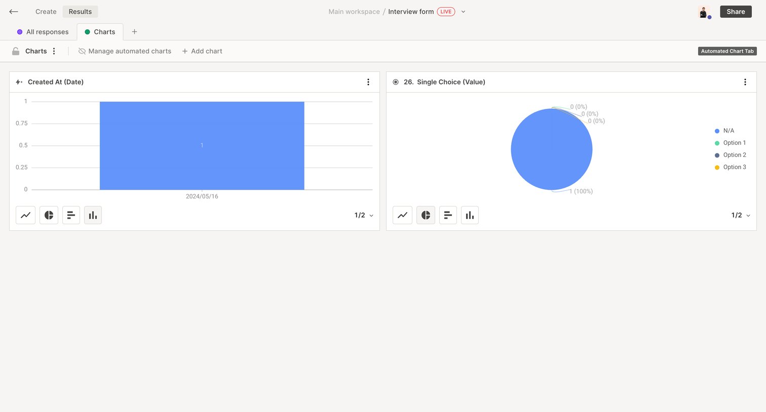

Dashboard displaying automated charts for form responses, allowing the user to switch between bar and pie chart visualizations.
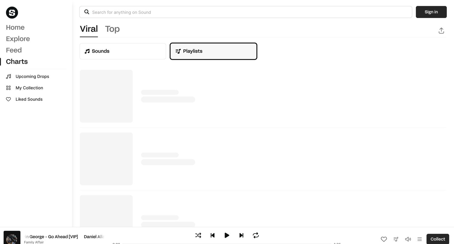

List view displaying the viral playlists chart with skeleton loaders while the content fetches, featuring a persistent media player at the bottom.
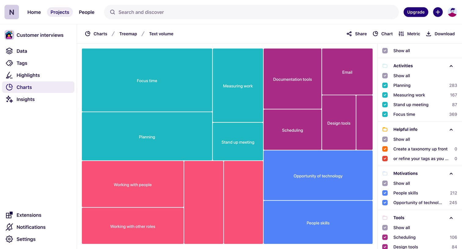

Analytics view showing a treemap chart of text volume across categories like Activities, Helpful info, Motivations, and Tools.
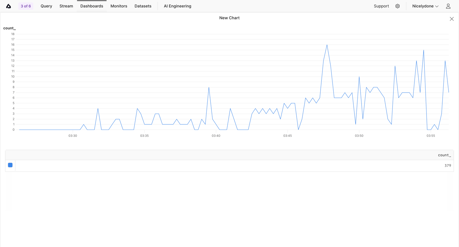




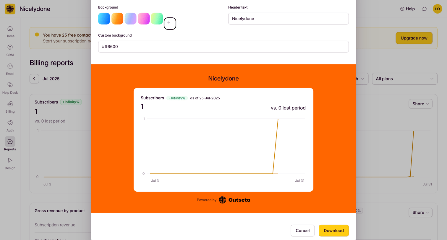

Dashboard modal where the user customizes the background color and header text before downloading a billing report chart.
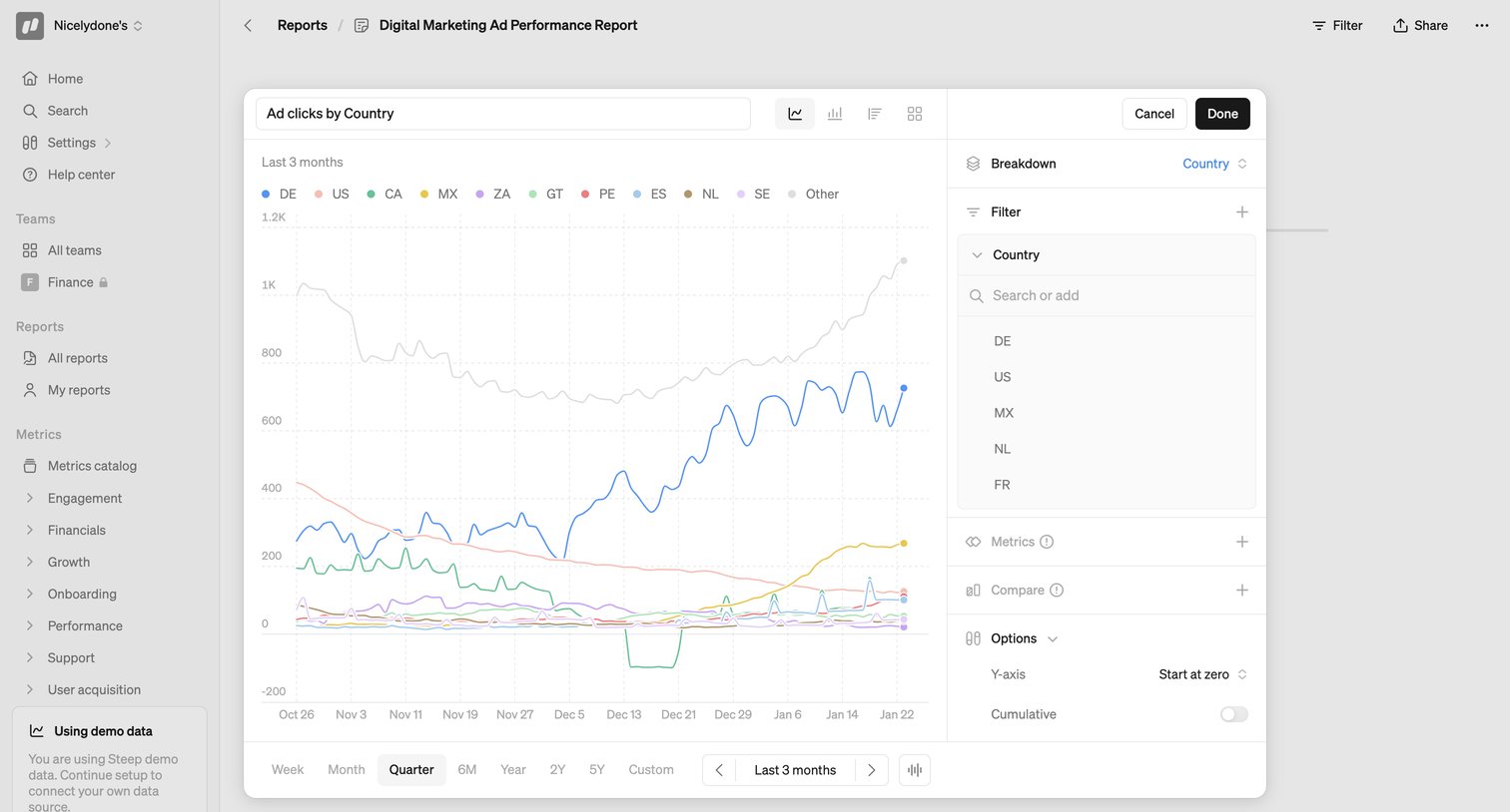

Dashboard where the user is configuring a line chart for ad clicks by country, adjusting filters and time granularity within a large modal overlay.
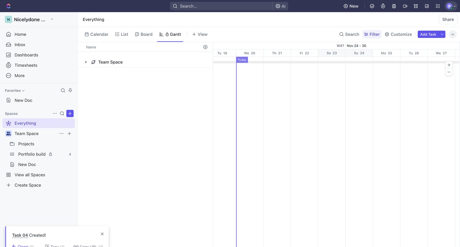

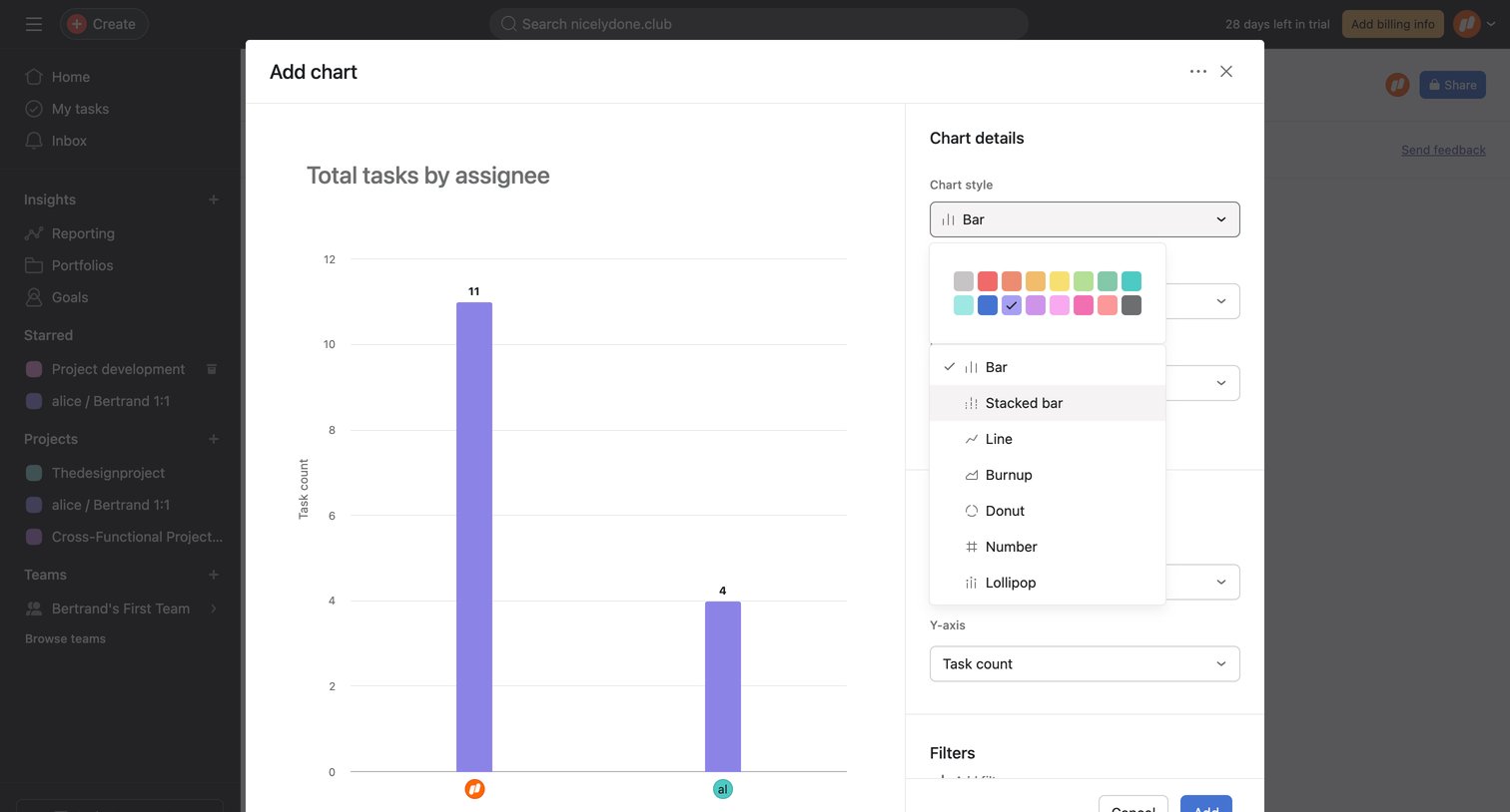

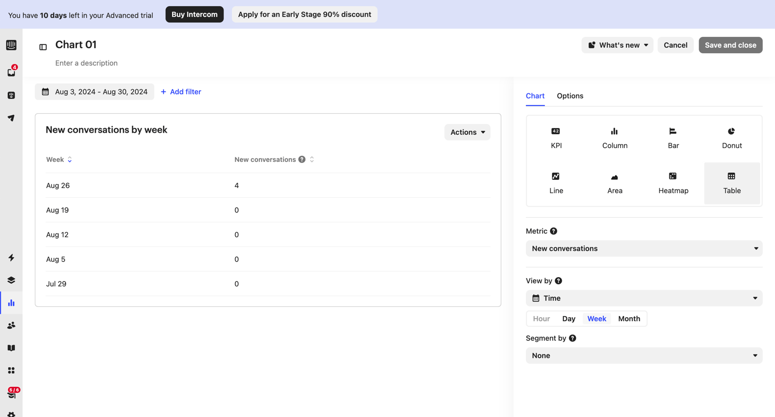

Chart builder where the user configures a new report by selecting metrics, time groupings, and visualization types.
Explore the full SaaS screen library
Upgrade to unlock the full library.
Trusted by the best teams








About Charts
Explore how SaaS apps use charts to present patterns in data. Look at how labels, legends, time ranges, and supporting figures give context to the visualization.