Data visualization screen examples
Data visualization screen design examples from SaaS apps. See how interfaces present data in a compact visual component. Explore how chart labels, legends, and supporting values make a graph readable within a page…
Explore the examples
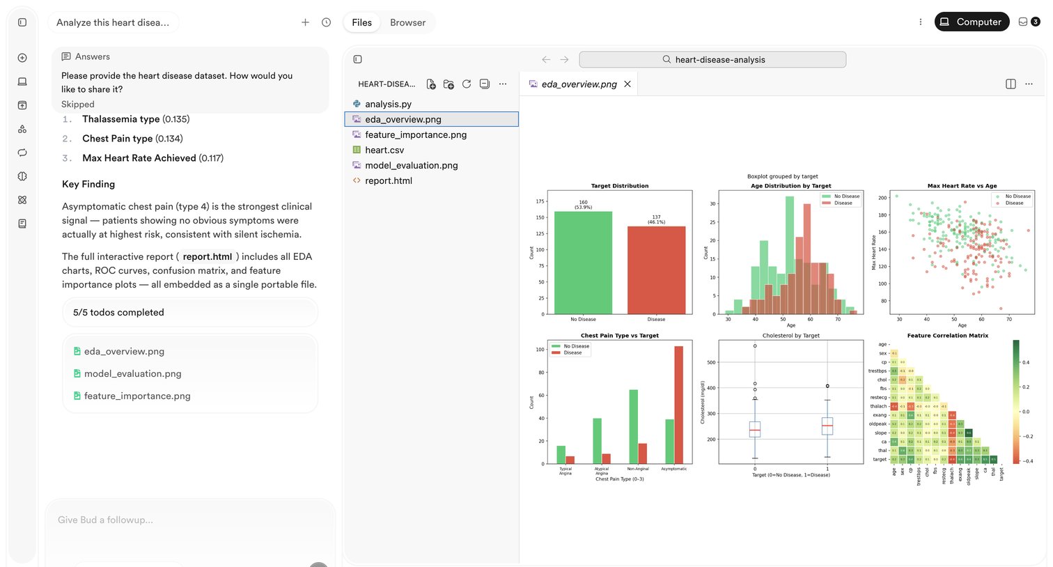

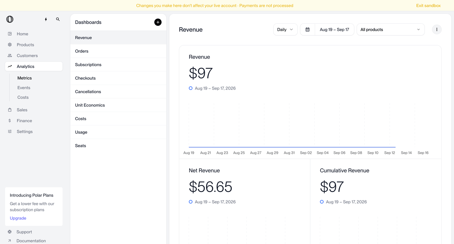

Dashboard where the user views daily revenue, net revenue, and cumulative revenue metrics filtered by date range and product.
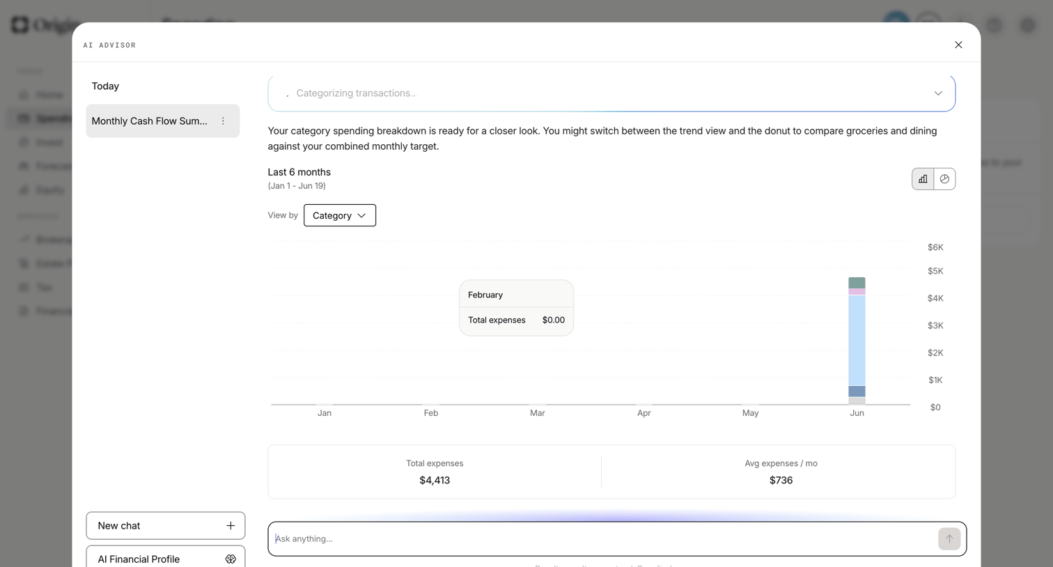

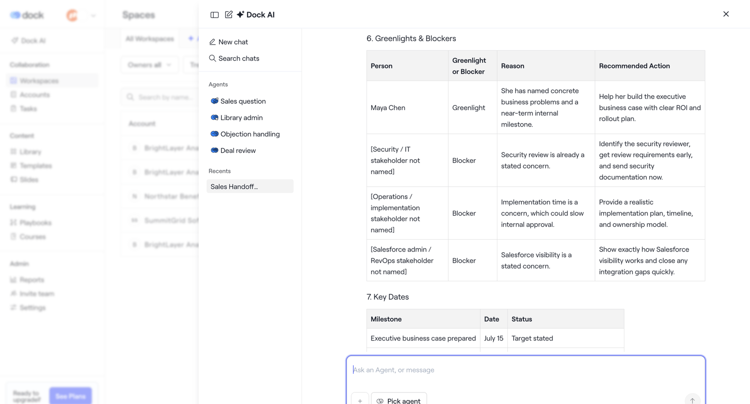
AI chat overlay where the user reviews a generated monthly cash flow summary featuring a stacked bar chart and expense KPIs.
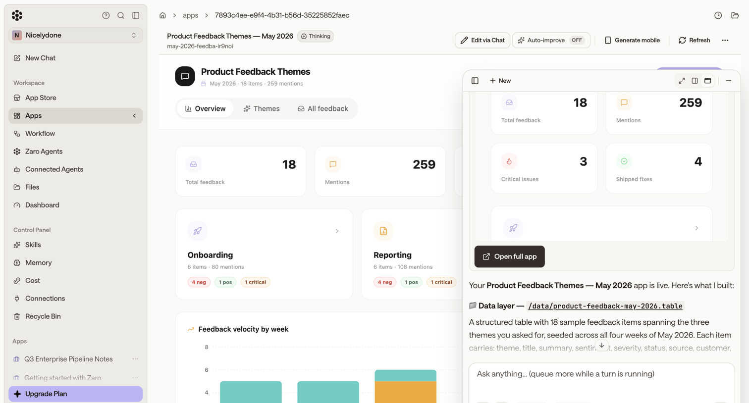

Dashboard preview of an AI-generated product feedback app, featuring a floating AI assistant panel for iterative editing and a live preview of metrics and charts.
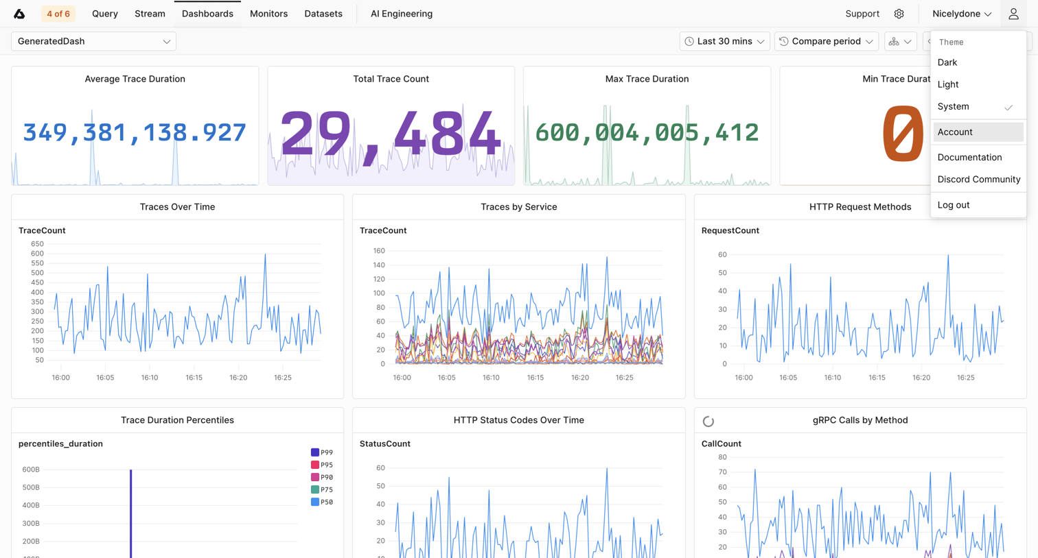

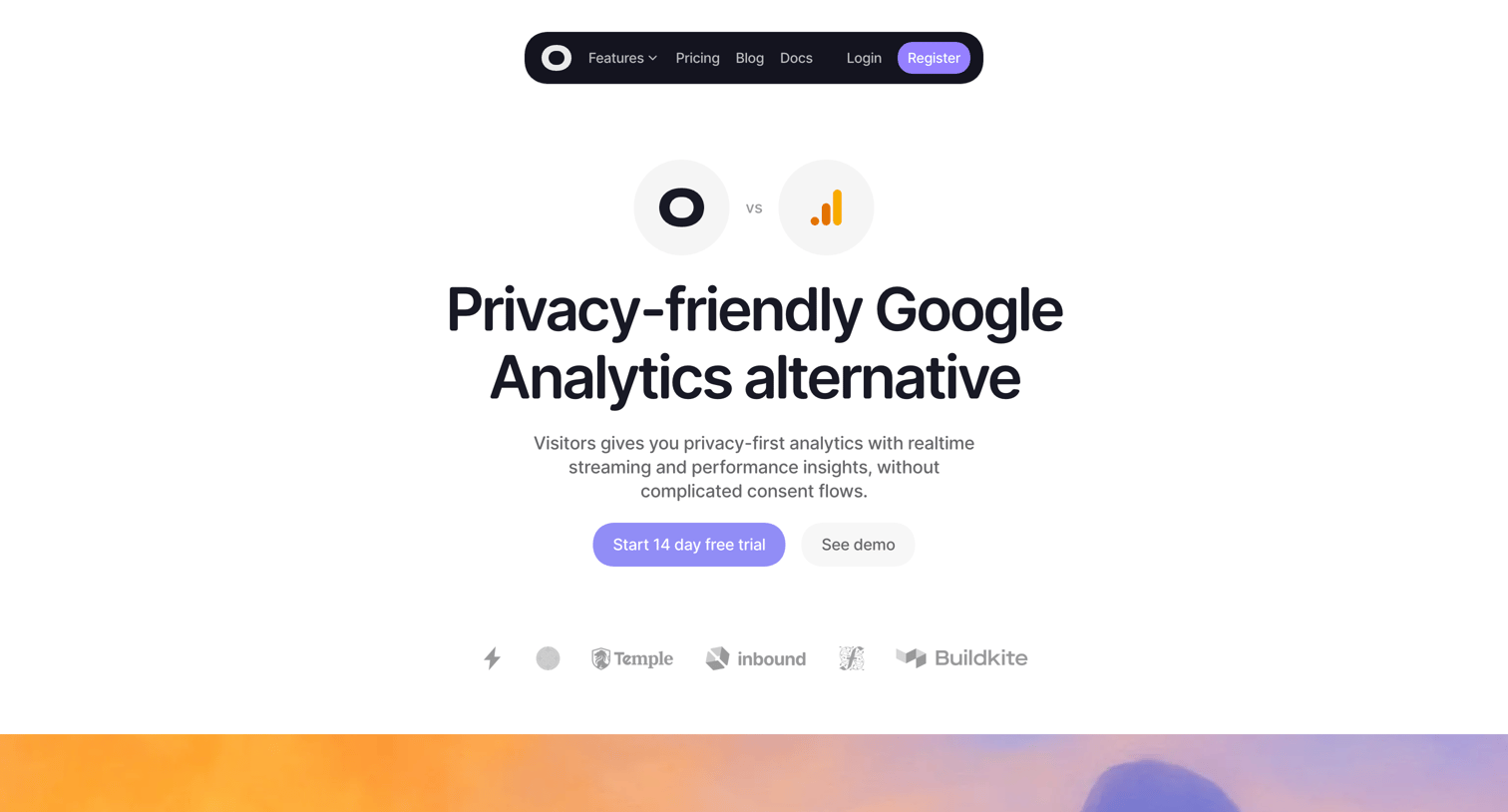

Marketing page positioning the product as a privacy-friendly alternative to Google Analytics, featuring a side-by-side feature comparison table and a bento grid highlighting key differentiators.

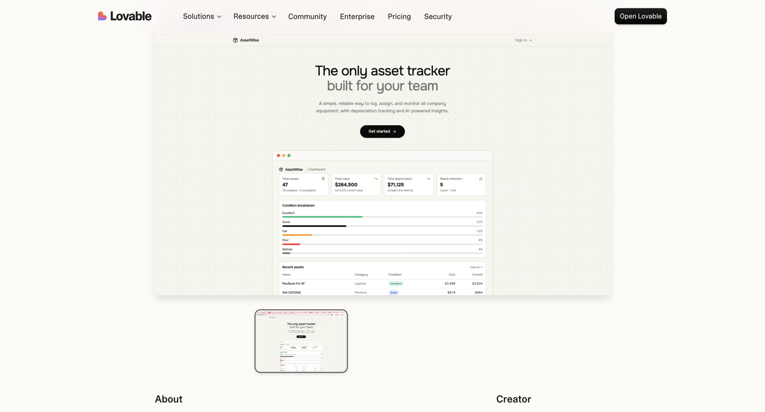

Product page showcasing AssetWise, an asset tracking application built by a creator, featuring a live preview window and creator details.
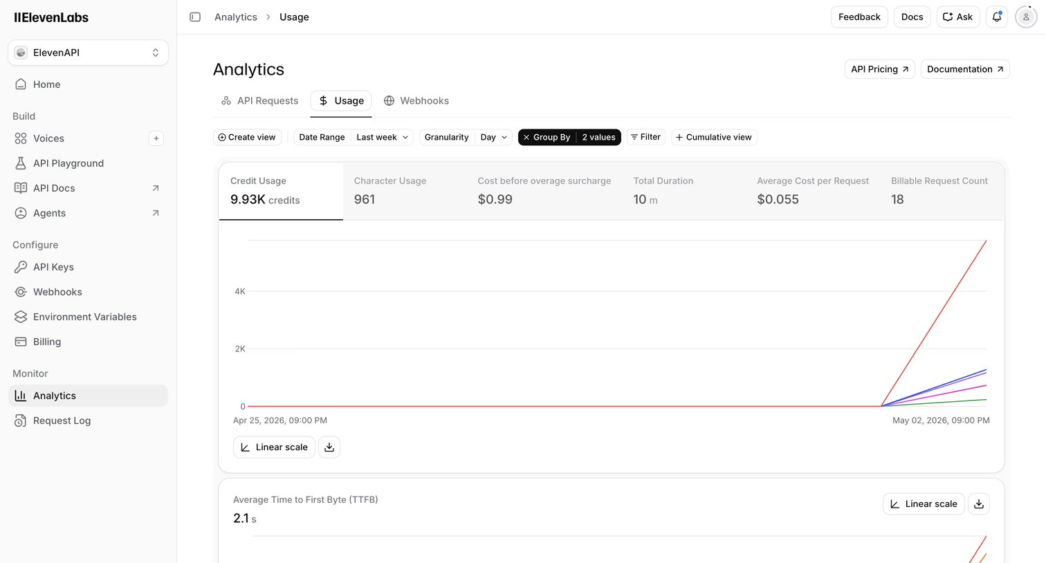

Dashboard where the user monitors API usage metrics like credit consumption, character count, and request costs over time.
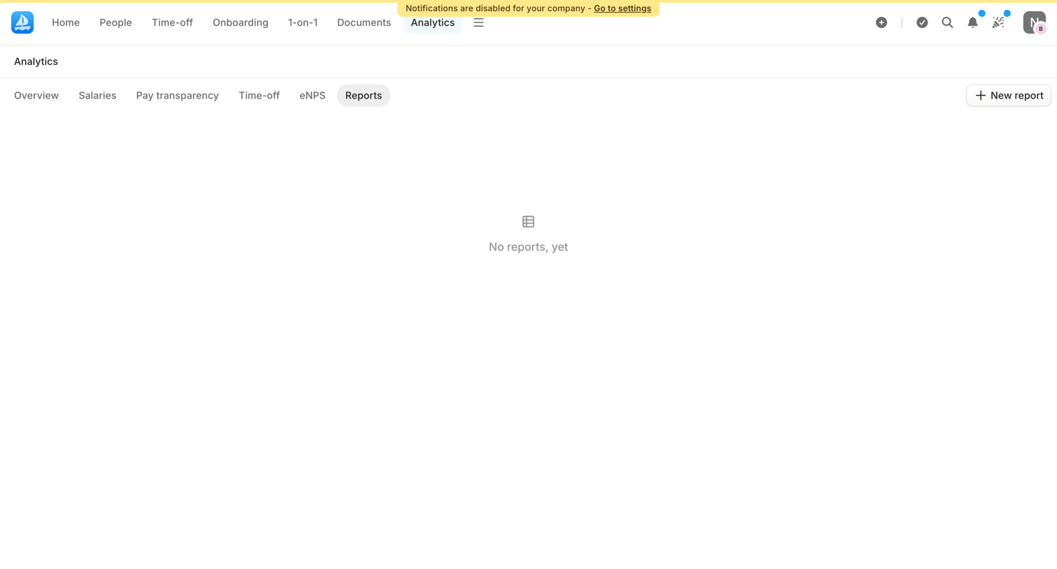

Analytics page where the user views their custom reports, currently showing an empty state with a prompt to create a new report.



Long-form marketing guide presenting survey data, charts, and customer stories to help small businesses adapt their strategies and grow.
Explore the full SaaS screen library
Upgrade to unlock the full library.
Trusted by the best teams








About Data visualization
See how interfaces present data in a compact visual component. Explore how chart labels, legends, and supporting values make a graph readable within a page or dashboard.