Better Stack design examples
Explore Better Stack UI design examples. Radically Better Observability Stack
Product screens
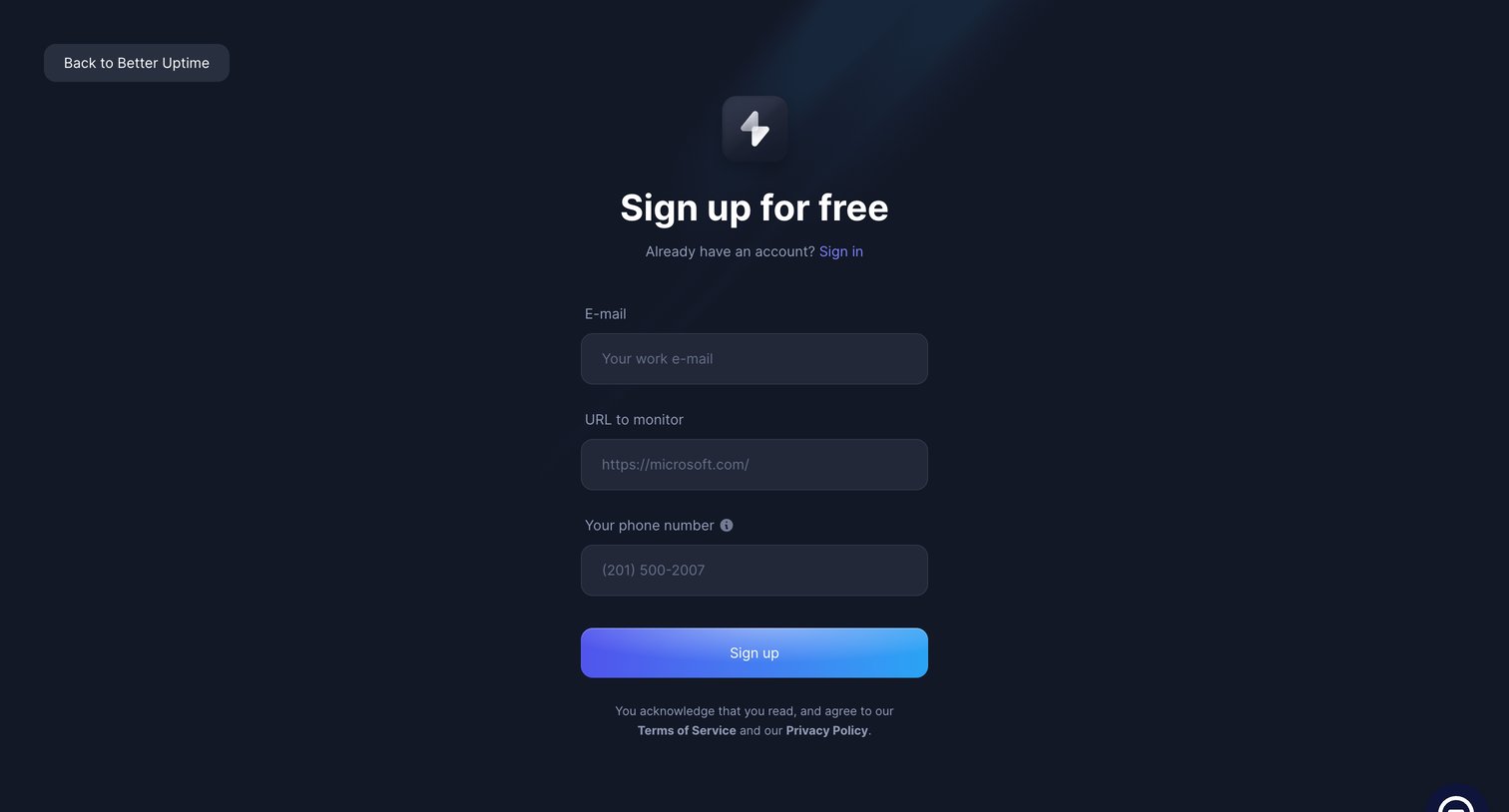

Sign-up screen where the user creates an account by providing their work email, a target URL to monitor, and a phone number.
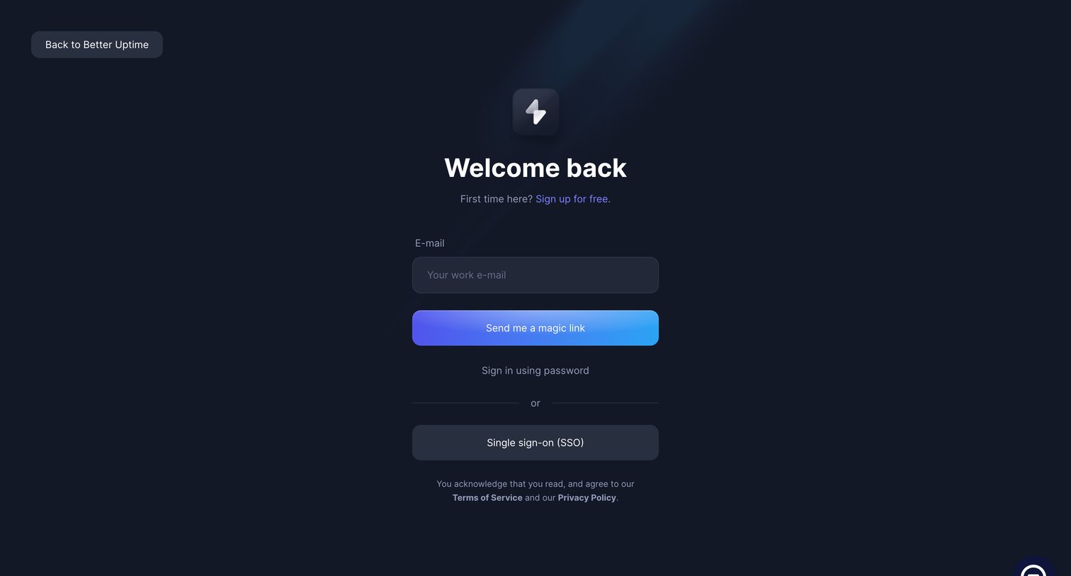
Sign-in screen where the user authenticates via a magic link sent to their work email, with secondary options to use a password or SSO.
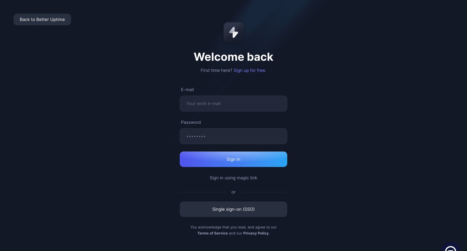
Sign-in screen where the user authenticates with an email and password, a magic link, or single sign-on.
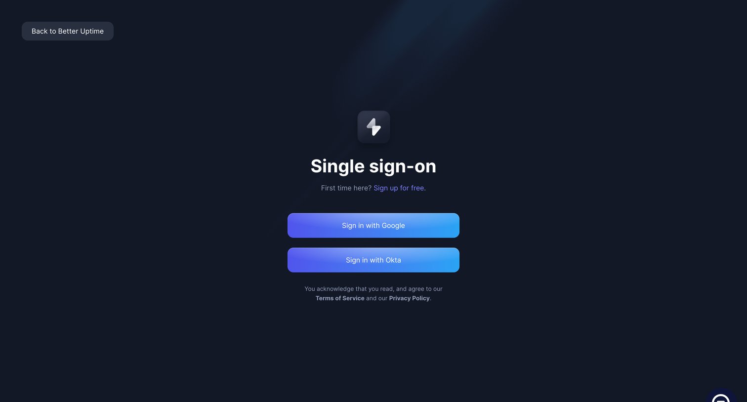
Sign-in screen where the user authenticates via Single Sign-On using Google or Okta.
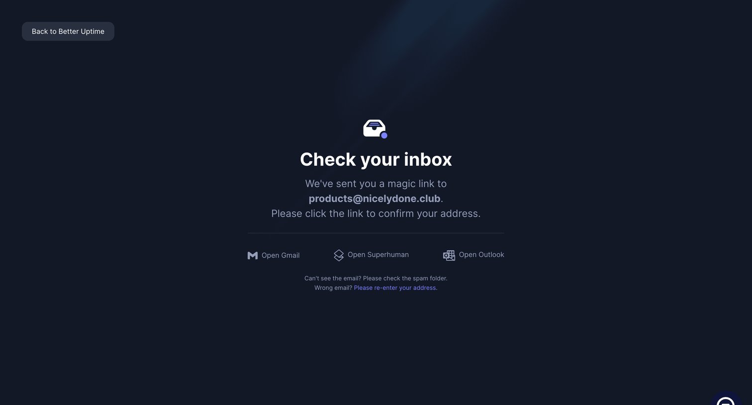
Verification screen prompting the user to check their inbox for a magic link, providing quick shortcuts to common email clients.
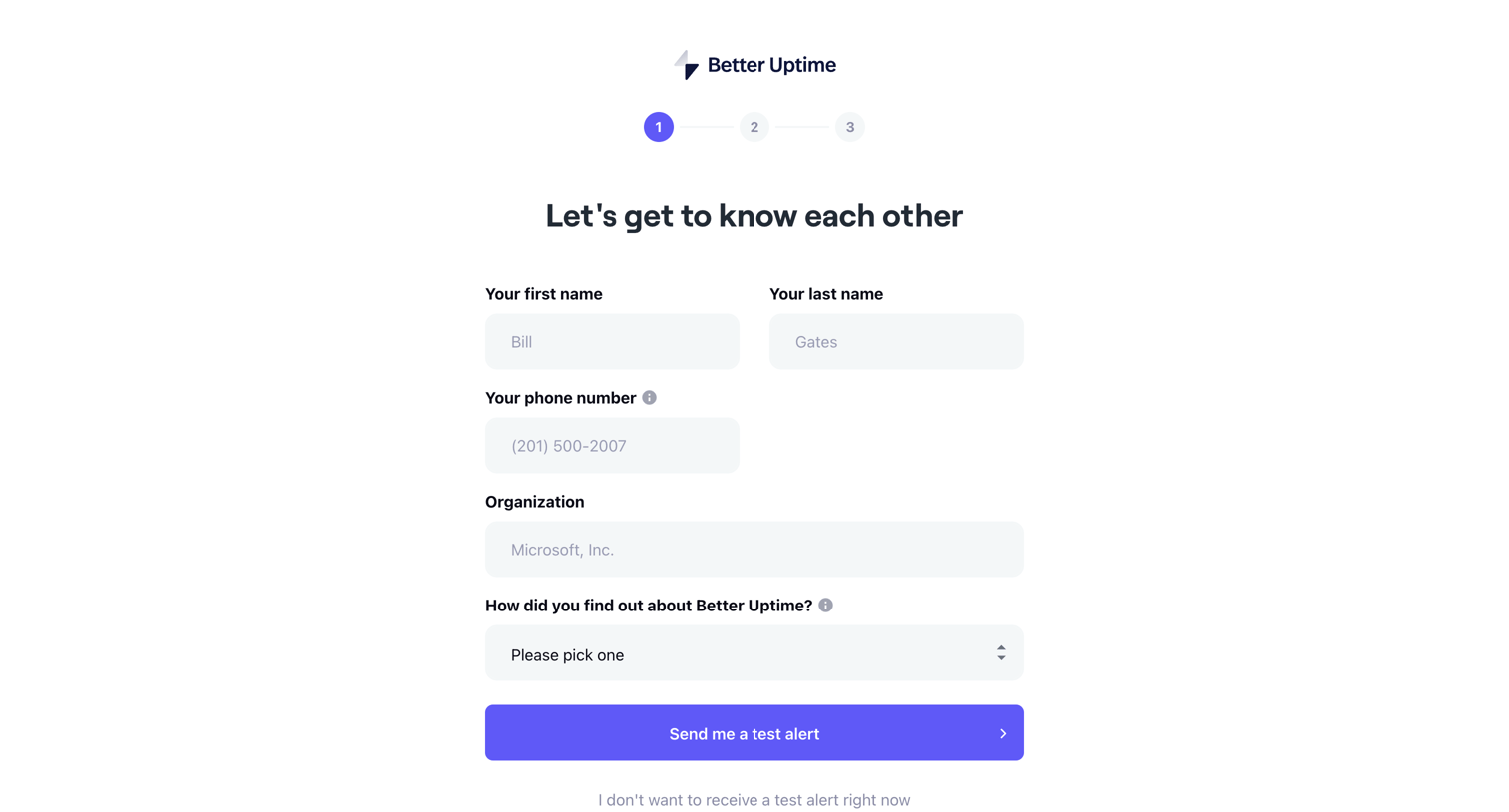
Onboarding step where the user provides their name, phone number, and organization, and chooses whether to receive a test alert.
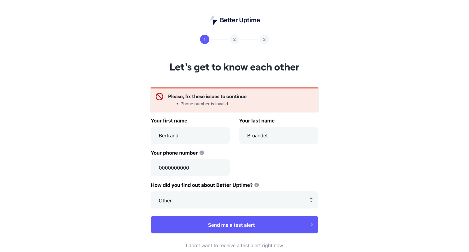
Onboarding step where the user provides their name and phone number to receive a test alert, currently blocked by a validation error on the phone number field.
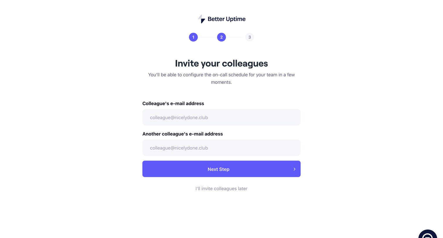
Onboarding step where the user invites colleagues by email to configure their on-call schedule.
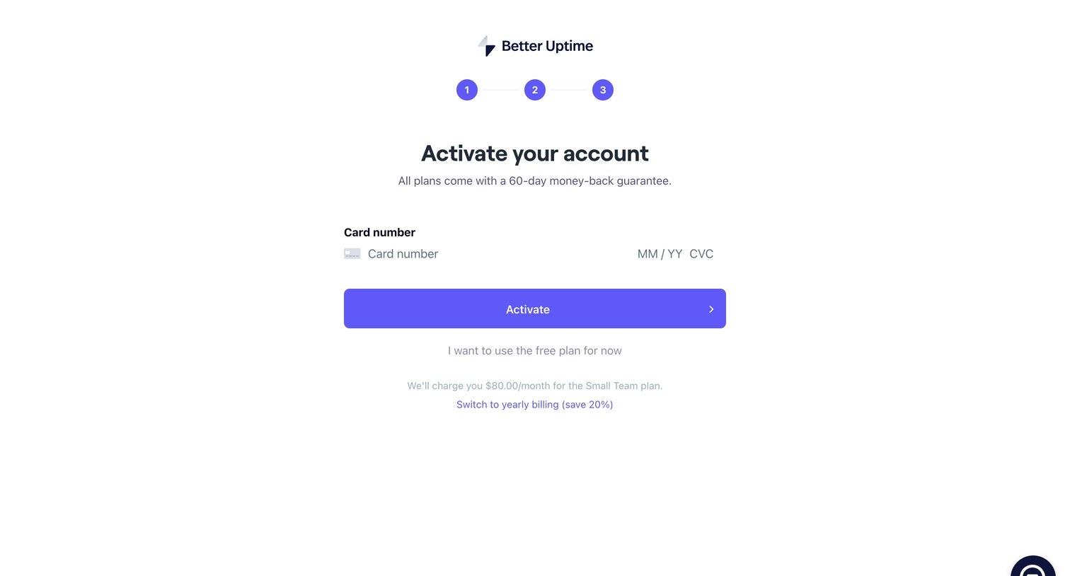
Checkout screen where the user enters their credit card details to activate a paid plan, with options to switch to yearly billing or fall back to a free plan.
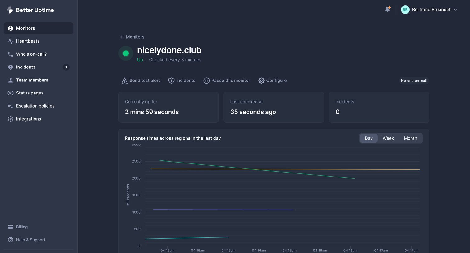
Detail page where the user views uptime metrics, response time charts, and historical availability for a specific monitor.
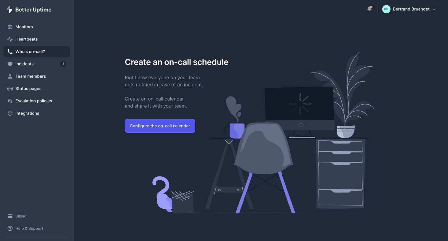
Empty state for the on-call feature where the user is prompted to configure their first schedule to notify the team during incidents.
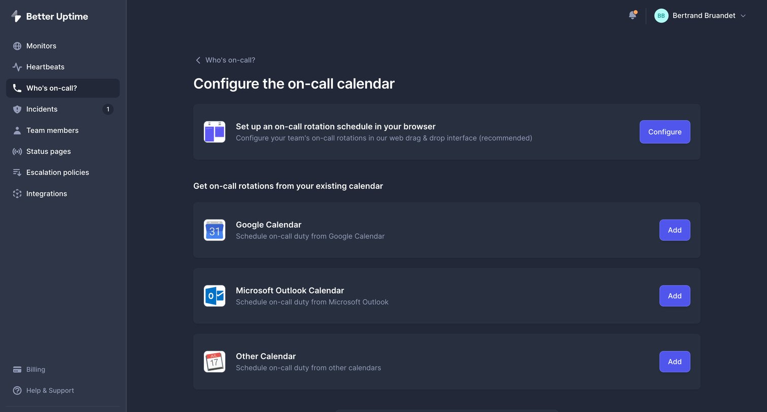
Settings page where the user configures their on-call rotation by choosing between a native browser schedule or connecting an existing Google, Outlook, or other calendar.
Browse the full SaaS app library
Explore real SaaS apps with their product screens, marketing screens, flows, and components.
Trusted by the best teams