Better Stack UI components examples
Browse Better Stack UI component design examples. Preview individual interface elements and explore related component categories. Radically Better Observability Stack
Explore the examples
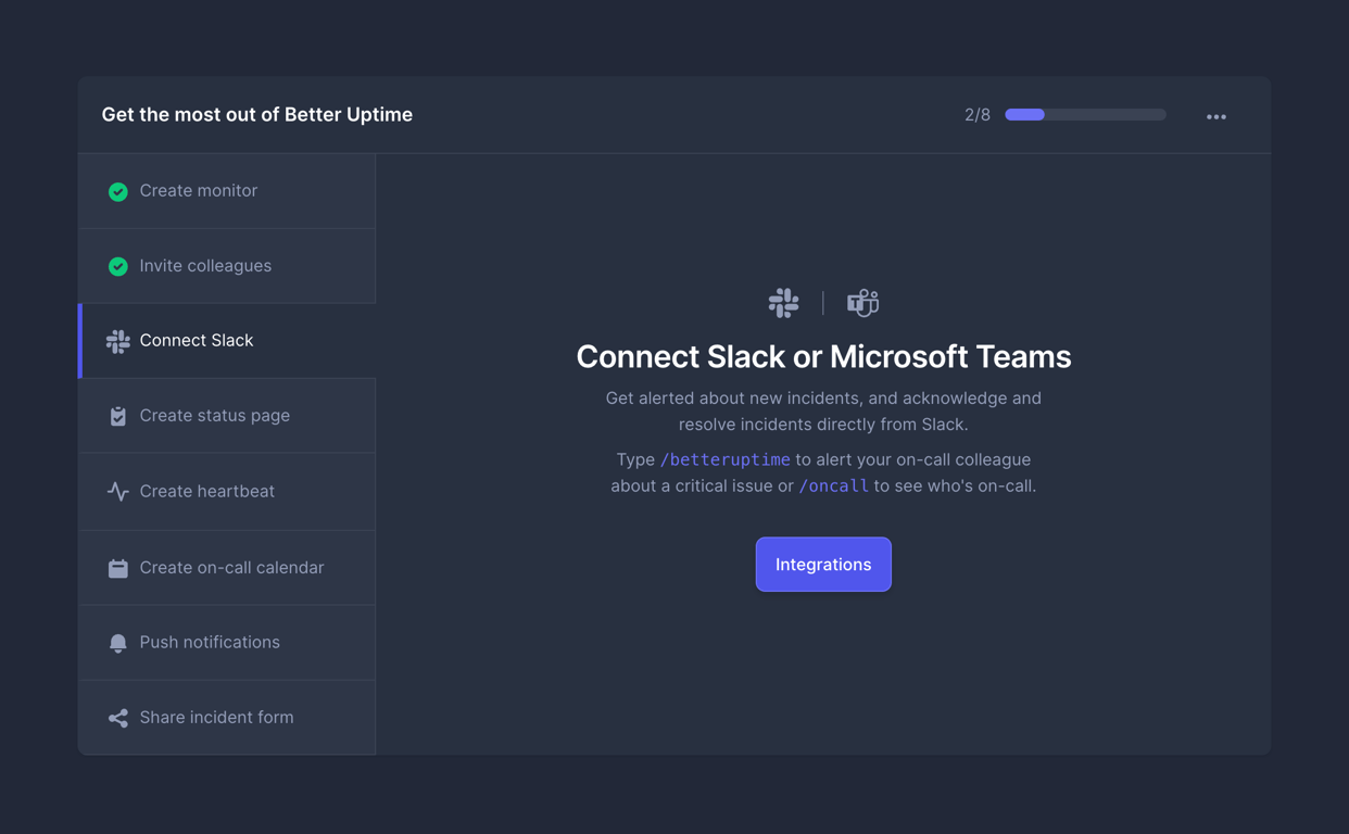

A split-pane onboarding widget. The left pane lists setup tasks with completion status. The right pane displays details and actions for the selected task.
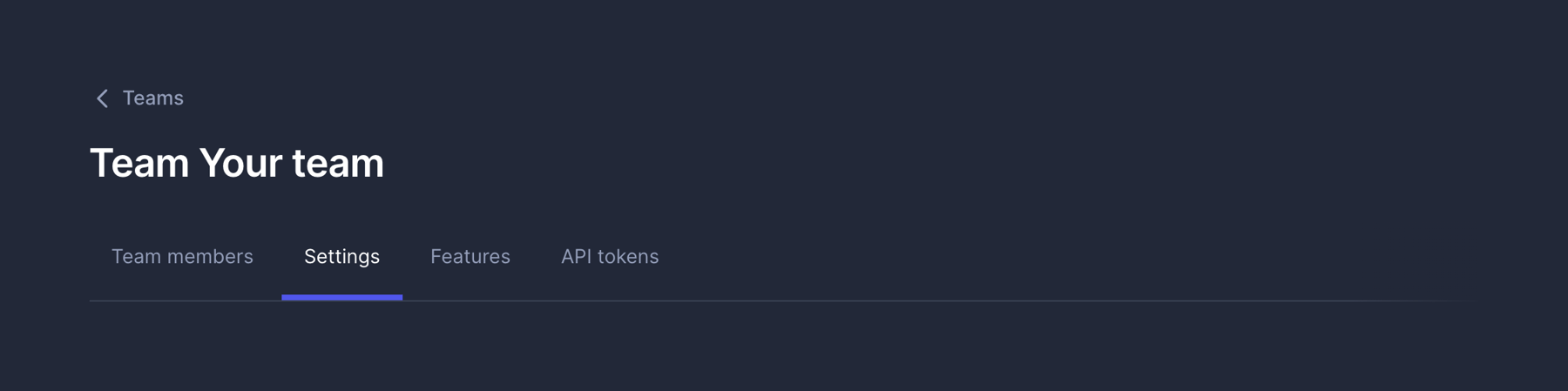
A page header containing a back link, a main title, and a horizontal tab navigation menu.

A user profile lockup displaying a circular initial avatar next to a stacked email address.
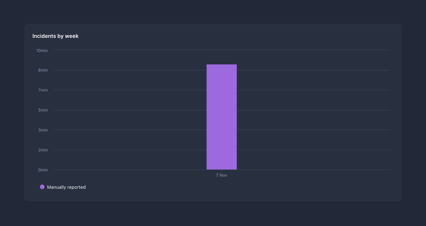
A bar chart displaying incidents by week, with a single purple bar representing manually reported incidents on November 7th.
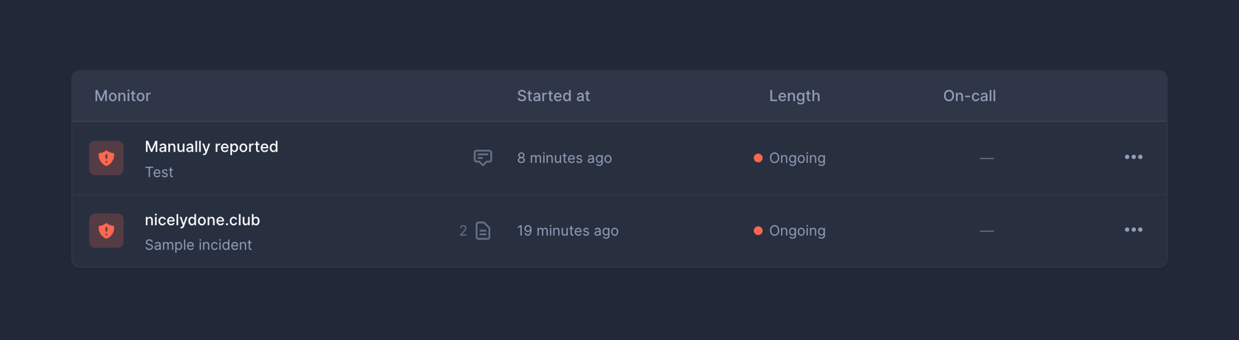
A data table displaying a list of active incidents with columns for Monitor, Started at, Length, and On-call.

A full-width error alert banner displaying a failure message and a specific reason.
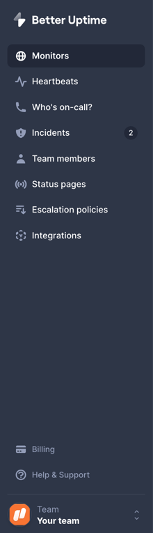
A dark-themed vertical sidebar navigation menu with a logo at the top, a list of primary navigation links with icons, a secondary list of links at the bottom, and a workspace switcher at the very bottom.
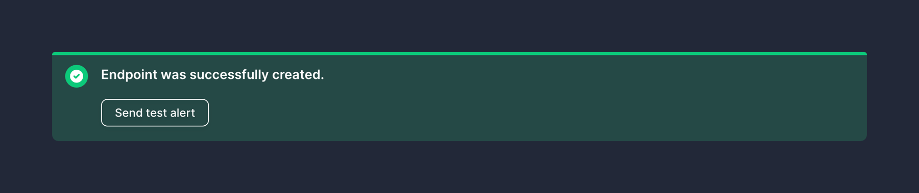
A success alert banner confirming the creation of an endpoint, featuring a green checkmark icon and an outlined button to send a test alert.
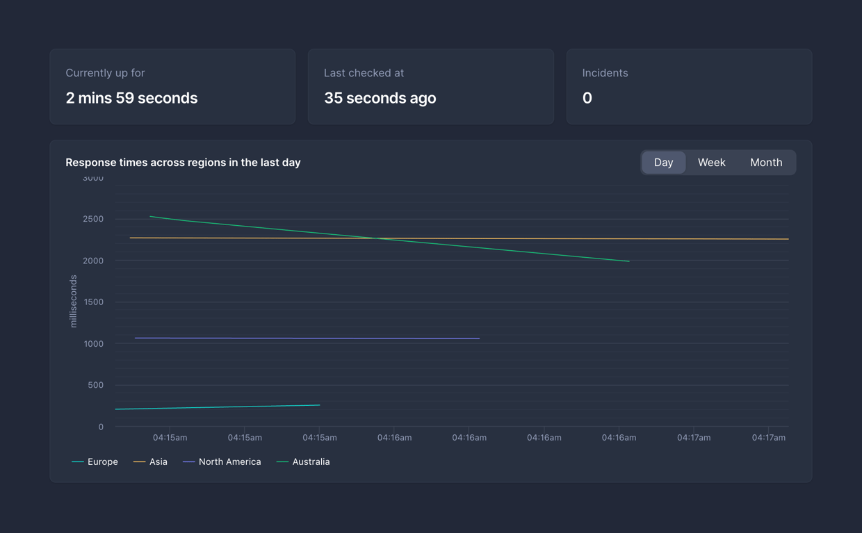
A dashboard section displaying key performance indicators (KPIs) and a line chart for response times across different regions.
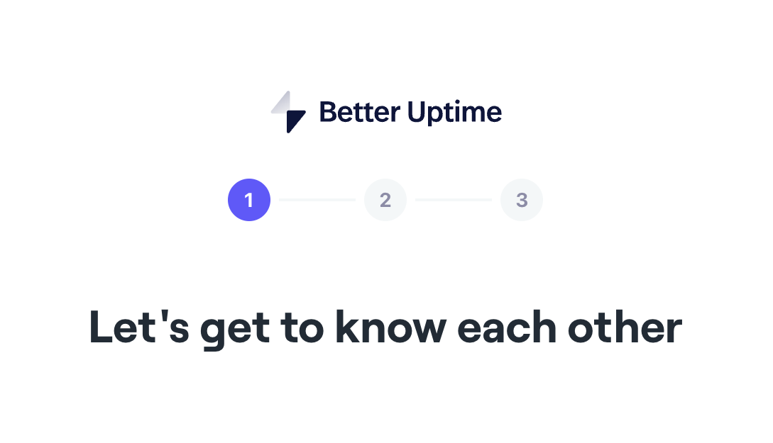
A page header featuring a logo, a three-step progress indicator with the first step active, and a large title welcoming the user.
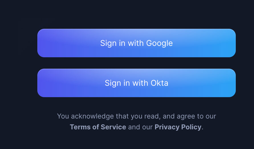
A vertical stack of two single sign-on buttons for Google and Okta, followed by a terms of service and privacy policy agreement text.
Browse the full component library
Browse the full UI component library.
Trusted by the best teams







