Message UI examples
Message UI design examples from SaaS apps. See how interfaces present notices within the page. Explore how message text, emphasis, and related actions explain a change, requirement, or current…
Explore the examples
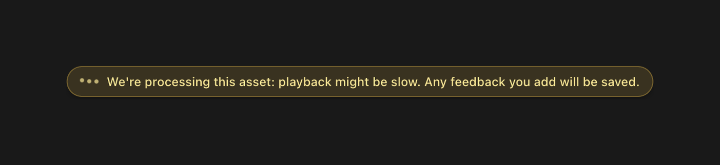

A notification bar indicating asset processing status and feedback saving.
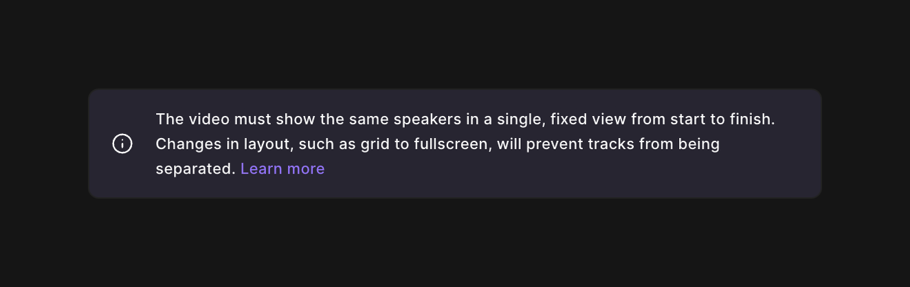

An informational message providing guidance on video recording requirements, specifically regarding speaker layout and its impact on track separation.
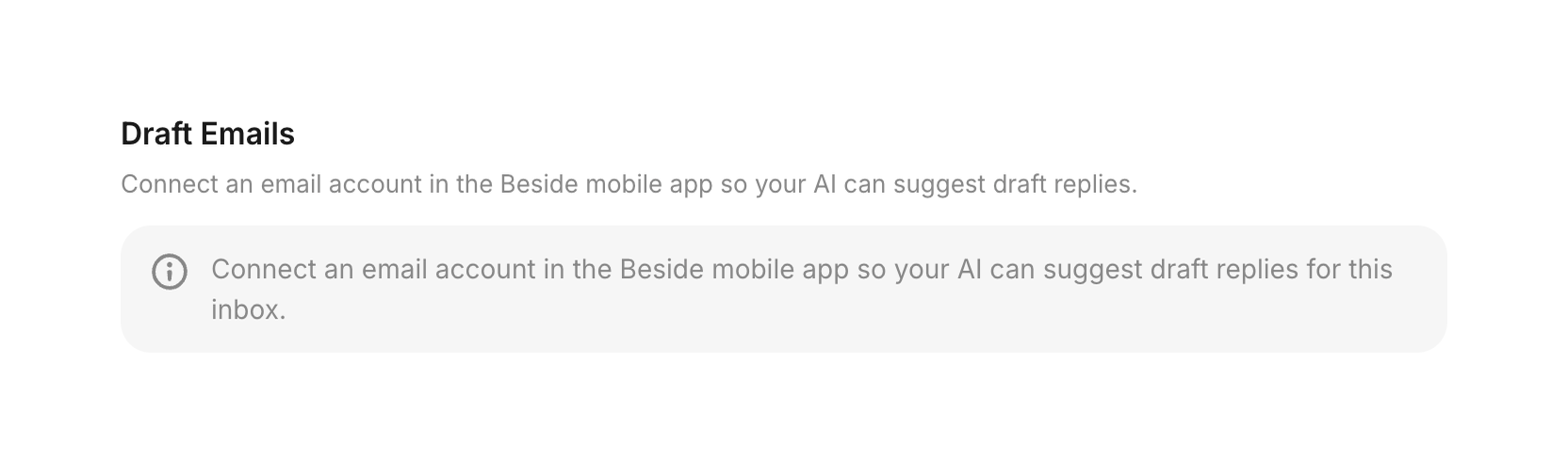

Displays a prompt to connect an email account for AI draft reply suggestions
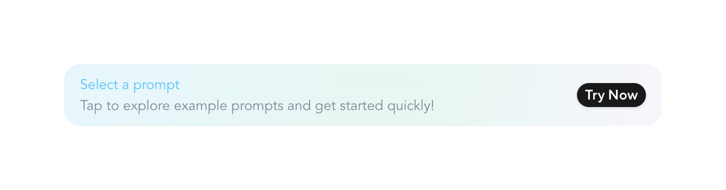

Encourages selection of an example prompt to quickly start AI avatar configuration
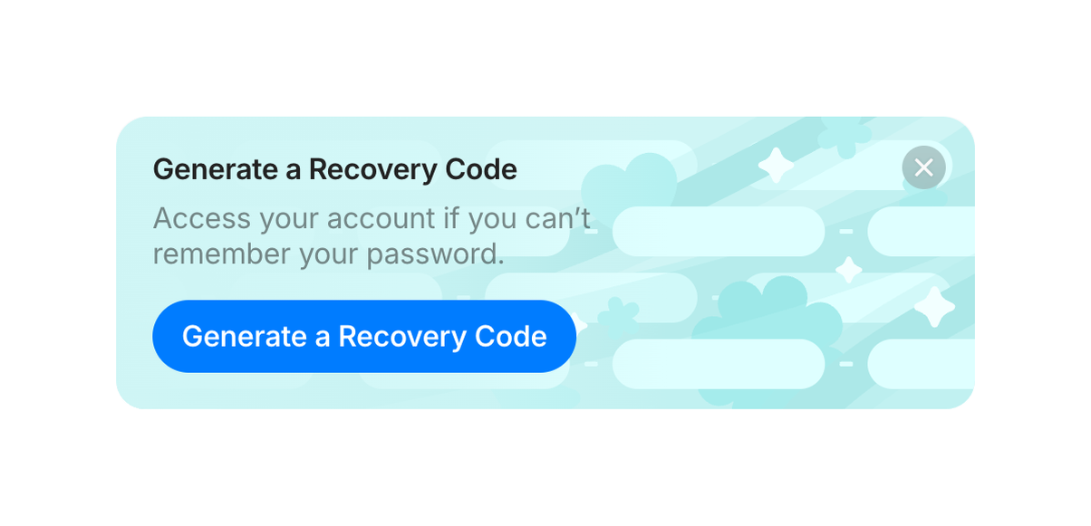

Dismissible light-blue card with title, short description and blue CTA button encouraging generation of a recovery code.
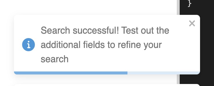

Shows success feedback after a search action and suggests refining parameters
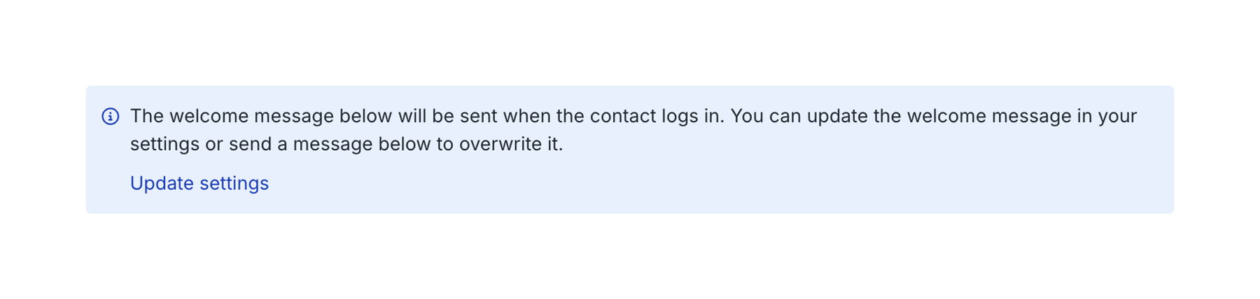

An informational message box with a link to update settings, displayed on a white background.
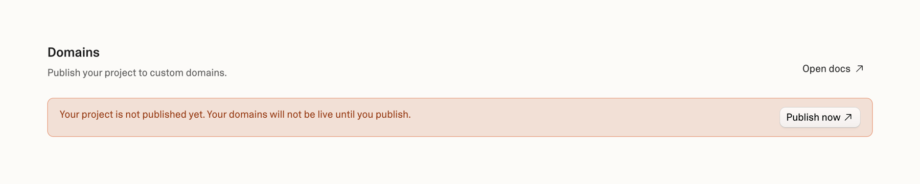

A page section displaying domain management options with a warning message about an unpublished project and a call to action to publish.
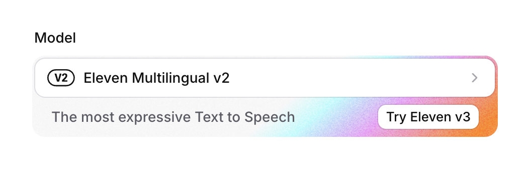

A user interface displaying a model selection field and a promotional banner for a newer version of a text-to-speech model.


An informational banner notifying users about a change in the location of comparative reports, providing options to learn more or view the reports.
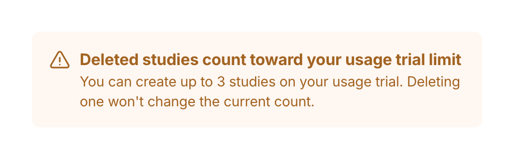

A warning message informing the user about trial usage limits and that deleted studies still count towards the limit.


A dark mode banner notification prompting a user to upgrade their plan to invite more members, featuring a clickable upgrade link and a dismiss icon.
Browse the full component library
See 77 more Components.
Trusted by the best teams








About Message
See how interfaces present notices within the page. Explore how message text, emphasis, and related actions explain a change, requirement, or current condition near the affected content.