
WeTransfer design examples
Explore WeTransfer UI design examples. The simplest way to send your files around the world.
Product screens

Verification step where the user enters a code sent to their email to create a verified account.
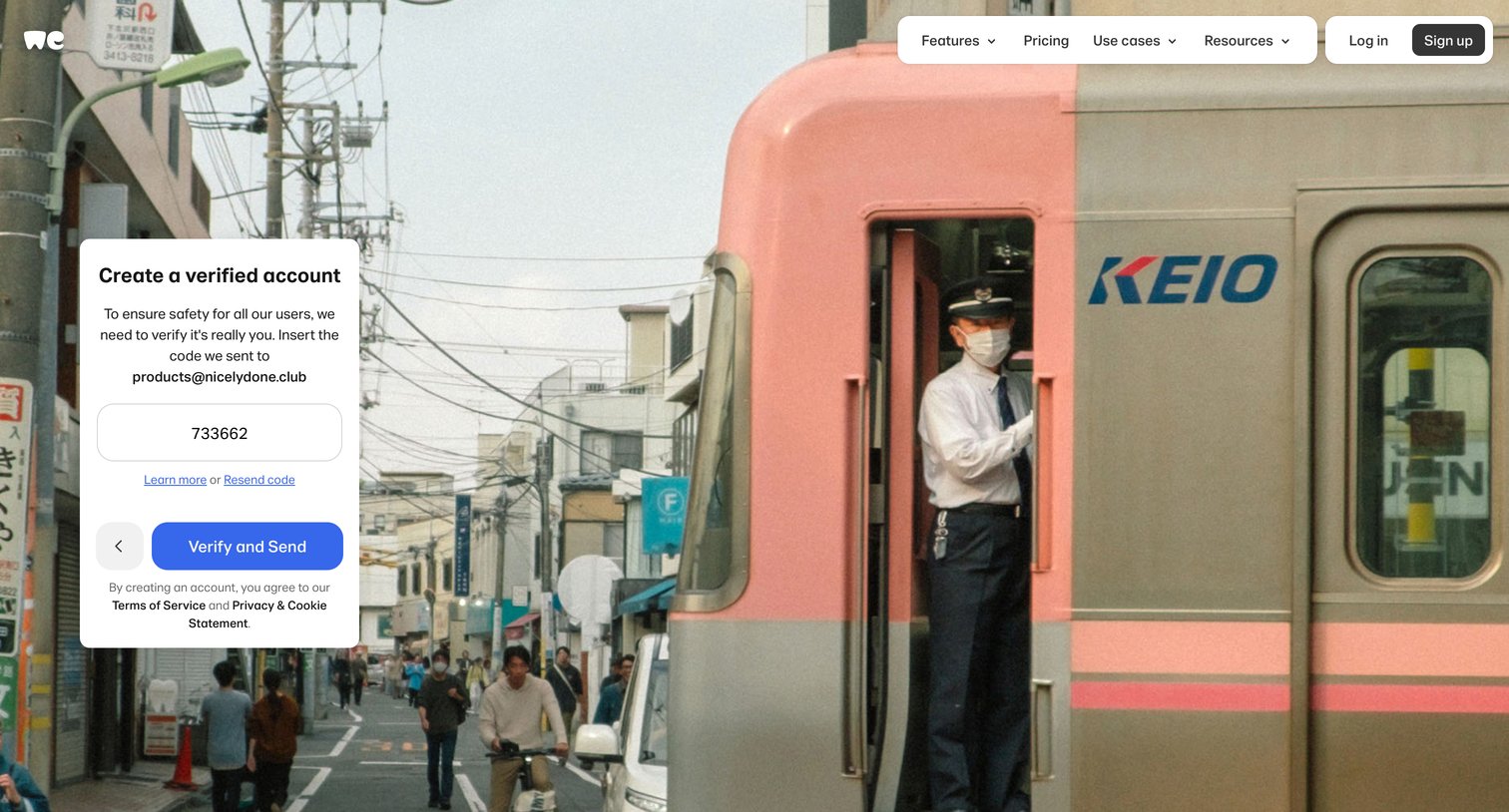
Verification screen where the user enters a 6-digit code sent to their email to complete account creation.
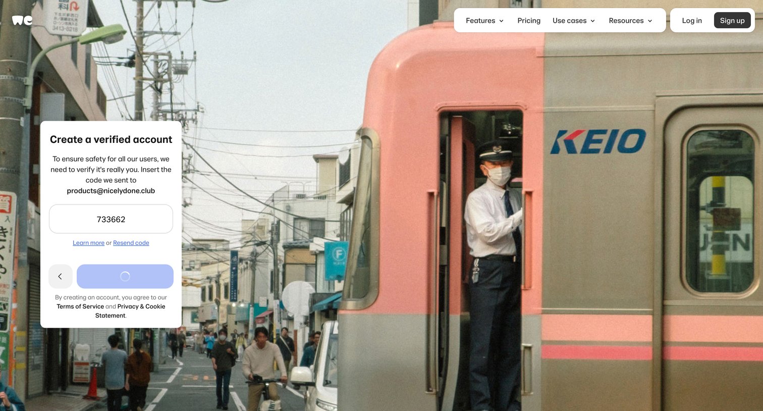
Verification screen where the user enters a 6-digit code sent to their email to finalize account creation.
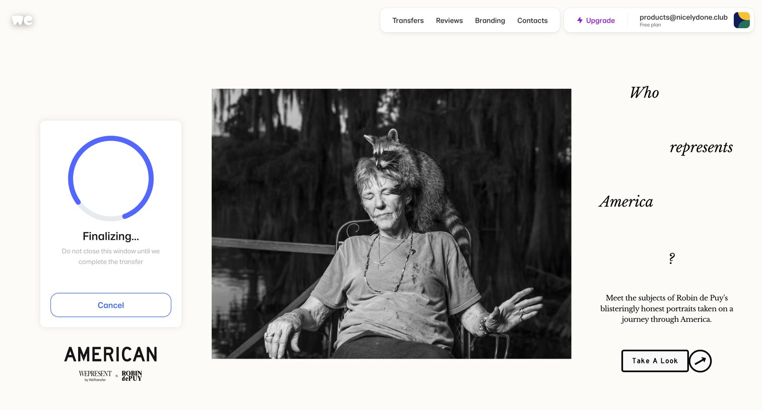
Home screen where a file transfer is actively finalizing in a floating card, displayed alongside a featured editorial campaign.
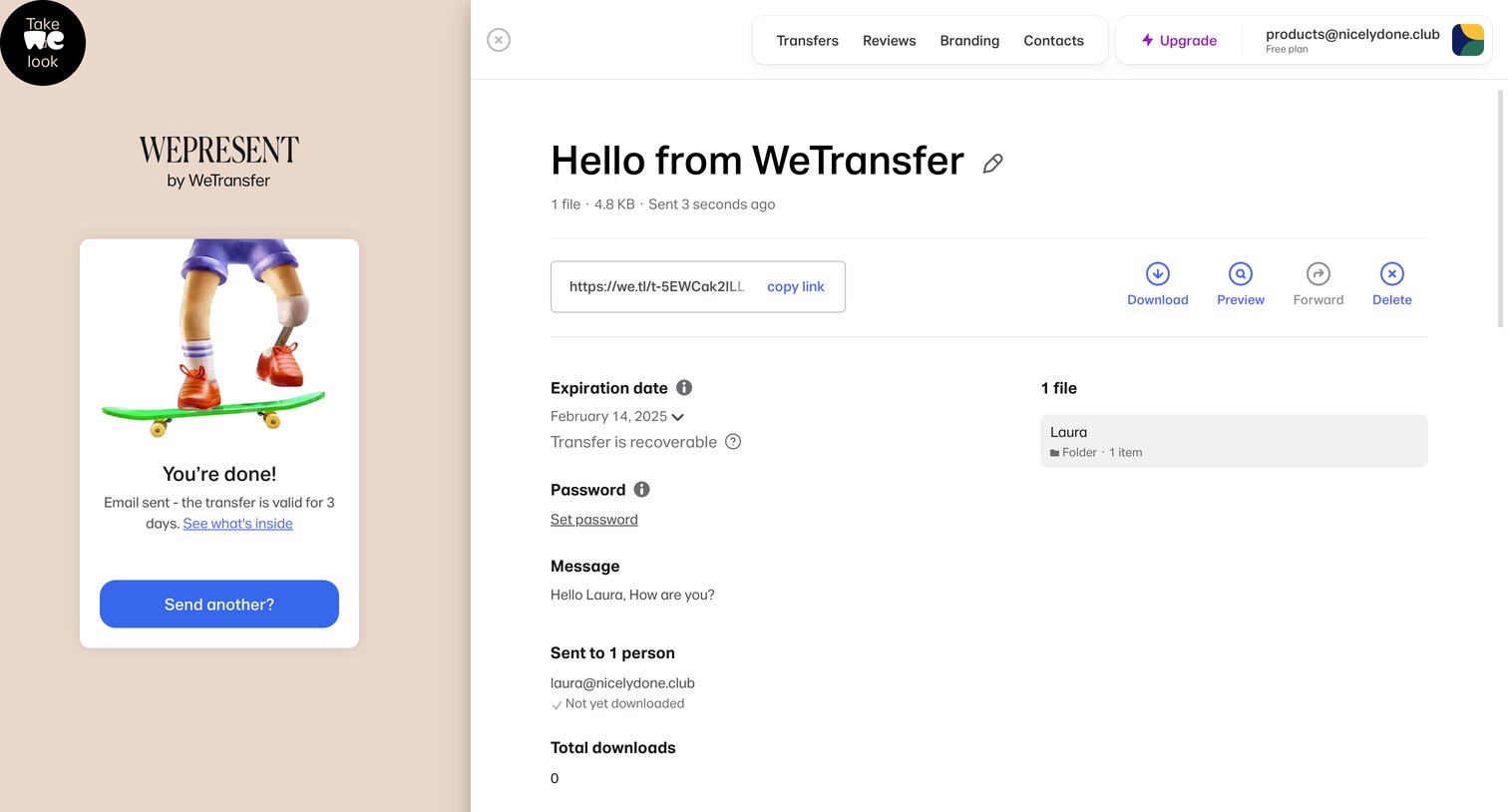
Detail page where the user views a recently sent transfer's status, copies the share link, and manages settings like expiration date and password.
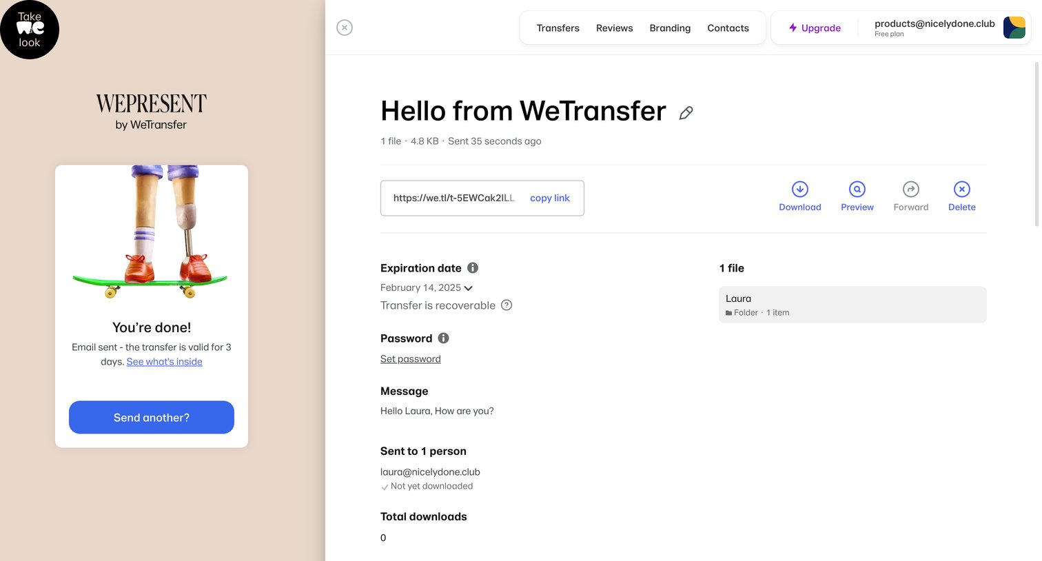
Detail page for a specific file transfer showing expiration, recipients, and download status, alongside a confirmation panel that the transfer was successfully sent.
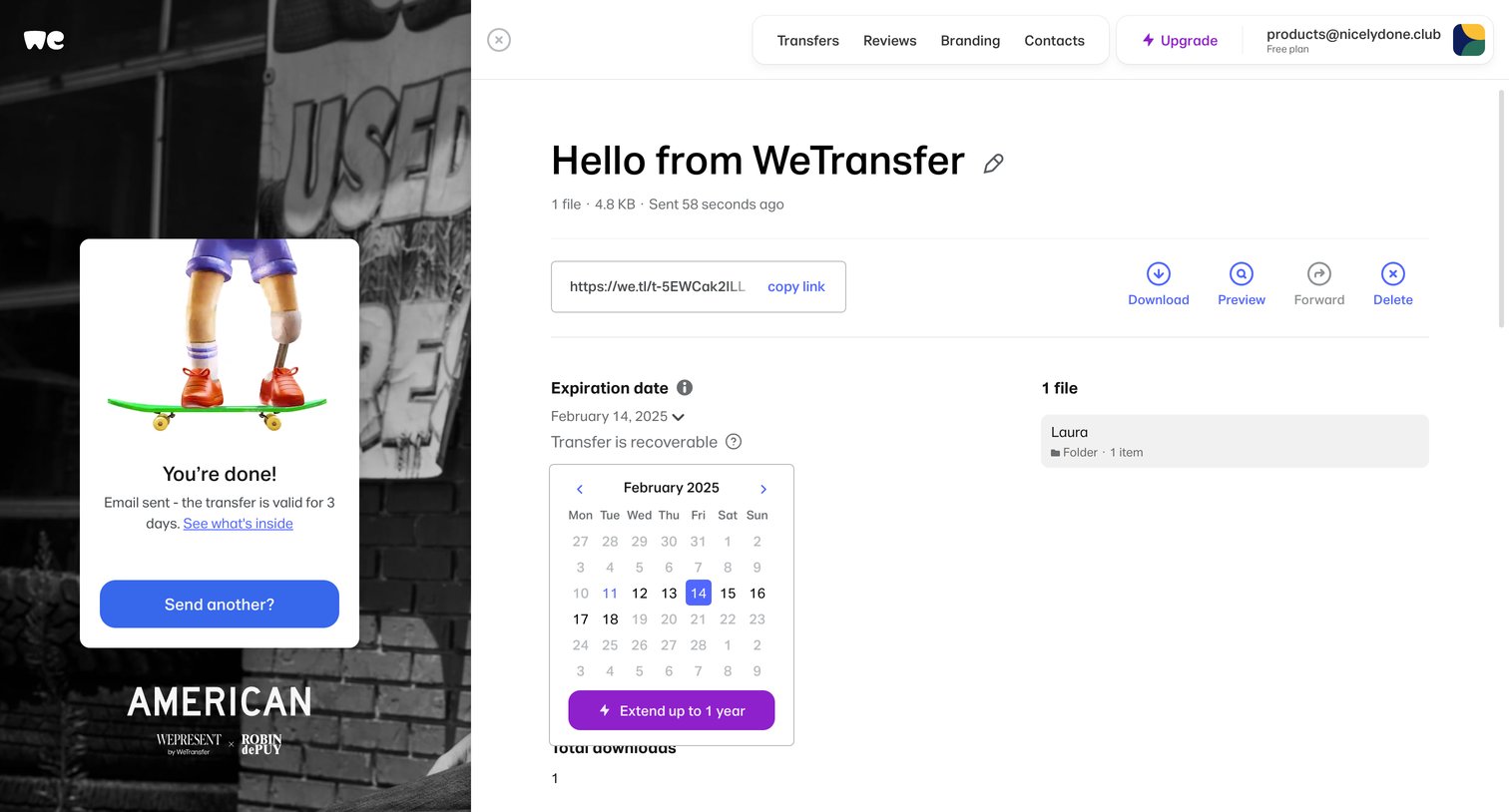
Detail drawer where the user views a completed file transfer, copies the share link, and adjusts the expiration date via an open calendar picker.
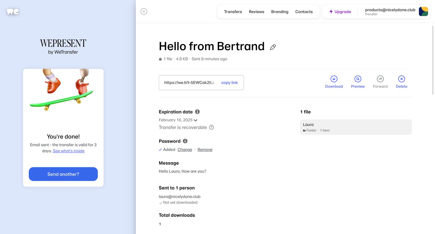
Detail page where the user views a completed file transfer's status, copies the share link, and manages settings like expiration date and password.
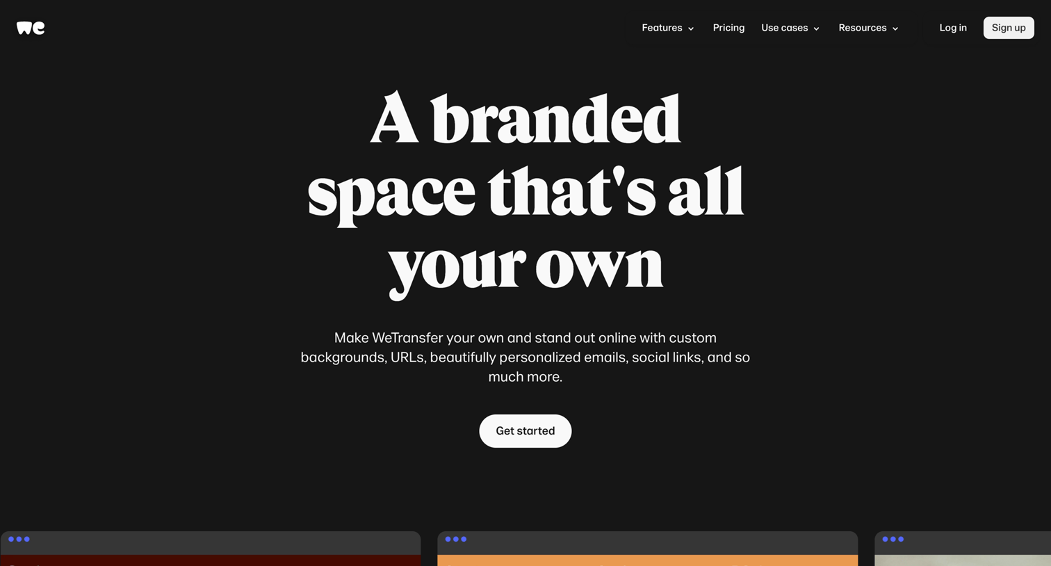
Feature page explaining how users can customize their file-sharing experience with custom backgrounds, URLs, and branded emails, concluding with a prompt to view pricing plans.
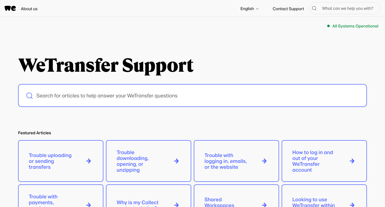
Help center landing page where the user can search for support articles, browse featured troubleshooting guides, or navigate by product and account topics.
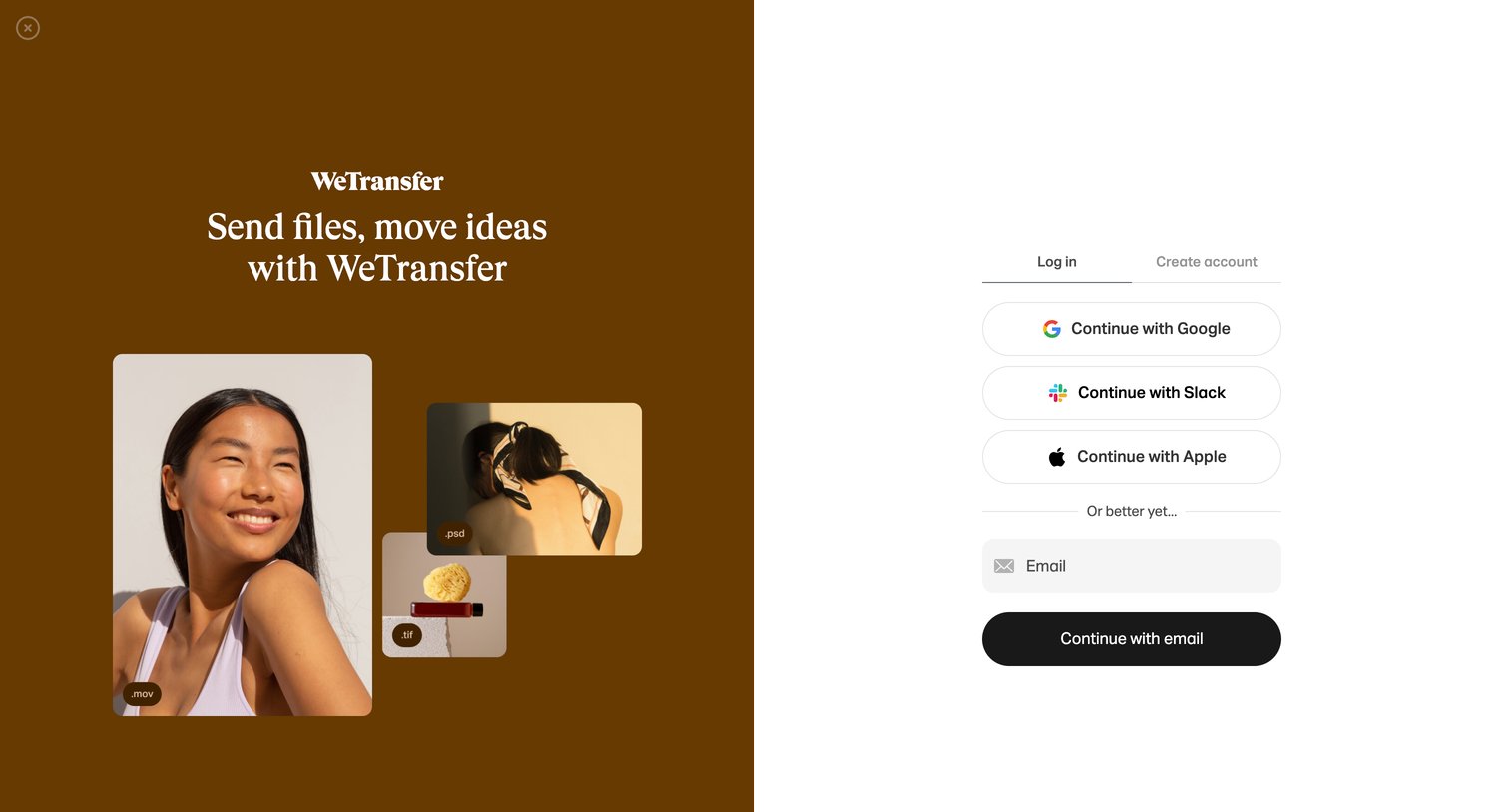
Sign-in screen where the user authenticates with Google, Slack, Apple, or email, featuring a branded image collage on the left.
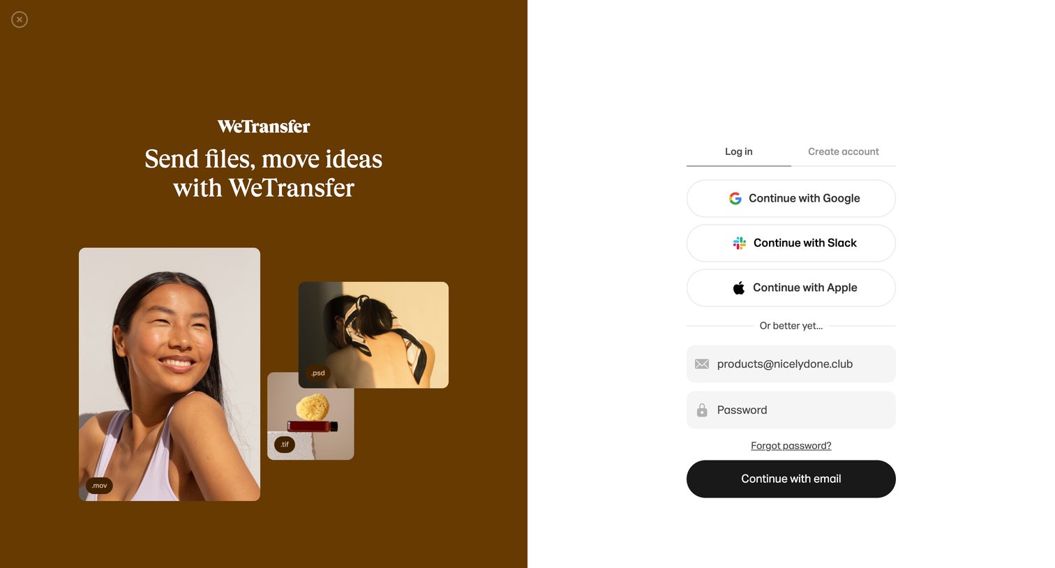
Sign-in screen where the user authenticates with Google, Slack, Apple, or email, featuring a large branding panel on the left.
Browse the full SaaS app library
Explore real SaaS apps with their product screens, marketing screens, flows, and components.
Trusted by the best teams