Checkout page design for payments and subscriptions
A checkout page can support payment entry, order review, subscription changes, or account funding. These six screens show distinct layouts and proposed purchase actions. For each purchase type, choose a layout that exposes the required details before payment.
Explore the examples
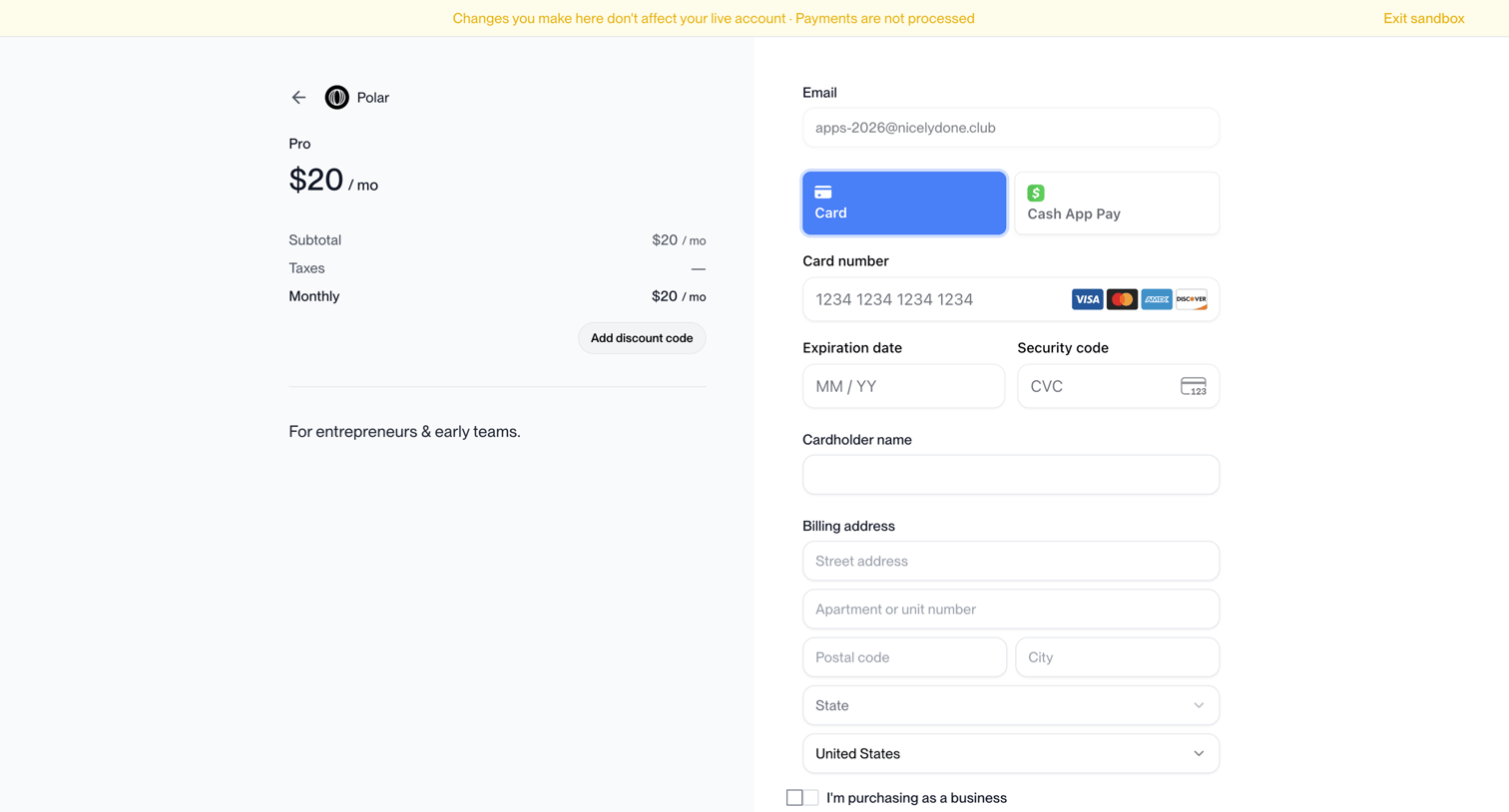

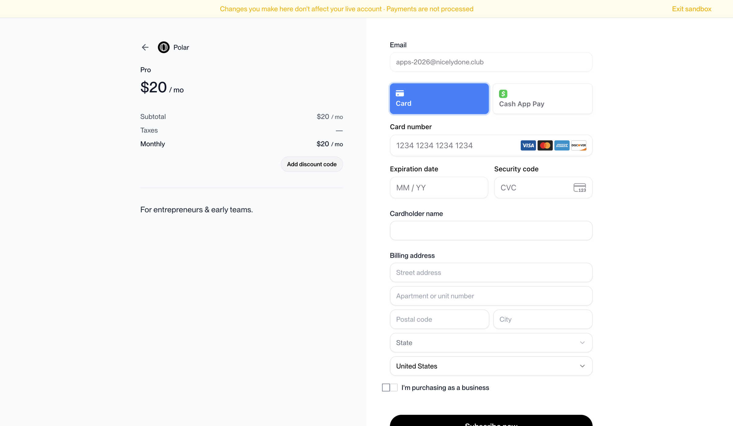
Checkout page where the user enters their payment details, selects between Card or Cash App Pay, and provides a billing address to subscribe to the Pro plan.
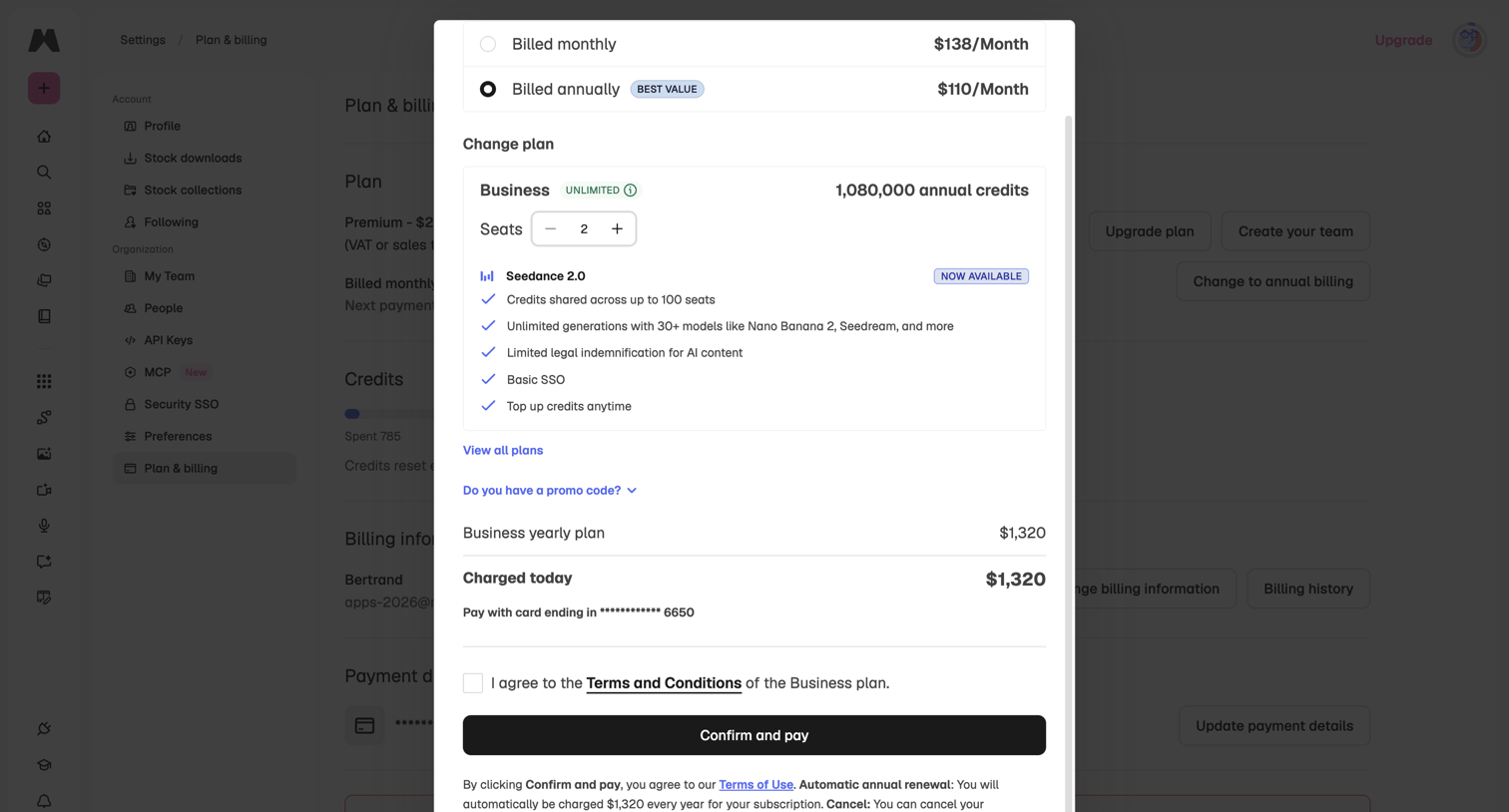

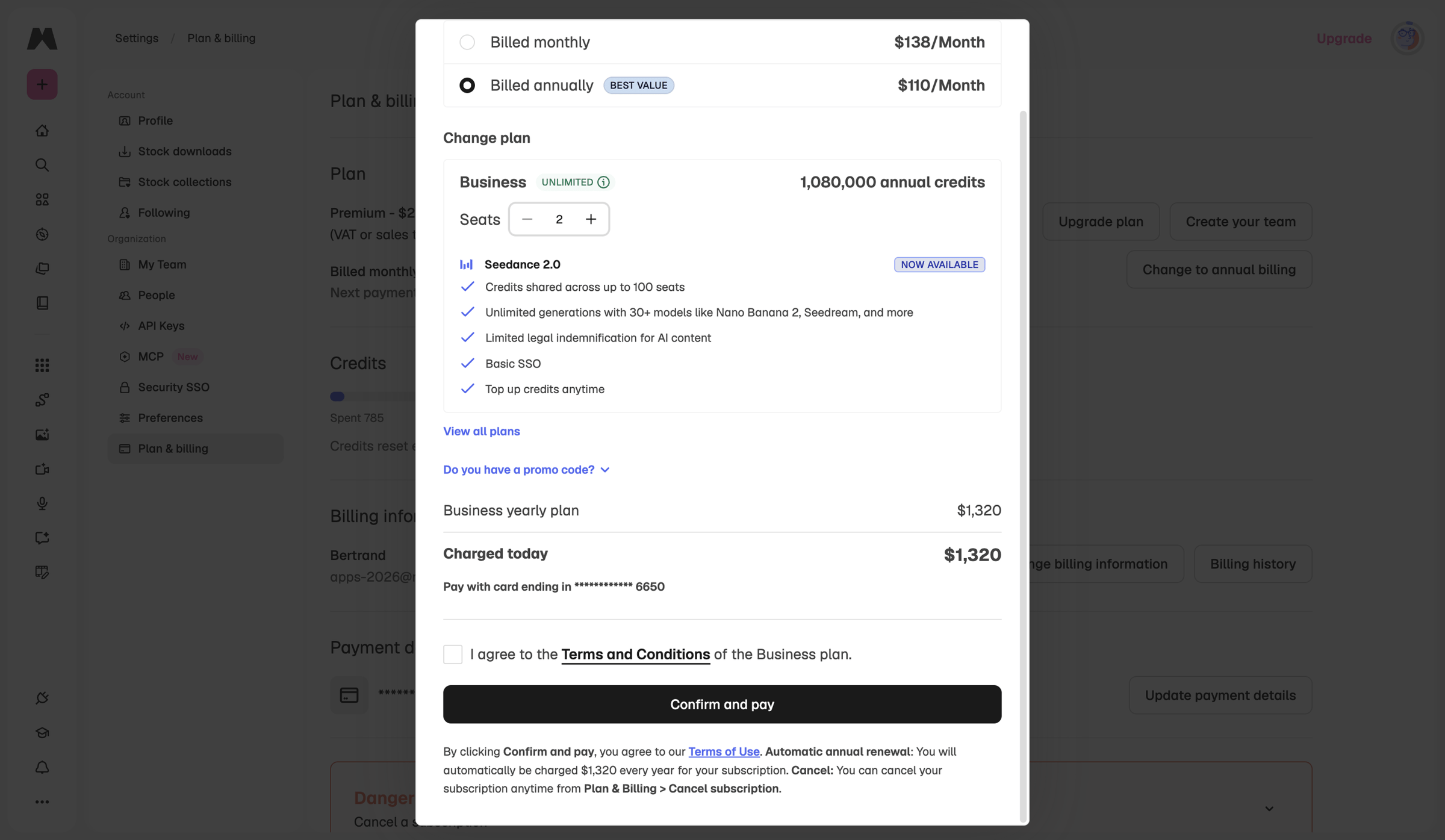
Settings page where the user is upgrading to a Business plan, selecting the number of seats, and confirming payment details in a checkout modal.
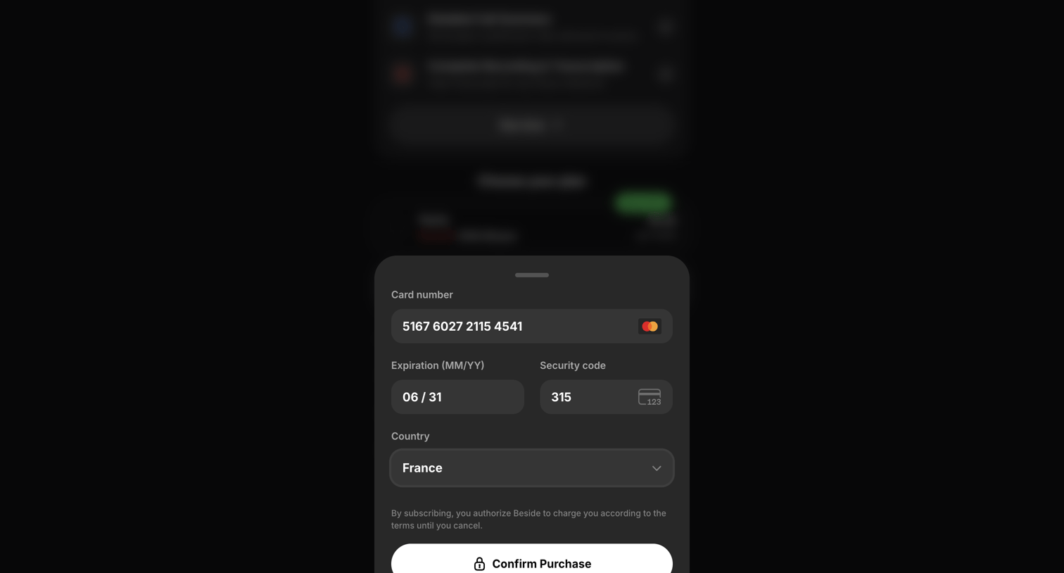

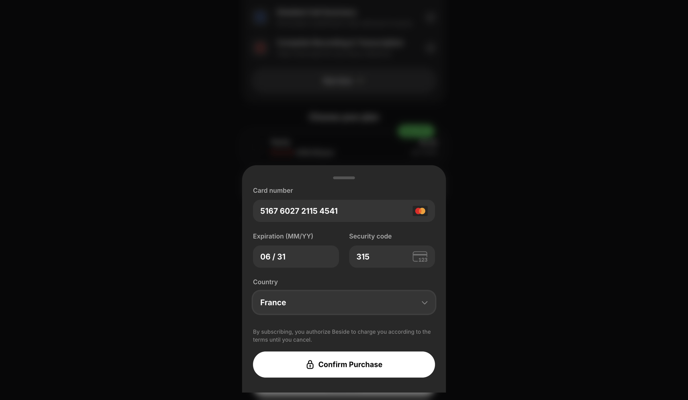
Checkout drawer where the user enters their credit card details and billing country to confirm a subscription purchase.
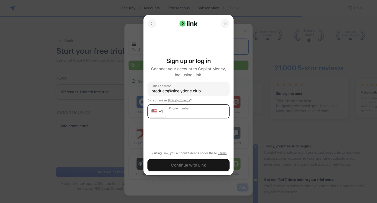

Paywall overlay where the user enters their email and phone number to sign up or log in to Stripe Link to activate their subscription.
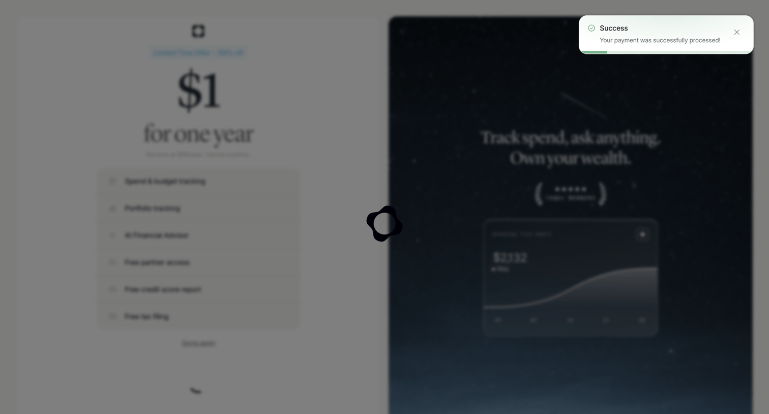

Checkout screen displaying a success toast after payment while transitioning, showing a discounted annual offer and product features.
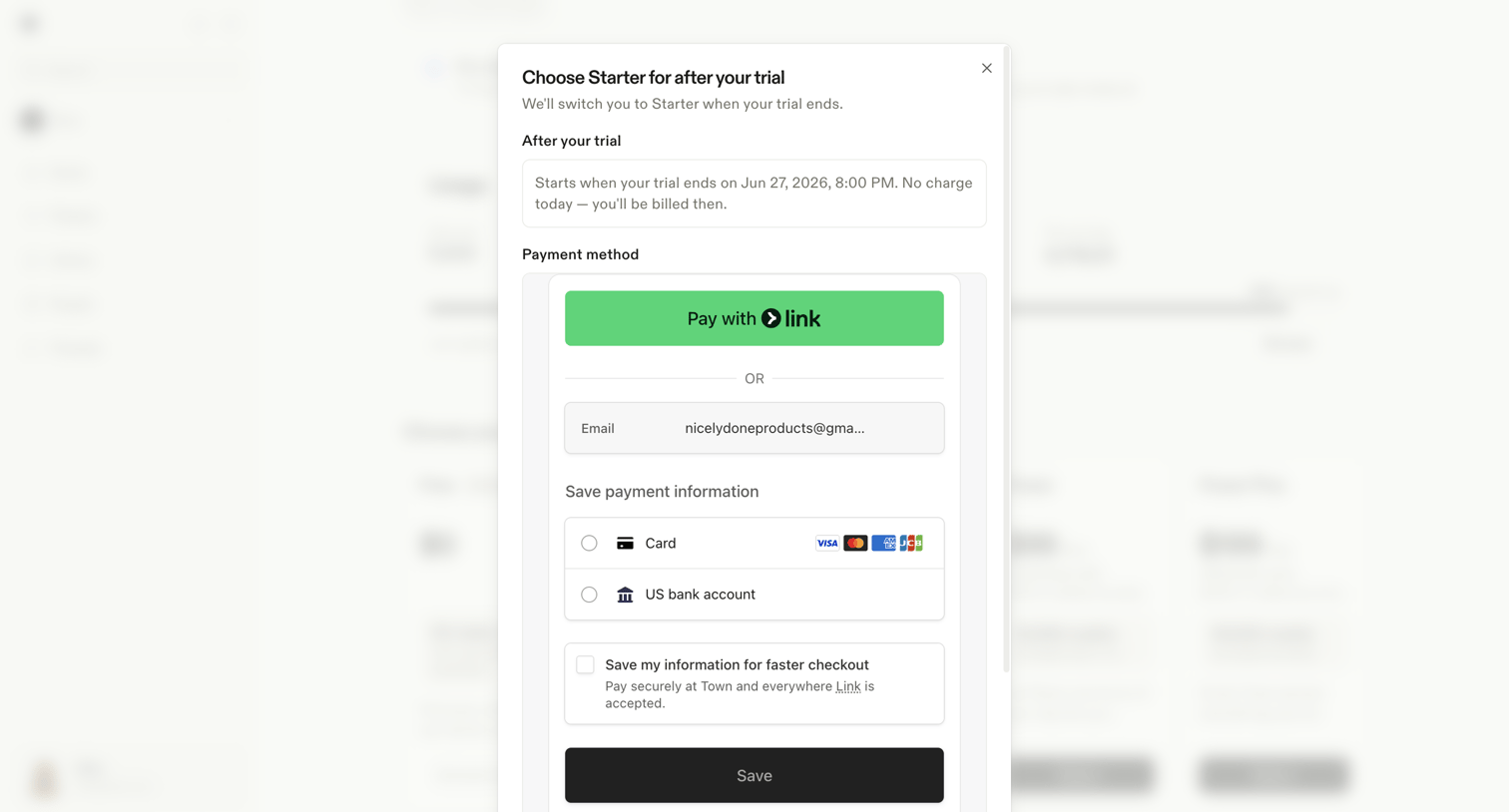

Settings modal where the user sets up a payment method via Stripe Link, credit card, or bank account to activate the Starter plan after their trial ends.
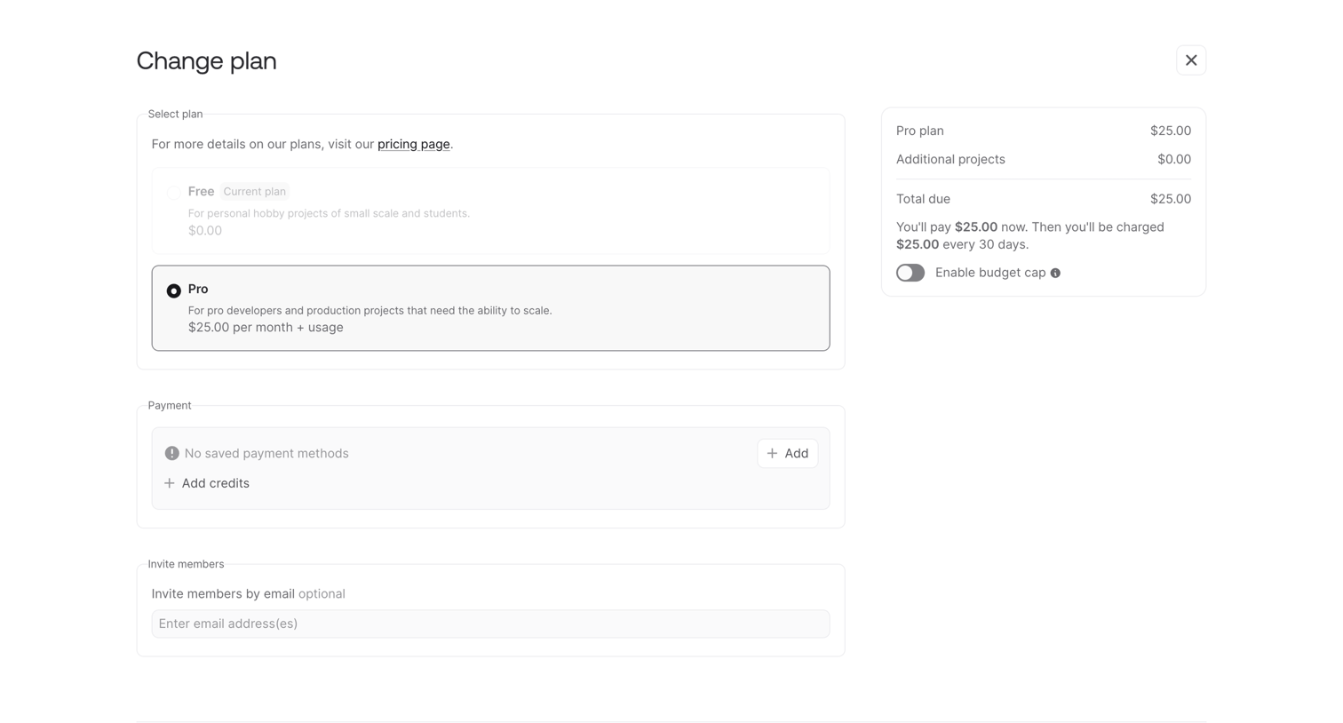

Billing checkout screen where the user selects a Pro subscription tier, reviews the order summary, and can add payment methods or invite team members before confirming the upgrade.
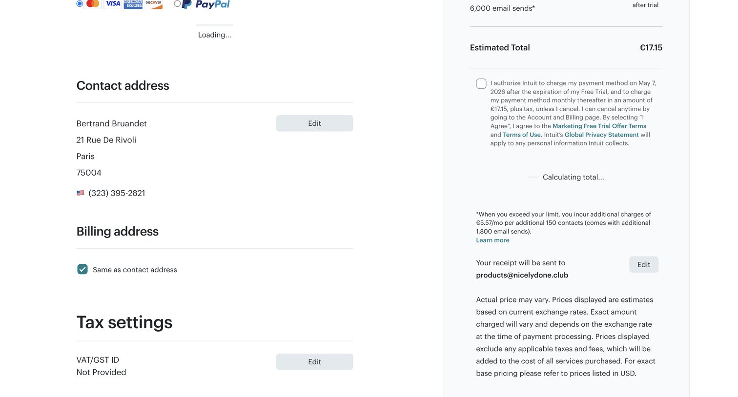

Checkout screen where the user reviews their contact and tax details, agrees to trial terms, and views the estimated total before starting a subscription.
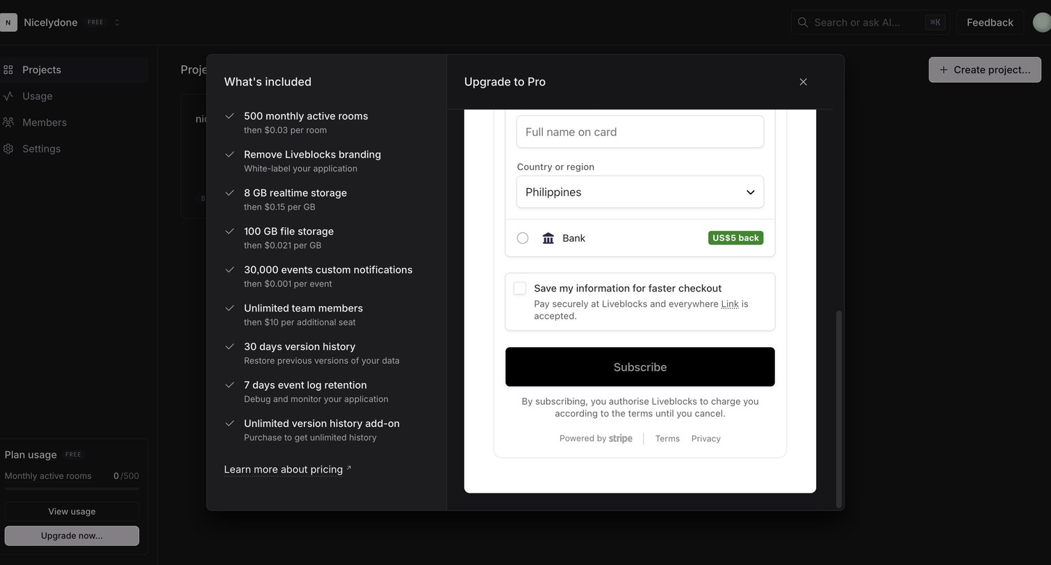

Checkout modal where the user reviews Pro plan features like realtime storage and active rooms, and enters payment details via Stripe.
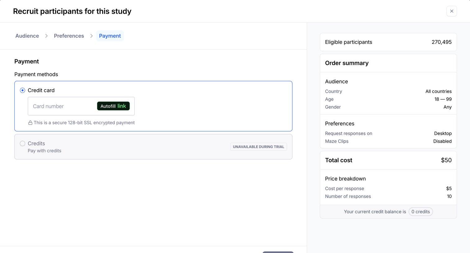

Checkout modal where the user reviews their participant recruitment order summary and enters credit card details to pay.
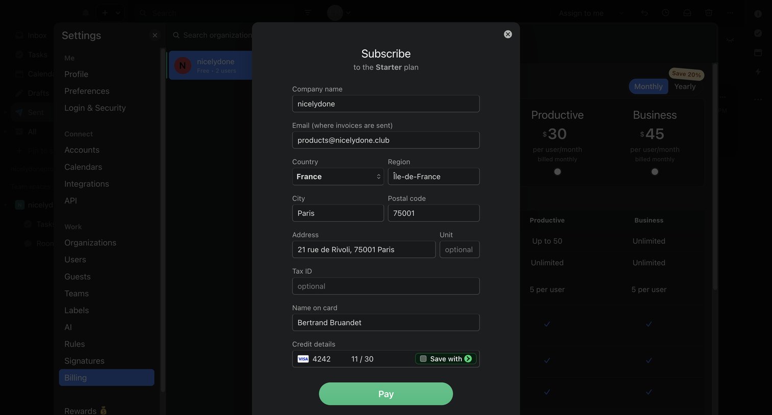

Settings page where the user completes a checkout form to subscribe to the Starter plan, entering billing and credit card details.
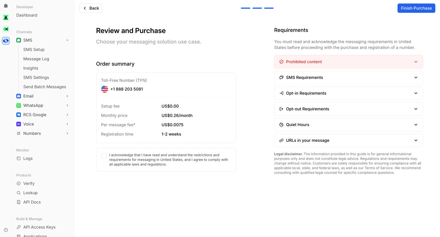

Checkout screen where the user reviews the order summary and compliance requirements before purchasing a toll-free SMS number.
Split checkout and compact payment panels
When buyers need purchase details during payment entry, use a split layout with a summary beside the form. When payment entry follows plan selection, use a compact panel. Before submission, repeat the price and billing interval inside the panel.
Show the recurring commitment
Before subscription payment, show the plan, billing interval, amount due now, and renewal terms. If taxes require billing details, label the tax row “Calculated after billing details” until calculation completes.
Match fields to the selected payment method
When multiple payment methods are available, show the selected method above its required fields. When the selected country changes address requirements, update the address fields for that country.
Repeat purchase details in compact panels
If a panel obscures the summary, repeat the price and billing interval above the purchase button. When buyers need to change the selected plan, provide a return control to plan selection.
Identify sandbox behavior
If checkout runs in a sandbox, state whether changes affect live accounts. State whether payments are processed. Provide a labeled Exit sandbox control.
Polar places a Pro summary on the left and payment and billing fields on the right. The summary shows “$20 / mo”, “Taxes —”, and “Add discount code”. Card is selected beside Cash App Pay. The sandbox banner states that changes do not affect the live account and payments are not processed.
Beside shows a compact dark panel with populated card fields. Expiration and security code share a row. The Country dropdown shows France above subscription authorization text and Confirm Purchase. No price or billing interval is readable in the panel.
Order review with separate Edit controls
When buyers must review account, billing, and payment details before subscribing, use an order review. If a detail needs correction, provide an Edit control beside its section.
Support corrections by section
When account, billing, and payment details occupy separate sections, place an Edit control beside each section. After editing, return buyers to order review.
Label the subscription action
For subscription orders, include the amount and subscription commitment in the payment button label. Before subscription payment, show the renewal interval beside the plan price.
Explain the displayed total
If taxes or adjustments affect the total, show those components above the payment action. If the dollar symbol could be ambiguous, identify the currency.
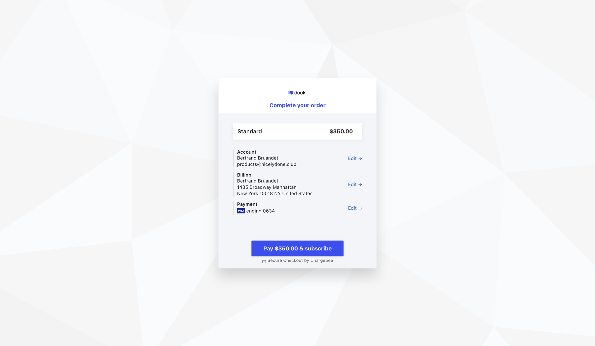
Dock shows Standard at $350.00 above stacked Account, Billing, and Payment sections. Each section has an Edit → control on the right. Payment displays Visa ending 0634. The blue button reads “Pay $350.00 & subscribe”. No billing interval is visible.
Annual billing with seat selection and charge review
When buyers can choose billing intervals or seat quantities, place those controls before the charge summary. For annual subscriptions, distinguish the monthly equivalent from the annual amount due.
Distinguish monthly equivalents from annual charges
When offering annual billing, show the annual amount due beside the monthly equivalent. Before payment, state the renewal amount and interval.
Explain the effect of seat changes
When a seat change affects price or credits, update the purchase summary. Before seat selection, identify whether displayed prices cover all seats or each seat.
Place required agreement before payment
When agreement is required, place the checkbox and linked terms before the payment button. Beside the checkbox, explain the agreement requirement.
Provide alternatives before commitment
When buyers need another plan before confirmation, provide a plan comparison route. If promotions apply, expose code entry above the payment button.
Magnific shows annual billing selected at $110/Month and a Seats control set to 2. The summary reads “Business yearly plan $1,320” and “Charged today $1,320”. The agreement checkbox above Confirm and pay is unchecked. Text below the button specifies automatic renewal at $1,320 every year. View all plans and “Do you have a promo code?” appear above the summary.
Trial change confirmation with an immediate charge
When payment also ends a trial or changes access immediately, use a confirmation modal. Before confirmation, present the proposed charge and access reductions.
State when the trial ends
If confirmation ends a trial immediately, state that consequence beside the proposed plan. Before confirmation, show the amount due now and the recurring price.
Describe access reductions
When a plan change reduces access, list the affected limits and removed features. When quantities differ, show the old and new quantities.
Pair the charge action with cancellation
When charging a saved payment method, state its saved status beside the charge summary. Label the confirmation button with the charge amount. Provide Cancel beside confirmation.
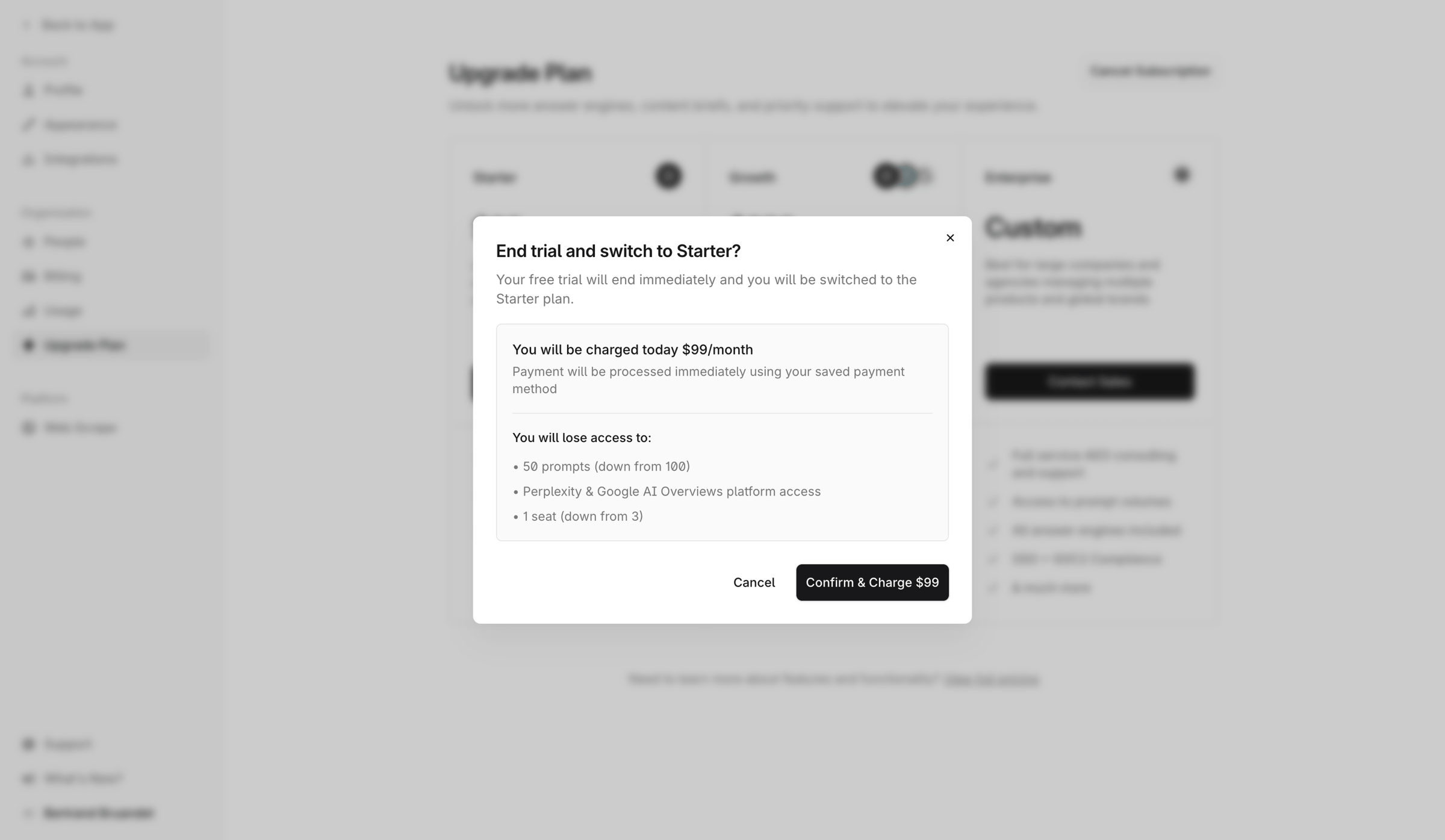
Tryprofound asks “End trial and switch to Starter?” in a centered modal. The text states that the trial will end immediately. The summary states “You will be charged today $99/month” and describes immediate processing using a saved payment method. Listed losses include “50 prompts (down from 100)”, Perplexity & Google AI Overviews platform access, and “1 seat (down from 3)”. Cancel and “Confirm & Charge $99” appear at the lower right.
Account funding with an editable purchase amount
When buyers add funds for metered usage, use a dialog with an amount input and payment method control. Before Purchase, show the funds to add and the total charge.
Define the funding amount
For editable funding amounts, label the currency and required amount. If limits apply, state the minimum and maximum beside the input.
Allow payment method changes
Before purchase, provide a way to change the displayed payment method. When buyers change payment methods, keep the entered amount.
Show the complete purchase amount
If fees or taxes apply, distinguish them from the funds added to the account. Before Purchase, show the total charge. Provide Cancel beside Purchase.
Handle the payment result
After payment succeeds, show the funds added and resulting balance. If payment fails, retain the entered amount. With a payment failure message, show a retry action. If payment status is unresolved, provide an action to check its status.
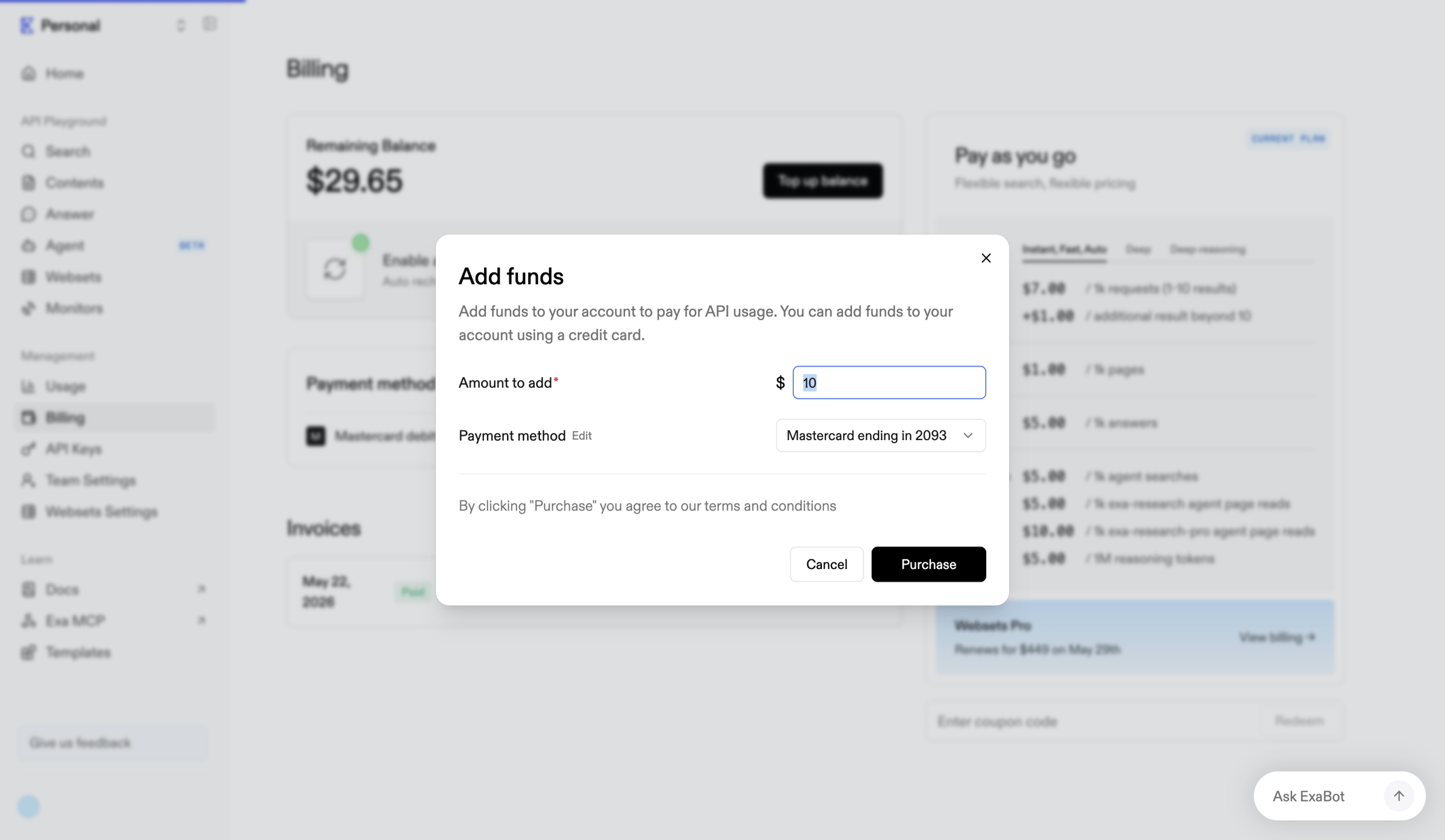
Exa’s Add funds dialog contains a required Amount to add field showing 10 beside a dollar sign. The amount field has a blue outline and highlighted value. A payment method dropdown displays “Mastercard ending in 2093”. Edit appears beside Payment method. Cancel and Purchase sit at the lower right.
Explore the full SaaS screen library
Upgrade to unlock the full library.
Trusted by the best teams