Badge UI examples
Badge UI design examples from SaaS apps. See how interfaces attach a compact status or count to an item. Explore how badge text, color, and placement add context to nearby content.
Explore the examples

The screenshot displays a 'Failed' status indicator.


A simple announcement banner.

A button with a neon outline and text inside.
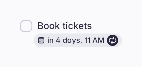

A booking card with a checkbox and a date and time indicator.

A small, pill-shaped badge used as an eyebrow heading to introduce a section.
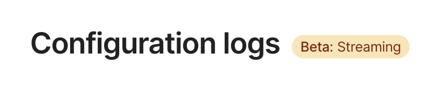

A large page title 'Configuration logs' accompanied by a pill-shaped badge indicating a beta feature.

A pill-shaped badge used to announce news, featuring text and a right-pointing chevron icon.

A pill-shaped badge displaying a date alongside an image icon.

A blue button with the text 'New'

A button with an icon and text

A pill-shaped badge indicating a beta feature or status.

A button with text and an arrow icon
Browse the full component library
See 75 more Components.
Trusted by the best teams








About Badge
See how interfaces attach a compact status or count to an item. Explore how badge text, color, and placement add context to nearby content.