Button group UI examples
Button group UI design examples from SaaS apps. See how interfaces place related actions together. Explore how grouped buttons use labels, spacing, and emphasis to show the relationship between available…
Explore the examples
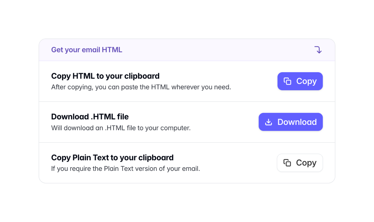

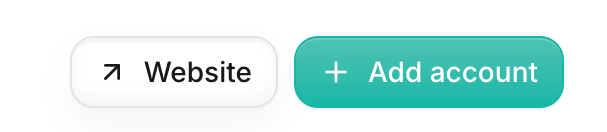

The image shows two buttons.
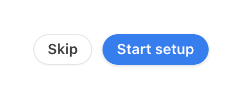

The image shows two buttons, one to skip and one to start setup.
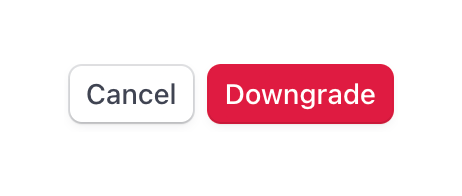

A horizontal button group containing a secondary 'Cancel' button and a primary destructive 'Downgrade' button.
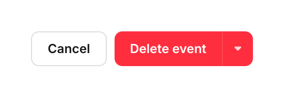

A button group containing an outlined Cancel button and a red filled Delete event button with a dropdown arrow.
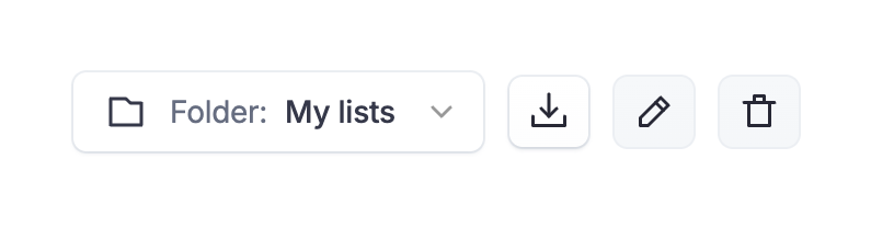

A set of actions for a folder
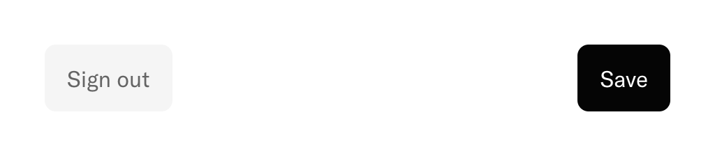

A pair of buttons positioned at opposite ends of a row, typically found at the bottom of a modal or form. The left button is a secondary 'Sign out' action, and the right is a primary 'Save' action.
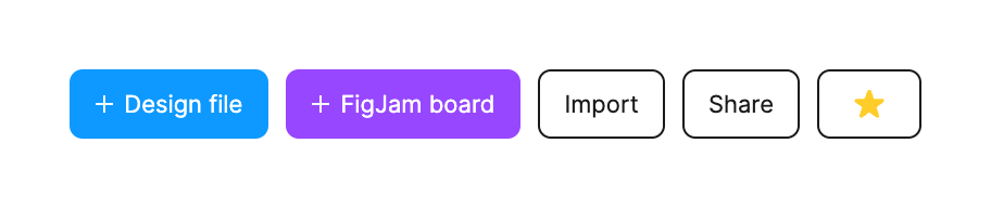

A set of action buttons
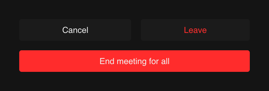

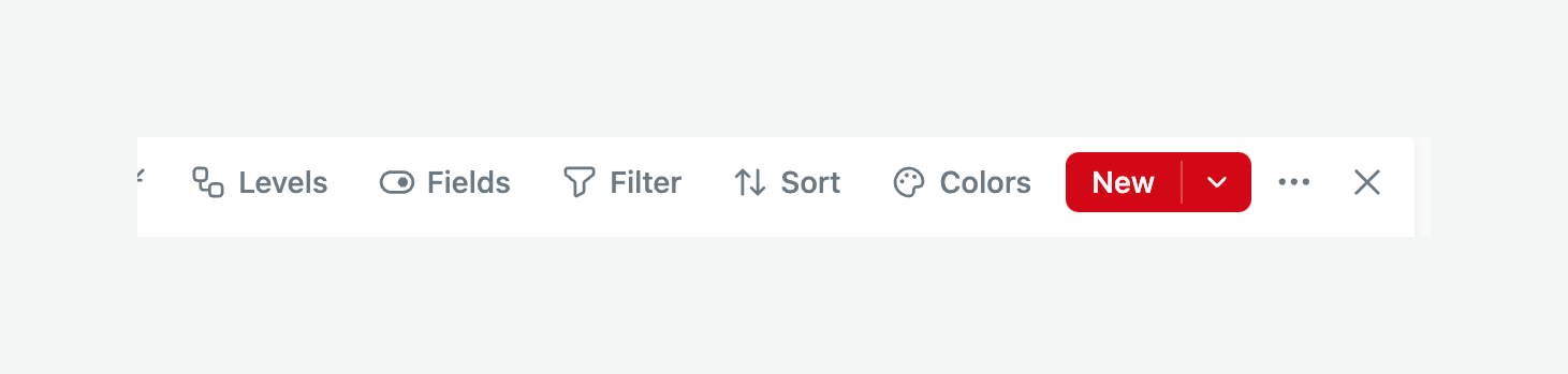

A toolbar with several options.
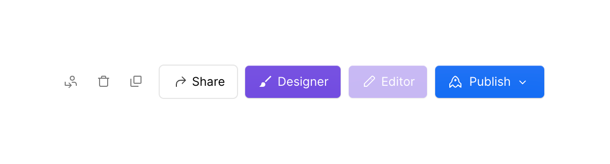

A set of action buttons
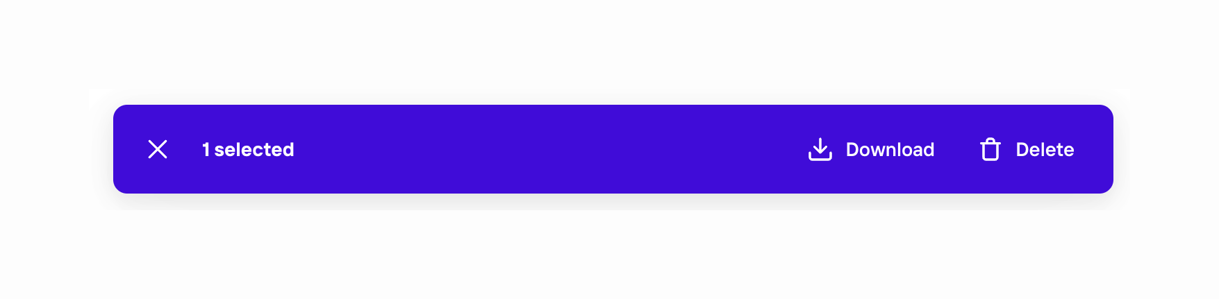

A selection bar with actions
Browse the full component library
See 57 more Components.
Trusted by the best teams








About Button group
See how interfaces place related actions together. Explore how grouped buttons use labels, spacing, and emphasis to show the relationship between available choices.