Tome UI components examples
Browse Tome UI component design examples. Preview individual interface elements and explore related component categories. The storytelling tool for work
Explore the examples
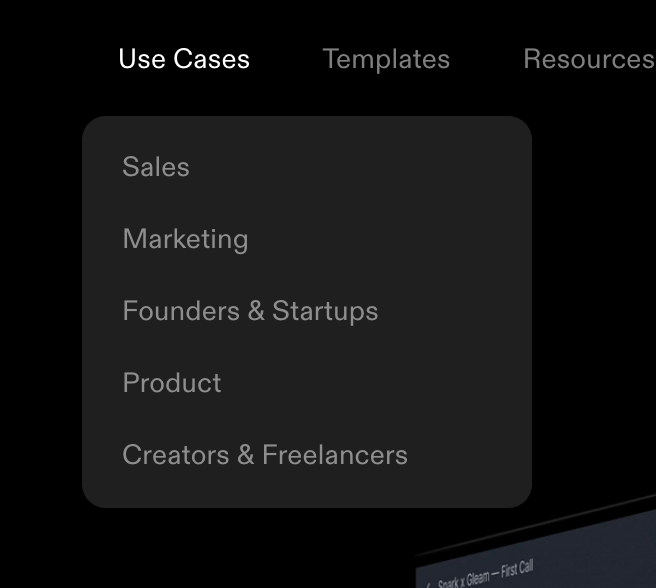

A dark-themed dropdown menu originating from a top navigation bar. The 'Use Cases' item is active, revealing a list of specific use cases like Sales, Marketing, and Product.
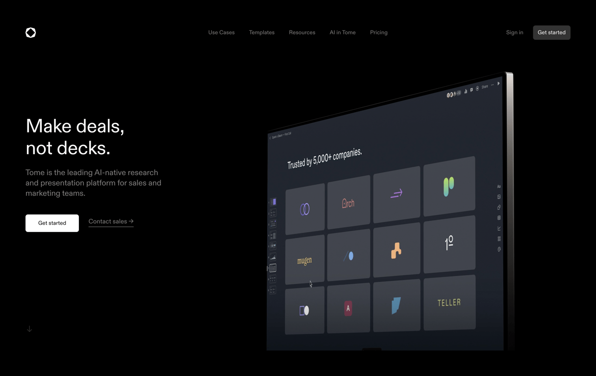
A dark-themed hero section featuring a bold headline, a descriptive subheadline, and two call-to-action buttons on the left. On the right, a large, angled product screenshot showcases the presentation platform's interface.
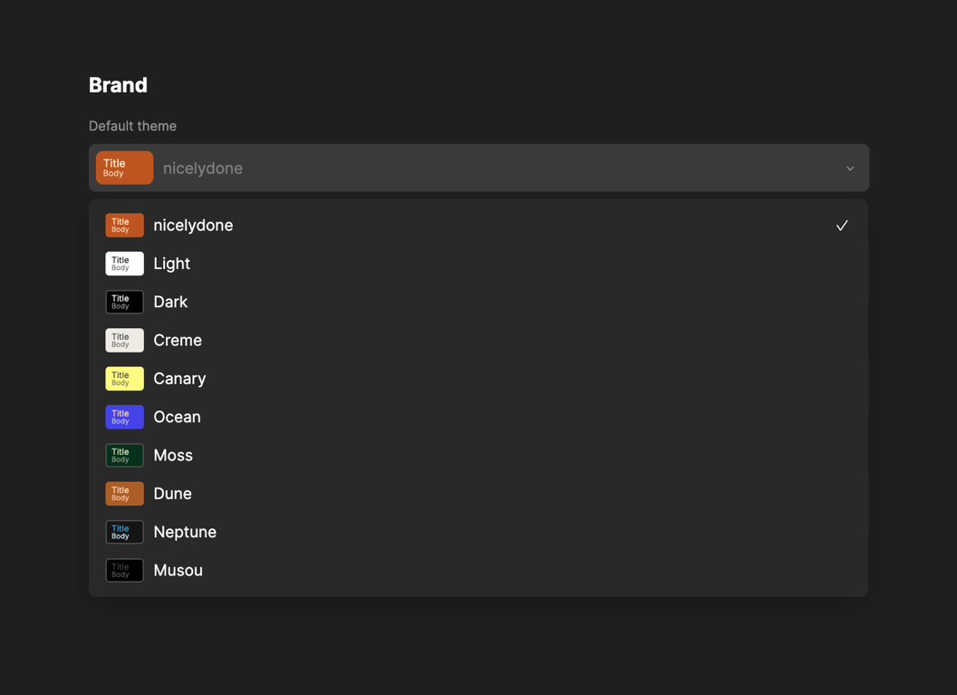
An open dropdown menu for selecting a default brand theme. The list displays various theme options, each with a small preview thumbnail showing title and body text colors, alongside the theme name. The currently selected theme has a checkmark next to it.
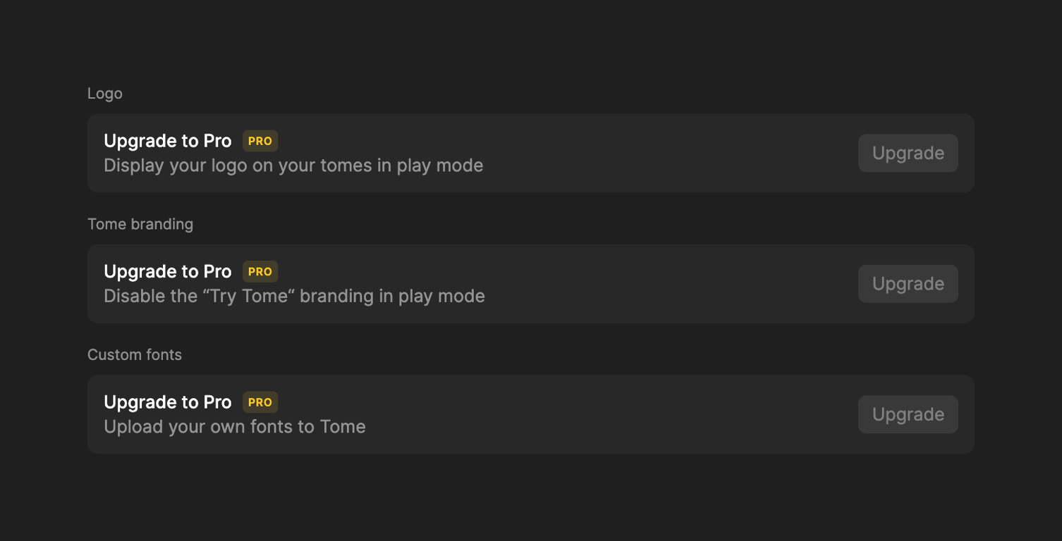
A list of features that are locked behind a Pro subscription. Each item shows a title, description, a 'PRO' badge, and an 'Upgrade' button.
A simple text-only empty state message indicating the user hasn't been added to any items yet.

A dark-themed top navigation area featuring a prominent red banner alerting the user that their workspace has exceeded the free plan's creation limit, alongside a call-to-action button to upgrade. Below the banner is a header with a user profile dropdown, a notification bell,…
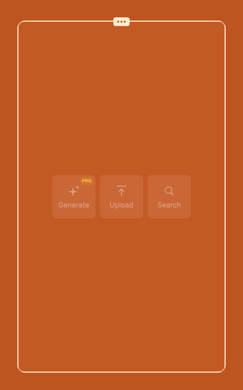
An empty slide state in a presentation editor offering three primary actions to populate the slide: Generate (with AI), Upload, or Search. The actions are presented as large, square, semi-transparent buttons centered within a bordered slide area.
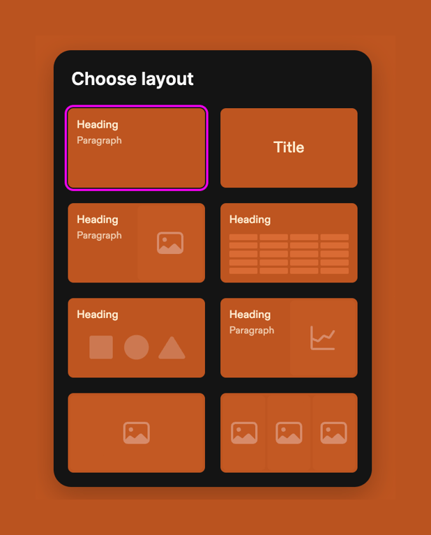
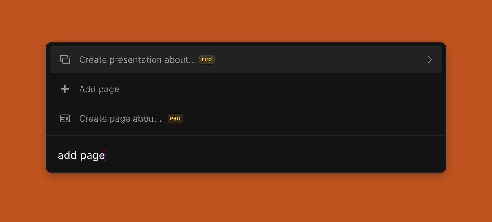
A dark-themed command palette with a text input field at the bottom and a list of suggested actions above. The user has typed 'add page' into the input field, filtering the list to show related actions like 'Create presentation about...', 'Add page', and 'Create page…
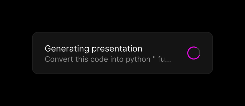
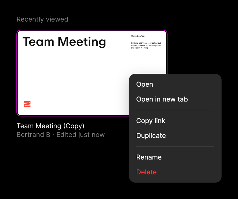
A document preview card showing a presentation title and metadata, with an open context menu overlay displaying file actions like Open, Duplicate, and Delete.
Browse the full component library
Browse the full UI component library.
Trusted by the best teams







