Theme settings UI examples
Theme settings UI design examples from SaaS apps. See how interfaces present appearance choices. Explore how theme previews, color options, and selection states communicate changes to the look of the product.
Explore the examples
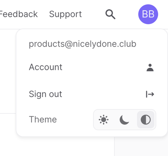

A user profile dropdown menu displaying account details, sign out option, and a theme selection toggle.
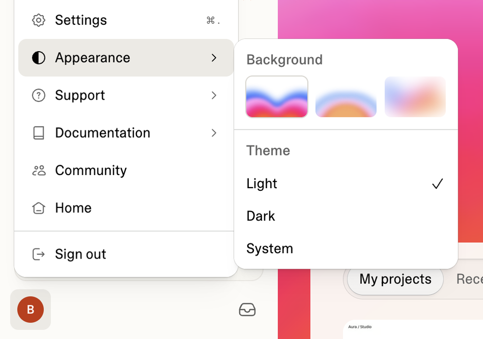

A user interface displaying application settings with options for appearance, including background and theme selection.
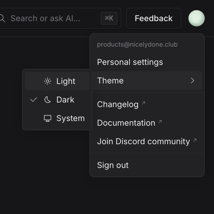

A user account dropdown menu displaying personal settings, theme selection, and external links, with a nested menu for theme options.
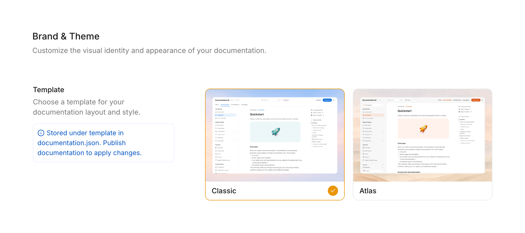

A settings page for documentation branding and theme, showcasing two template options: Classic and Atlas, with a selected state for the Classic template.
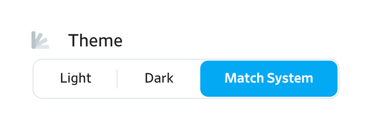

User interface for theme selection
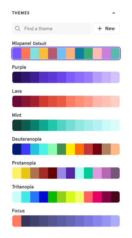

A user interface for selecting and managing color themes, featuring a search bar, a new theme button, and a list of predefined color palettes.
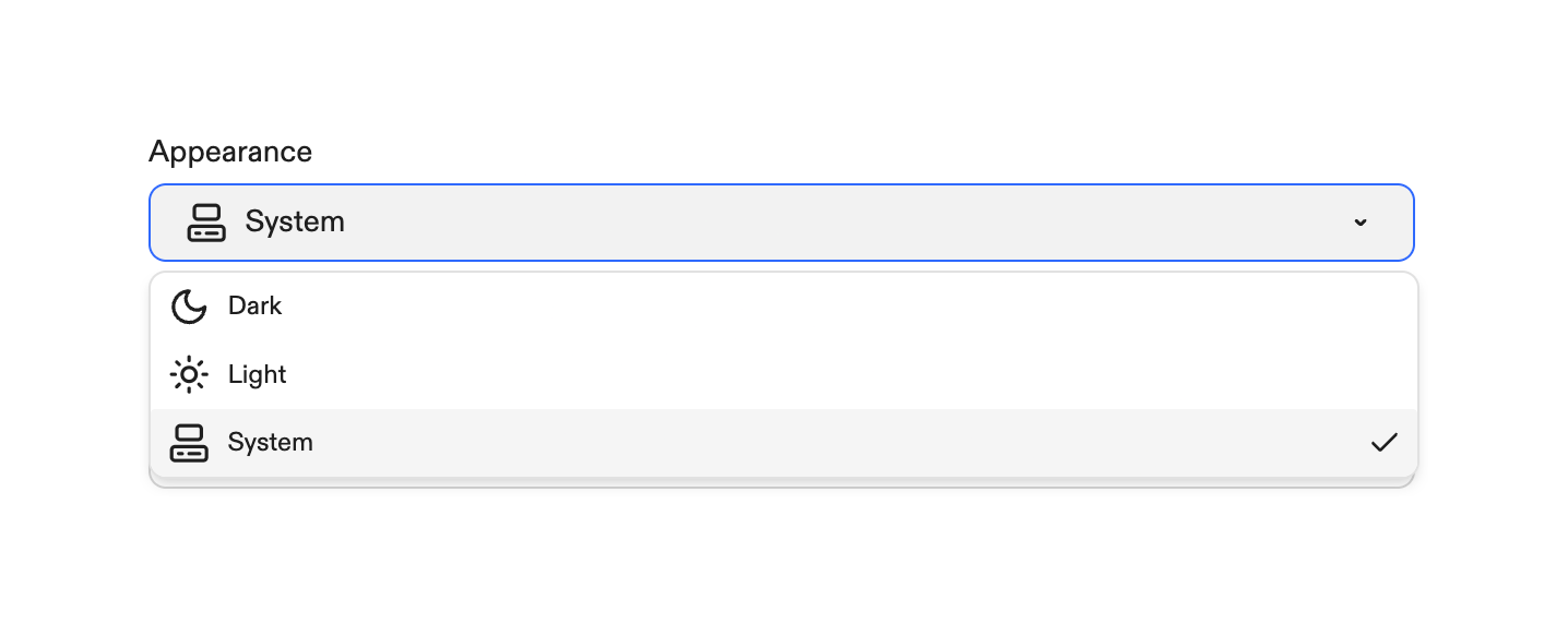

A dropdown menu displaying appearance settings with options for system, dark, and light themes.
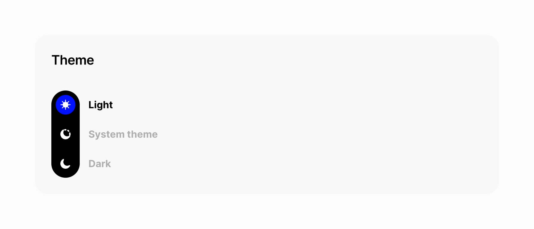
A user interface element for selecting a display theme
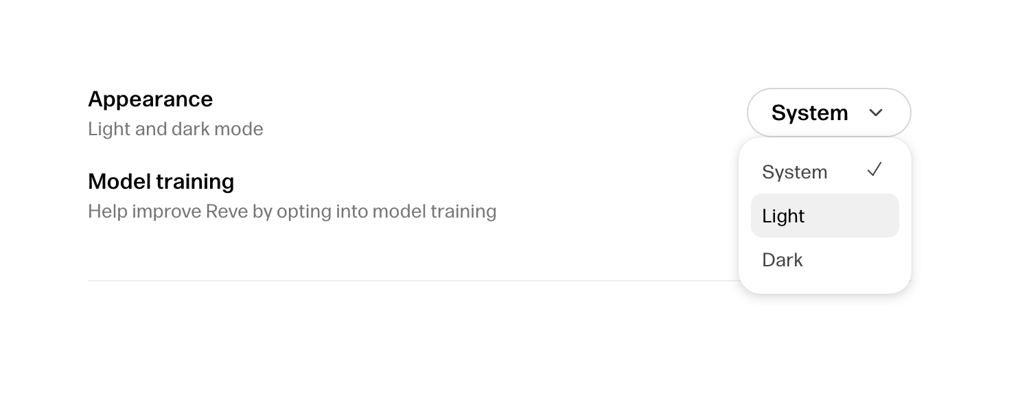

A settings interface displaying options for appearance mode and model training.
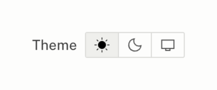

A user interface element for selecting the display theme, offering light, dark, and system options.
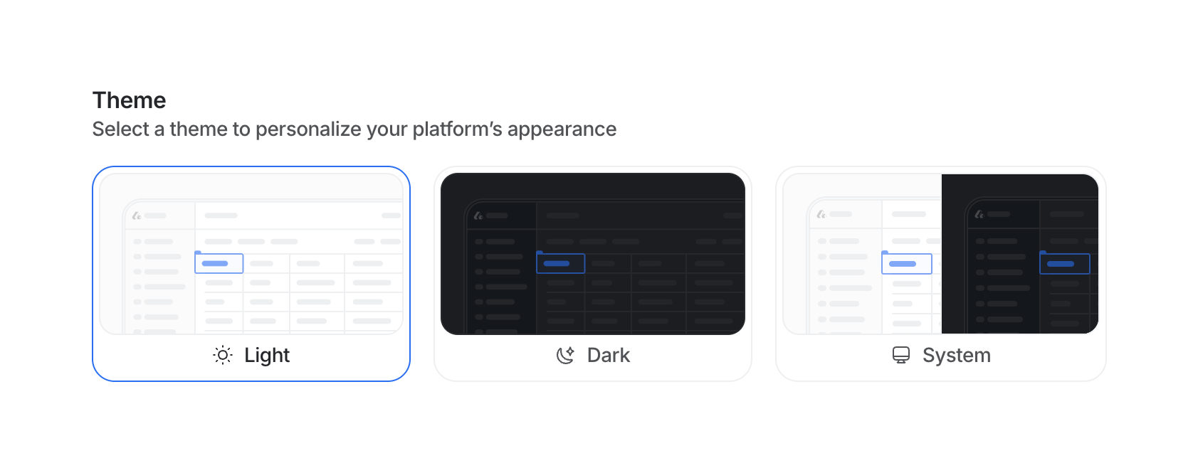

Theme selection modal
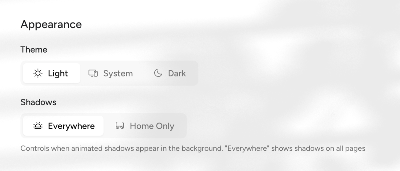

The screenshot shows appearance settings with options for theme and shadows.
Browse the full component library
See 154 more Components.
Trusted by the best teams








About Theme settings
See how interfaces present appearance choices. Explore how theme previews, color options, and selection states communicate changes to the look of the product.