Rows UI components examples
Browse Rows UI component design examples. Preview individual interface elements and explore related component categories. The spreadsheet with superpowers
Explore the examples
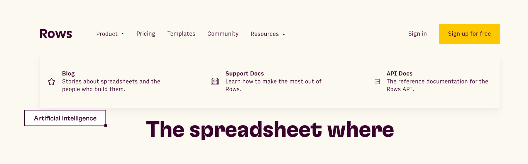

A website header featuring a logo, navigation links, and authentication buttons. The 'Resources' navigation item is active, displaying a full-width dropdown menu with three distinct resource categories, each accompanied by an icon and a brief description.
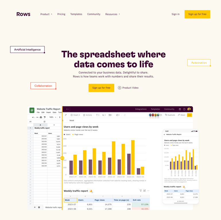
A hero section featuring a top navigation bar, a large headline, a subheadline, call-to-action buttons, and a prominent product interface mockup showing a spreadsheet and a mobile view.

A card displaying the current usage of integration executions, indicating that the limit has been reached and prompting the user to upgrade.
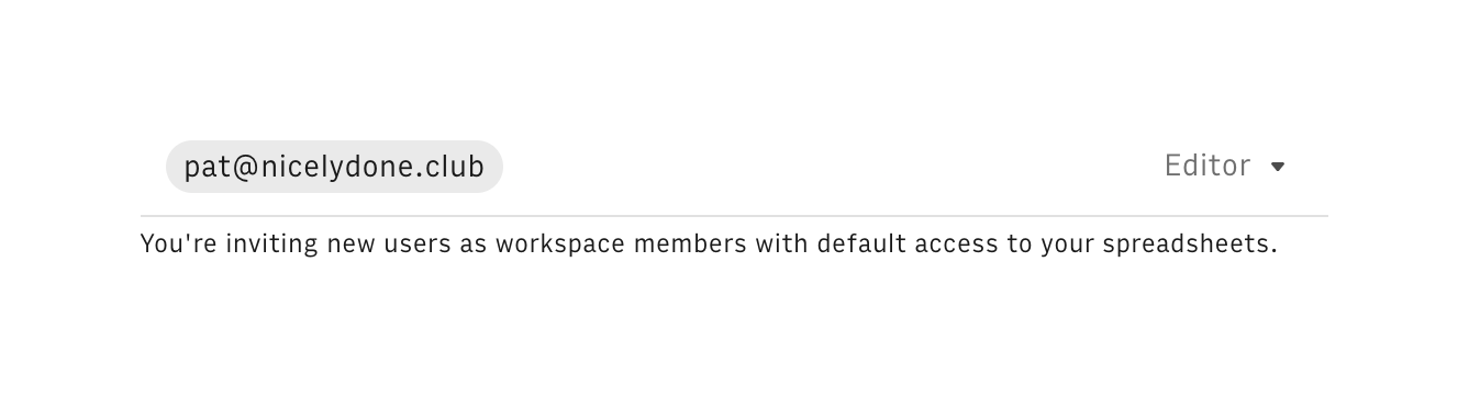
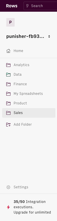
A vertical sidebar navigation menu featuring a workspace switcher, a list of folders, and a usage quota indicator at the bottom.
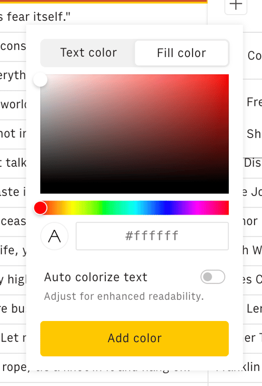
A popover containing a color picker with tabs for text and fill color, a color gradient area, a hue slider, a hex input, a toggle for auto colorizing text, and an add color button.
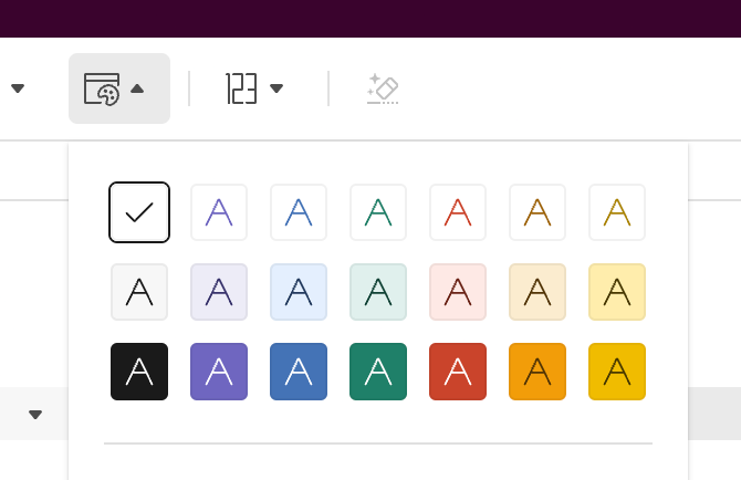
A popover menu displaying a grid of color swatches for text formatting, opened from a toolbar button.
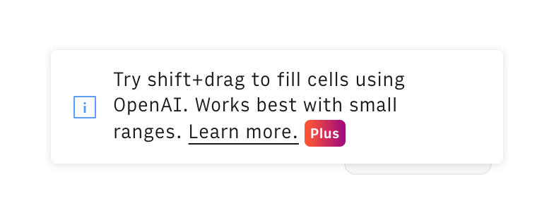
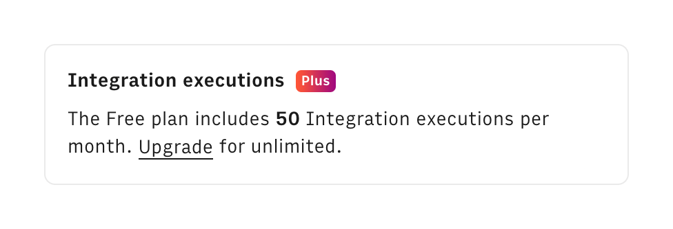
A small card displaying usage limits for integration executions on a free plan, with a link to upgrade.
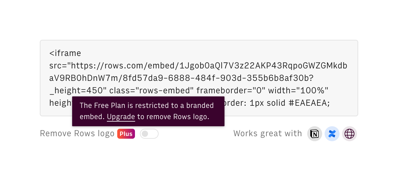
A read-only text area displaying an iframe embed code, accompanied by a disabled toggle to remove branding and a tooltip prompting the user to upgrade their plan.
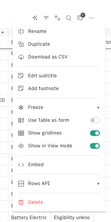
A dropdown menu containing various table configuration options, actions, and toggles.
Browse the full component library
Browse the full UI component library.
Trusted by the best teams







