Skip to content

Eraser UI components examples

Browse Eraser UI component design examples. Preview individual interface elements and explore related component categories. Documents & diagrams for engineering teams

Explore the examples
Eraser — Dropdown menu component
Eraser logo
Eraser

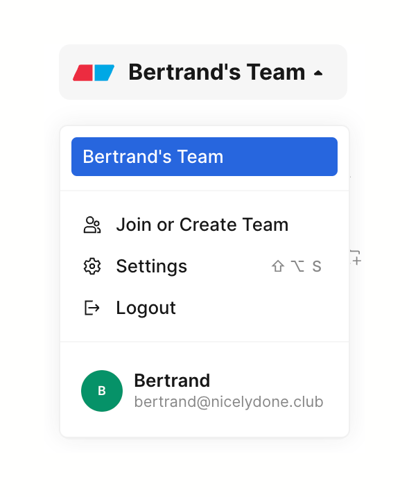
A dropdown menu for switching workspaces, managing team settings, and user account actions. It features a highlighted active team, a list of actions with icons, and a user profile section at the bottom.
Eraser — Dropdown menu component
Eraser logo
Eraser

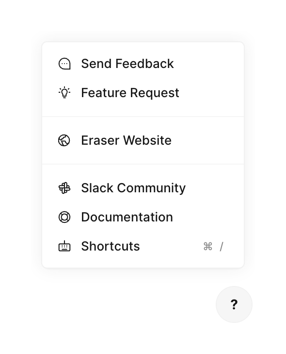
A popover menu containing links to support resources, feedback, and documentation, triggered by a floating help button.
Eraser — Progress indicator component
Eraser logo
Eraser

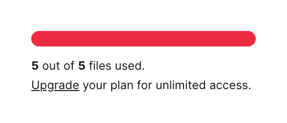
A progress bar indicating a reached usage limit, accompanied by text stating the limit and a link to upgrade the plan.
Eraser — Table component
Eraser logo
Eraser

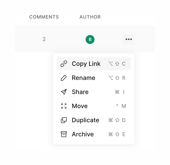
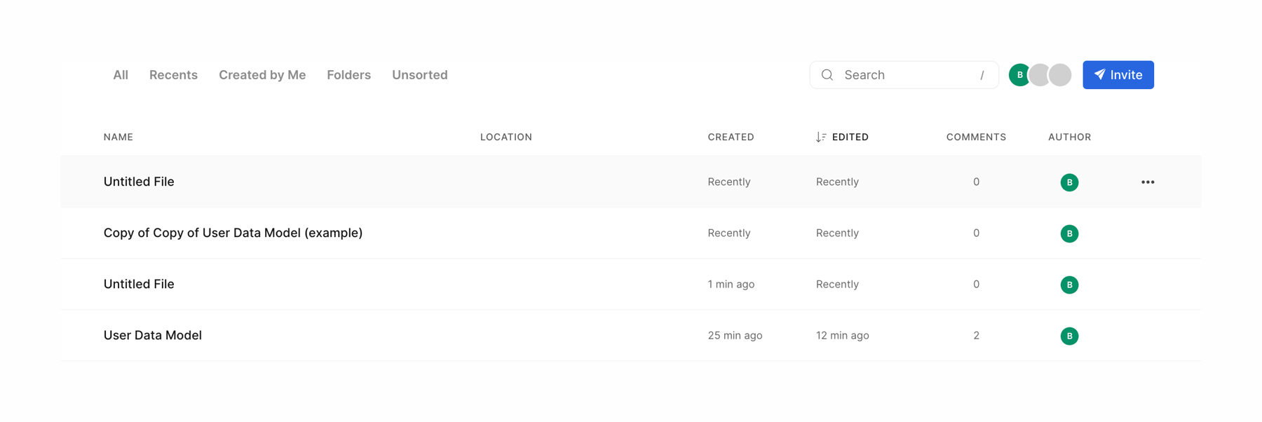
A table displaying a list of files with columns for name, location, created date, edited date, comments count, and author. It includes a top toolbar with tabs for filtering, a search input, an avatar group, and an invite button.

Eraser — Coachmark component
Eraser logo
Eraser

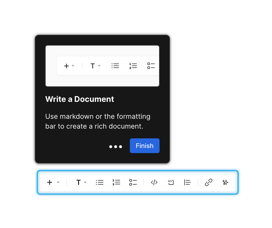
A dark-themed coachmark tooltip pointing to a formatting toolbar. It includes an illustration of the toolbar, a title, a description, progress dots, and a 'Finish' button.

Eraser — Coachmark component
Eraser logo
Eraser

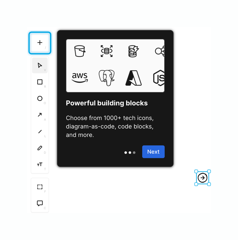
A dark-themed onboarding popover attached to a toolbar button, featuring an illustration, title, description, progress dots, and a 'Next' button.

Eraser — Coachmark component
Eraser logo
Eraser

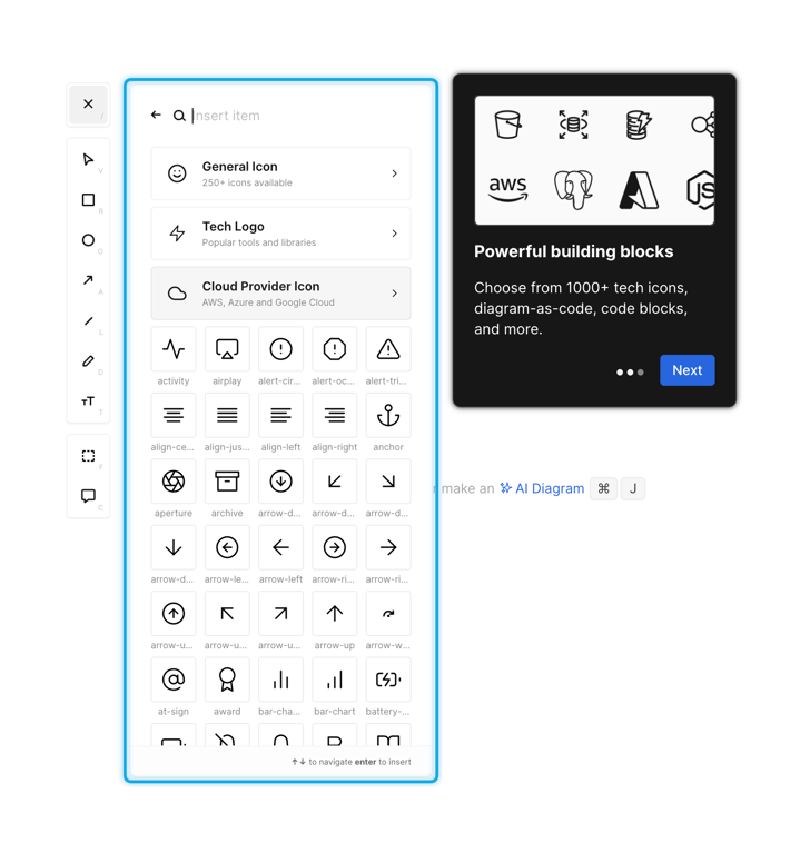
A floating icon picker panel with a search bar, category folders, and a grid of icons. A dark-themed coachmark tooltip points to the picker, explaining its features with a 'Next' button.

Eraser — Coachmark component
Eraser logo
Eraser

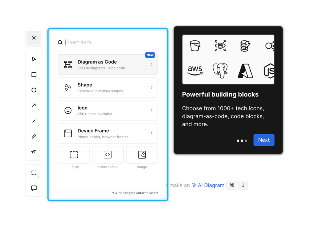
A split view showing a vertical toolbar on the left, an open 'insert item' menu with search and categorized options in the center, and a dark-themed onboarding tour card on the right.

Eraser — Coachmark component
Eraser logo
Eraser

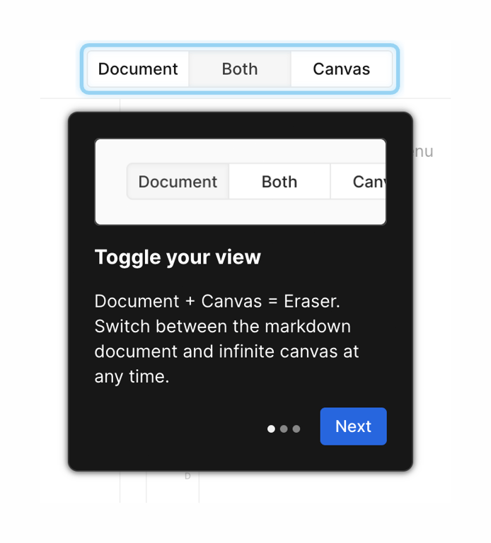
A dark-themed onboarding tooltip pointing to a segmented control. It includes an image of the control, a title, a description, a progress indicator, and a 'Next' button.

Eraser — Theme settings component
Eraser logo
Eraser

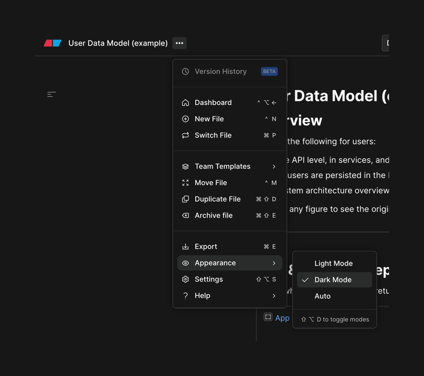
A dropdown menu with a nested submenu for selecting the appearance mode. The primary menu lists file and workspace actions, while the active 'Appearance' item opens a secondary menu to choose between Light, Dark, and Auto modes.

Eraser — Horizontal navigation component
Eraser logo
Eraser

A horizontal page header containing a title, an options menu icon, a search input, an avatar group, and an invite button.

Browse the full component library

Browse the full UI component library.

Trusted by the best teams