Skip to content

WorkOs UI components examples

Browse WorkOs UI component design examples. Preview individual interface elements and explore related component categories. Your app, enterprise-ready

Explore the examples

WorkOs — Bento box component
WorkOs logo
WorkOs

A bento grid layout highlighting key features of a Single Sign-On product. It includes a prominent headline, a primary call-to-action button, and a grid of cards detailing specific capabilities like SAML support and identity provider integrations.

WorkOs — Message component
WorkOs logo
WorkOs

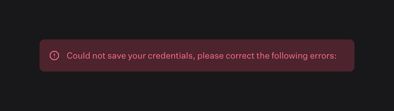
An error message modal

WorkOs — Badge component
WorkOs logo
WorkOs

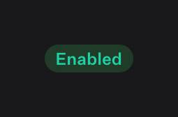
A pill-shaped badge indicating an 'Enabled' status.

WorkOs — Message component
WorkOs logo
WorkOs

A full-width warning alert banner containing a single line of text instructing the user to add the ACS URL to complete the connection.

WorkOs — Badge component
WorkOs logo
WorkOs

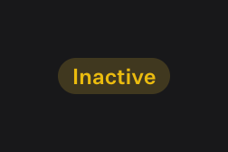
A pill-shaped badge indicating an 'Inactive' status, featuring yellow text on a dark olive background.

WorkOs — Vertical navigation component
WorkOs logo
WorkOs

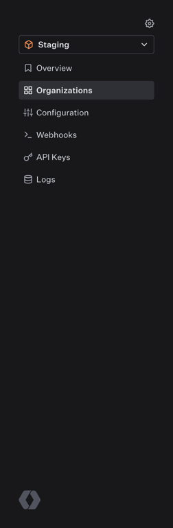
A dark-themed vertical sidebar navigation menu. It features an environment selector dropdown at the top, followed by a list of navigation links with icons. The 'Organizations' link is currently active.

WorkOs — Breadcrumb component
WorkOs logo
WorkOs

A breadcrumb trail showing the hierarchical path to the current page, with clickable links for parent levels and plain text for the current level.
WorkOs — Input code component
WorkOs logo
WorkOs

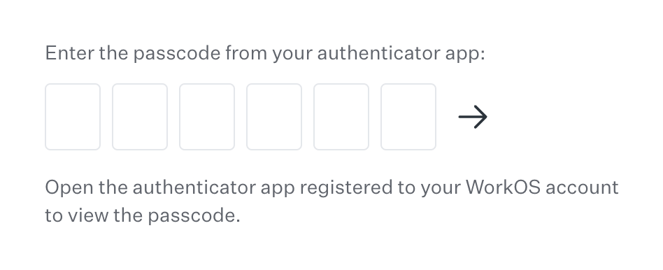
A 6-digit one-time passcode (OTP) input field with instructional text above and below, and a submit arrow button.
WorkOs — Benefit List component
WorkOs logo
WorkOs

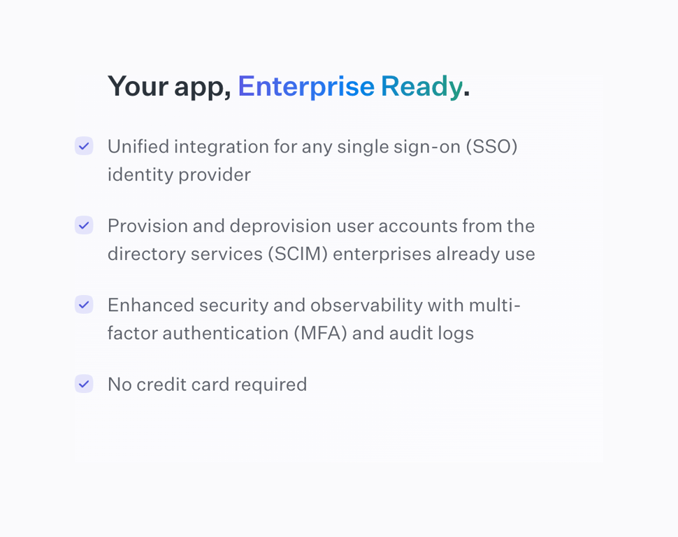
A list of product benefits with a headline and checkmark icons.

WorkOs — FAQ component
WorkOs logo
WorkOs

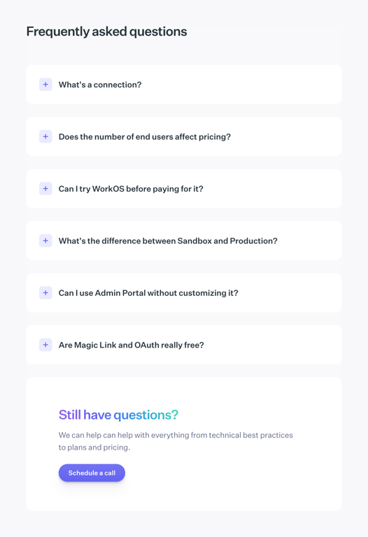
A frequently asked questions section featuring a list of collapsible questions and a final card prompting users to schedule a call if they have more questions.

WorkOs — Toggle/Switch component
WorkOs logo
WorkOs

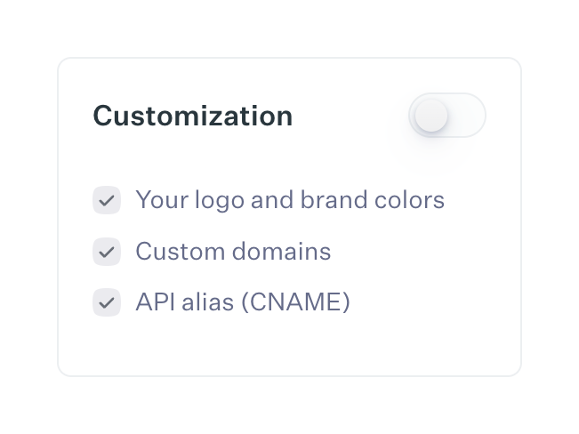
A card component displaying a feature category with a toggle switch and a list of included features.
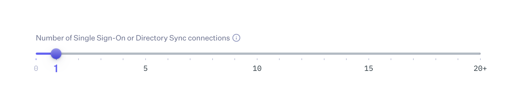
WorkOs — Slider component
WorkOs logo
WorkOs

A horizontal slider control used to select a numeric value, featuring a label, an info icon, and a track with tick marks and numeric labels at intervals.

Browse the full component library

Browse the full UI component library.

Trusted by the best teams