Threads UI components examples
Browse Threads UI component design examples. Preview individual interface elements and explore related component categories. Threads is a Slack replacement designed for makers
Explore the examples
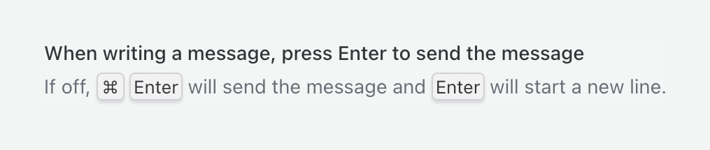
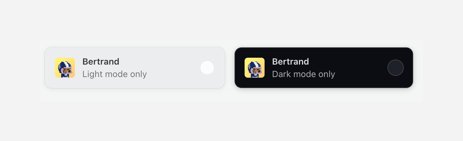

Two side-by-side cards for selecting a theme. The left card represents light mode and the right card represents dark mode. Each card contains an avatar, a title, a subtitle, and a radio button.
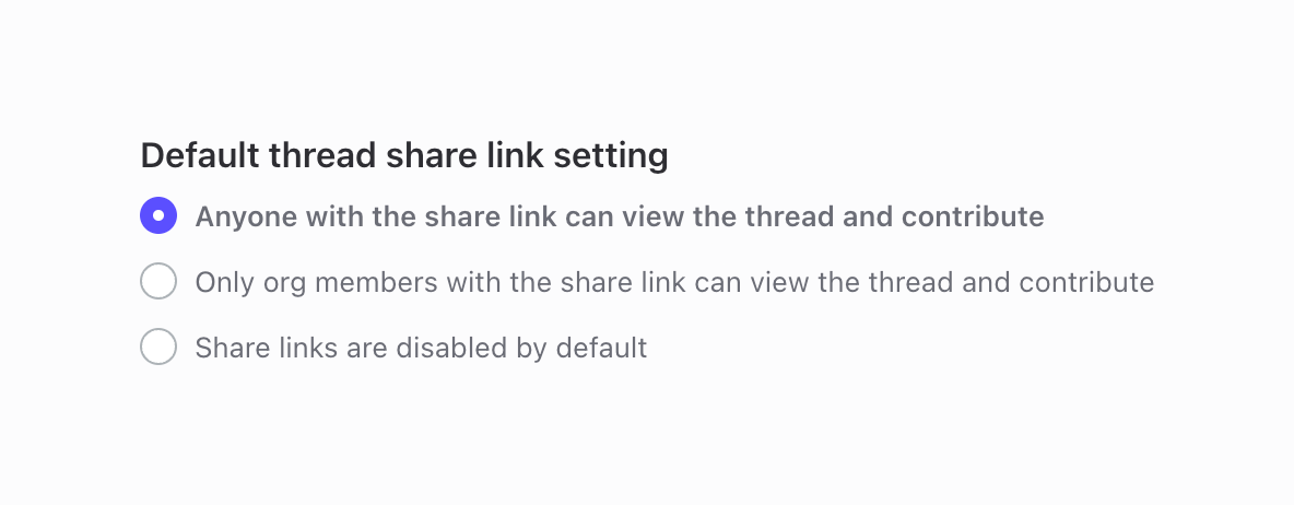
A radio group for configuring the default thread share link setting, with three mutually exclusive options.

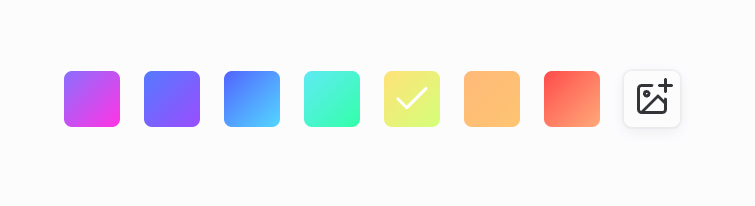
A horizontal row of rounded square color swatches for selecting a theme. One swatch is selected, indicated by a checkmark. An add image button is at the end of the row.

A toggle switch to enable or disable audio-only mode, featuring a speaker icon and text label.
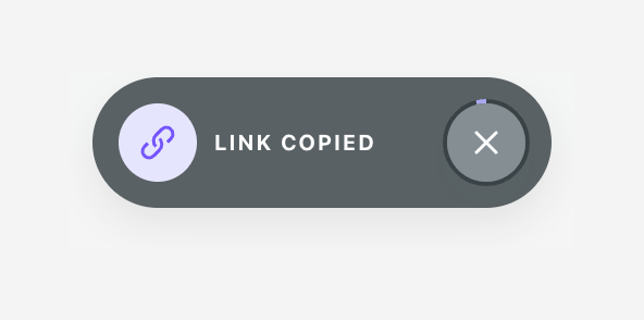
A dark, pill-shaped toast notification confirming that a link has been copied. It features a purple link icon on the left and a close button on the right.

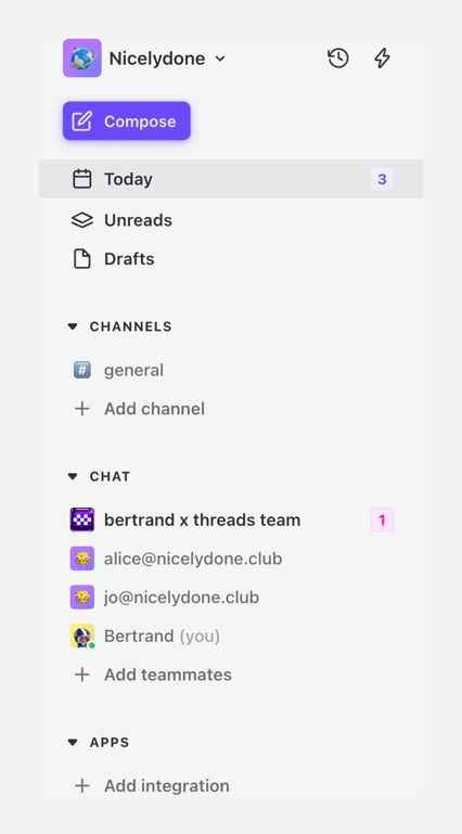
A vertical sidebar navigation menu featuring a workspace switcher, a primary compose button, and collapsible sections for core views, channels, direct chats, and apps. It includes unread notification badges.
Browse the full component library
Browse the full UI component library.
Trusted by the best teams







