Theme selection cards
Two side-by-side cards for selecting a theme. The left card represents light mode and the right card represents dark mode. Each card contains an avatar, a title, a subtitle, and a radio button.
Explore the examples
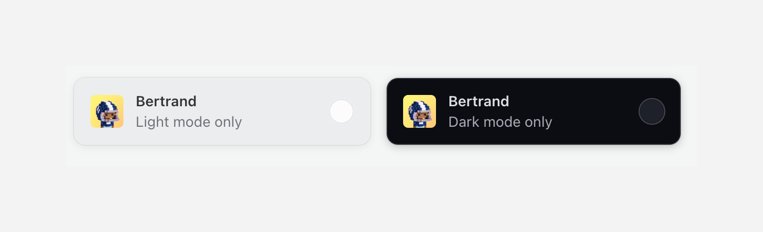

Two side-by-side cards for selecting a theme. The left card represents light mode and the right card represents dark mode. Each card contains an avatar, a title, a subtitle, and a radio button.
Browse the full component library
Browse the full UI component library.
Trusted by the best teams







