Rise UI components examples
Browse Rise UI component design examples. Preview individual interface elements and explore related component categories. The calendar that works for you
Explore the examples
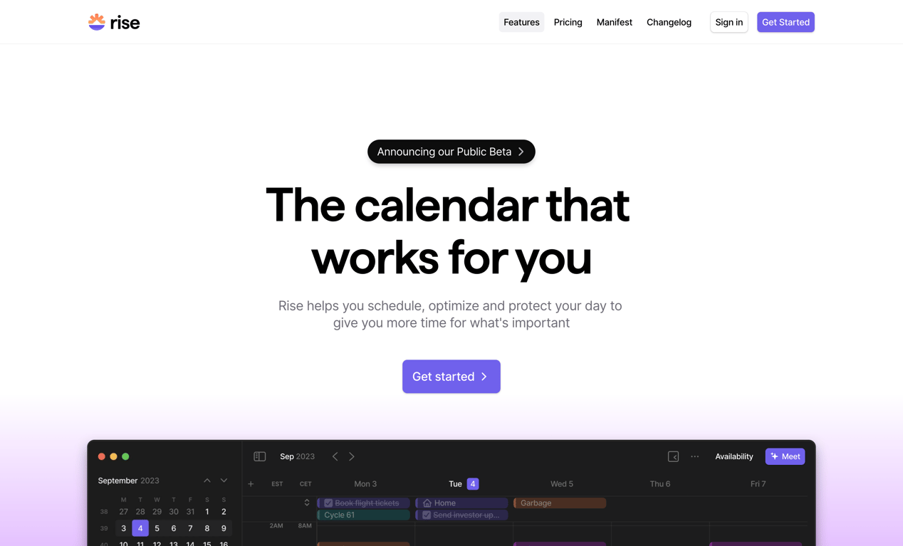

A hero section featuring a top navigation bar, a prominent headline, a subheadline, a primary call-to-action button, and a partial view of the application interface.
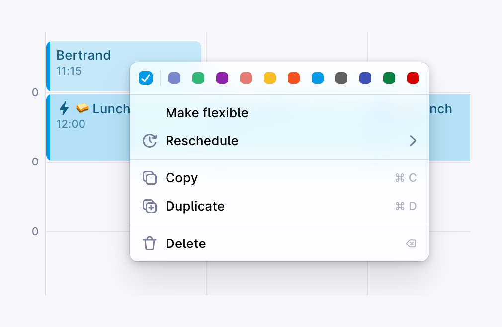
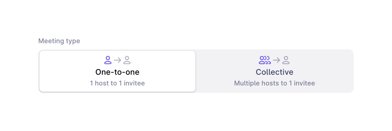
A segmented control allowing the user to select between a One-to-one or Collective meeting type. The One-to-one option is currently selected, indicated by a white background and border, while the unselected option has a light gray background.
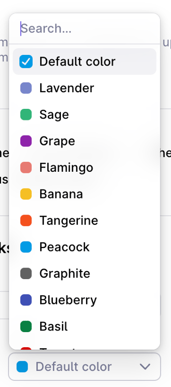
A dropdown menu for selecting a color, featuring a search input at the top and a list of named colors with corresponding color swatches. The 'Default color' option is currently selected.
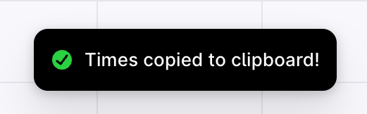
A dark, pill-shaped toast notification confirming that times have been copied to the clipboard, featuring a green checkmark icon.

A toggle switch with an accompanying icon and label to enable a single-use scheduling link.
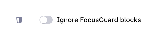
A horizontal row containing an icon, a toggle switch in the off position, and a text label.
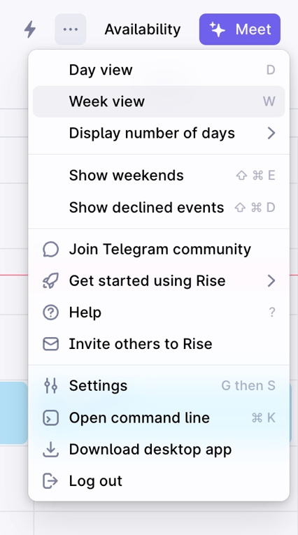
A dropdown menu triggered from a top bar, offering options to change calendar views, toggle display settings, access help and community links, and manage app settings.
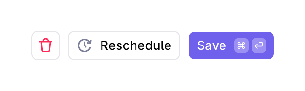
A row of three buttons for managing an event: a delete icon button, a reschedule button with an icon, and a primary save button with keyboard shortcut indicators.
Browse the full component library
Browse the full UI component library.
Trusted by the best teams







