Skip to content

Oh Dear UI components examples

Browse Oh Dear UI component design examples. Preview individual interface elements and explore related component categories. The all-in-one monitoring tool for your entire website

Explore the examples
Oh Dear — Bento box component
Oh Dear logo
Oh Dear

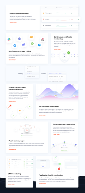
A bento grid layout displaying various features of a monitoring tool. Each card highlights a specific feature like uptime checking, notifications, certificate monitoring, and performance monitoring with a brief description, an illustration or UI snippet, and a 'Learn More' link.

Oh Dear — Input number component
Oh Dear logo
Oh Dear

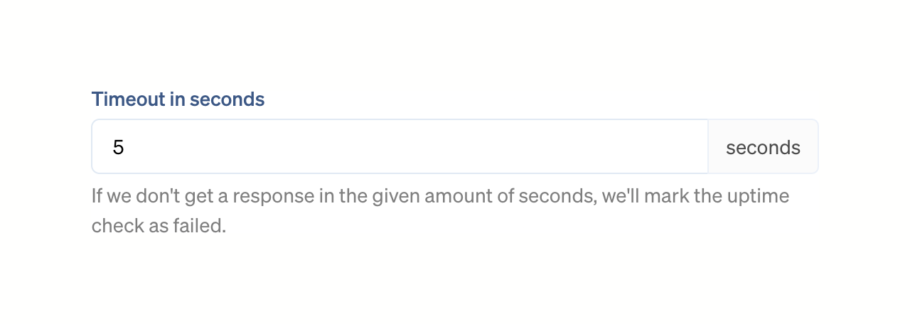
A numeric input field with a label, a right-aligned unit addon, and helper text below.
Oh Dear — Input select component
Oh Dear logo
Oh Dear

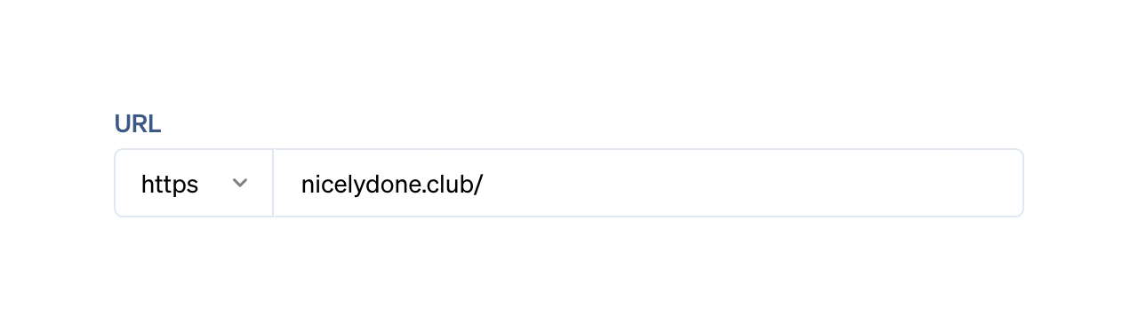
A composite input field for entering a URL, featuring a protocol selector dropdown and a text input for the domain.

Oh Dear — Message component
Oh Dear logo
Oh Dear

An inline alert banner indicating an error state, featuring a red accent bar, a message about broken links, and an inline link to a settings screen.

Oh Dear — Charts component
Oh Dear logo
Oh Dear

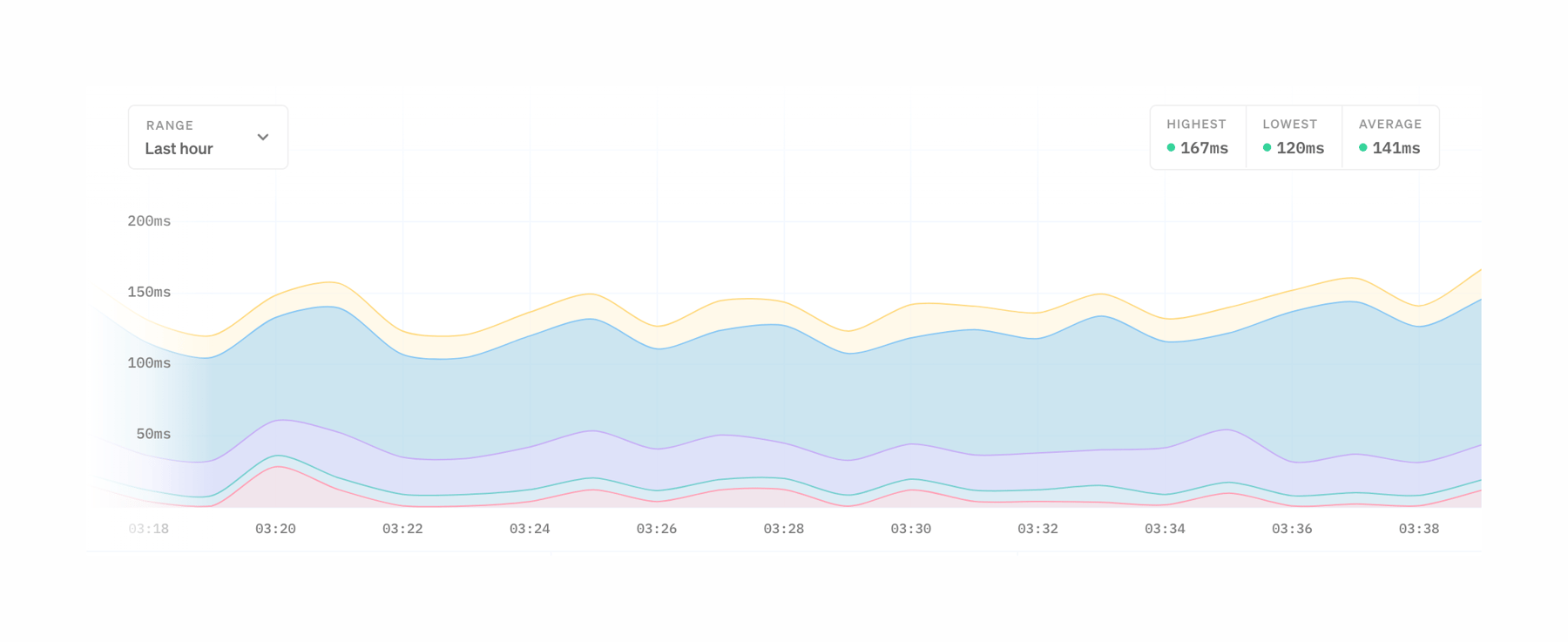
A stacked area chart displaying performance metrics over time, with a time range selector and summary statistics for highest, lowest, and average values.

Oh Dear — Tabs component
Oh Dear logo
Oh Dear

A horizontal row of tabs for navigating different settings categories. The active tab has a colored bottom border and bolder text.

Oh Dear — Dropdown menu component
Oh Dear logo
Oh Dear

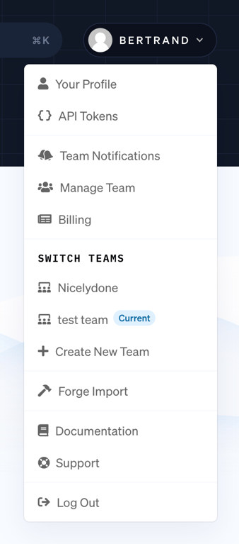
An open dropdown menu triggered from a user profile button in the top navigation. It contains links for profile settings, team management, team switching, documentation, and logging out.

Oh Dear — Tips component
Oh Dear logo
Oh Dear

A simple informational alert box with an icon and a single line of text explaining notification behavior.

Oh Dear — Click to copy component
Oh Dear logo
Oh Dear

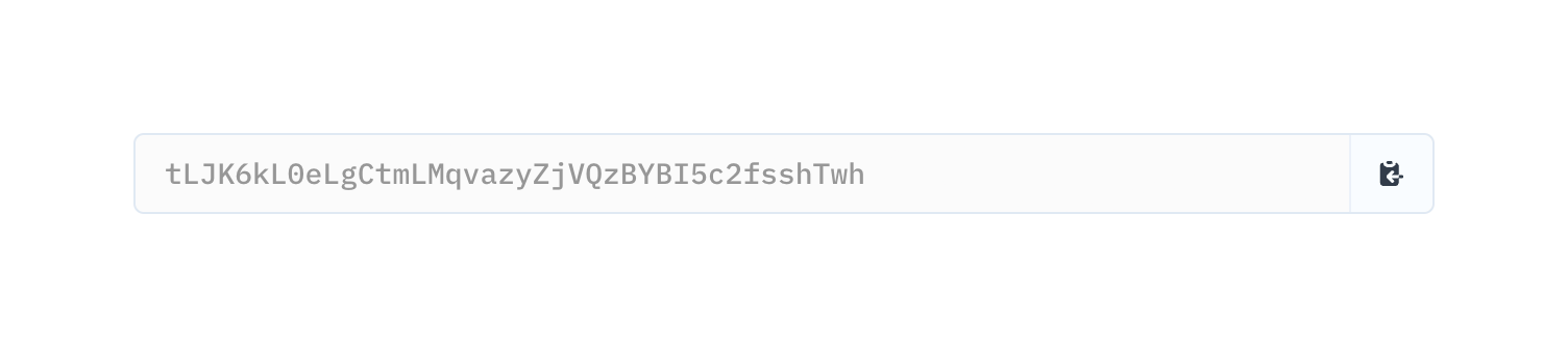
A read-only input field displaying an API token with an inline copy-to-clipboard button.
Oh Dear — Button group component
Oh Dear logo
Oh Dear

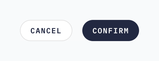
A button group containing an outlined 'Cancel' button and a filled 'Confirm' button.

Oh Dear — Message component
Oh Dear logo
Oh Dear

A simple notification message

Oh Dear — Badge component
Oh Dear logo
Oh Dear

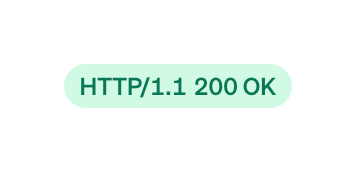
A pill-shaped badge indicating a successful HTTP status code.

Browse the full component library

Browse the full UI component library.

Trusted by the best teams