Jitter UI components examples
Browse Jitter UI component design examples. Preview individual interface elements and explore related component categories. Motion design made simple
Explore the examples
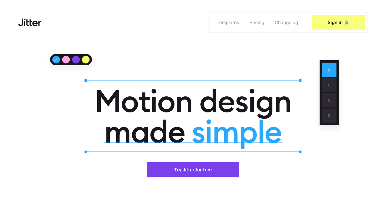

A hero section featuring a top navigation header with a logo, links, and a sign-in button. The main body displays a large headline 'Motion design made simple' styled to look like it's selected in a design tool, complete with a bounding box and floating toolbars. A primary…
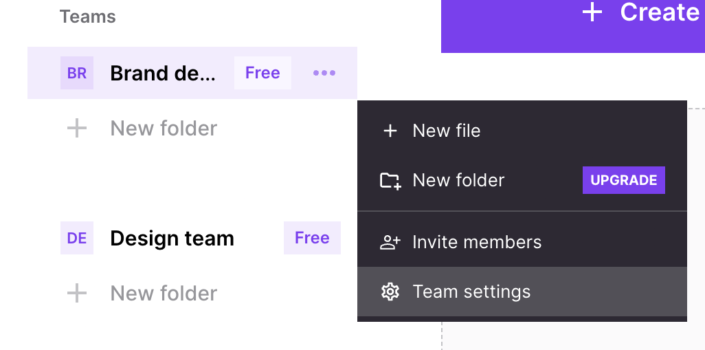
A context menu opened from a team list item in a sidebar, showing options to create files, folders, invite members, and access settings. The 'New folder' option includes an 'UPGRADE' badge.
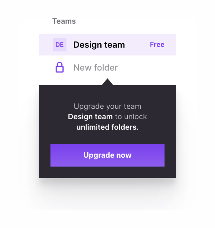
A dark-themed tooltip pointing to a locked 'New folder' action, prompting the user to upgrade their team to unlock unlimited folders.
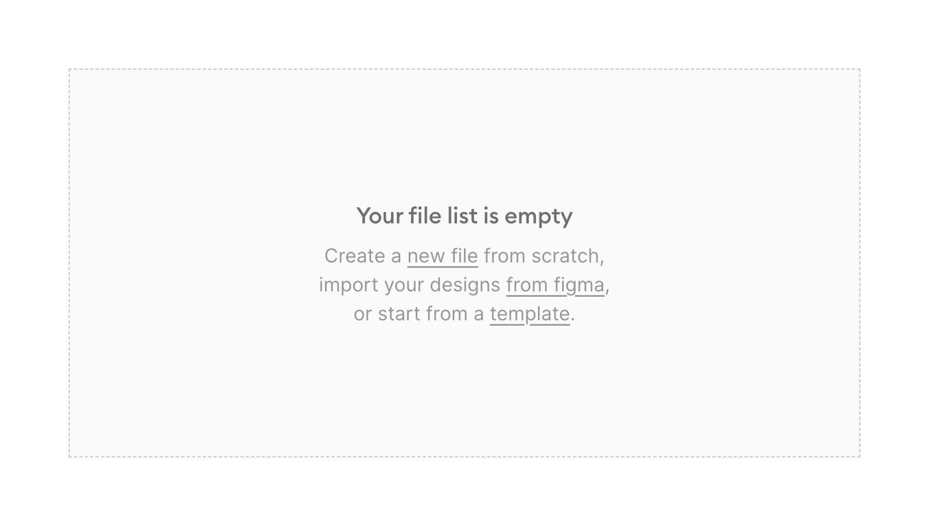
An empty state message indicating that the file list is empty, providing links to create a new file, import from Figma, or start from a template.
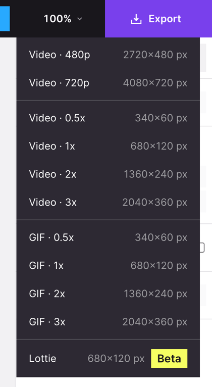
A dropdown menu showing various export options for a design project, including Video, GIF, and Lottie formats with different resolutions.
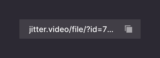
A read-only input field displaying a truncated URL with a copy icon button on the right.

An illustration showing a wireframe globe with two avatar icons placed on it, representing global collaboration or sharing.
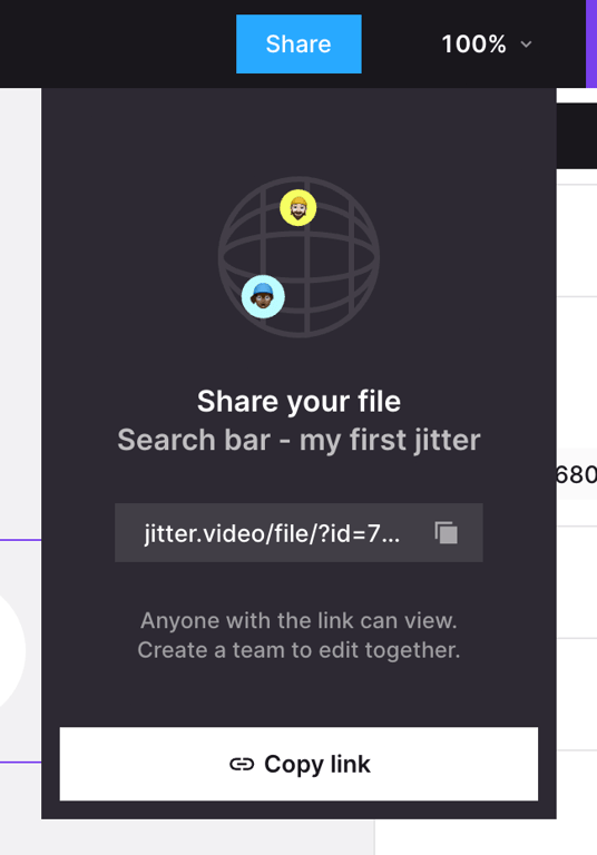
A popover menu for sharing a file, featuring an illustration, file title, a read-only input with a shareable link, and a prominent 'Copy link' button.
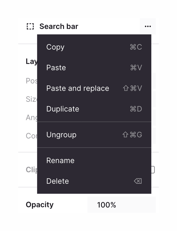
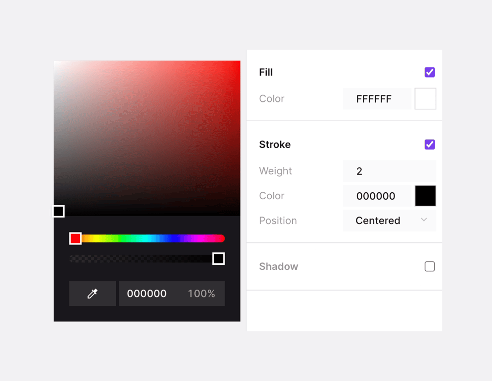
A split view showing a dark-themed color picker on the left and a light-themed property inspector on the right. The color picker includes a gradient area, hue and opacity sliders, an eyedropper tool, and hex/opacity inputs. The inspector panel controls Fill, Stroke, and…
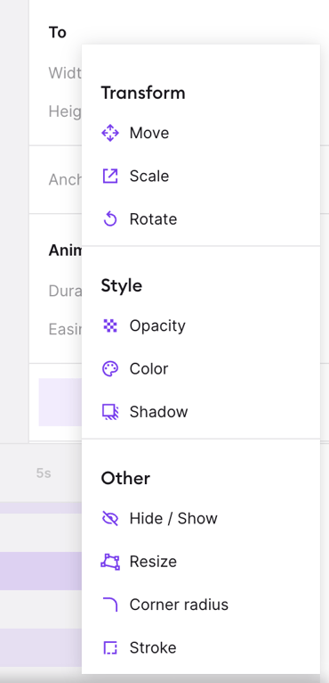
A dropdown menu displaying animation property options categorized into Transform, Style, and Other.
Browse the full component library
Browse the full UI component library.
Trusted by the best teams







