Color picker and property inspector
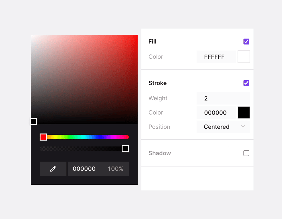
A split view showing a dark-themed color picker on the left and a light-themed property inspector on the right. The color picker includes a gradient area, hue and opacity sliders, an eyedropper tool, and hex/opacity inputs. The inspector panel controls Fill, Stroke, and Shadow properties with checkboxes, hex inputs, and dropdowns.
Explore the examples

A split view showing a dark-themed color picker on the left and a light-themed property inspector on the right. The color picker includes a gradient area, hue and opacity sliders, an eyedropper tool, and hex/opacity inputs. The inspector panel controls Fill, Stroke, and…
Browse the full component library
Browse the full UI component library.
Trusted by the best teams







