Arrows UI components examples
Browse Arrows UI component design examples. Preview individual interface elements and explore related component categories. The collaborative customer onboarding platform built for HubSpot
Explore the examples
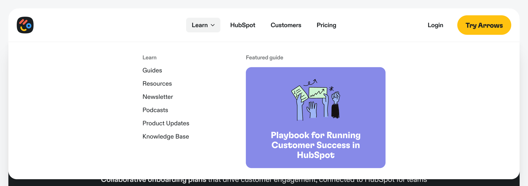

A global navigation header with an expanded mega menu dropdown. The dropdown reveals a list of learning resources and a featured guide card.
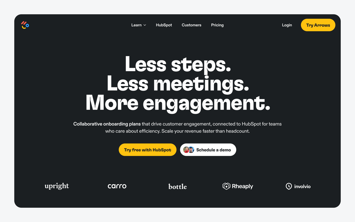
A dark-themed hero section featuring a prominent headline, subheadline, dual call-to-action buttons, and a logo wall of customer companies.
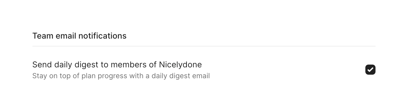
A settings section with a title, a divider, and a single configuration option. The option includes a primary label, a secondary description, and a checked checkbox aligned to the right.
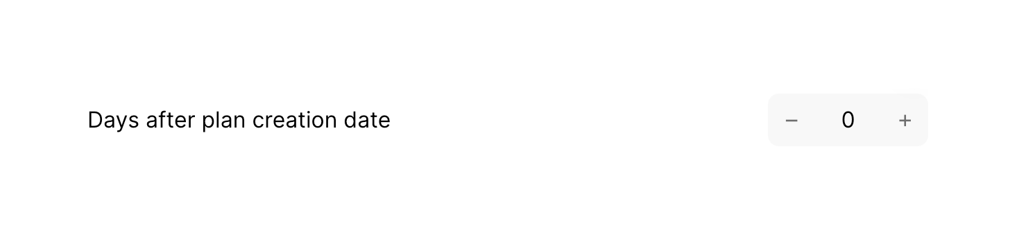
A number input control with a label indicating 'Days after plan creation date'. The input features minus and plus buttons to decrement or increment the value, currently set to 0.
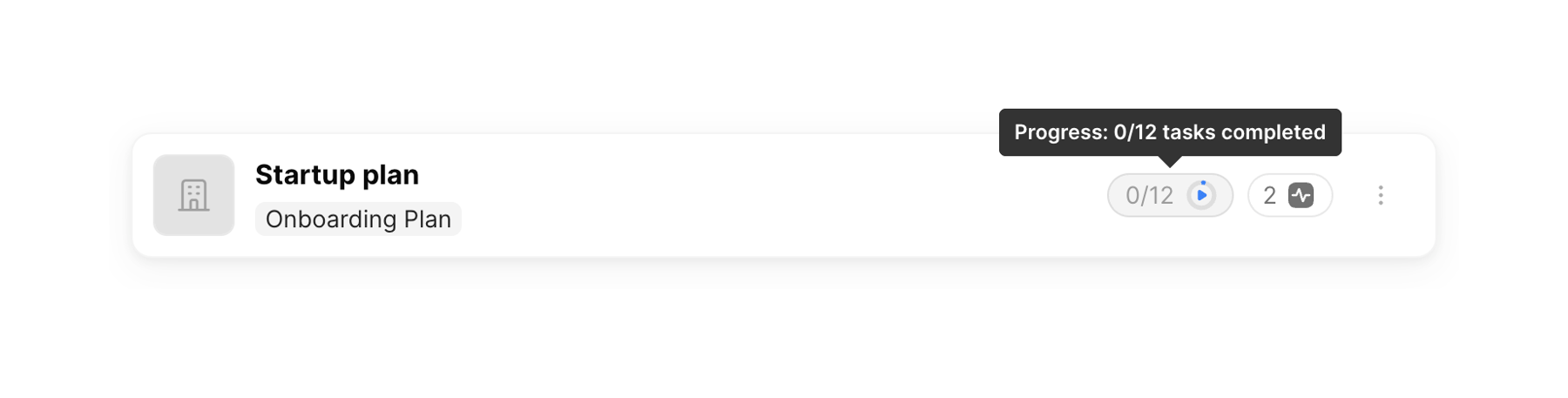
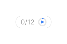
A pill-shaped badge displaying a numeric progress ratio alongside a circular progress indicator with a play icon.
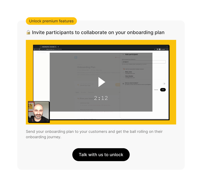
A paywall card prompting the user to unlock a premium feature. It includes a badge, a title with a lock icon, a video preview of the feature, a descriptive paragraph, and a primary call-to-action button to contact sales.
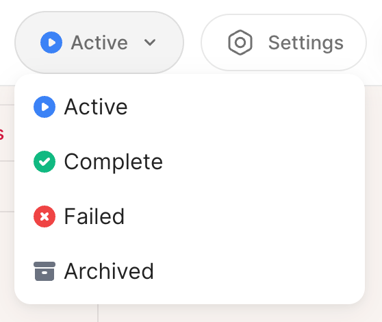
An open dropdown menu for selecting the status of an item, showing options like Active, Complete, Failed, and Archived.
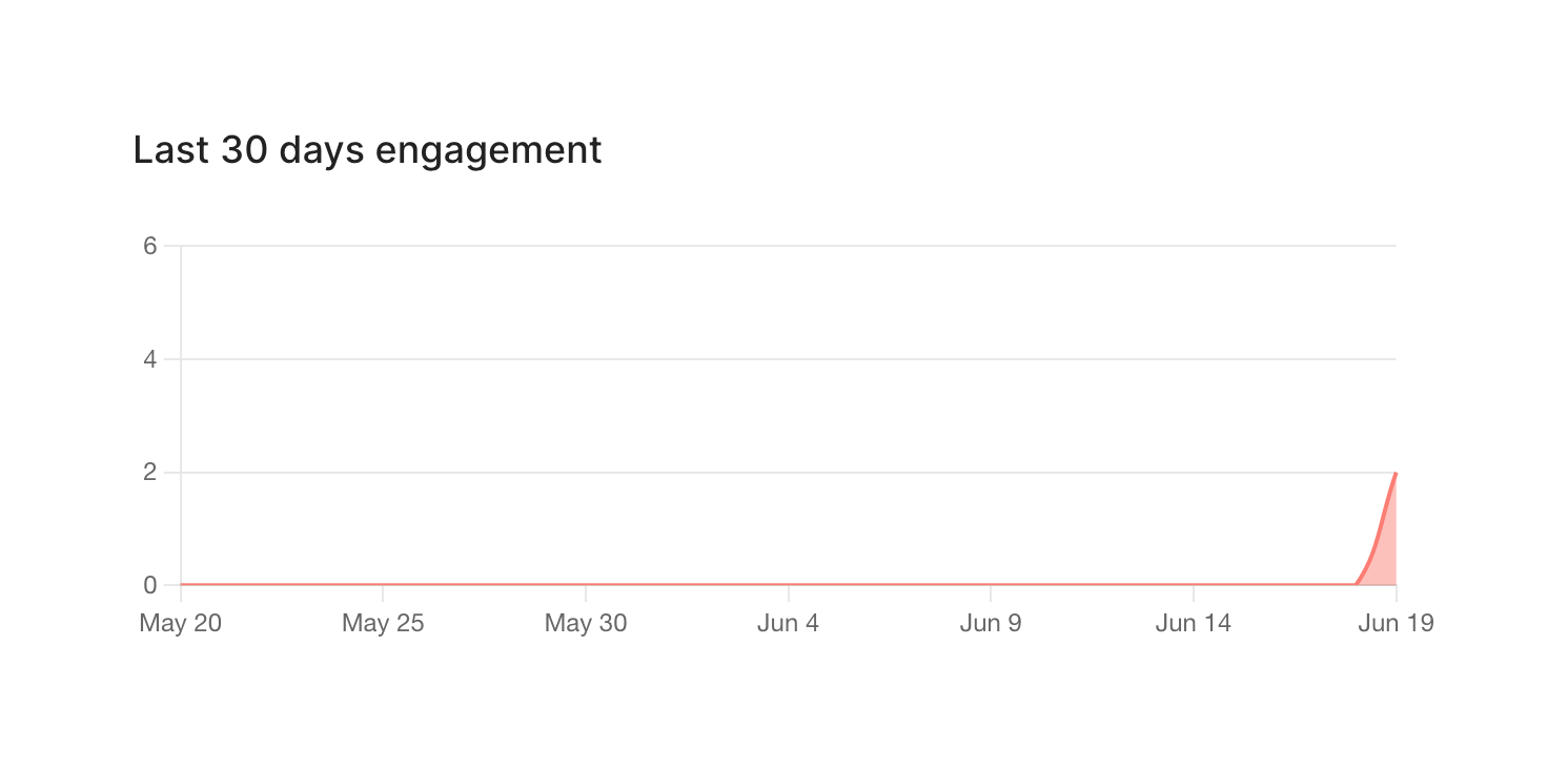
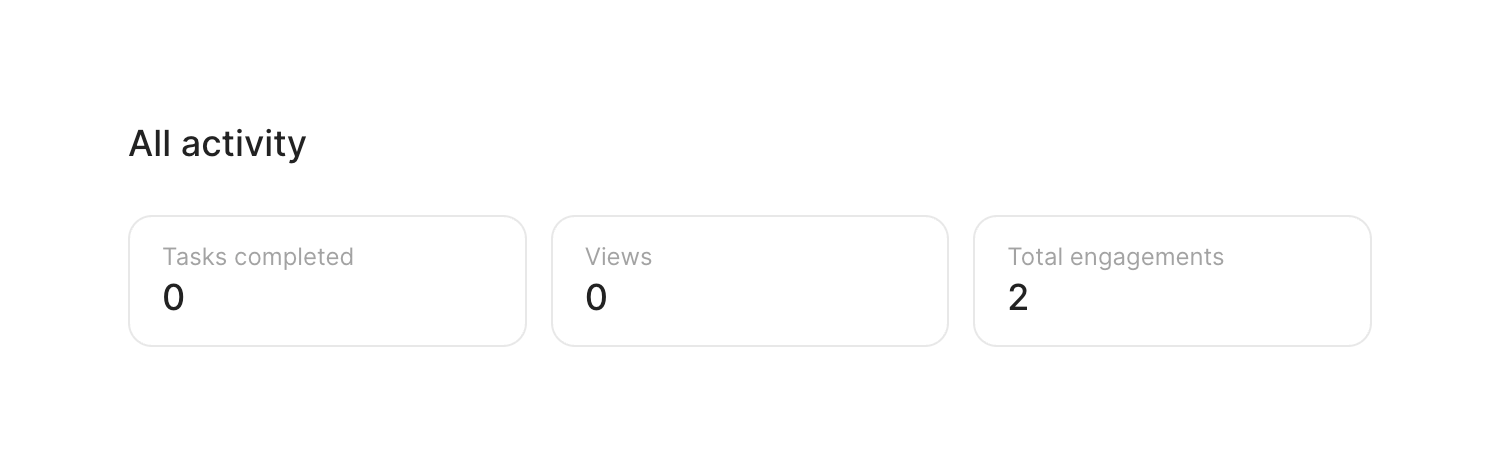
Browse the full component library
Browse the full UI component library.
Trusted by the best teams







