Notification setting toggle
A settings section with a title, a divider, and a single configuration option. The option includes a primary label, a secondary description, and a checked checkbox aligned to the right.
Explore the examples
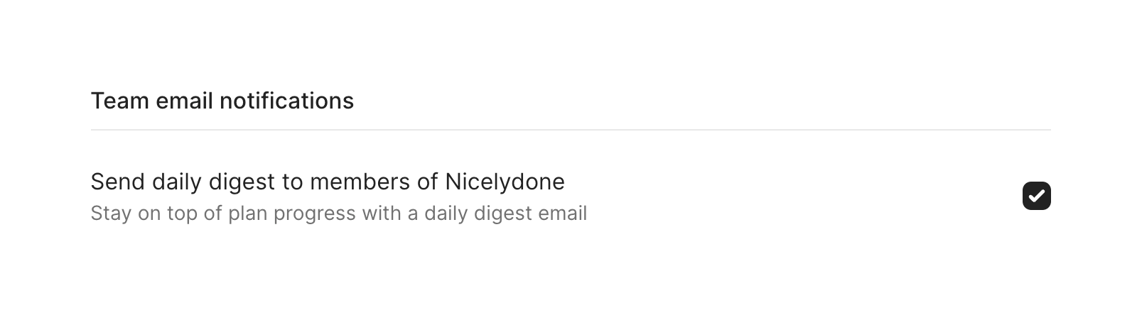

A settings section with a title, a divider, and a single configuration option. The option includes a primary label, a secondary description, and a checked checkbox aligned to the right.
Browse the full component library
Browse the full UI component library.
Trusted by the best teams







