Charts UI examples
Charts UI design examples from SaaS apps. See how interfaces present data in a compact visual component. Explore how chart labels, legends, and supporting values make a graph readable within a page…
Explore the examples
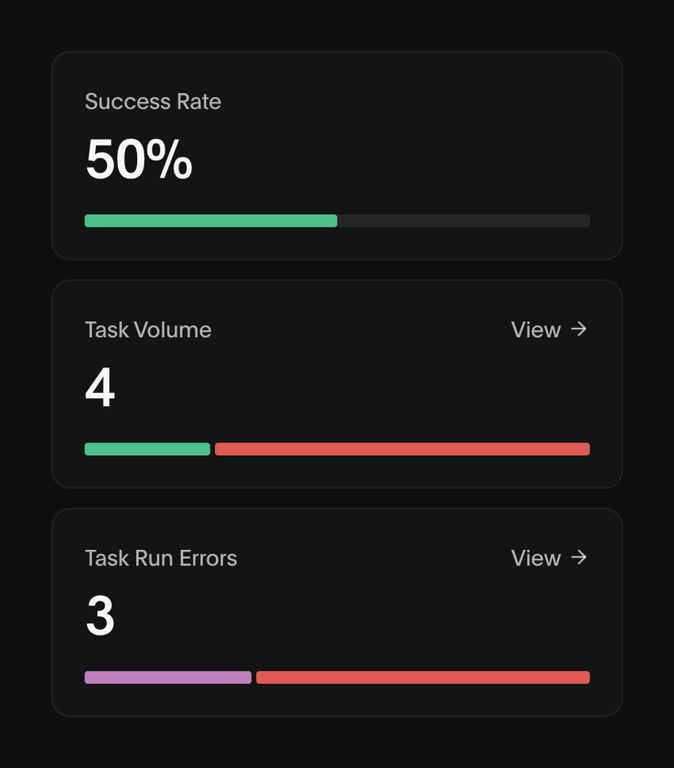

A dashboard displaying key performance indicators such as success rate, task volume, and task run errors, each presented within a distinct card with a progress bar.
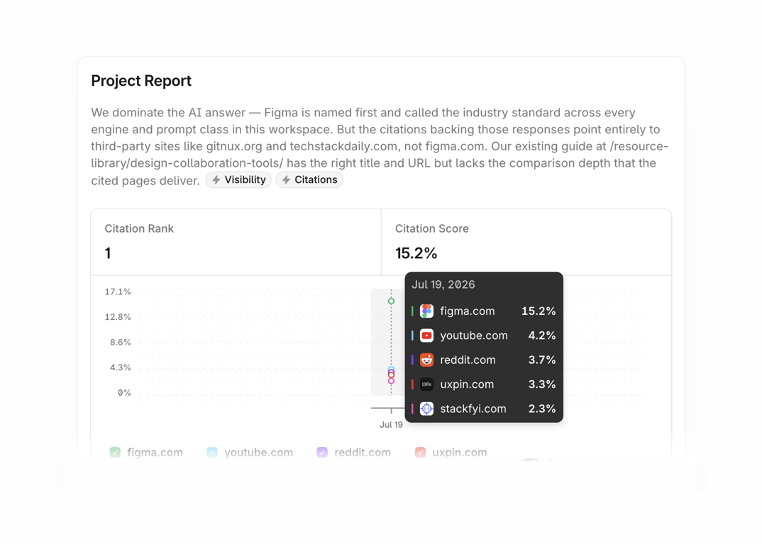

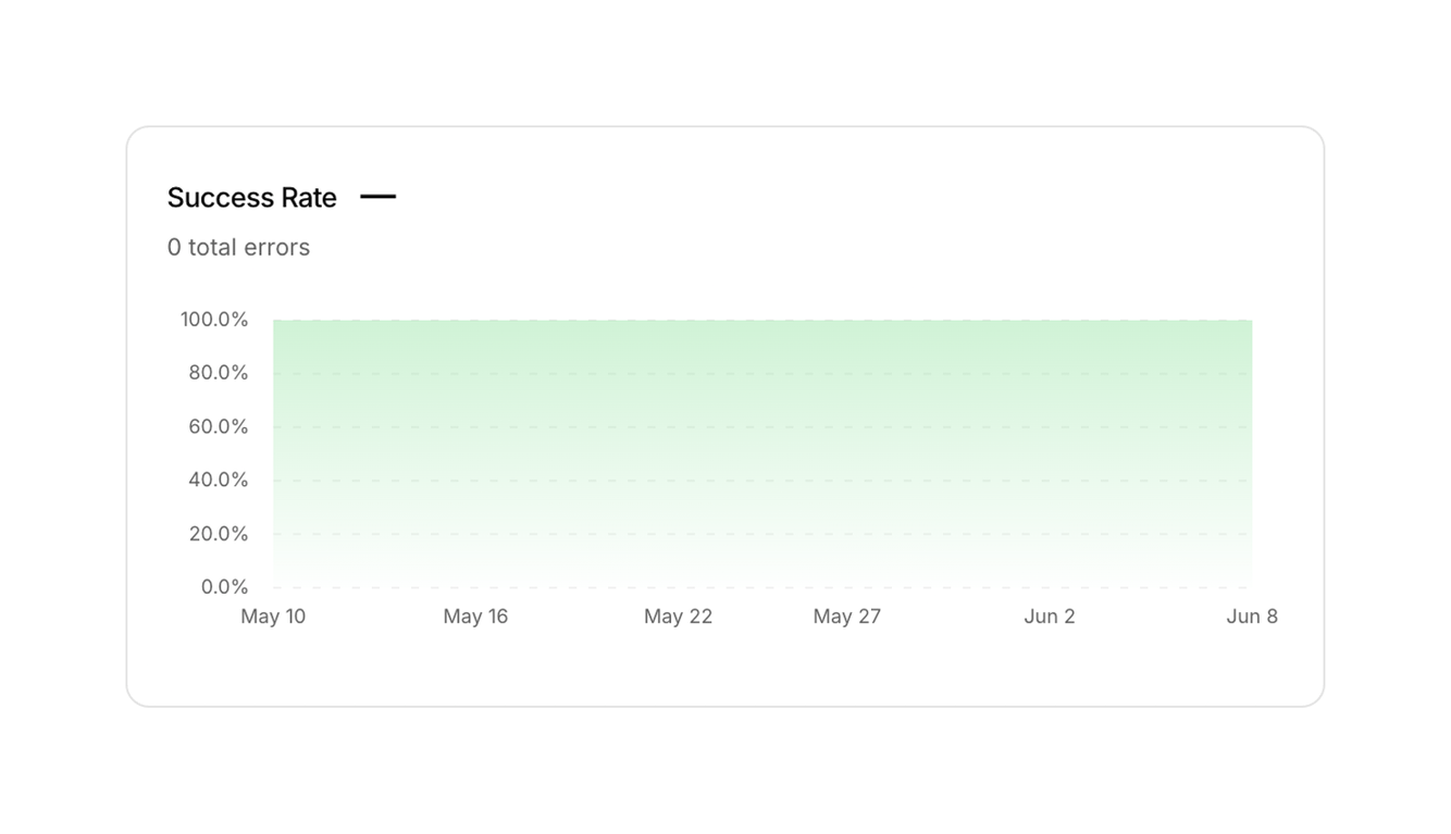

A card displaying a success rate area chart with 0 total errors over a period.
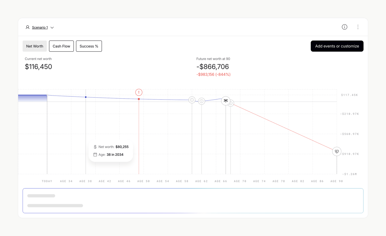

A financial dashboard displaying net worth projection over time with an interactive graph and key financial metrics.
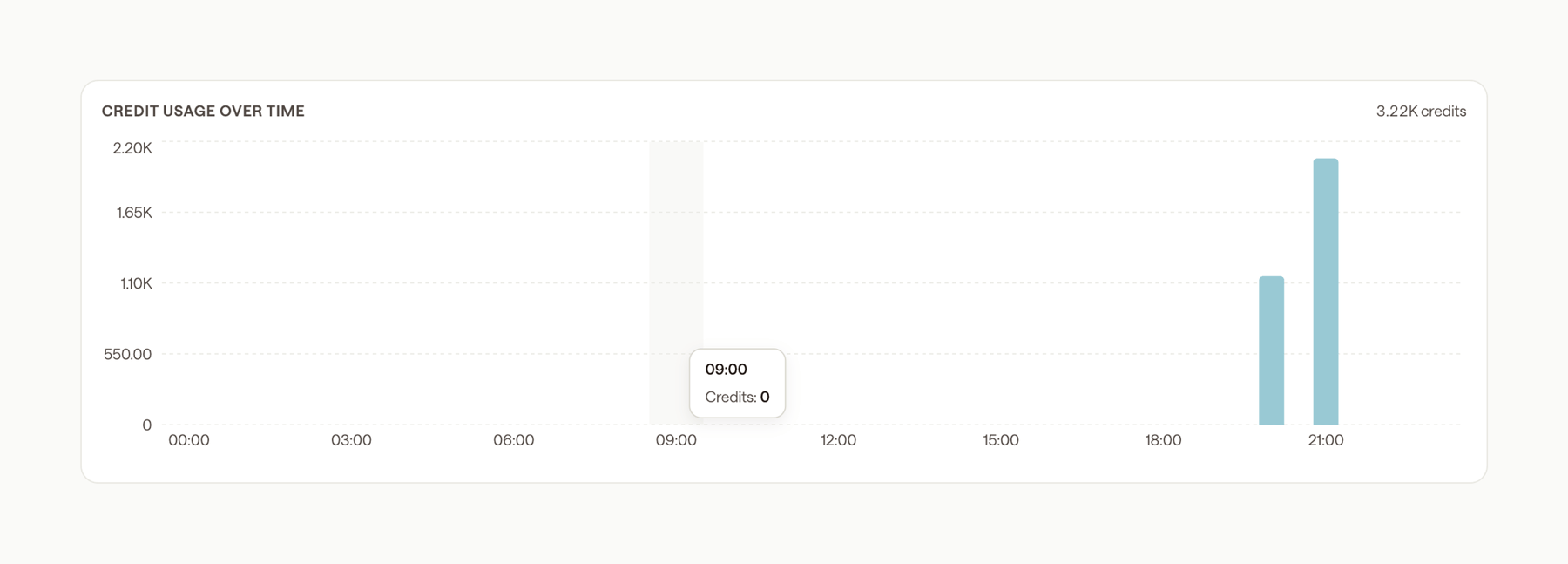

A bar chart displaying credit usage over time with a tooltip showing details for a specific time point.
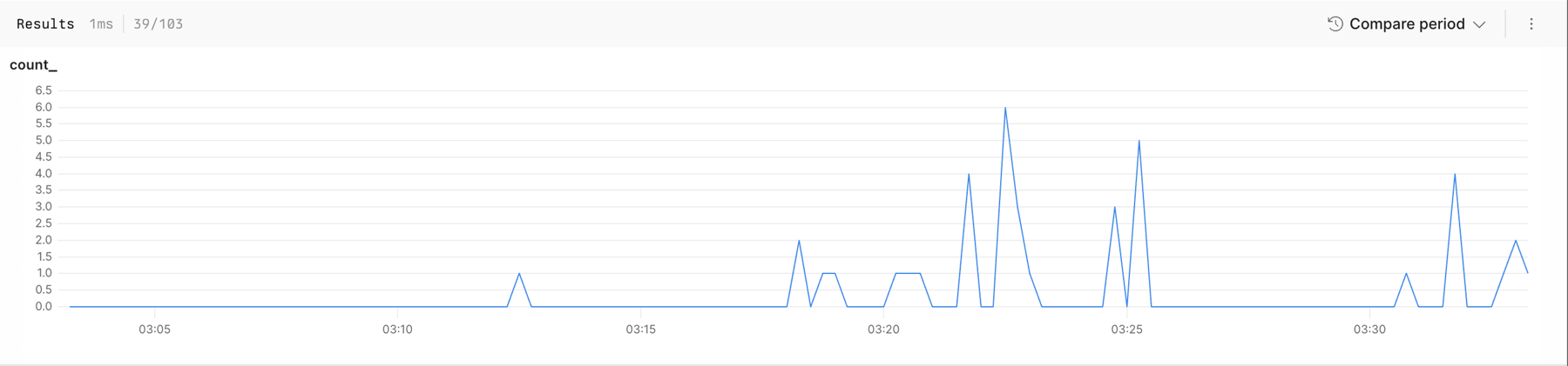

A line chart displaying time-series data with a header showing results and comparison options.
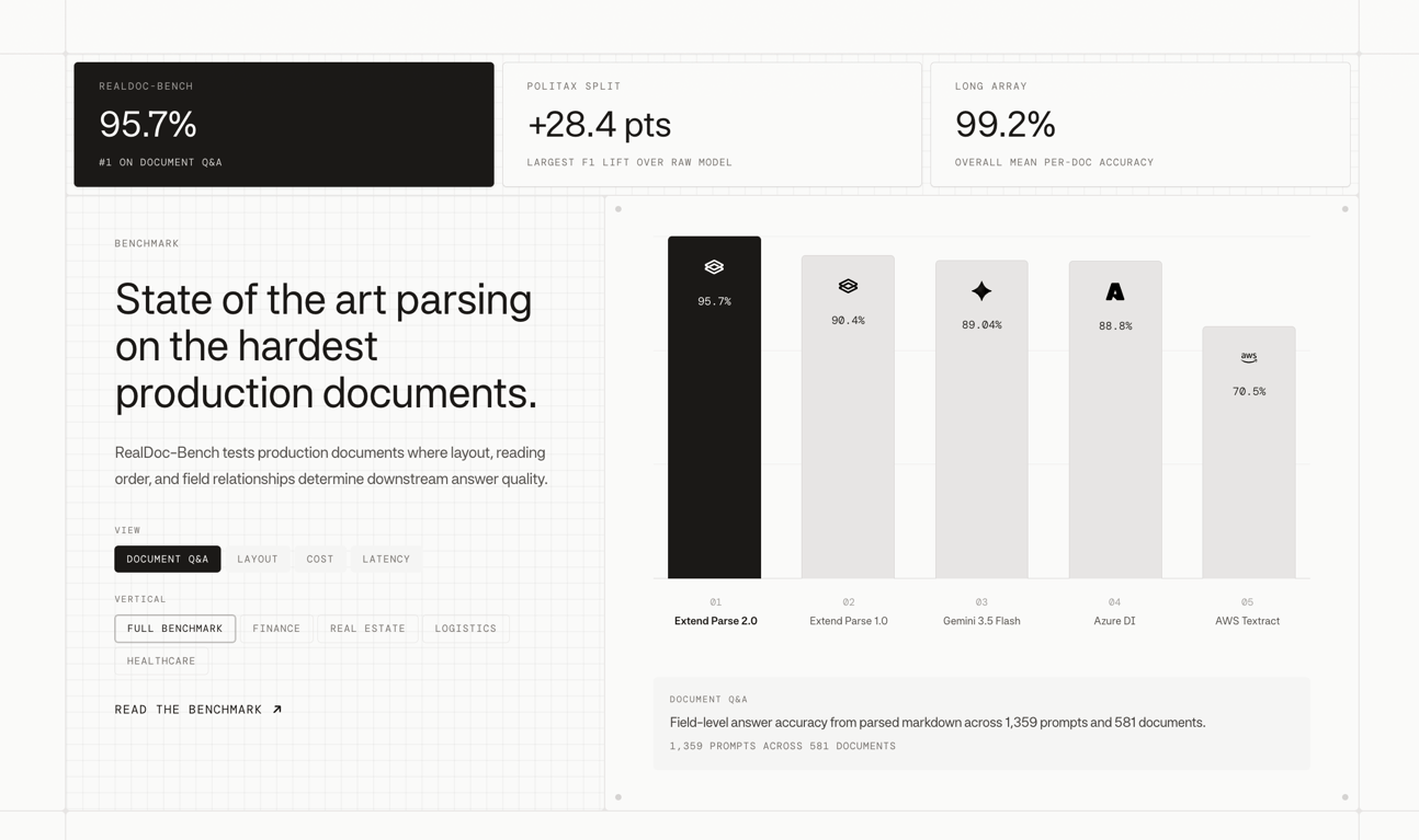

A benchmark dashboard displaying performance metrics and comparative analysis of document parsing models with filtering options.
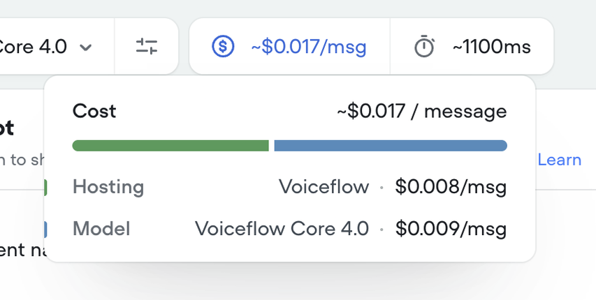

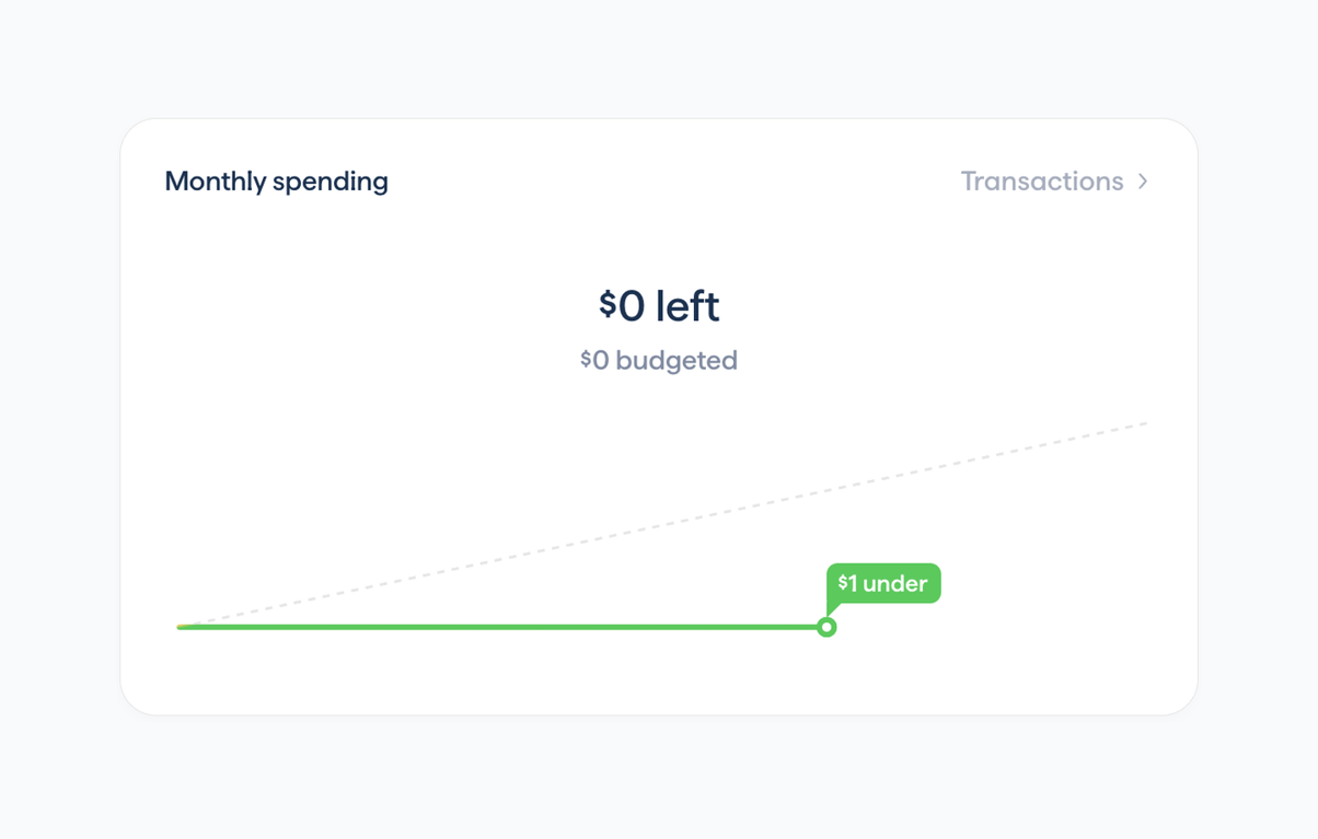

Displays current monthly budget status with remaining amount and visual progress line
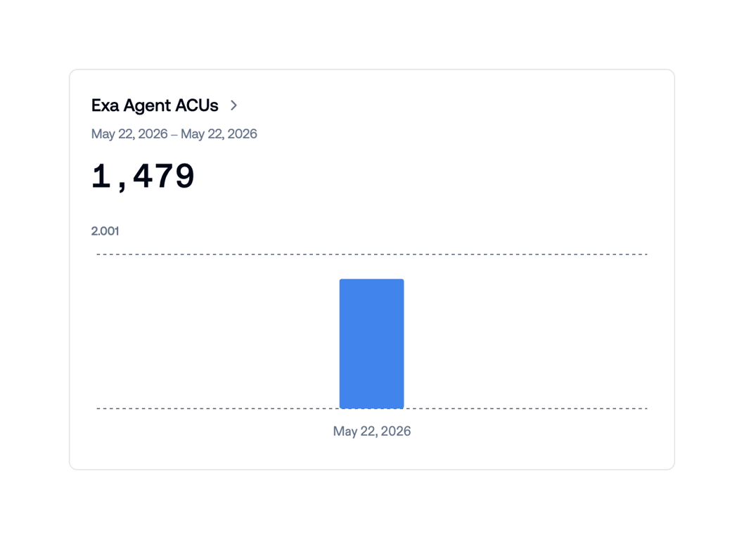

Card showing Exa Agent ACUs total (1,479) for a single-day range with a centered blue bar on a minimal y-axis scale.
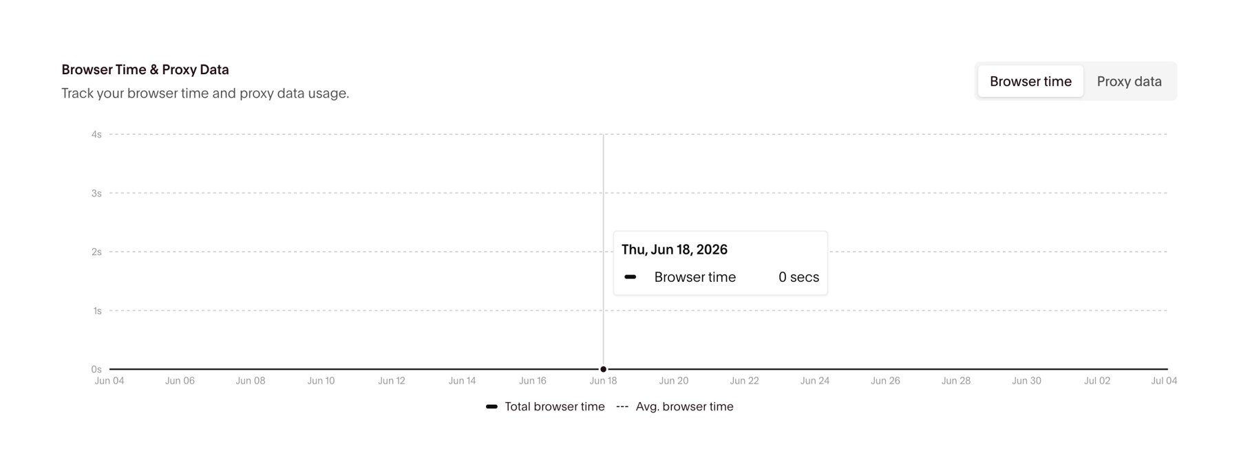

Displays browser time and proxy data trends over time with toggleable series and interactive tooltip
Browse the full component library
See 416 more Components.
Trusted by the best teams








About Charts
See how interfaces present data in a compact visual component. Explore how chart labels, legends, and supporting values make a graph readable within a page or dashboard.