Whimsical UI components examples
Browse Whimsical UI component design examples. Preview individual interface elements and explore related component categories. The hub for visual collaboration
Explore the examples
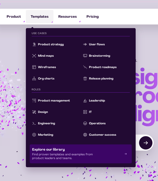

A large dropdown menu displaying categorized navigation links and a featured call to action.
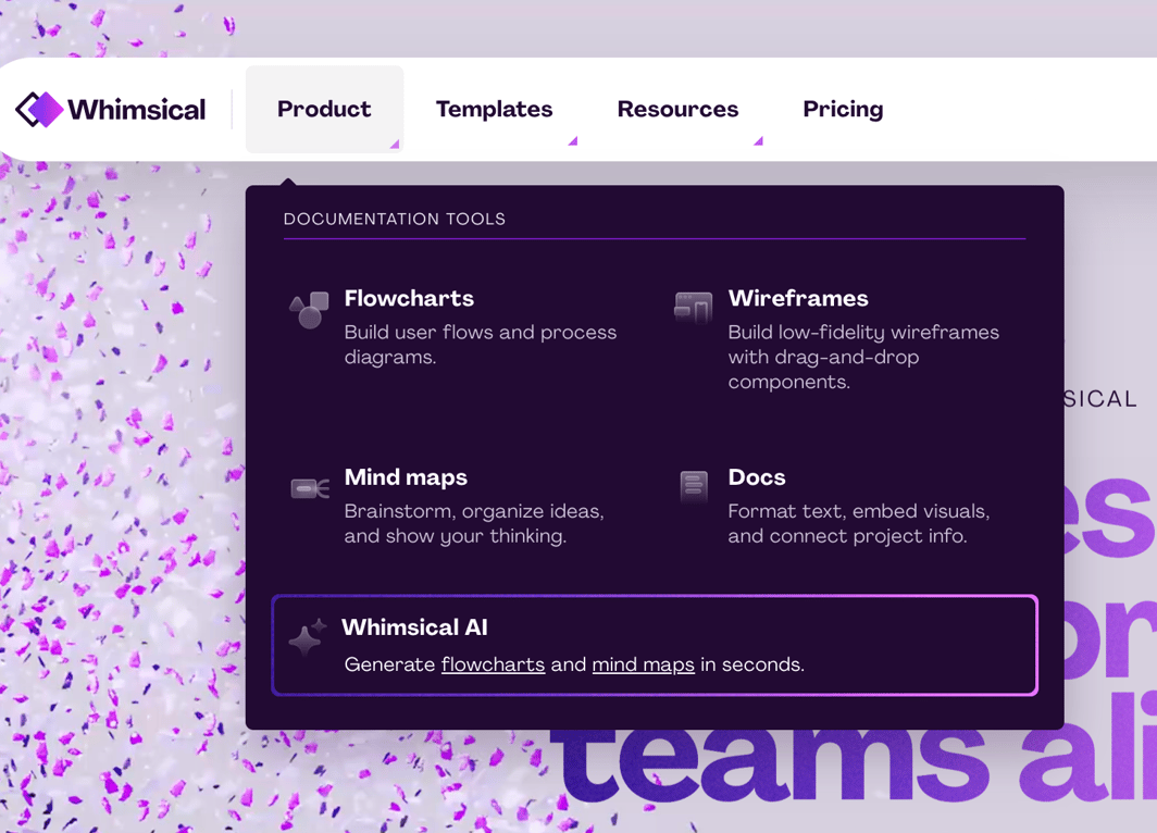
A top navigation bar with an expanded mega menu dropdown for the 'Product' tab, displaying a grid of documentation tools and an AI feature highlight.
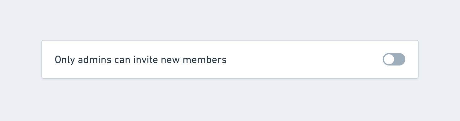
A single row containing a text label and a toggle switch, used for configuring a specific workspace setting.

A section header with a title on the left and a badge indicating the feature is paywalled on the right.
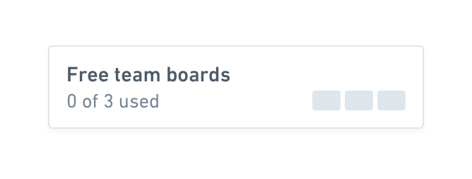
A card displaying the current usage of a free tier limit, showing 0 out of 3 boards used with a visual block indicator.
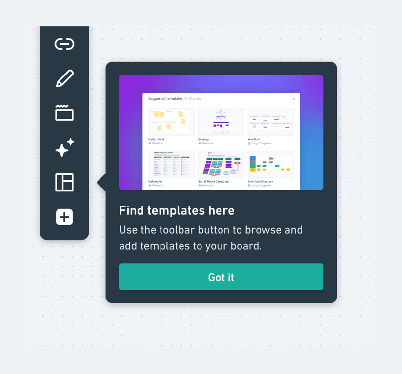
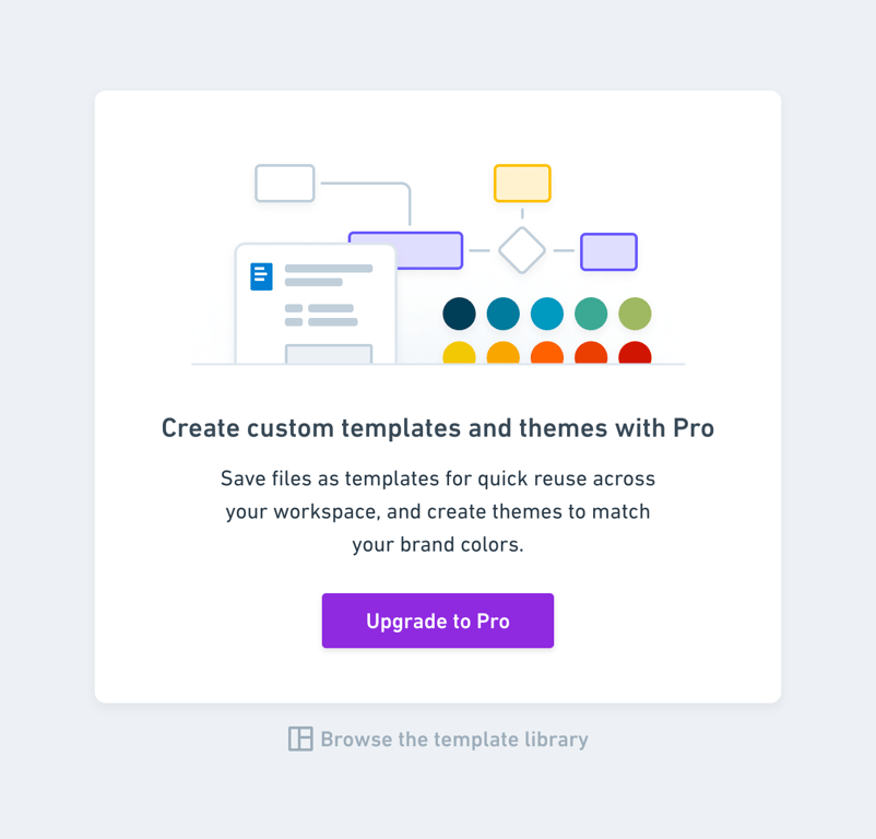
A card prompting the user to upgrade to a Pro plan to unlock custom templates and themes, featuring an illustration, descriptive text, and a primary call-to-action button.
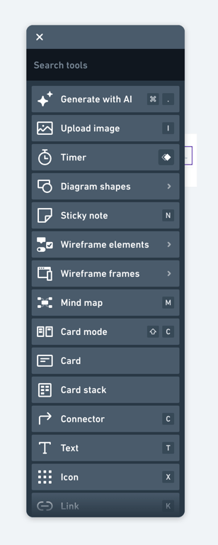

A breadcrumb navigation showing the current document title 'Getting Started' within 'MY FILES', accompanied by a dropdown menu trigger and a star icon for favoriting.
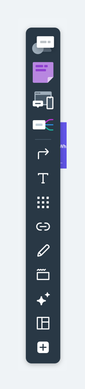
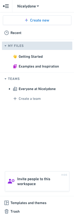
A vertical sidebar navigation menu for a workspace, featuring a workspace switcher, a prominent 'Create new' button, collapsible file and team sections, an invite prompt, and utility links at the bottom.
Browse the full component library
Browse the full UI component library.
Trusted by the best teams







