Skip to content

Typefully UI components examples

Browse Typefully UI component design examples. Preview individual interface elements and explore related component categories. Distraction-free editor to write & publish tweets and threads.

Explore the examples
Typefully — Avatar component
Typefully logo
Typefully

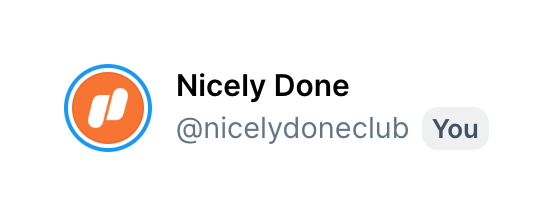
A horizontal row displaying a user's avatar, display name, handle, and a badge indicating it is the current user.

Typefully — Timeline & history component
Typefully logo
Typefully

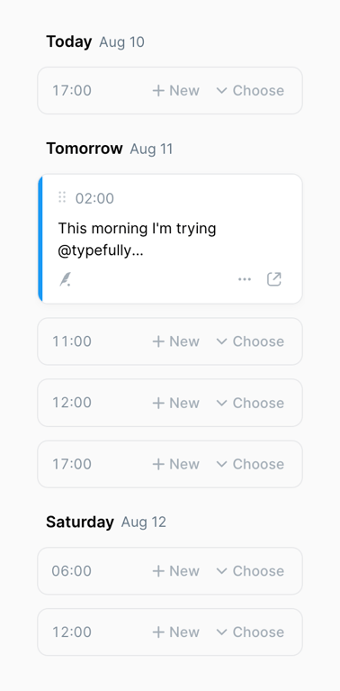
A vertical list of scheduled time slots grouped by day. Empty slots offer options to create new content or choose existing drafts. One slot contains a scheduled post preview with a drag handle and action icons.
Typefully — Charts component
Typefully logo
Typefully

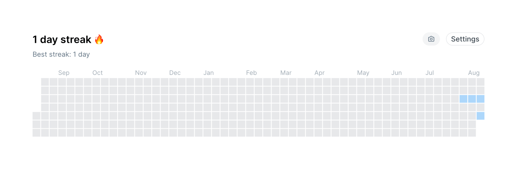
A contribution graph showing daily activity over a year, with a header displaying the current and best streak.

Typefully — Charts component
Typefully logo
Typefully

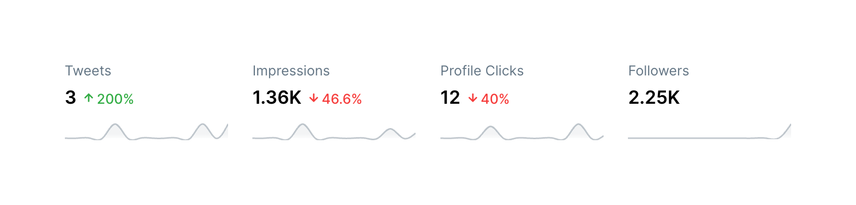
A row of four key performance indicator (KPI) tiles. Each tile displays a metric name, a current value, a percentage change with a trend arrow, and a sparkline chart showing historical data.

Typefully — Tooltip component
Typefully logo
Typefully

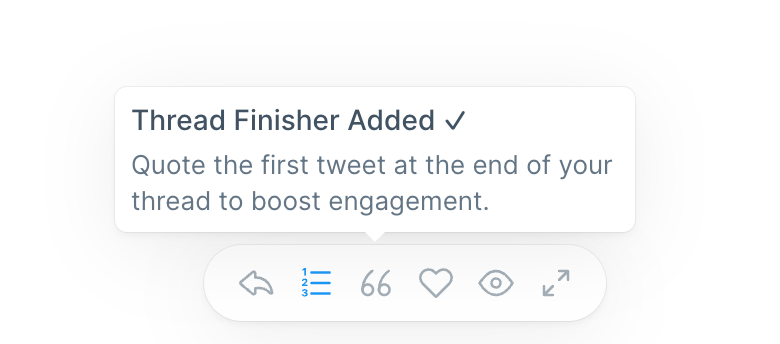
A tooltip displaying a success message and explanation, pointing to an active icon in a floating toolbar below.

Typefully — Segmented control component
Typefully logo
Typefully

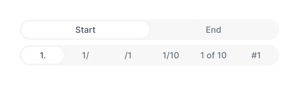
Two stacked segmented controls. The top control selects between Start and End positioning. The bottom control selects the numbering format style, such as '1.', '1/', or '1 of 10'.
Typefully — Segmented control component
Typefully logo
Typefully

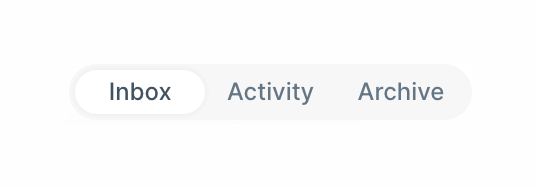
A pill-shaped segmented control with three options: Inbox, Activity, and Archive. The 'Inbox' option is currently selected, indicated by a white pill background.
Typefully — Segmented control component
Typefully logo
Typefully

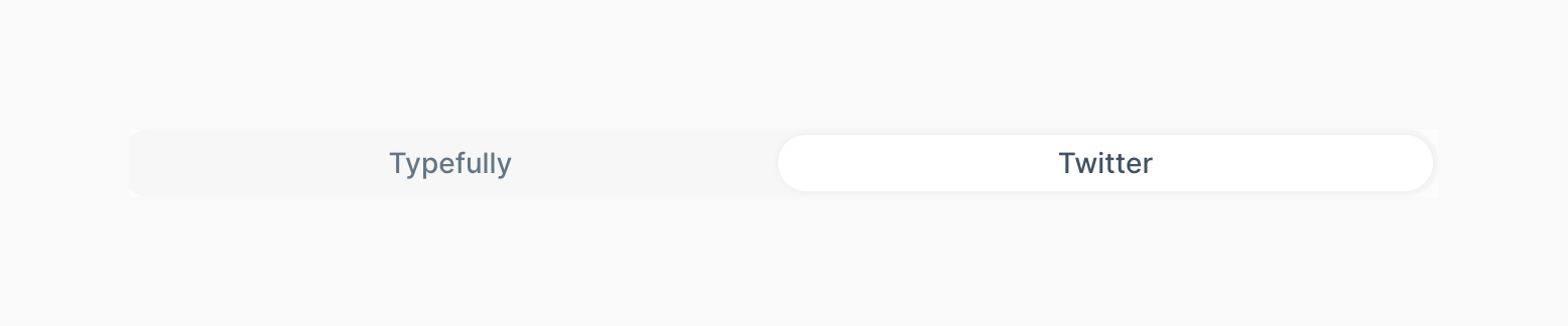
A segmented control with two options, Typefully and Twitter, where Twitter is currently selected.
Typefully — Tabs component
Typefully logo
Typefully

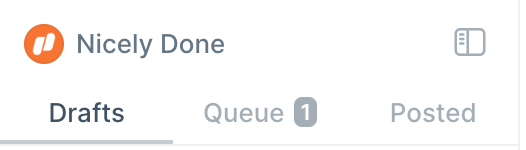
A sidebar header containing an account switcher or profile identifier, a layout toggle icon, and a tabbed navigation menu for content states (Drafts, Queue, Posted). The Queue tab includes a numeric badge.

Typefully — Upgrade your plan component
Typefully logo
Typefully

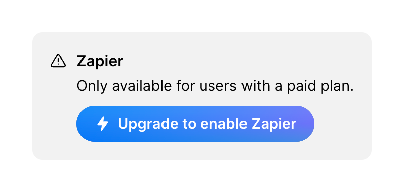
A card prompting the user to upgrade their plan to unlock a specific integration. It features an alert icon, a title, a brief explanation, and a prominent call-to-action button.
Typefully — Theme settings component
Typefully logo
Typefully

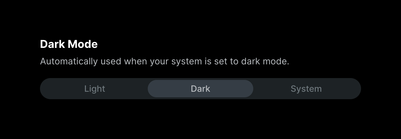
A segmented control for selecting the application's theme, with options for Light, Dark, and System.
Typefully — Theme settings component
Typefully logo
Typefully

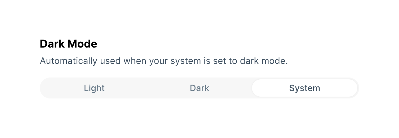
A segmented control allowing the user to select their preferred theme: Light, Dark, or System. The System option is currently selected.

Browse the full component library

Browse the full UI component library.

Trusted by the best teams