Todoist UI components examples
Browse Todoist UI component design examples. Preview individual interface elements and explore related component categories. The to do list to organize work & life
Explore the examples
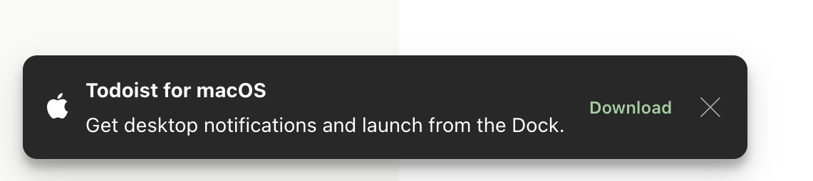

A dark-themed toast notification prompting the user to download the macOS desktop app, featuring an Apple icon, title, description, a download action, and a close button.
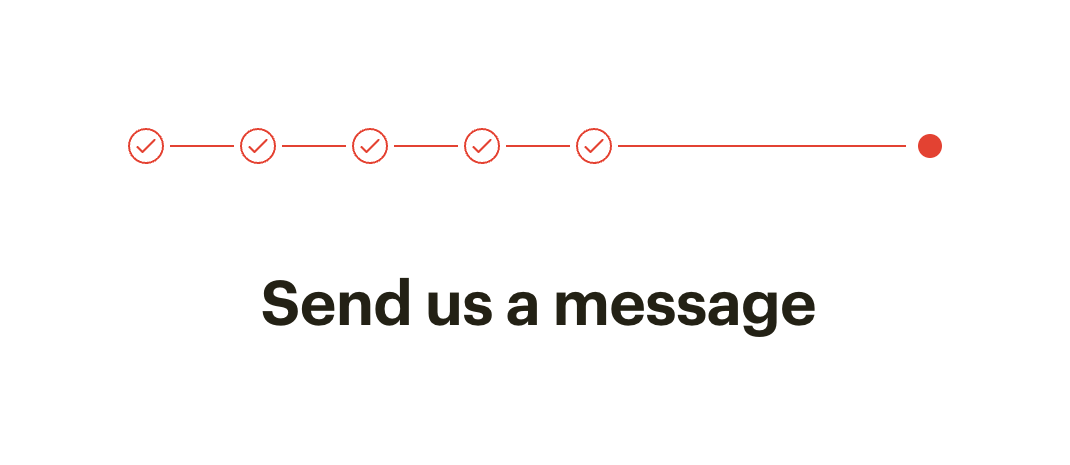
A horizontal progress stepper showing five completed steps and one active step, followed by a title.
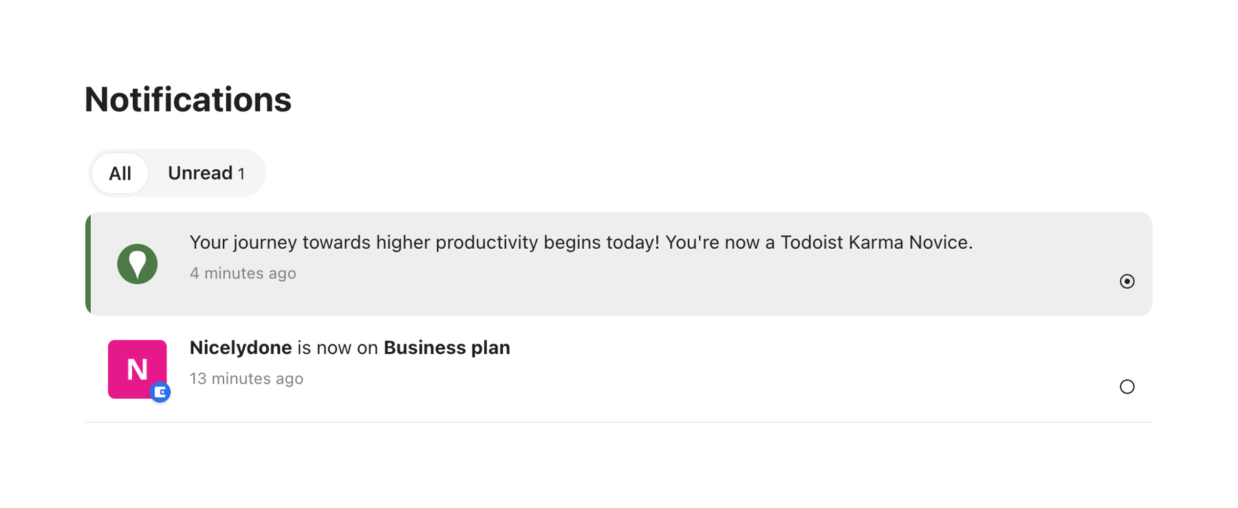
A list of notifications with a segmented control to filter by All or Unread. The unread notification has a gray background and a green left border.
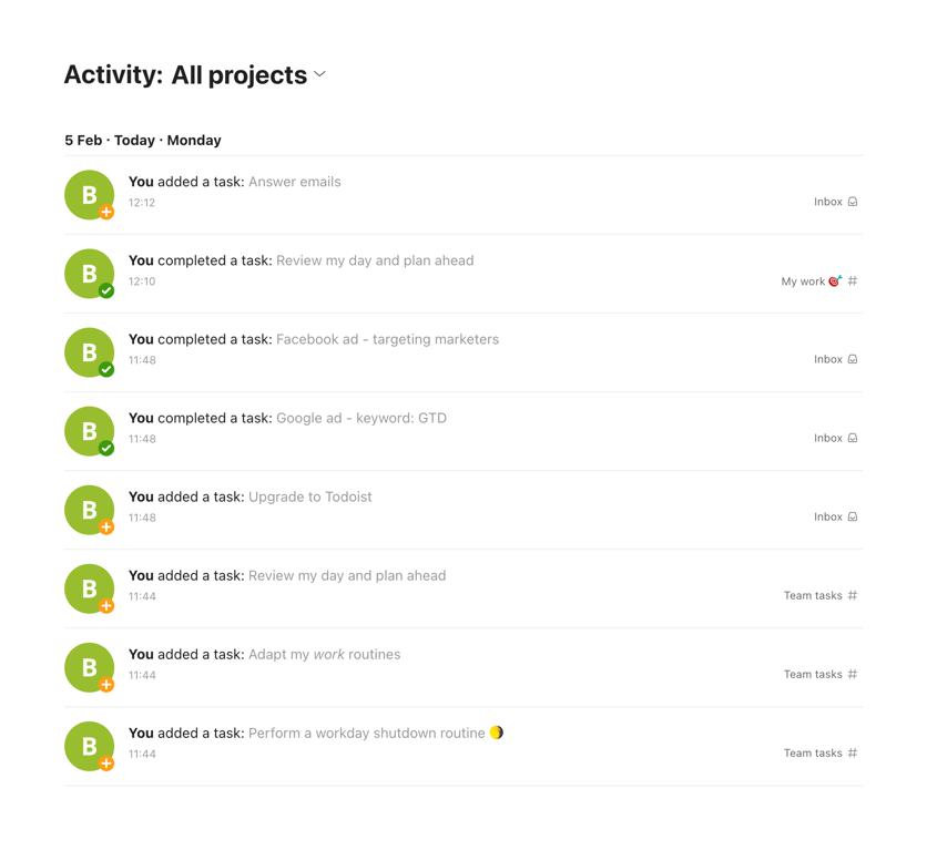
A chronological list of user activities, showing added and completed tasks with timestamps and project locations.
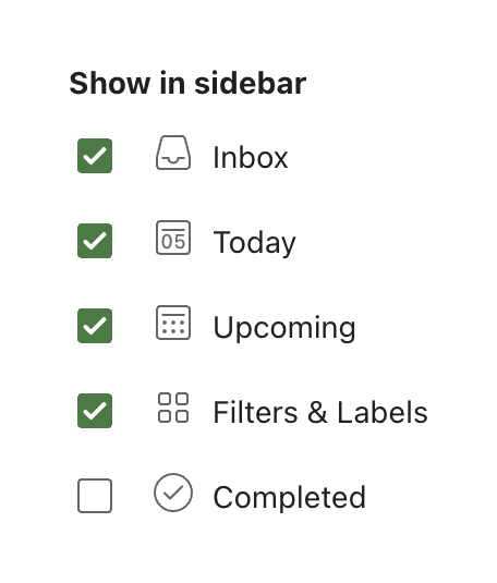
A list of checkboxes allowing the user to select which items appear in the sidebar.
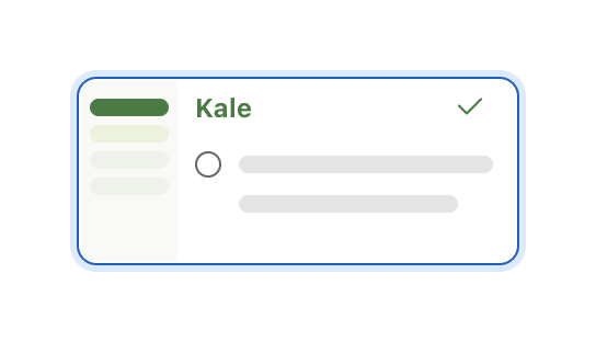
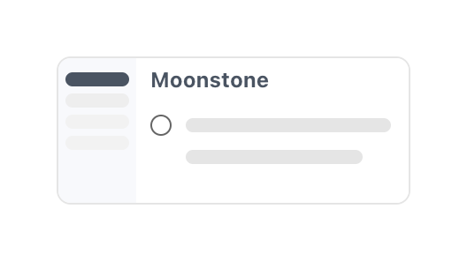
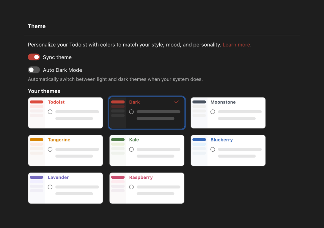
A settings panel allowing users to customize the application's appearance. It includes toggles for syncing themes and auto dark mode, followed by a grid of selectable theme preview cards.
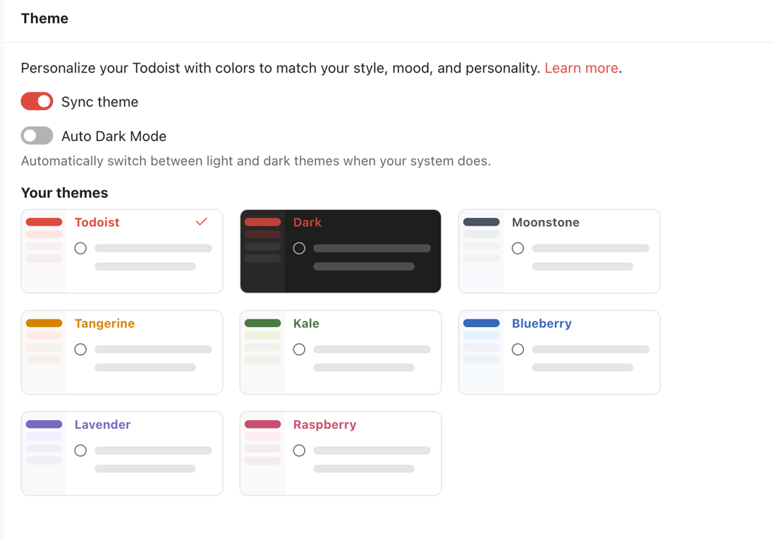
A settings panel allowing the user to select a color theme for their workspace, with options to sync the theme and enable auto dark mode.
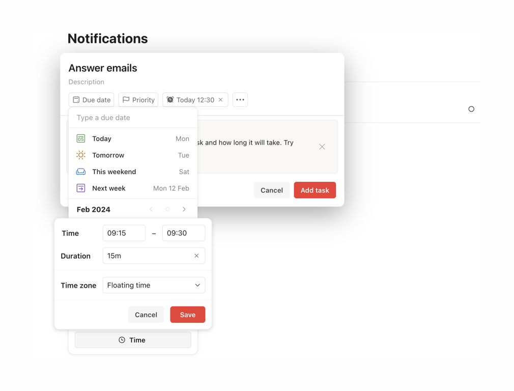
A complex task creation modal with nested popovers for selecting due dates, times, durations, and time zones.
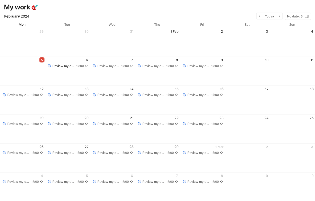
A monthly calendar view displaying scheduled tasks within a project. It includes a header with the project title, current month/year, navigation controls, and a grid of days showing individual task items with checkboxes and times.
Browse the full component library
Browse the full UI component library.
Trusted by the best teams







