Outverse UI components examples
Browse Outverse UI component design examples. Preview individual interface elements and explore related component categories. Where software companies build community
Explore the examples
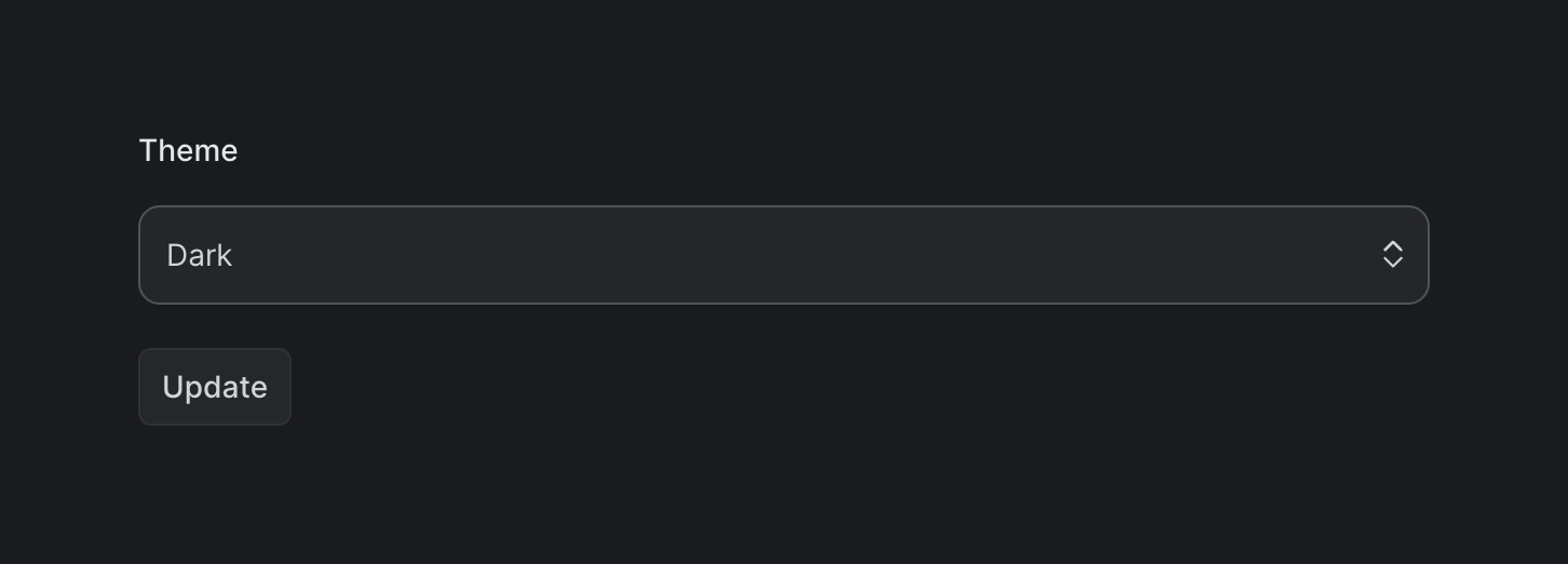

A form section for selecting the application theme, featuring a label, a dropdown select input currently showing 'Dark', and an 'Update' button.
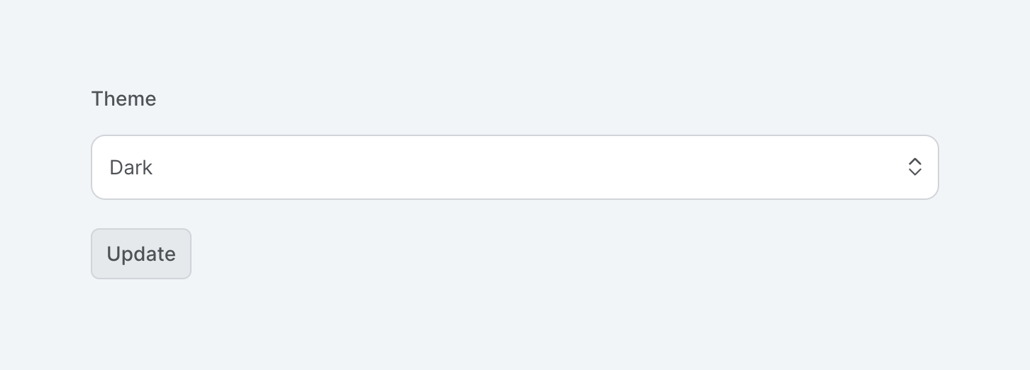
A form section allowing users to select their preferred theme via a dropdown menu, followed by an update button.
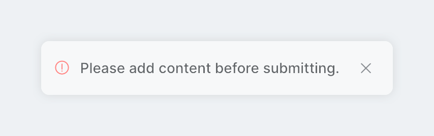
A floating toast notification displaying a validation error message with a red alert icon and a close button.
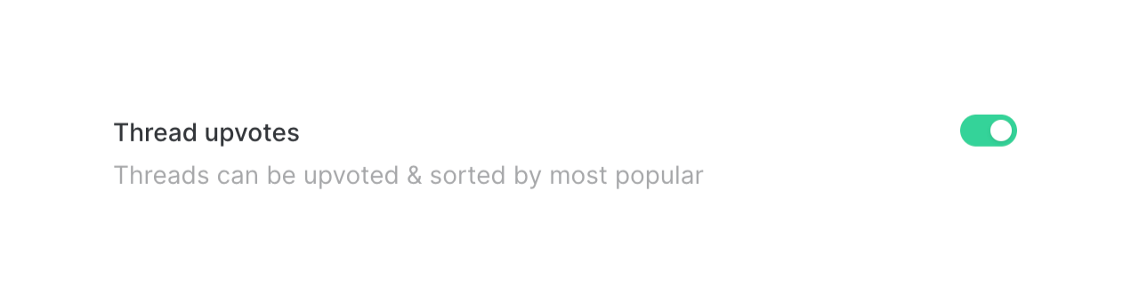
A toggle switch with a title and a descriptive subtitle, used to enable or disable a specific feature.

A row containing a title, a descriptive subtitle, and a toggle switch to enable or disable a setting.
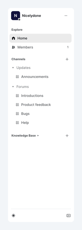
A vertical sidebar navigation menu for a community workspace, featuring a workspace switcher, explore links, collapsible channel categories, and a knowledge base section.
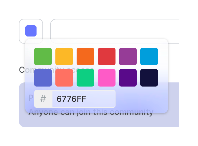
A floating color picker popover displaying a grid of preset color swatches and a hex code input field.
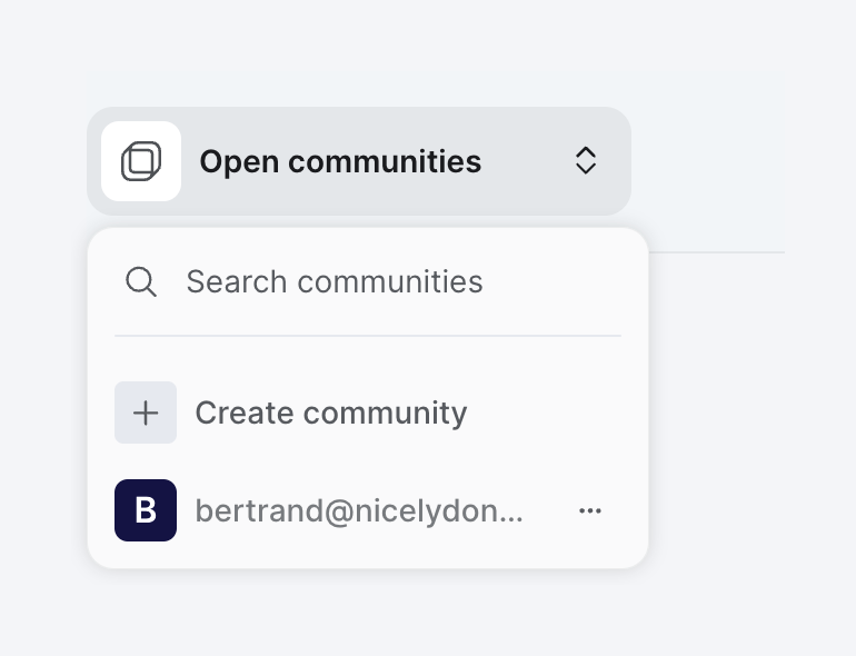
A dropdown menu for switching between communities, featuring a search bar, an option to create a new community, and a list of existing communities.
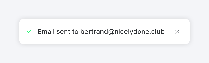
A toast notification confirming that an email has been sent successfully. It features a green checkmark icon, the confirmation message including the recipient's email address, and a close icon.
An abstract illustration depicting a browser window containing stylized lines of code on the left and a mobile device mockup on the right.
Browse the full component library
Browse the full UI component library.
Trusted by the best teams







