ClickUp UI components examples
Browse ClickUp UI component design examples. Preview individual interface elements and explore related component categories. The everything app, for work
Explore the examples
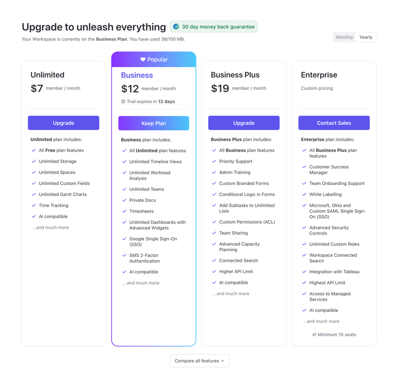

A four-column pricing table comparing subscription tiers. The current plan is highlighted with a gradient border and a 'Popular' badge. Each tier lists a price, a call-to-action button, and a checklist of included features.

A horizontal banner promoting an AI add-on for paid plans. It features a dark background, an AI icon, promotional text with a crossed-out original price, a 'Learn more' link, and a primary 'Choose plan' button.
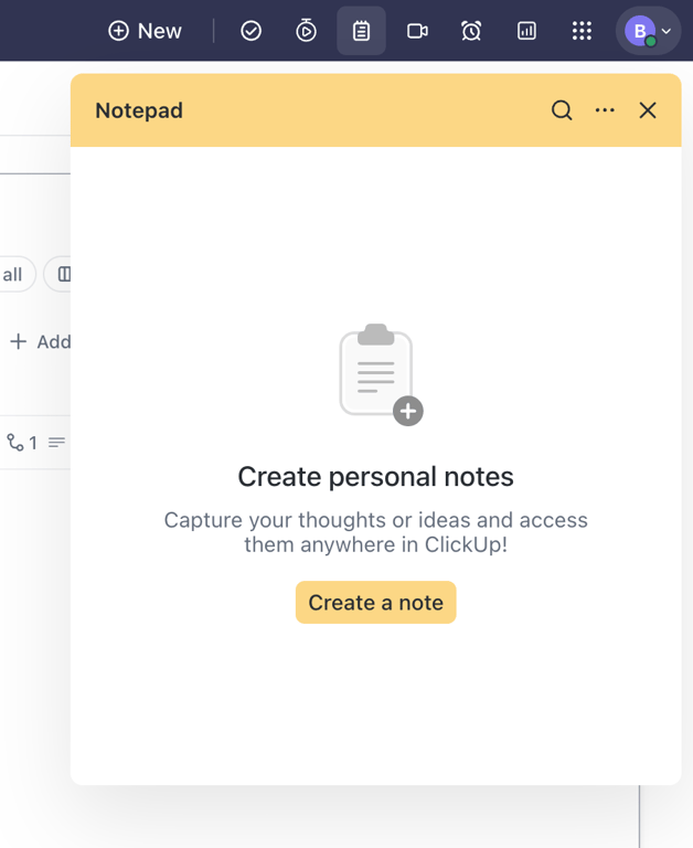
An empty state drawer for a notepad feature, prompting the user to create their first personal note.
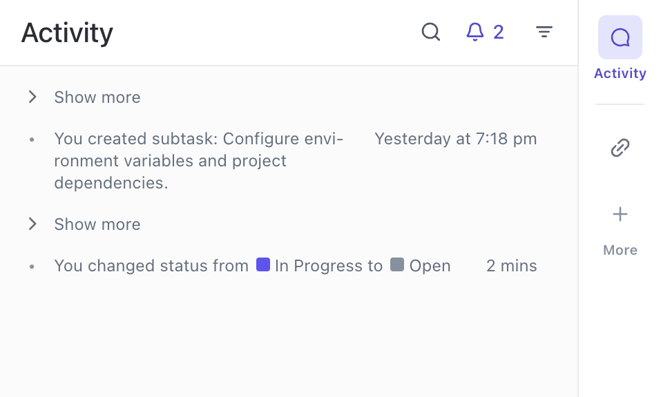
A panel displaying a chronological list of task activities, including status changes and subtask creations, with a right-hand sidebar for navigation.

A horizontal bar offering AI prompt suggestions. It features an AI icon and a sentence with clickable inline actions to trigger specific AI tasks.
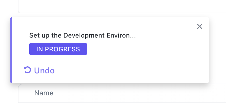
A toast notification confirming a task status change to 'In Progress', featuring an undo action and a close button.
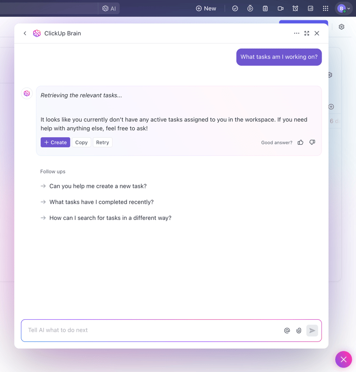
This is a modal for an AI assistant that helps users manage their tasks.
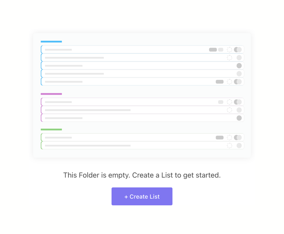
An empty state message indicating a folder has no lists, featuring an illustrative graphic of lists, a descriptive text prompt, and a primary call-to-action button to create a new list.
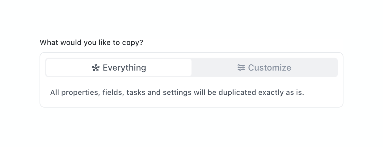
A segmented control allowing the user to choose between 'Everything' and 'Customize' when copying a project space. The 'Everything' option is selected, and a description below explains the consequence of this choice.
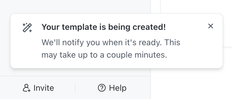
A toast notification informing the user that a template is being created. It includes an icon, a title, a descriptive message, and a close button.
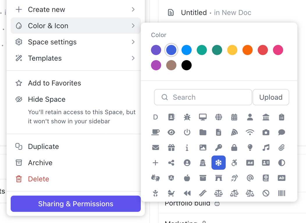
A context menu with a nested popover for selecting a color and an icon. The primary menu lists space settings, while the nested popover provides a grid of color swatches and a searchable grid of icons.
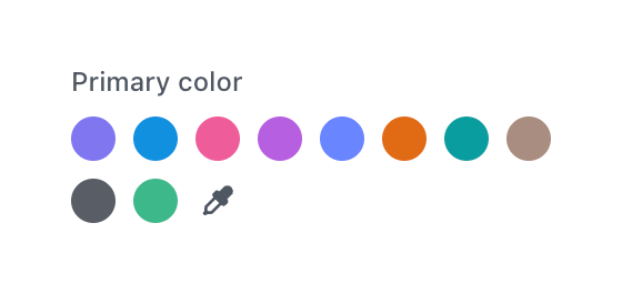
A color selection component displaying a grid of circular color swatches and an eyedropper tool for custom color selection.
Browse the full component library
Browse the full UI component library.
Trusted by the best teams







