Skip to content

Causal UI components examples

Browse Causal UI component design examples. Preview individual interface elements and explore related component categories. The business planning platform

Explore the examples
Causal — Badge component
Causal logo
Causal

A pill-shaped badge displaying an icon and a count of models.

Causal — Message component
Causal logo
Causal

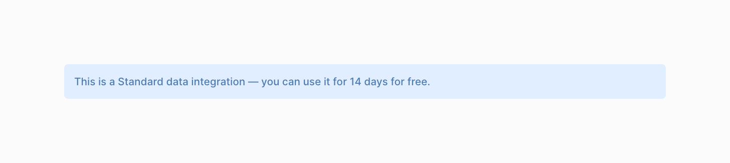
A simple informational banner with a light blue background and dark blue text, indicating a trial period for a data integration.

Causal — Stepper component
Causal logo
Causal

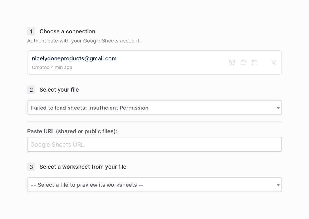
A vertical stepper for configuring a Google Sheets data connection. It shows three steps: choosing a connection, selecting a file, and selecting a worksheet. The second step displays an error message indicating insufficient permission.

Causal — Badge component
Causal logo
Causal

A pill-shaped badge displaying a warning icon and a count of warnings.

Causal — Input select component
Causal logo
Causal

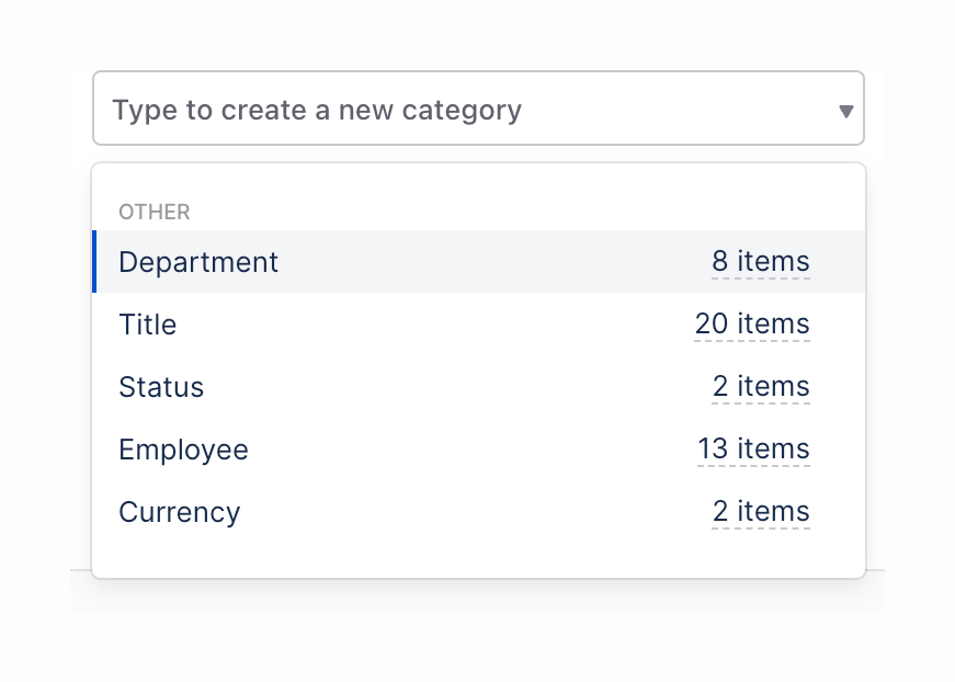
A combobox input field that allows typing to create a new category, with an open dropdown list showing existing categories grouped under 'OTHER'. Each list item displays the category name and the number of items it contains.

Causal — Stepper component
Causal logo
Causal

A horizontal stepper showing four stages of a data import process. The first step is completed, the second is active, and the remaining two are upcoming.

Causal — File upload input component
Causal logo
Causal

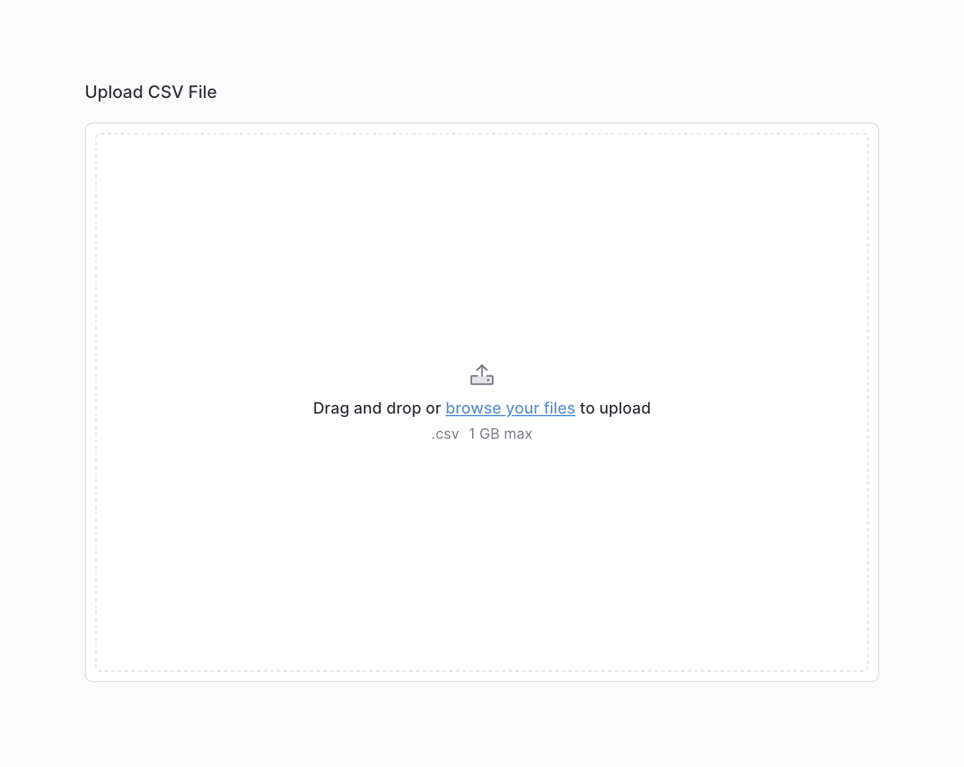
A file upload area with a dashed border, an upload icon, and text instructing the user to drag and drop or browse for a file. It specifies the accepted file format (.csv) and maximum file size (1 GB).

Causal — Skeleton component
Causal logo
Causal

A data table displaying a loading skeleton state. The row headers are visible, but the cell contents are replaced with rounded rectangular placeholders.

Causal — Charts component
Causal logo
Causal

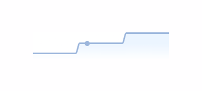
A small, simple line chart with a gradient fill below the line, showing an upward trend with a single data point highlighted.

Causal — Timeline & history component
Causal logo
Causal

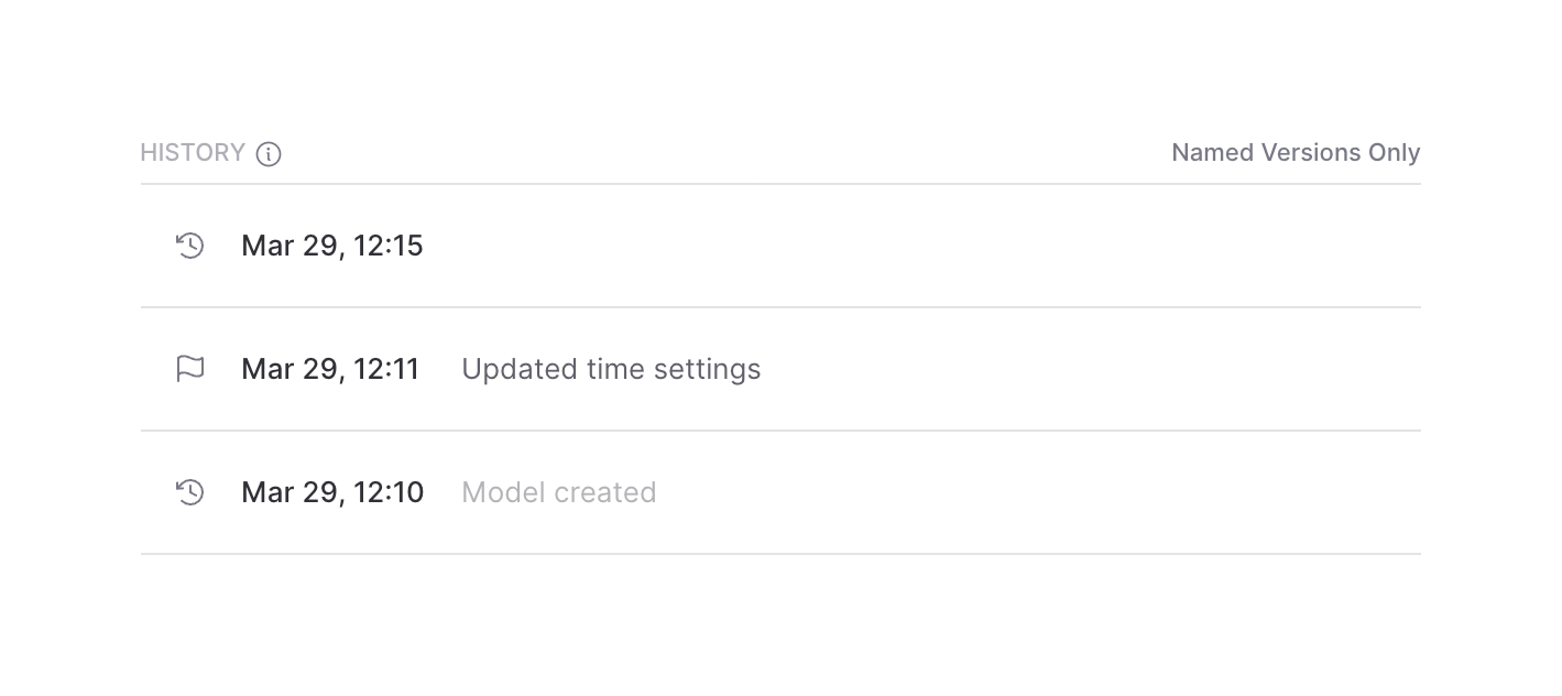
A list displaying the version history of a document or model, showing timestamps and descriptions for each entry.
Causal — Tooltip component
Causal logo
Causal

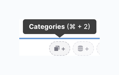
A dark tooltip displaying the label 'Categories' along with its corresponding keyboard shortcut. It points downwards to a blue line, below which are dashed, pill-shaped buttons with icons and plus signs.

Causal — Dropdown menu component
Causal logo
Causal

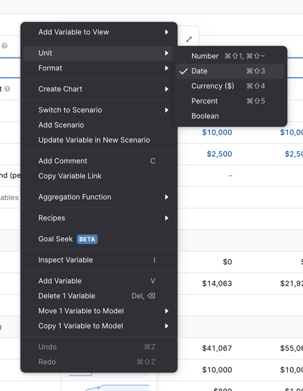
A dark-themed context menu with a nested submenu open. The main menu contains various actions and settings for a financial model variable, with the 'Unit' item hovered to reveal a submenu for selecting data types like Number, Date, Currency, Percent, and Boolean.

Browse the full component library

Browse the full UI component library.

Trusted by the best teams