
Expensify UI components examples
Browse Expensify UI component design examples. Preview individual interface elements and explore related component categories. The expense management app that does it all
Explore the examples

A success toast notification confirming that the user has been opted out of Personal Karma, featuring a light green background and a close icon.
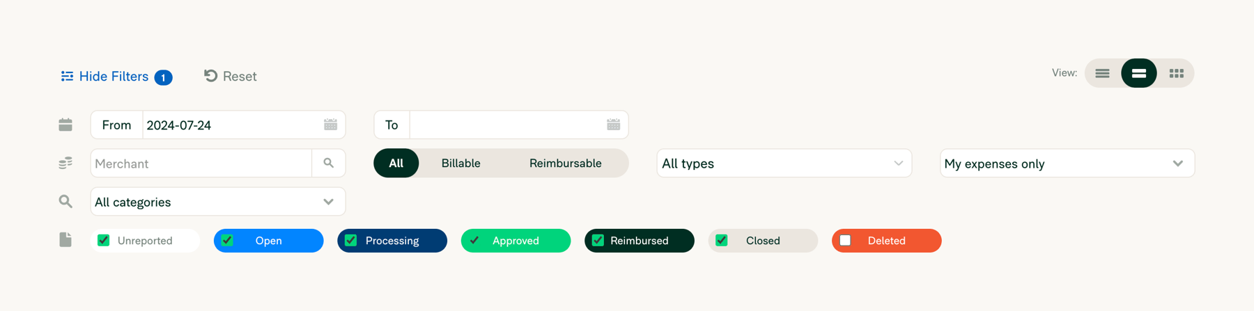
A comprehensive filter toolbar for a list of expenses, featuring date ranges, merchant search, category dropdowns, status toggles, and view options.
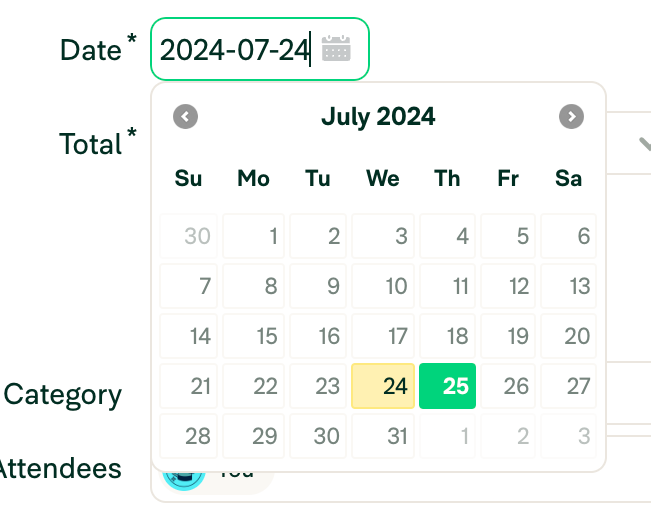
A date input field with an open calendar popover. The input field shows a selected date and has a green focus border. The calendar displays a month view with a selected date highlighted in yellow and the current date highlighted in green.

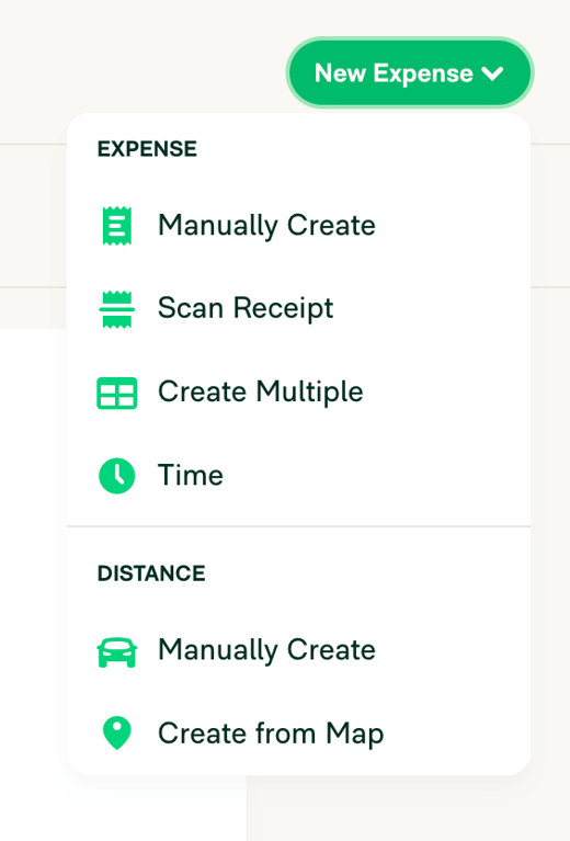
A dropdown menu triggered by a 'New Expense' button, offering various methods to create expenses categorized into 'EXPENSE' and 'DISTANCE'. Options include manual creation, scanning receipts, and creating from a map.

A page header and toolbar for an expenses list. It includes a page title, a primary 'New Expense' dropdown button, a 'Show Filters' toggle, and a view toggle group.
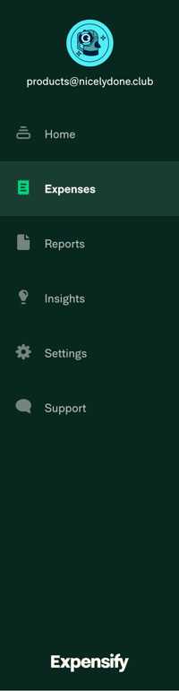
A dark-themed vertical sidebar navigation menu with an avatar, user email, a list of navigation links with icons, and a logo at the bottom. The 'Expenses' link is currently active.
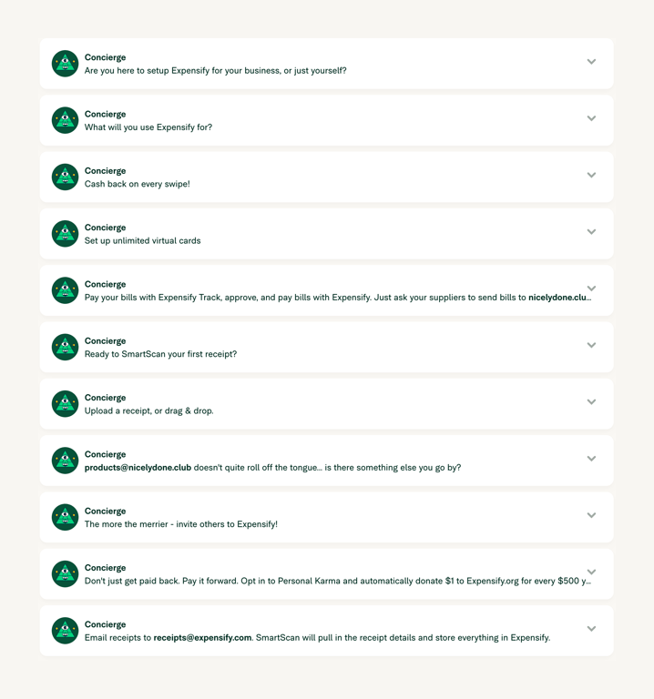
A vertical list of expandable cards, each presenting a task or message from a virtual concierge. Each card features an avatar, a title, a brief description, and a chevron icon indicating it can be expanded.
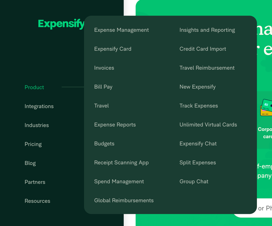
A large, dark-themed flyout menu displaying a two-column list of product features and capabilities, triggered from a vertical sidebar navigation.
Similar components
Browse the full component library
Browse the full UI component library.
Trusted by the best teams







