Plans · Dock
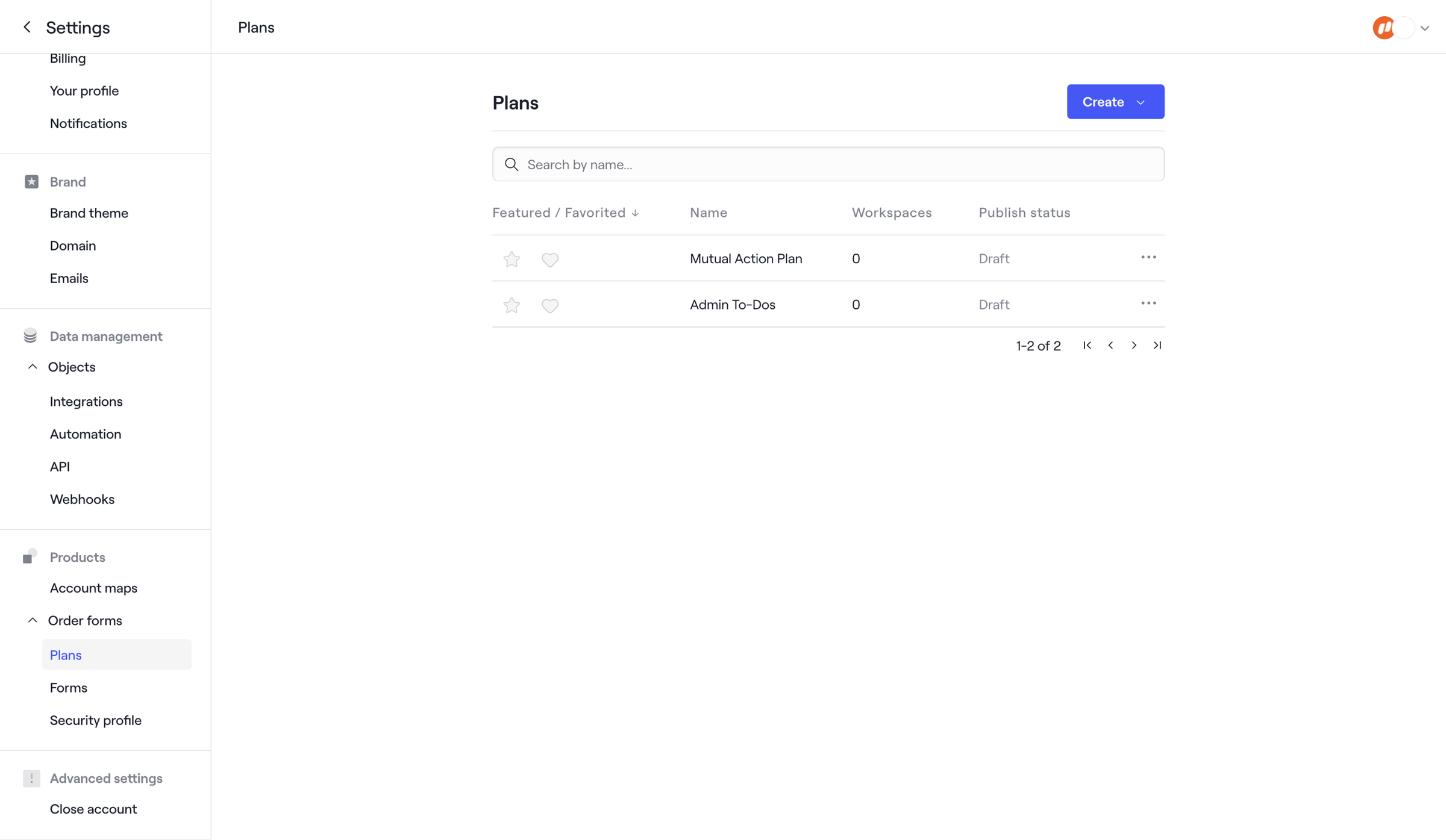
Screen UI design example from Dock. The screen displays a settings interface with a two-column layout. The left column features a vertical navigation menu, categorized into 'Settings', 'Brand', 'Data management', 'Products', and 'Advanced settings'. The 'Products' category is expanded, and 'Plans' is the currently selected item, highlighted in light gray. The right column, which is the main content area, is titled 'Plans'. Below the title, there's a primary 'Create' button with a dropdown arrow on the right, and a search input field labeled 'Search by name...'. A table occupies the central part of the content area, displaying a list of plans with columns for 'Featured / Favorited', 'Name', 'Workspaces', and 'Publish status'. The 'Featured / Favorited' column header shows a down arrow, indicating a sort order. Two rows are visible in the table: 'Mutual Action Plan' and 'Admin To-Dos', both with '0' workspaces and 'Draft' publish status. Each row also includes a star icon (unfilled), a heart icon (unfilled), and a three-dot 'more options' icon. At the bottom right of the table, pagination controls are visible, indicating '1-2 of 2' items, along with 'first', 'previous', 'next', and 'last' page navigation icons. The top right of the screen features a user avatar and a logo, accompanied by a dropdown arrow.

The screen displays a settings interface with a two-column layout. The left column features a vertical navigation menu, categorized into 'Settings', 'Brand', 'Data management', 'Products', and 'Advanced settings'. The 'Products' category is expanded, and 'Plans' is the…
Explore the full SaaS screen library
Upgrade to unlock the full library.
Trusted by the best teams







