Workflow | extend
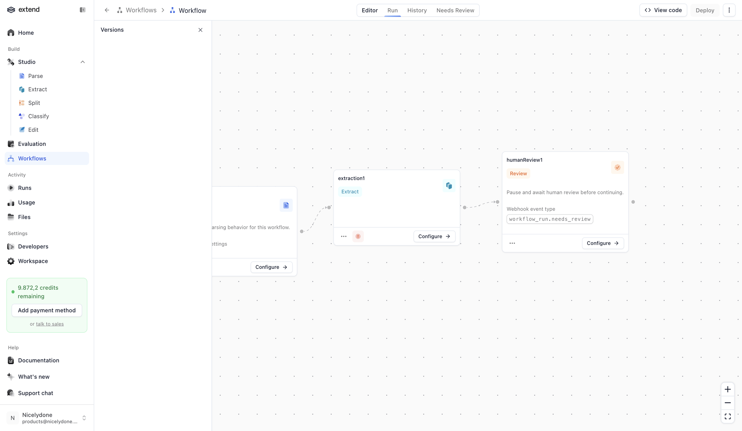
Screen UI design example from Extend. The screen displays a workflow editor interface with a two-column layout. The left column features a vertical navigation sidebar, and the right column contains the main workflow canvas and a horizontal header. The sidebar includes the 'extend' logo, primary navigation categories like 'Home', 'Build' (with 'Studio' expanded to show 'Parse', 'Extract', 'Split', 'Classify', 'Edit', 'Evaluation', and 'Workflows' selected), 'Activity', 'Settings', and 'Help'. Below the navigation, there's a green informational box indicating '9.872,2 credits remaining' with an 'Add payment method' button and a 'talk to sales' link. At the very bottom of the sidebar is a user avatar and name. The main content area features a dotted grid background, representing a canvas for building workflows. A breadcrumb 'Workflows > Workflow' is visible at the top left of the main content. Below the breadcrumb, there are four tabs: 'Editor' (selected), 'Run', 'History', and 'Needs Review'. On the top right of the main content area, there are 'View code' and 'Deploy' buttons, followed by a '...' (more options) button. Three workflow nodes are visible on the canvas: an initial node (partially visible, with a 'Configure' button), an 'extraction1' node (labeled 'Extract', with a 'Configure' button and an error indicator), and a 'humanReview1' node (labeled 'Review', with a 'Configure' button, a filled input field 'workflow_run_needs_review', and a success indicator). A zoom control with '+' and '-' buttons and a full-screen toggle is present in the bottom right corner of the canvas.

The screen displays a workflow editor interface with a two-column layout. The left column features a vertical navigation sidebar, and the right column contains the main workflow canvas and a horizontal header. The sidebar includes the 'extend' logo, primary navigation…
Explore the full SaaS screen library
Upgrade to unlock the full library.
Trusted by the best teams







