Vev UI components examples
Browse Vev UI component design examples. Preview individual interface elements and explore related component categories. No-code web design platform for professional creatives
Explore the examples
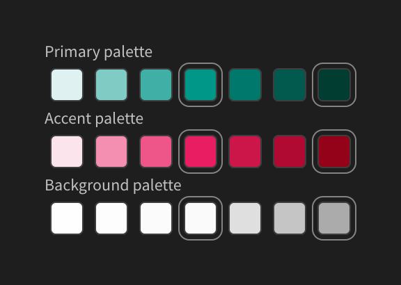
A set of color palette swatches organized into Primary, Accent, and Background categories. Each category displays a row of rounded square color swatches, with some swatches highlighted by an outer border.
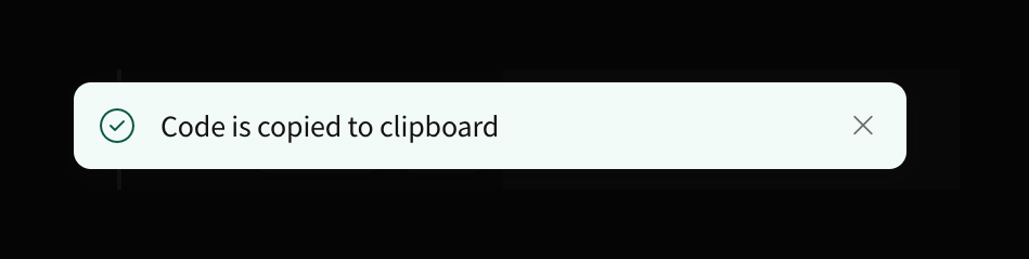
A success toast notification confirming that code has been copied to the clipboard.
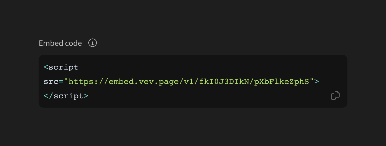
A dark-themed code block displaying an HTML script tag for embedding content, featuring a copy-to-clipboard icon button.
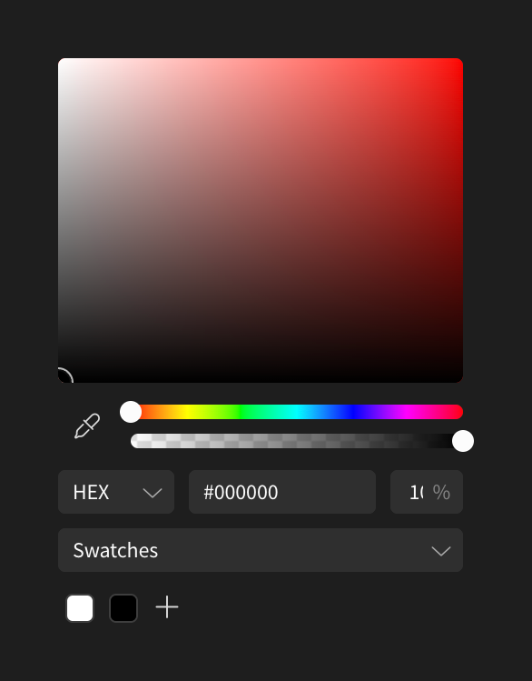
A dark-themed color picker panel featuring a large saturation/brightness area, hue and opacity sliders, HEX input, and a swatches section.
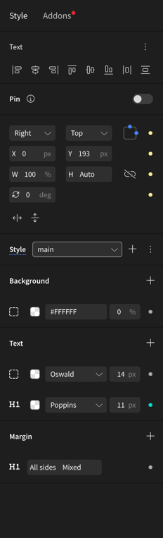
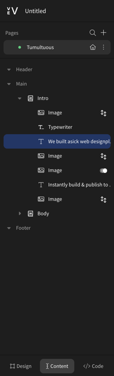
A dark-themed sidebar panel showing a hierarchical list of page elements, with a selected text element highlighted in blue.
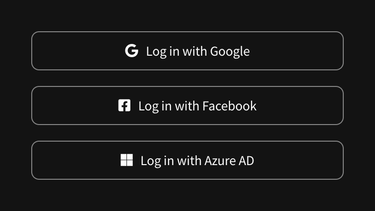
A vertical stack of three outlined buttons for logging in with third-party providers: Google, Facebook, and Azure AD. Each button features the provider's logo and text.
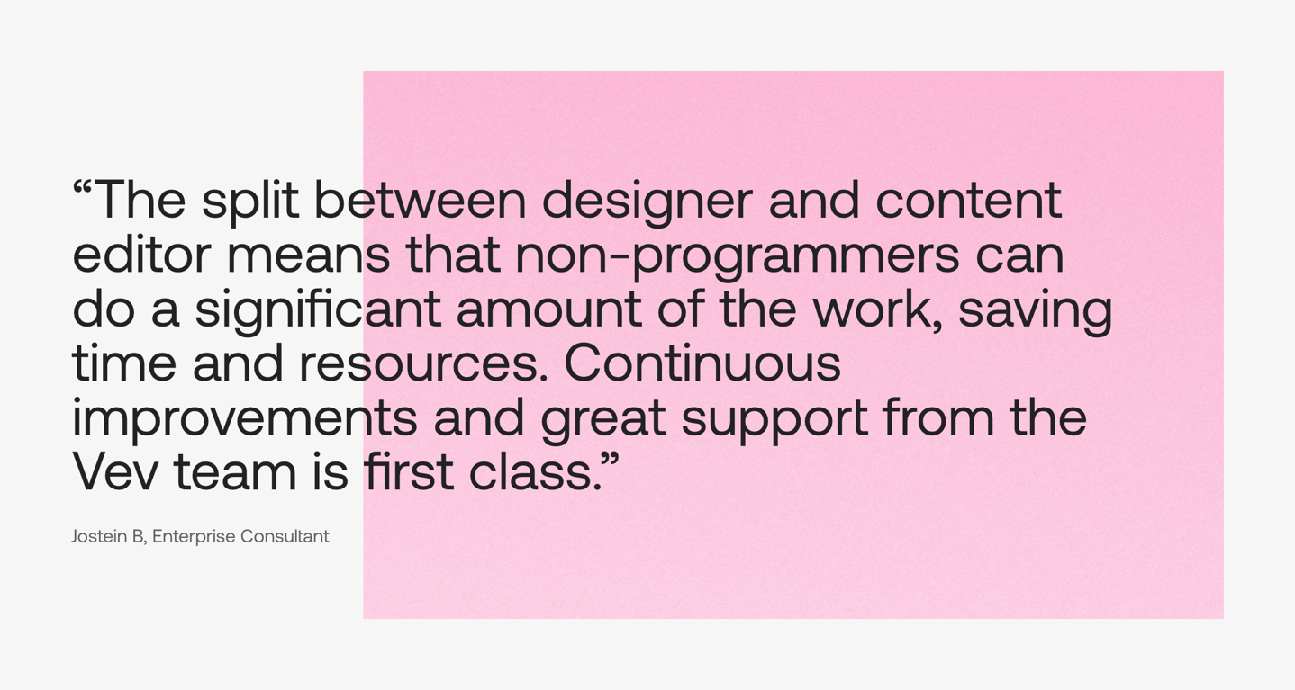
A large text block displaying a customer quote and attribution, set against a partially overlapping pink background shape.

Browse the full component library
Browse the full UI component library.
Trusted by the best teams







