Twist UI components examples
Browse Twist UI component design examples. Preview individual interface elements and explore related component categories. Work is changing. Messaging should too.
Explore the examples
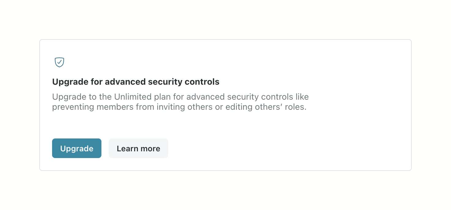

A card prompting the user to upgrade their plan to access advanced security controls. It includes an icon, a title, a brief description of the benefits, and two buttons for upgrading or learning more.
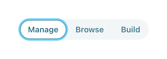
A pill-shaped segmented control with three options: Manage, Browse, and Build. The 'Manage' option is currently selected.
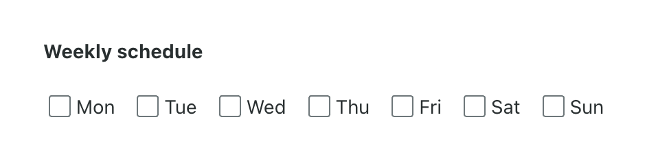
A horizontal row of checkboxes for selecting days of the week, labeled 'Weekly schedule'.
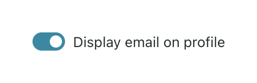
A toggle switch with a label to control whether an email address is displayed on a profile.
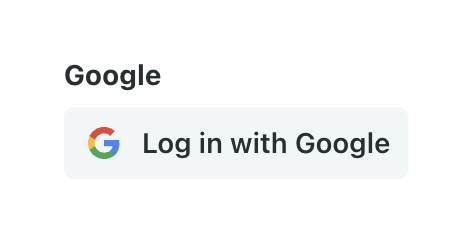
A social login button for Google, featuring the Google logo and text 'Log in with Google', positioned below a 'Google' section heading.
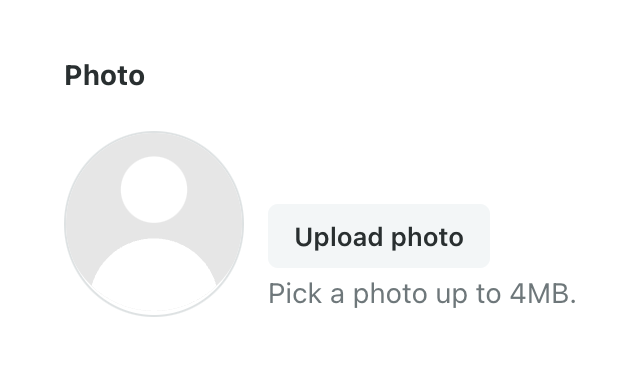
A form field for uploading a user profile photo, featuring a default avatar placeholder, an upload button, and helper text specifying the file size limit.
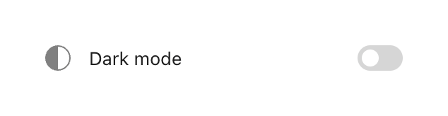
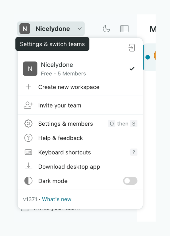
A dropdown menu for switching workspaces and accessing settings. It includes the current workspace details, options to create or invite, settings links with keyboard shortcuts, and a dark mode toggle.
Browse the full component library
Browse the full UI component library.
Trusted by the best teams







