Twingate UI components examples
Browse Twingate UI component design examples. Preview individual interface elements and explore related component categories. Secure access for fast-growing teams
Explore the examples
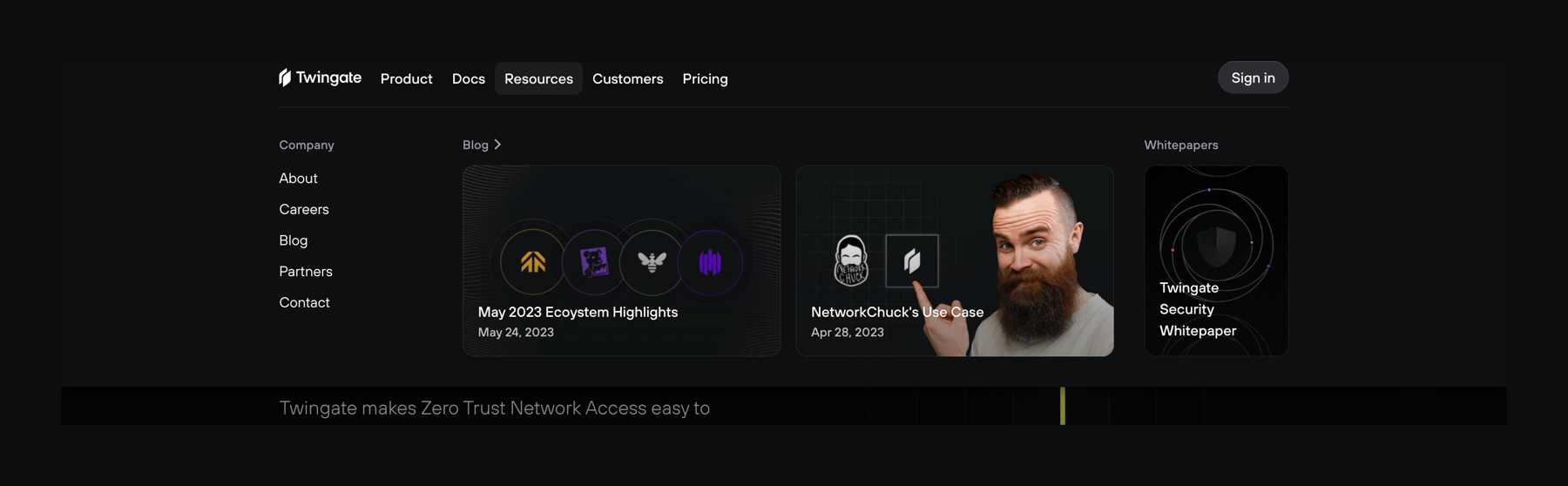

A dark-themed global navigation header with an expanded mega menu under the 'Resources' tab. The menu displays a list of company links, featured blog posts with thumbnail images, and a whitepaper link.
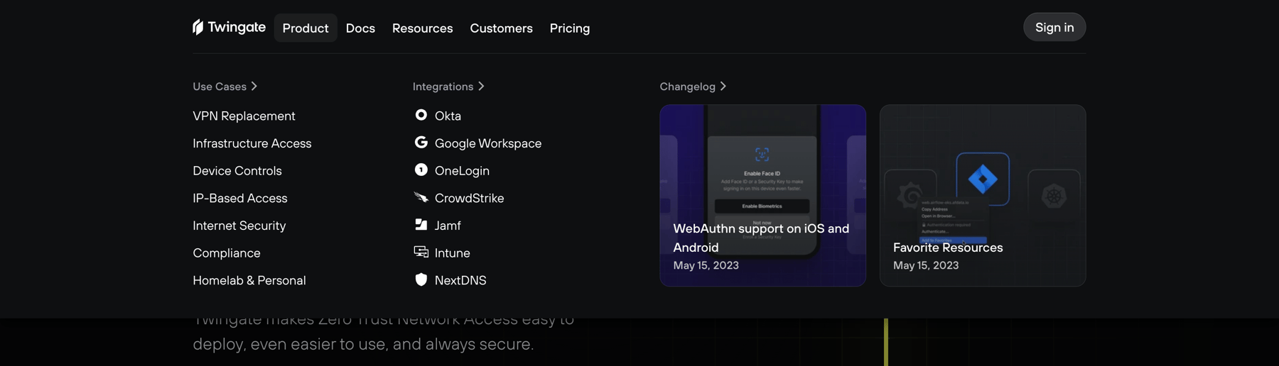
A dark-themed global navigation header with an expanded mega menu. The menu displays categorized links for 'Use Cases' and 'Integrations', alongside featured 'Changelog' updates with thumbnail images.
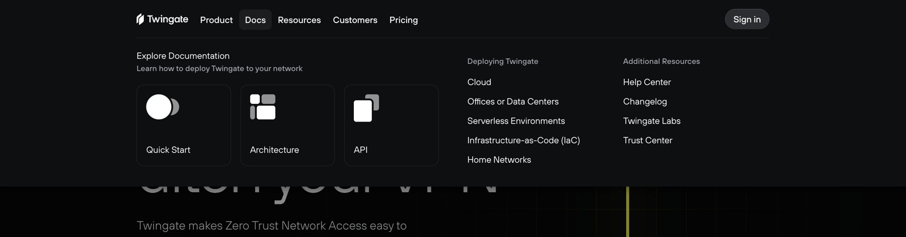
A global navigation header with an expanded mega menu dropdown. The dropdown reveals a grid of documentation resources, including featured cards with icons and categorized lists of links.
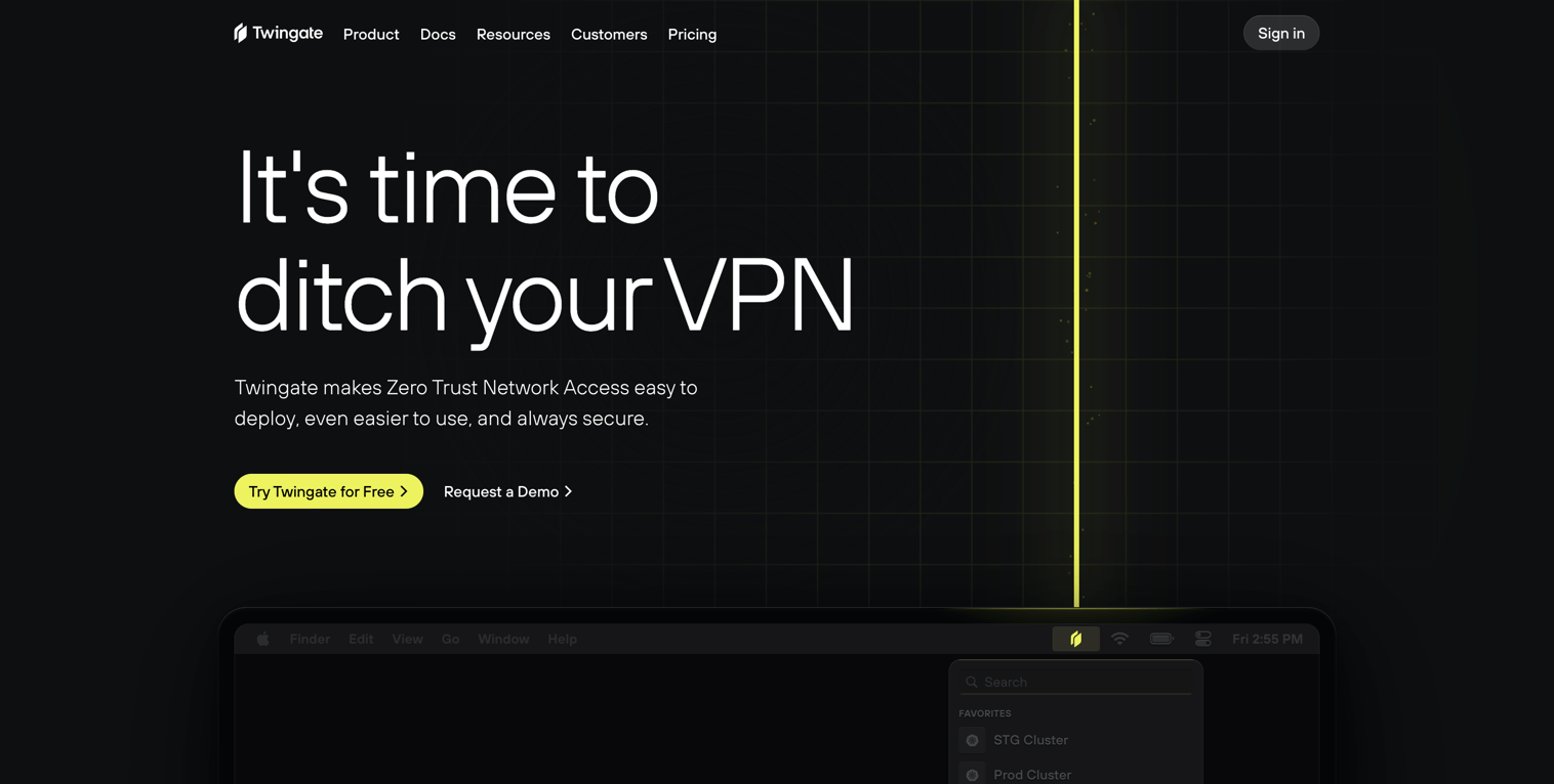
A dark-themed hero section featuring a bold headline, subheadline, and two call-to-action buttons. It includes a top navigation bar and a stylized background graphic with a bright vertical line. A partial view of a desktop interface is visible at the bottom.
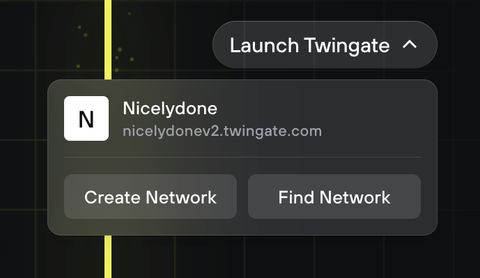
An expanded dropdown menu showing an active network connection and options to create or find other networks.

A dark-themed toast notification prompting the user to sign in again to verify their account. It includes an information icon on the left and a close icon on the right.
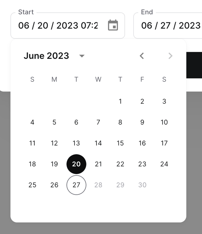
A date range picker component showing a start date input field and an open calendar popover. The calendar displays June 2023 with the 20th selected as the start date and the 27th outlined, likely indicating the end date.
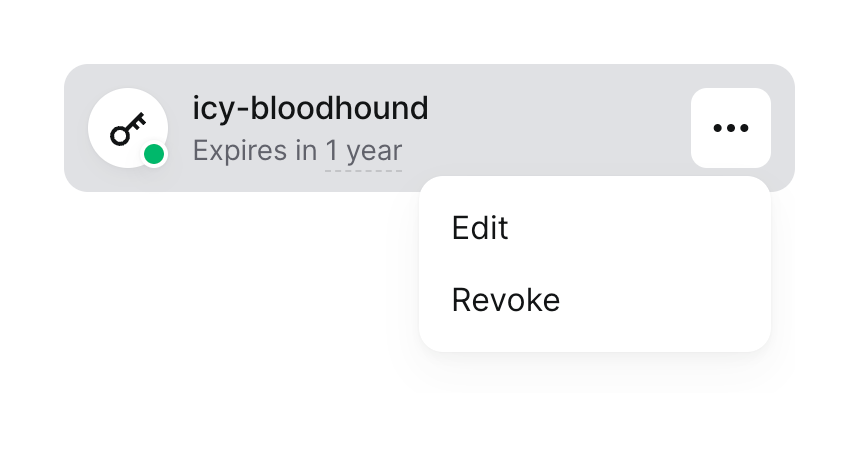
A list item representing a service key, showing its name, expiration status, an icon with a status indicator, and an open overflow menu with actions to edit or revoke the key.

A blue success toast notification confirming that a service account was created.
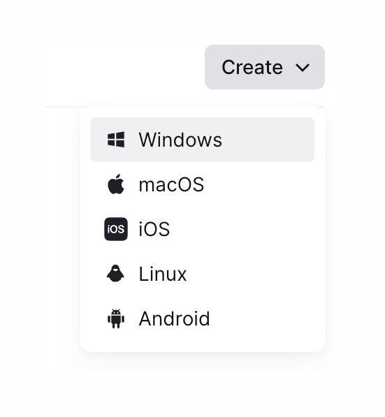
An open dropdown menu triggered by a 'Create' button, displaying a list of operating systems with their respective icons.
Browse the full component library
Browse the full UI component library.
Trusted by the best teams







