Date Range Picker
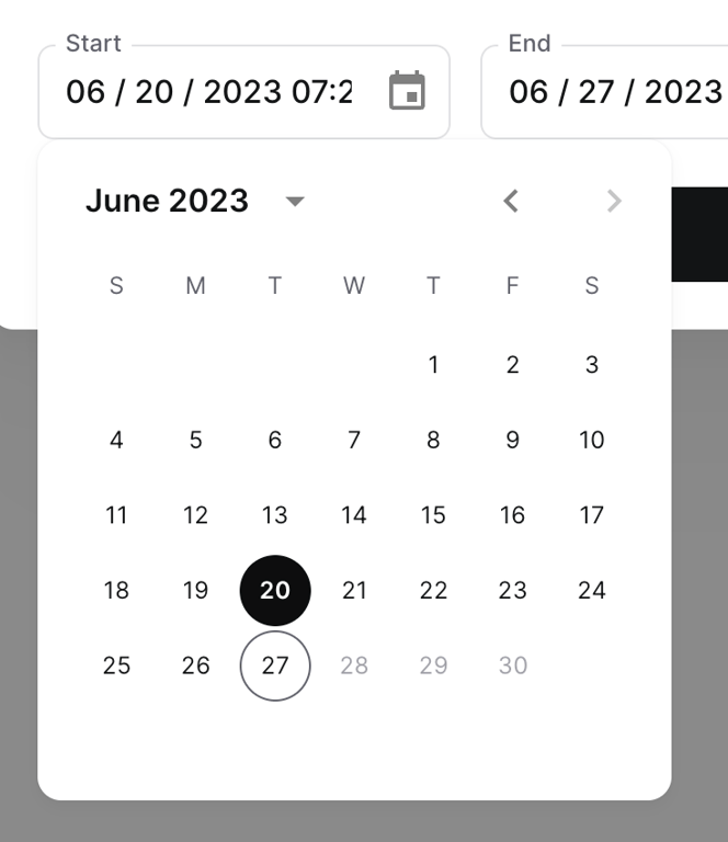
A date range picker component showing a start date input field and an open calendar popover. The calendar displays June 2023 with the 20th selected as the start date and the 27th outlined, likely indicating the end date.
Explore the examples

A date range picker component showing a start date input field and an open calendar popover. The calendar displays June 2023 with the 20th selected as the start date and the 27th outlined, likely indicating the end date.
Browse the full component library
Browse the full UI component library.
Trusted by the best teams







