Tola UI components examples
Browse Tola UI component design examples. Preview individual interface elements and explore related component categories. Pay bills, get paid and manage cash flow
Explore the examples
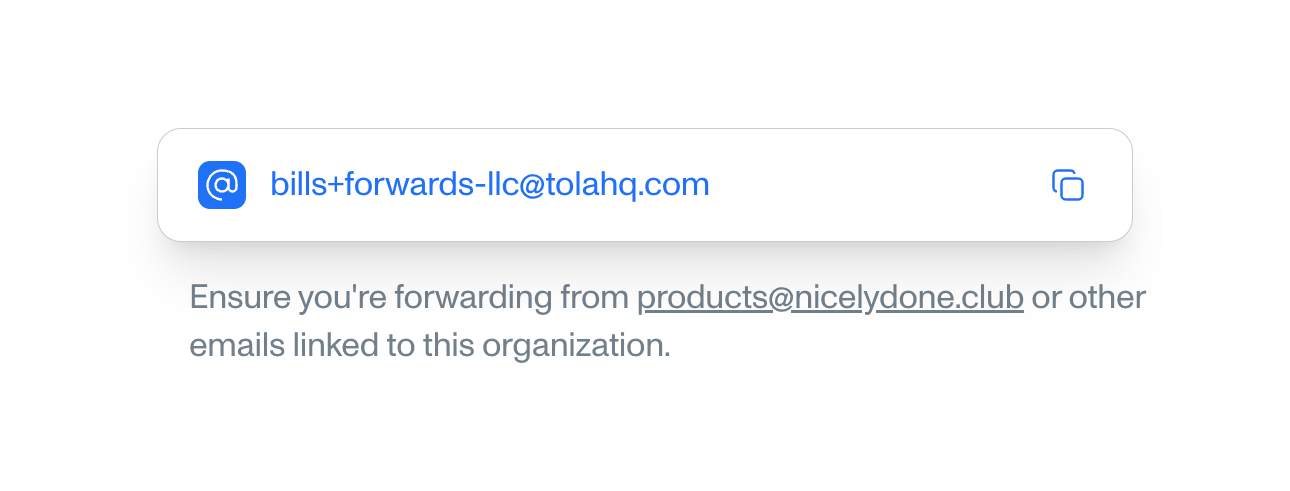

A read-only field displaying an email address with a copy icon, accompanied by helper text below.
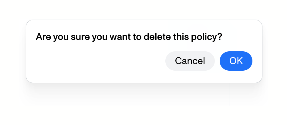
A small confirmation dialog asking the user to confirm the deletion of a policy, with Cancel and OK buttons.
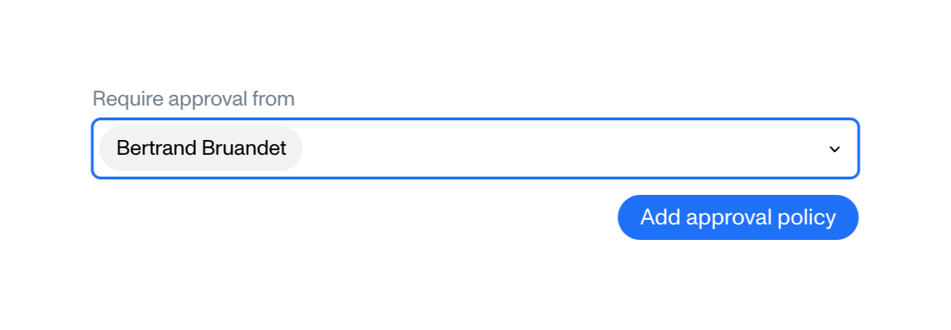
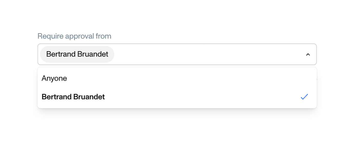
An open dropdown menu for selecting an approver. The input field shows a selected user as a pill, and the open menu below lists available options with a checkmark indicating the current selection.
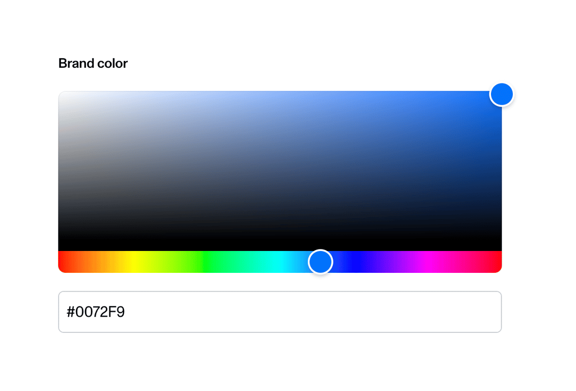
A color picker component allowing users to select a brand color. It features a saturation/lightness area, a hue slider, and a hex code input field.
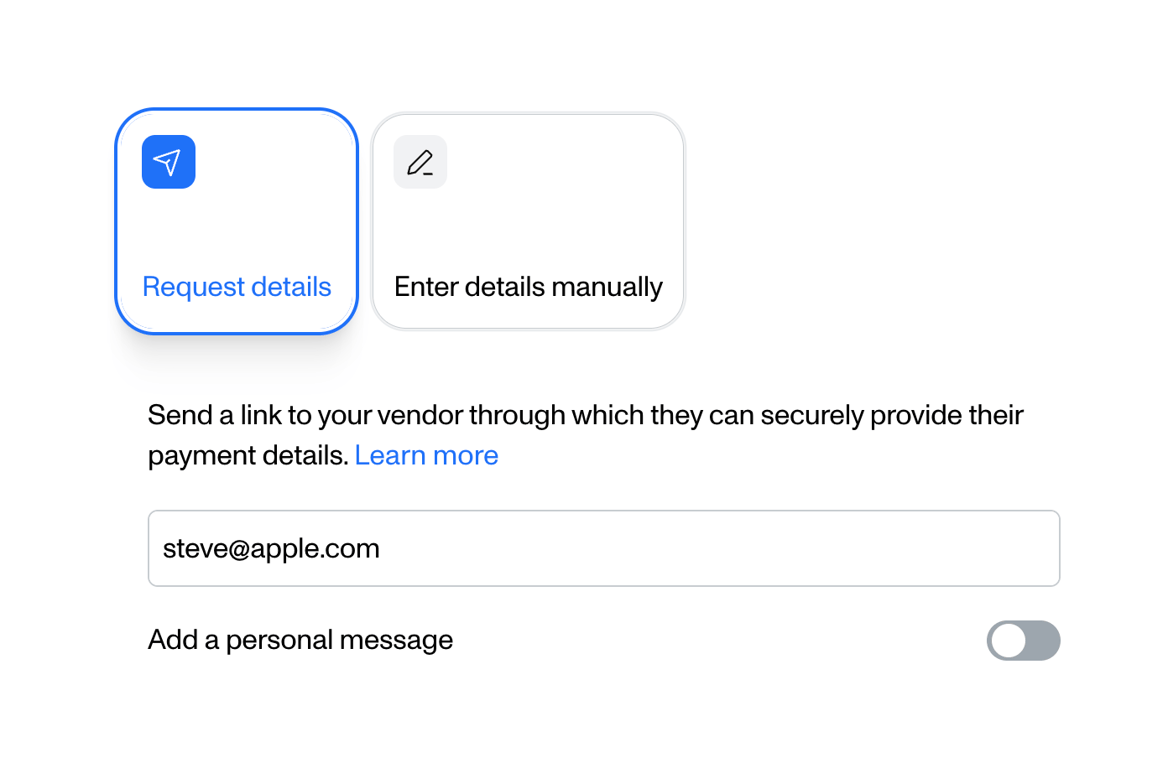
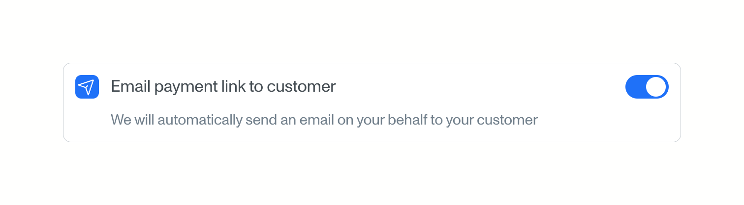
A toggle switch component within a bordered card, featuring an icon, a primary label, and a secondary description text. The toggle is currently in the active (on) state.
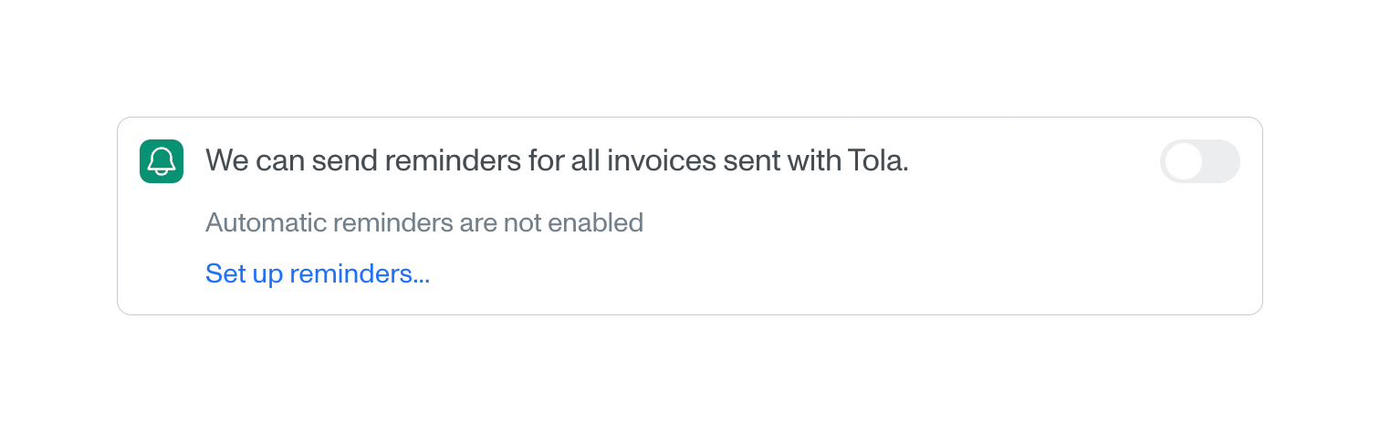
A card containing a toggle switch to enable automatic invoice reminders, along with a status message and a link to set them up.
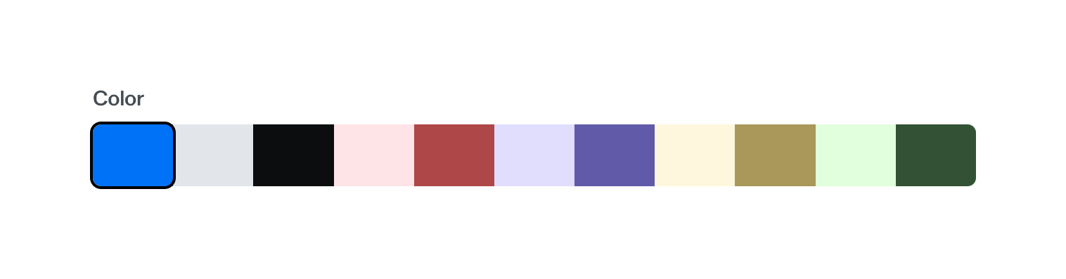
A horizontal row of color swatches allowing the user to select a brand color. The first swatch is currently selected, indicated by a black border.
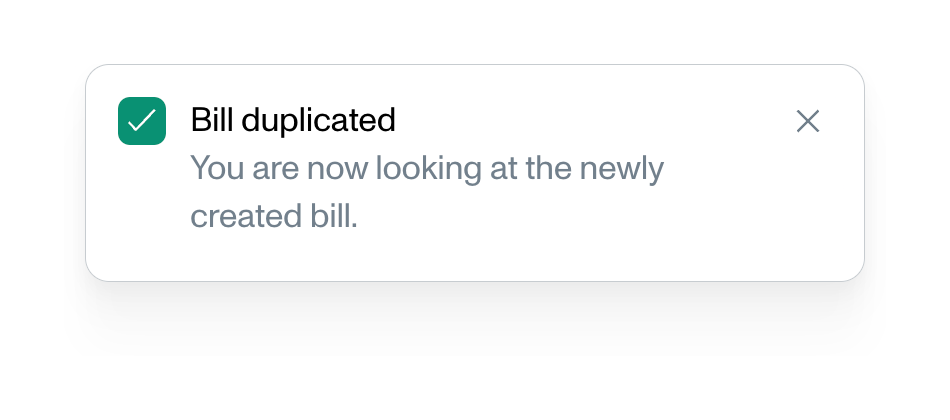
A success toast notification confirming that a bill has been duplicated, with a brief explanatory message and a close button.
Browse the full component library
Browse the full UI component library.
Trusted by the best teams







