Swell UI components examples
Browse Swell UI component design examples. Preview individual interface elements and explore related component categories. Next-level ecommerce for everyone
Explore the examples

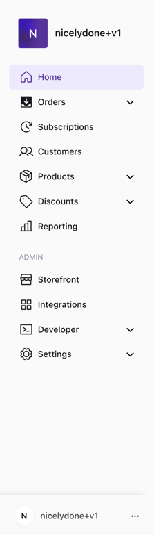

A vertical sidebar navigation menu for an admin dashboard, featuring a logo, primary navigation links with icons, an 'Admin' section, and a user profile/workspace switcher at the bottom.
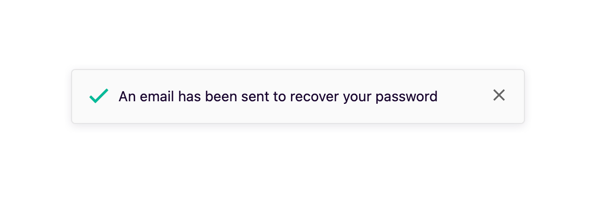
A toast notification confirming that a password recovery email has been sent.
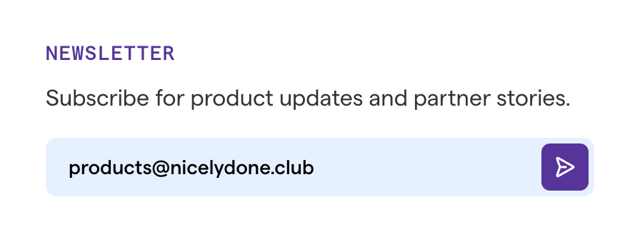
A simple newsletter subscription form with a heading, descriptive text, and an email input field featuring an inline submit button.
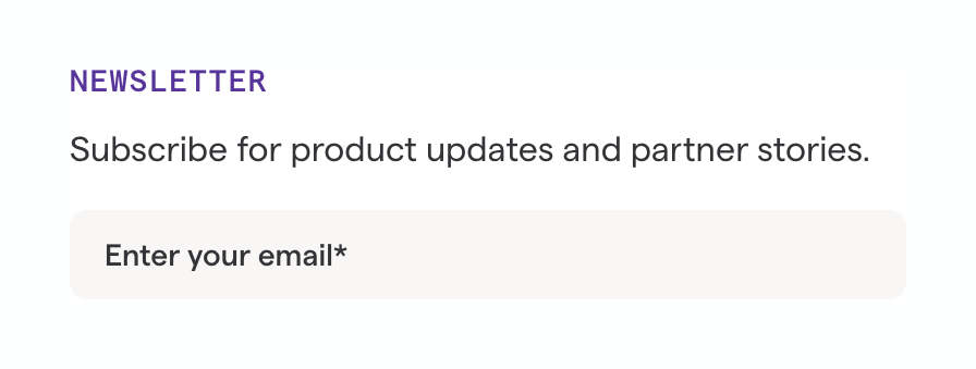
A simple newsletter subscription form featuring an eyebrow heading, a descriptive text, and an email input field.
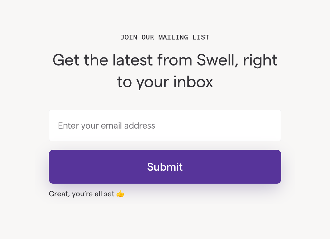
A centered newsletter signup form with an eyebrow, headline, email input field, submit button, and a success message.
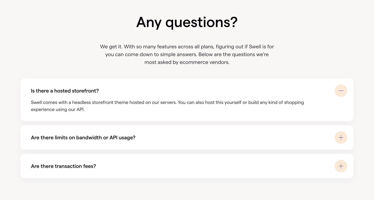
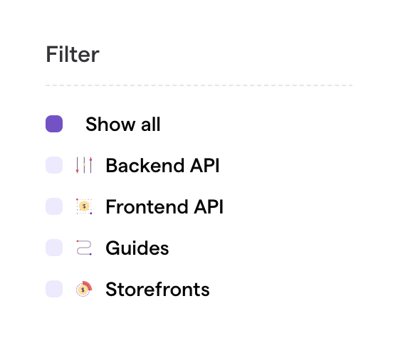
A vertical list of filter options with custom checkbox-like indicators and icons.
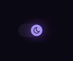
A pill-shaped switch component used to toggle between light and dark themes. The switch is currently in the active state, displaying a moon icon to indicate dark mode is enabled.
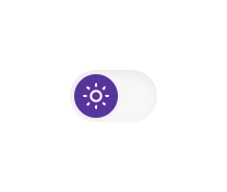
A pill-shaped toggle switch used to change the interface theme, currently showing a sun icon indicating light mode is active.
Browse the full component library
Browse the full UI component library.
Trusted by the best teams







