Skip to content

Standards UI components examples

Browse Standards UI component design examples. Preview individual interface elements and explore related component categories. Online brand guidelines for design today for design today

Explore the examples
Standards — Input text component
Standards logo
Standards

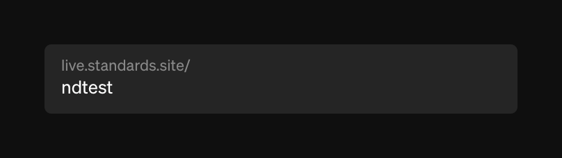
A dark-themed text input field displaying a base URL and an editable slug.

Standards — Segmented control component
Standards logo
Standards

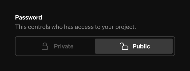
A segmented control for selecting project privacy, with options for Private and Public.
Standards — Color picker component
Standards logo
Standards

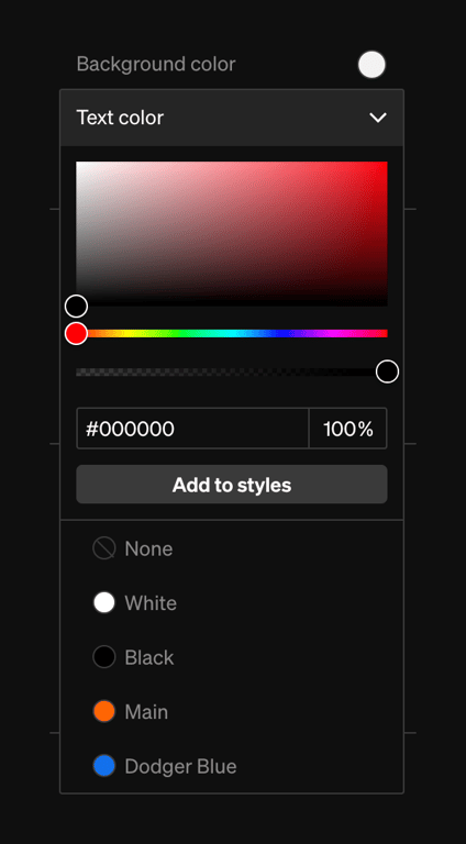
A dark-themed color picker panel with a gradient area, hue and opacity sliders, hex input, and a list of saved color swatches.
Standards — Segmented control component
Standards logo
Standards

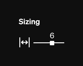
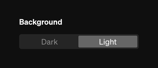
A segmented control to toggle the background theme between Dark and Light modes.
Standards — Toolbox component
Standards logo
Standards

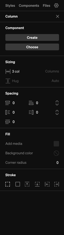
A dark-themed sidebar panel for editing layout properties like sizing, spacing, fill, and stroke.

Standards — Vertical navigation component
Standards logo
Standards

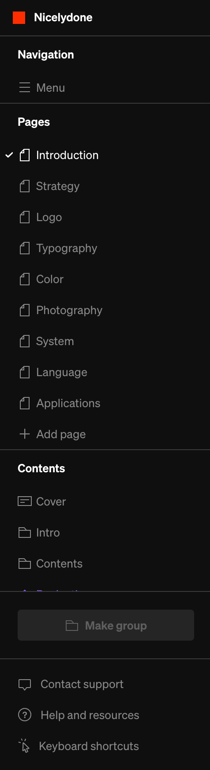
A dark-themed vertical sidebar navigation menu with sections for Navigation, Pages, Contents, and support links.

Standards — Horizontal navigation component
Standards logo
Standards

A dark-themed top navigation bar for a design editor, featuring a logo, tool selection, view toggles, and a publish button.
Standards — Toggle/Switch component
Standards logo
Standards

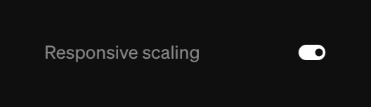
A toggle switch with a label for enabling or disabling responsive scaling.

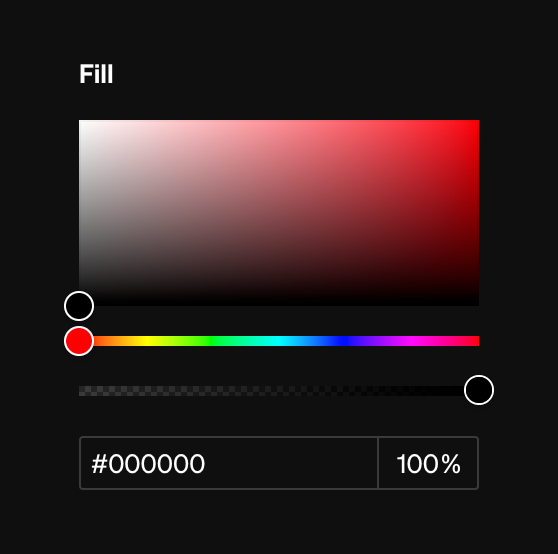
Standards — Color picker component
Standards logo
Standards

A dark-themed color picker interface featuring a saturation/brightness area, hue and opacity sliders, and hex/opacity input fields.
Standards — Stepper component
Standards logo
Standards

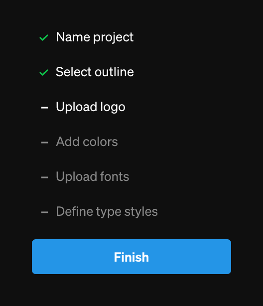
A vertical stepper component showing progress through a project setup flow. Completed steps have green checkmarks, the current step is white, and future steps are muted. A blue Finish button sits at the bottom.

Standards — Stepper component
Standards logo
Standards

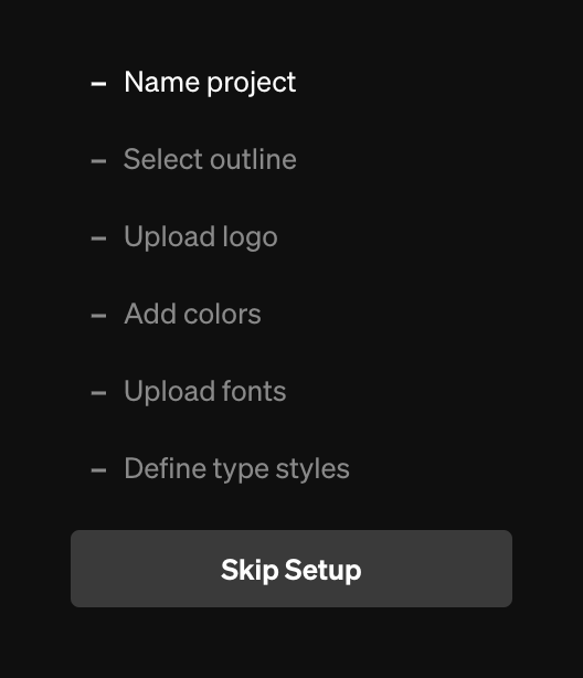
A vertical stepper showing the stages of a project setup wizard, with the first step active and subsequent steps muted. A 'Skip Setup' button is provided at the bottom.

Browse the full component library

Browse the full UI component library.

Trusted by the best teams