Scribe UI components examples
Browse Scribe UI component design examples. Preview individual interface elements and explore related component categories. Turn any process into a step-by-step guide, instantly
Explore the examples

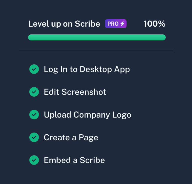

A completed onboarding checklist showing a 100% progress bar and a list of completed tasks with green checkmarks.
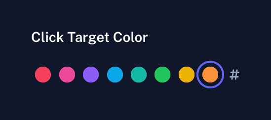
A horizontal row of circular color swatches under the label 'Click Target Color'. The orange swatch is currently selected, indicated by an outer ring. A hash symbol icon sits at the end of the row, likely to open a custom hex code input.
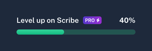
A progress bar showing 40% completion, accompanied by a 'Level up on Scribe' label and a 'PRO' badge with a lightning bolt icon.
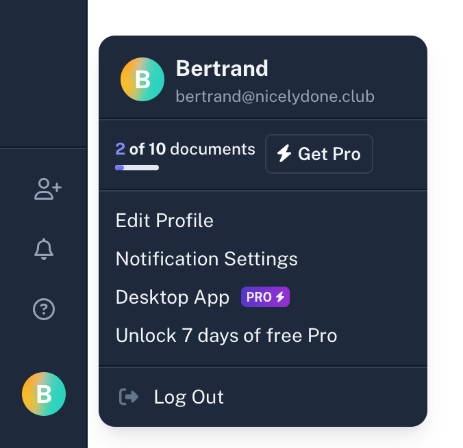
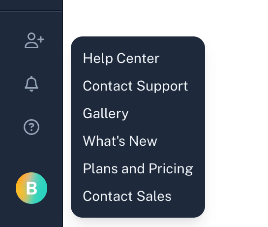
A dark-themed dropdown menu originating from a help icon in a sidebar, displaying various support and information links.
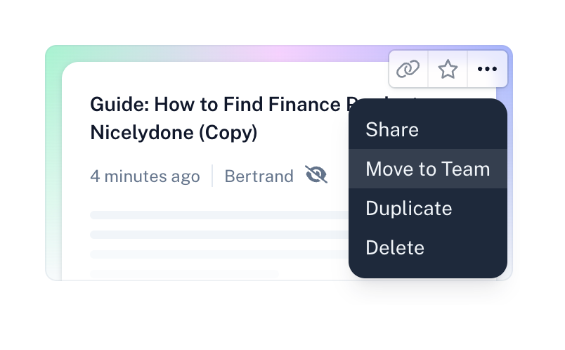
A document card displaying a title, metadata, and a top-right action bar. The 'more' icon is clicked, opening a dark dropdown menu with actions like Share, Move to Team, Duplicate, and Delete.
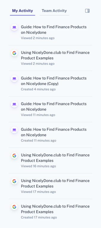
A list of recent user activity, showing viewed and created guides with timestamps. It includes tabs to switch between personal and team activity.

A top navigation bar for a document view, featuring a back button, logo, user avatar, and action buttons for editing and sharing.
Browse the full component library
Browse the full UI component library.
Trusted by the best teams







