Skip to content

Latitude UI components examples

Browse Latitude UI component design examples. Preview individual interface elements and explore related component categories. The data workspace for startups

Explore the examples
Latitude — Card component
Latitude logo
Latitude

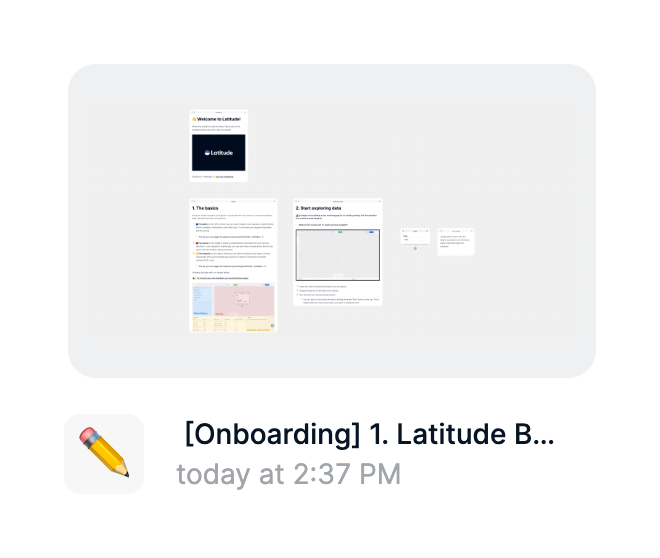
A card displaying a preview thumbnail of an app along with its title, an icon, and the last modified timestamp.

Latitude — Vertical navigation component
Latitude logo
Latitude

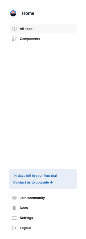
A vertical sidebar navigation menu featuring a logo, primary navigation links, a trial status banner, and secondary utility links at the bottom.
Latitude — FAQ component
Latitude logo
Latitude

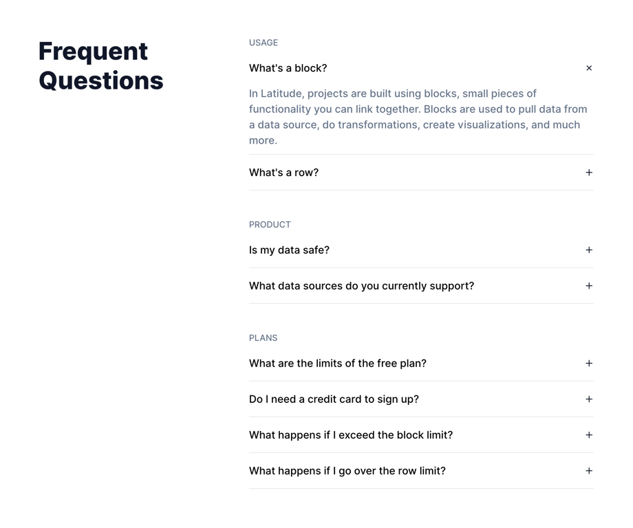
A frequently asked questions section organized into categories (Usage, Product, Plans). The first question under Usage is expanded, showing its answer, while the rest are collapsed.

Latitude — Bento box component
Latitude logo
Latitude

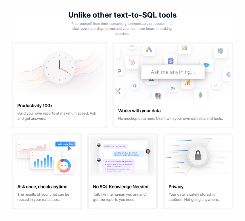
A feature section using a bento grid layout to highlight product benefits. It includes a section title and description, followed by a grid of five cards. Each card features a custom illustration, a bold title, and a brief description.

Latitude — Segmented control component
Latitude logo
Latitude

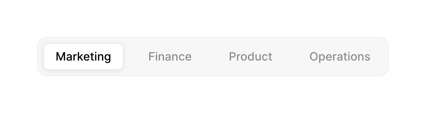
A horizontal segmented control with four options: Marketing, Finance, Product, and Operations. The 'Marketing' option is currently selected, indicated by a white pill background.
Latitude — FAQ component
Latitude logo
Latitude

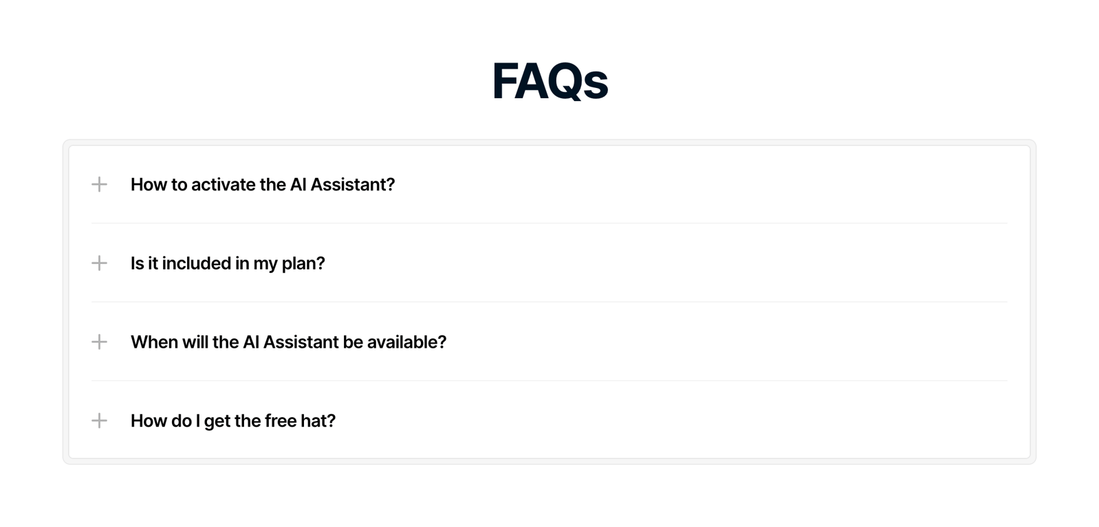
A frequently asked questions section featuring a list of collapsible items. Each item has a plus icon indicating it can be expanded to reveal more information.

Latitude — Card component
Latitude logo
Latitude

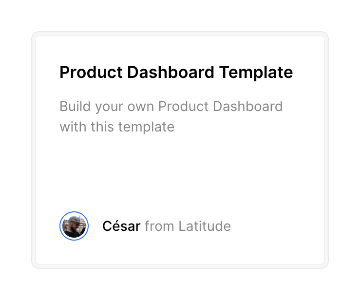
A card displaying a template title, a short description, and the author's avatar and name.

Latitude — Footer component
Latitude logo
Latitude

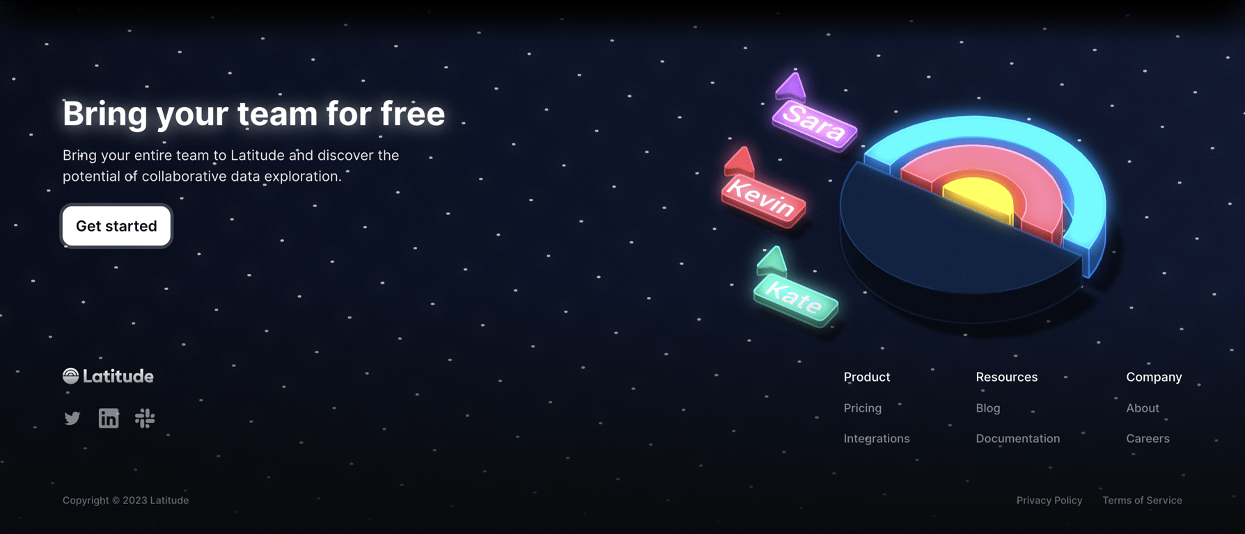
A dark-themed section combining a prominent call-to-action with a standard website footer. The CTA area features a headline, description, a 'Get started' button, and a 3D illustration of a chart with collaborative cursors. Below it, the footer includes a logo, social icons,…

Latitude — Header component
Latitude logo
Latitude

A standard website header featuring a logo on the left, a central navigation menu, and authentication buttons on the right.

Latitude — Button group component
Latitude logo
Latitude

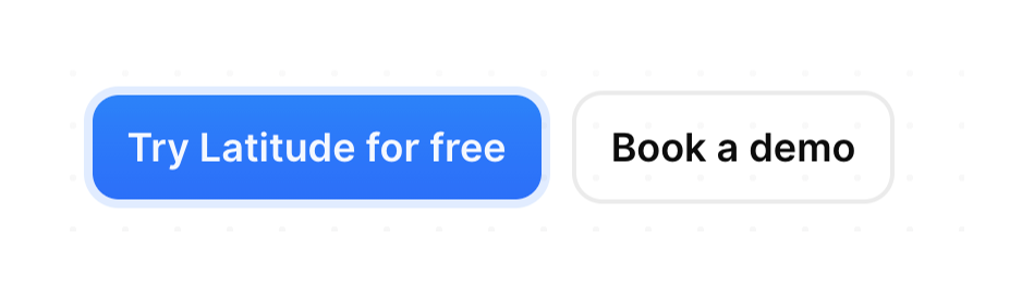
A pair of call-to-action buttons, one primary filled button and one secondary outlined button, set against a subtle dotted grid background.
Latitude — Illustration component
Latitude logo
Latitude

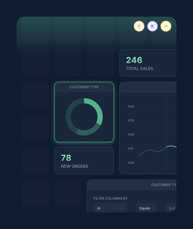
A stylized illustration of a dashboard grid featuring KPI cards, a donut chart, a line chart, and a filter panel, set against a dark background with glowing accents.
Latitude — Illustration component
Latitude logo
Latitude

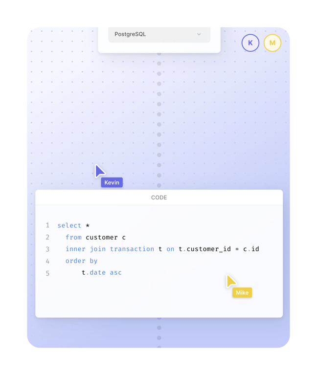
A stylized mockup of a collaborative SQL editor interface. It features a dotted background, a database selector dropdown at the top, user avatars indicating presence, and a central code editor window displaying a SQL query. Two custom cursors with user names ('Kevin' and…

Browse the full component library

Browse the full UI component library.

Trusted by the best teams