Help Scout UI components examples
Browse Help Scout UI component design examples. Preview individual interface elements and explore related component categories. Shared Inbox, Help Center, & Live Chat Software
Explore the examples


A toggle switch to enable or disable two-factor authentication, currently in the off state.

A horizontal stepper showing four numbered stages of a workflow creation process.
A small, rounded rectangular badge with a solid blue background and white text indicating a 'DRAFT' status.
A small, rounded rectangular badge with a solid gray background and white text indicating an 'UNPUBLISHED' status.
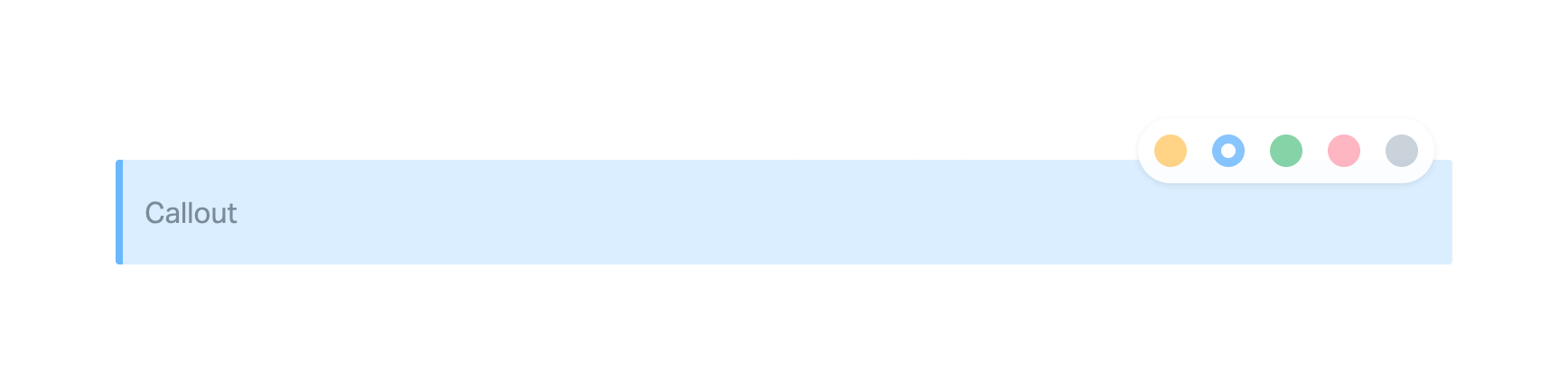
A callout block in a content editor with a floating color picker menu to change its background color.
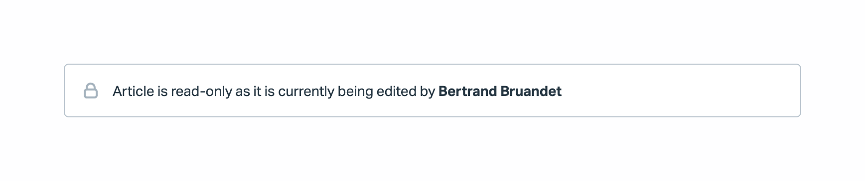
An inline alert notifying the user that the article is read-only because another user is editing it.

A stylized illustration of a green foam finger pointing up, surrounded by colorful confetti.
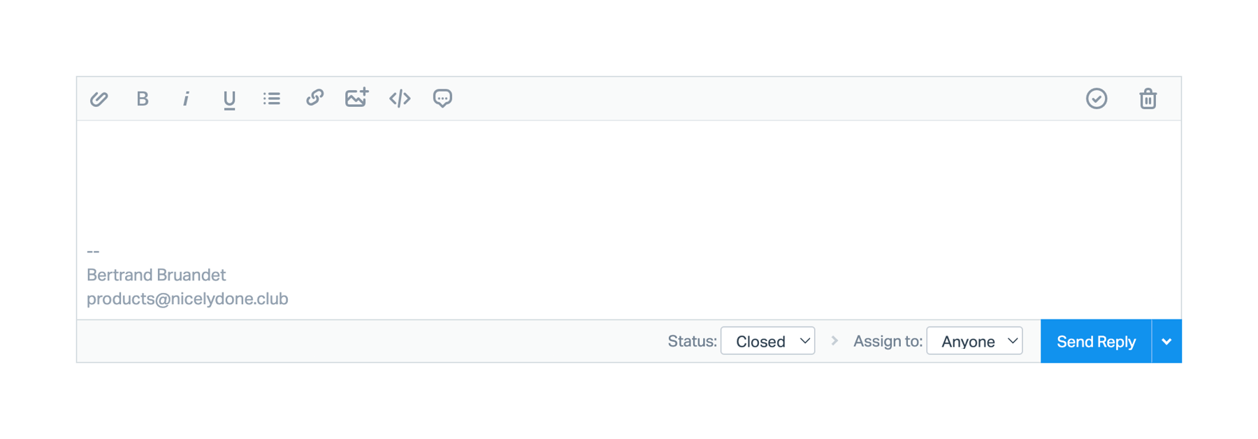
A rich text editor for drafting a reply, featuring a formatting toolbar, a text area with an email signature, and a bottom action bar with status and assignment dropdowns alongside a primary send button.

A vertical stepper component used for onboarding, displaying a list of tasks with icons and status indicators. The first task is marked as completed.

A simple horizontal row displaying the text 'Setup Guide' next to a pill-shaped badge indicating progress ('1 of 5').

A full-width top navigation bar featuring a logo, primary navigation links with dropdowns, a setup guide progress indicator, utility icons, and a user avatar.
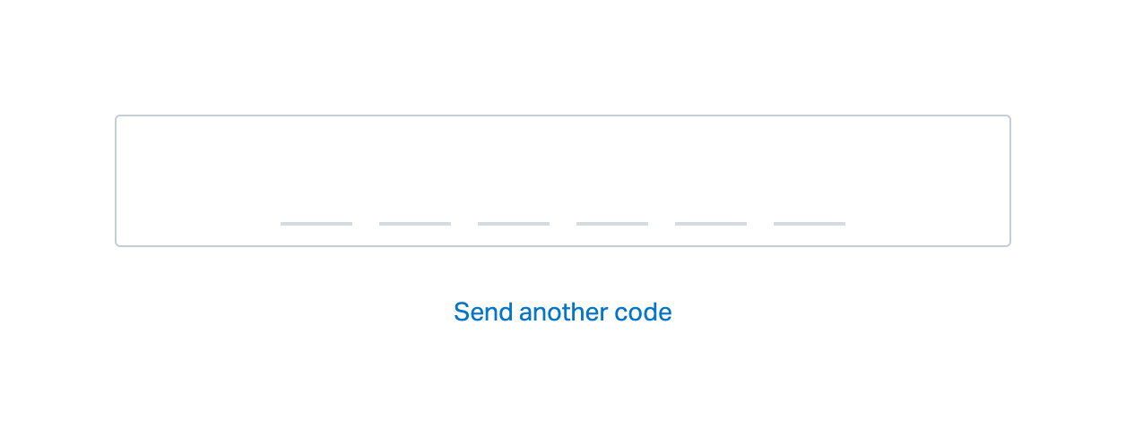
A 6-digit one-time password (OTP) input field with a 'Send another code' link below it.
Browse the full component library
Browse the full UI component library.
Trusted by the best teams







