Skip to content

Harvest UI components examples

Browse Harvest UI component design examples. Preview individual interface elements and explore related component categories. Time tracking software with invoicing

Explore the examples
Harvest — Alert component
Harvest logo
Harvest

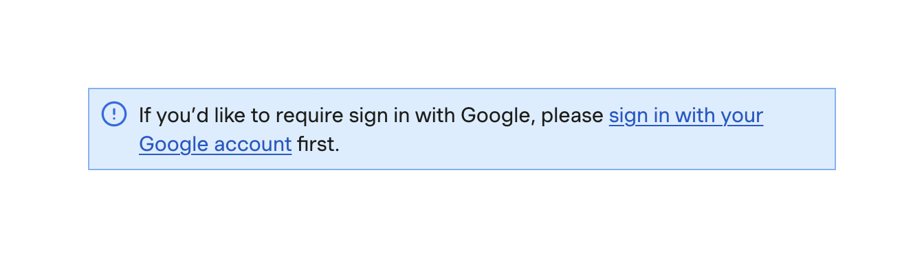
An inline informational alert box with a blue background, an exclamation icon, and a message containing a text link.

Harvest — Color picker component
Harvest logo
Harvest

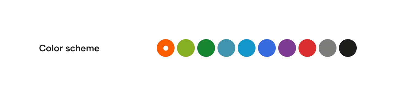
A horizontal row of circular color swatches used to select a color scheme. The currently selected color is indicated by a white dot in the center of the swatch.
Harvest — Table component
Harvest logo
Harvest

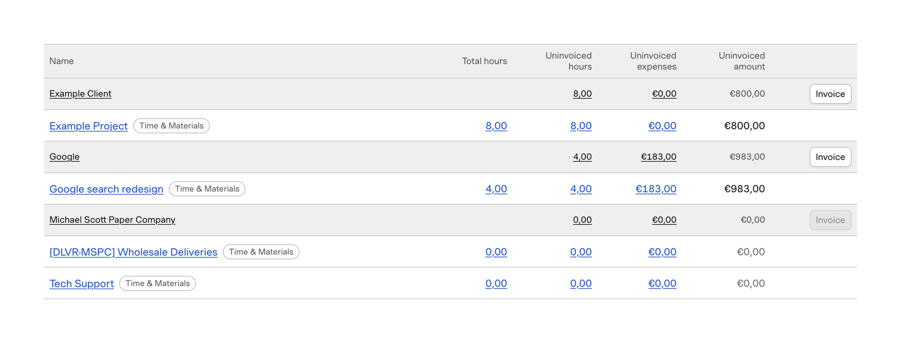
A data table displaying uninvoiced hours and expenses grouped by client and project. It includes columns for total hours, uninvoiced hours, uninvoiced expenses, and uninvoiced amount, with action buttons to generate invoices for specific clients.

Harvest — Tabs component
Harvest logo
Harvest

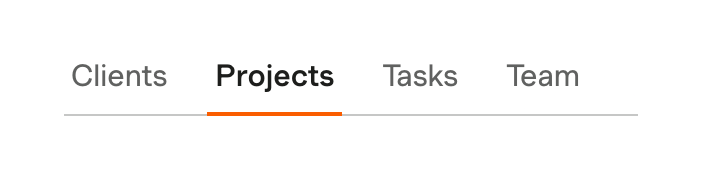
A horizontal row of text tabs with an underline indicator for the active state.

Harvest — Datepicker component
Harvest logo
Harvest

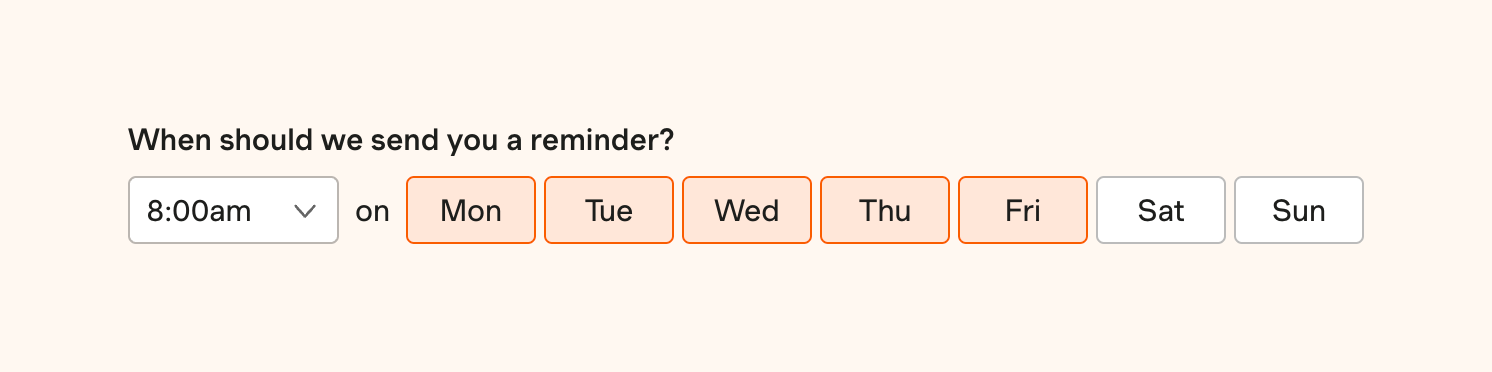
A form section allowing users to select a time and specific days of the week for receiving reminders. It features a dropdown for time selection and a toggle group of buttons for each day of the week.
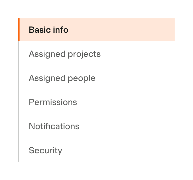
Harvest — Vertical navigation component
Harvest logo
Harvest

A vertical navigation menu for a settings page. The active item is highlighted with a light orange background and a thick orange left border.
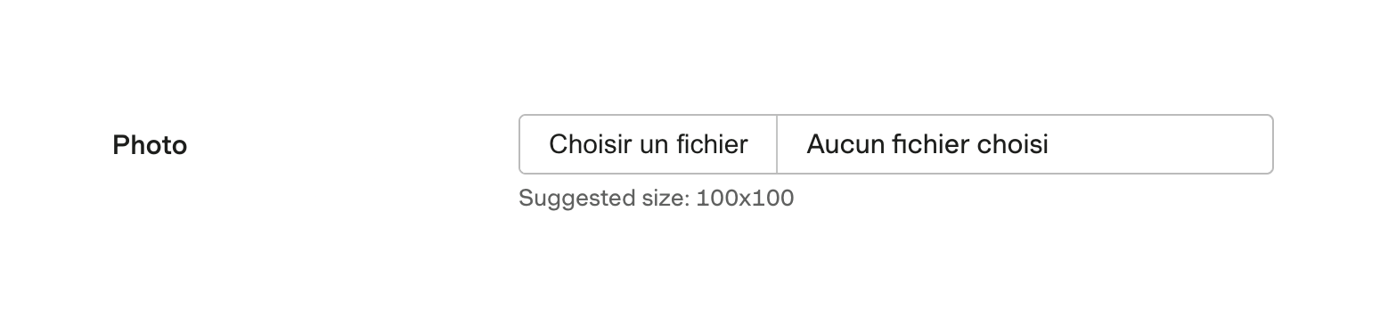

Harvest — File upload input component
Harvest logo
Harvest

A standard file upload input field with a label and helper text.

Harvest — Input tag component
Harvest logo
Harvest

A form field for assigning roles, displaying a selected role as a tag with a remove icon. Includes a label and helper text.

Harvest — Charts component
Harvest logo
Harvest

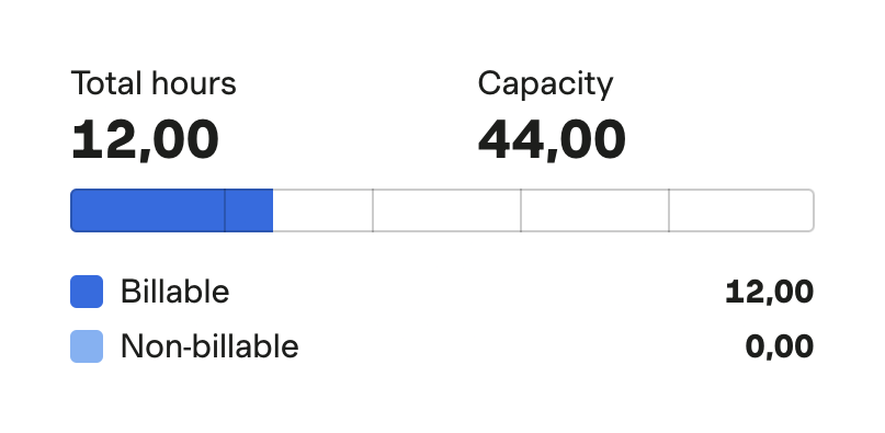
A progress bar showing total hours worked against capacity, with a breakdown of billable and non-billable hours.

Harvest — Charts component
Harvest logo
Harvest

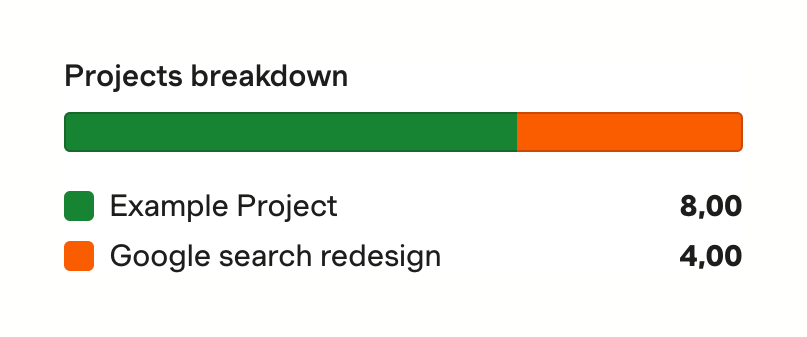
A stacked horizontal bar chart showing a breakdown of projects with a legend below.

Harvest — Checkbox & radio component
Harvest logo
Harvest

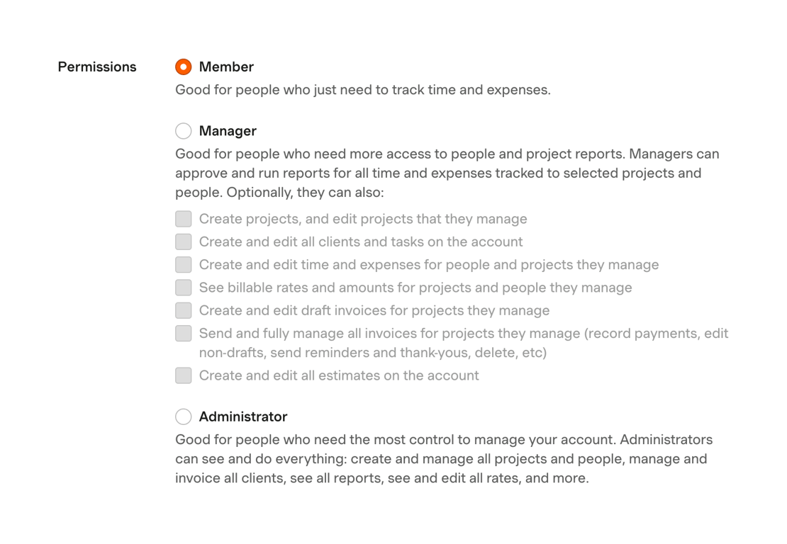
A form section for selecting user permissions. It features a radio group with three main roles: Member, Manager, and Administrator. The Manager option includes a nested list of disabled checkboxes for further configuration.
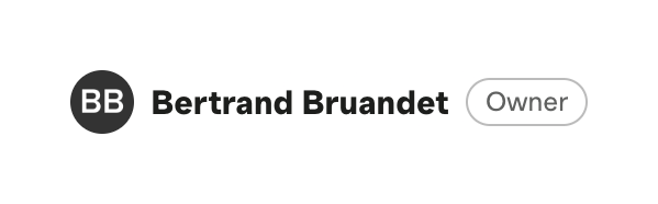
Harvest — Avatar component
Harvest logo
Harvest

A horizontal row displaying a user's initials avatar, full name, and a role badge.

Browse the full component library

Browse the full UI component library.

Trusted by the best teams