Flora UI components examples
Browse Flora UI component design examples. Preview individual interface elements and explore related component categories. Your creative environement
Explore the examples
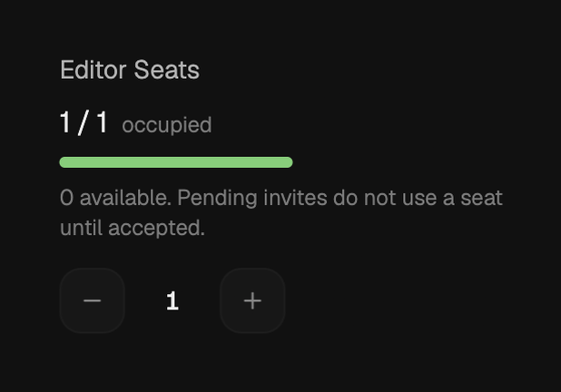
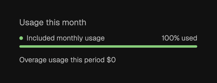

Display of monthly usage statistics with a progress bar indicating 100% usage.
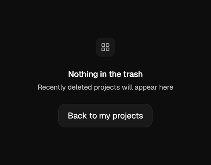
An empty state screen for a trash or recently deleted projects section, featuring a central icon, a main heading, a descriptive subtitle, and a call-to-action button.
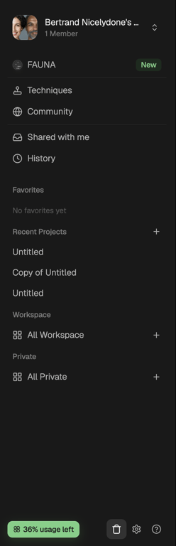
A vertical navigation sidebar displaying user profile, main menu items, project lists, workspace categories, and utility actions with a usage indicator.
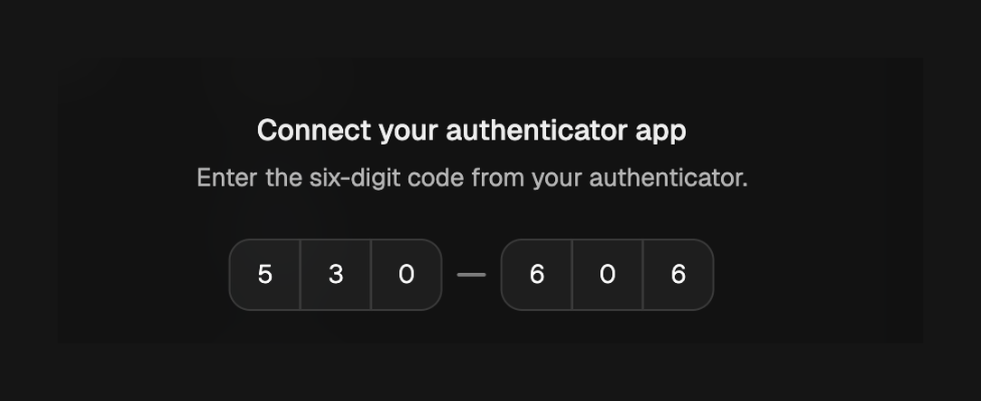

A dark mode application interface featuring a vertical navigation bar, a header with a title and user name, and a usage indicator at the bottom.

A top navigation bar with a back button and a persistent alert banner indicating low account credits with options to get more or upgrade.
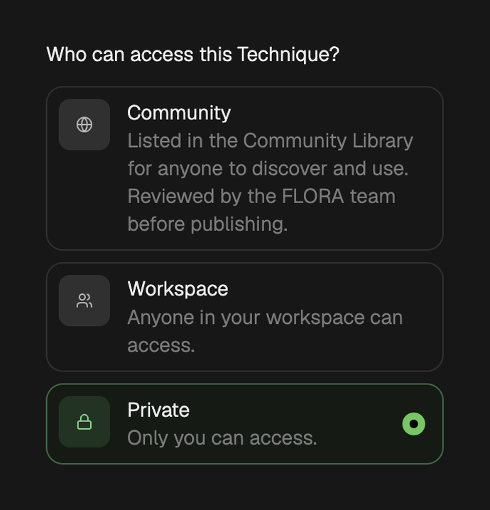
A user interface for setting access permissions for a technique, offering community, workspace, and private options.
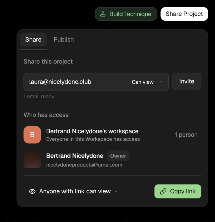
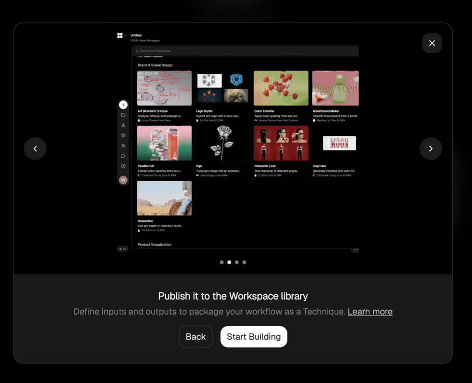
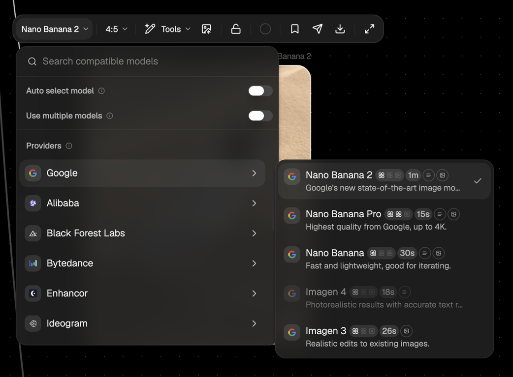
A dark mode interface displaying a dropdown menu for model selection and a list of providers, alongside a separate popover showing different model options with their details.
Browse the full component library
Browse the full UI component library.
Trusted by the best teams







