Dona UI components examples
Browse Dona UI component design examples. Preview individual interface elements and explore related component categories. A more humane to-do list
Explore the examples
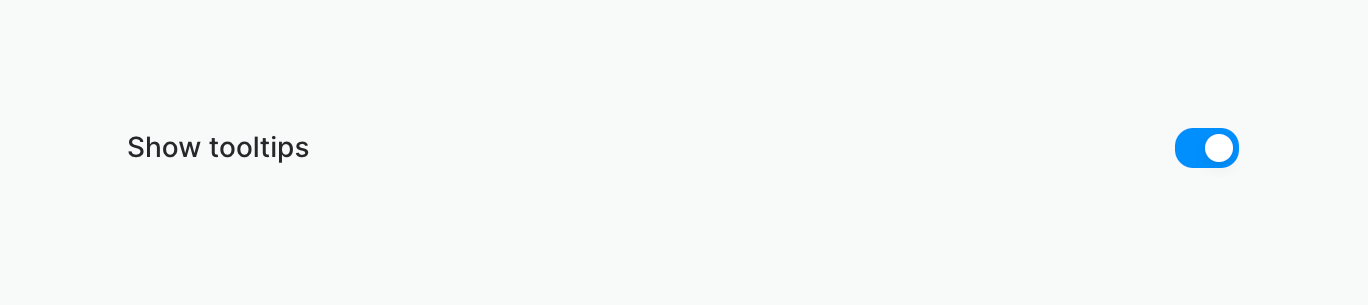

A horizontal row containing a text label and a toggle switch, currently in the active state.
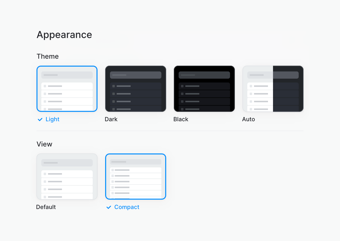
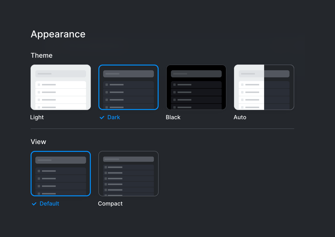
A settings panel for configuring the app's appearance, featuring visual cards for selecting the theme (Light, Dark, Black, Auto) and view density (Default, Compact).
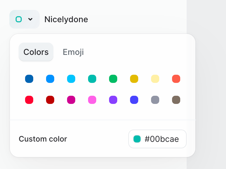
A popover menu allowing users to select a color or emoji for a list. It features tabs for 'Colors' and 'Emoji', a grid of preset color swatches, and an input field for a custom hex color code.
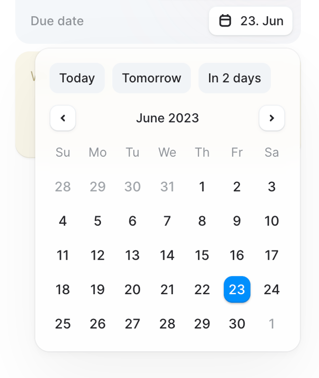
A date picker popover displaying a calendar for June 2023 with quick selection buttons for Today, Tomorrow, and In 2 days. The 23rd of June is currently selected.
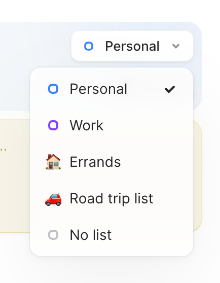
An open dropdown menu allowing the user to select a list category for a task. The current selection is 'Personal', indicated by a checkmark.
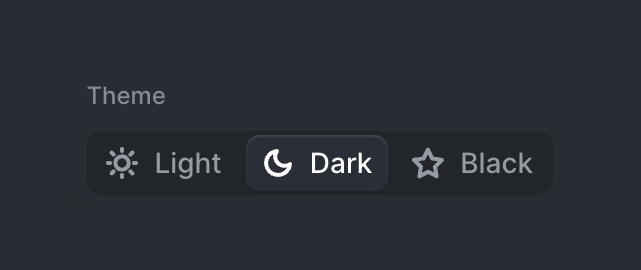
A segmented control for selecting the application theme, with options for Light, Dark, and Black. The 'Dark' option is currently selected.
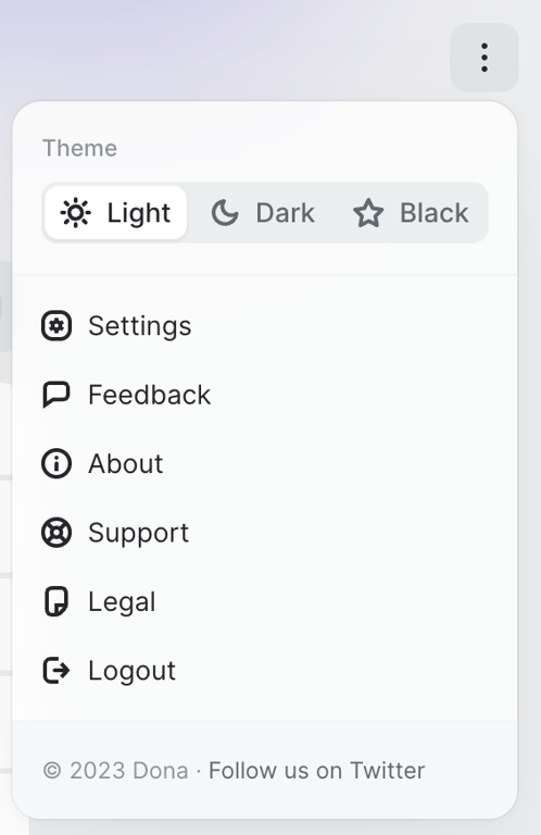
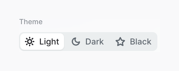
A segmented control for selecting the application theme, with options for Light, Dark, and Black.
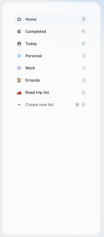
A vertical navigation sidebar showing task lists with item counts and a selected state for the Home item.


Browse the full component library
Browse the full UI component library.
Trusted by the best teams







