Skip to content

Discord UI components examples

Browse Discord UI component design examples. Preview individual interface elements and explore related component categories. Your place to talk and hang out

Explore the examples
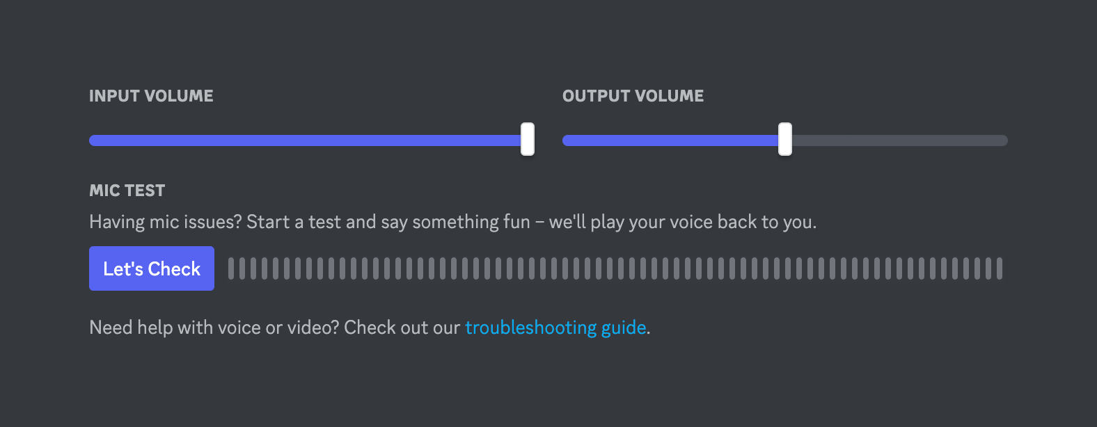
Discord — Slider component
Discord logo
Discord

A settings panel for adjusting input and output volume using sliders, and a mic test section with a button and a visual audio level indicator.

Discord — Slider component
Discord logo
Discord

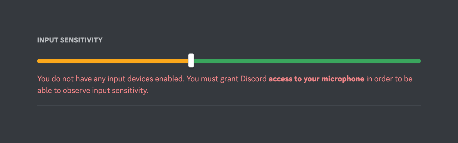
A slider component used to adjust input sensitivity, currently displaying an error message indicating no input devices are enabled.

Discord — Slider component
Discord logo
Discord

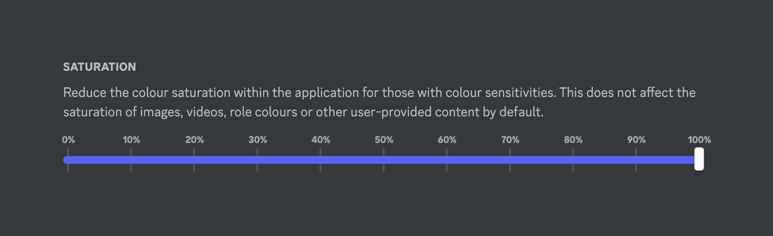
A slider control for adjusting color saturation, featuring a title, descriptive text, and a track with percentage markers from 0% to 100%.

Discord — Badge component
Discord logo
Discord

A small, pill-shaped badge indicating a beta feature.

Discord — Alert component
Discord logo
Discord

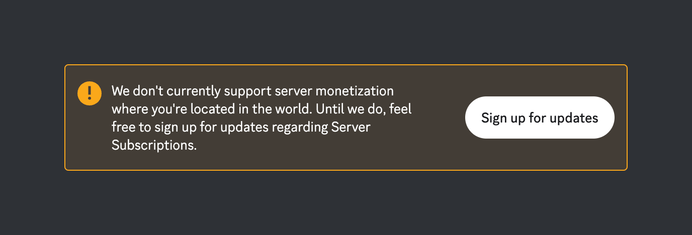
A warning alert banner informing the user that server monetization is not supported in their location, with a call to action to sign up for updates.

Discord — Alert component
Discord logo
Discord

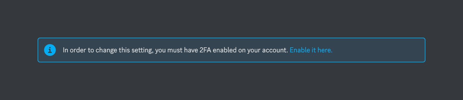
An inline informational alert box with an icon, a message, and a text link.

Discord — Click to copy component
Discord logo
Discord

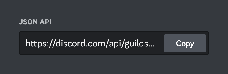
A read-only input field displaying a truncated JSON API URL with an inline Copy button.
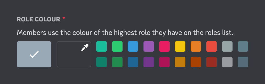
Discord — Color picker component
Discord logo
Discord

A color picker component for selecting a role color. It includes a label, helper text, a default color option with a checkmark, a custom color picker button with an eyedropper icon, and a grid of predefined color swatches.
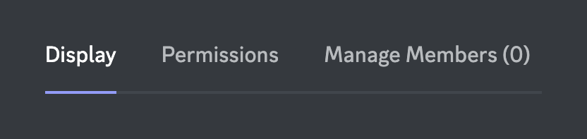
Discord — Tabs component
Discord logo
Discord

A horizontal tab navigation component with three options. The first tab is currently selected, indicated by a colored underline and brighter text.

Browse the full component library

Browse the full UI component library.

Trusted by the best teams