Cycle UI components examples
Browse Cycle UI component design examples. Preview individual interface elements and explore related component categories. Turn product feedback into customer love
Explore the examples
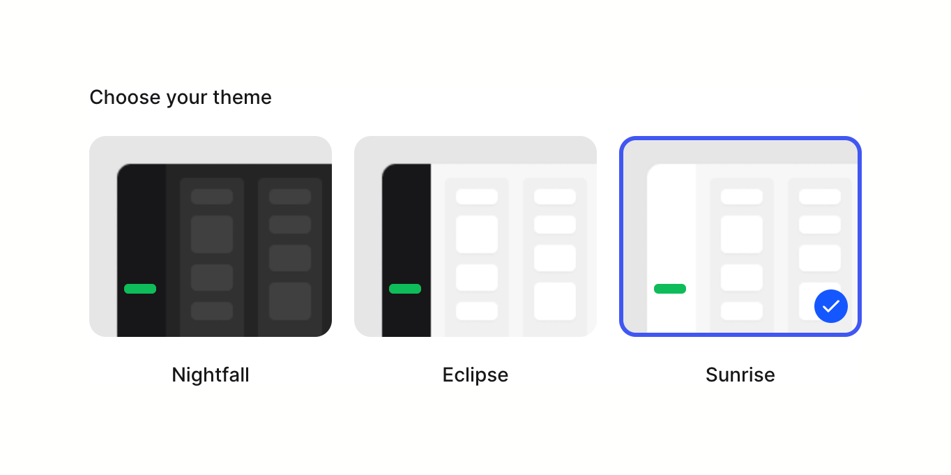

A radio group presenting three visual theme options (Nightfall, Eclipse, Sunrise) using thumbnail previews. The Sunrise option is currently selected, indicated by a blue border and a checkmark badge.

A form field section allowing users to view their current avatar and upload a new one.
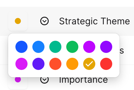
A popover displaying a grid of color swatches for selection. One swatch is currently selected, indicated by a checkmark.


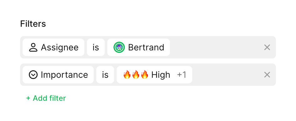
A filter builder component showing two active filter rules and an option to add more. Each rule consists of a property, an operator, and a value, displayed as inline chips within a gray container.
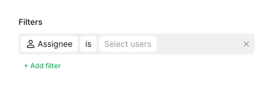
A single filter rule row within a filter builder, showing an active condition for 'Assignee is Select users' with an option to add more filters.

A horizontal row containing an icon, a label, and a toggle switch, used to enable or disable a specific setting.
Browse the full component library
Browse the full UI component library.
Trusted by the best teams







