Skip to content

Arcade UI components examples

Browse Arcade UI component design examples. Preview individual interface elements and explore related component categories. Create effortlessly beautiful demos in minutes

Explore the examples
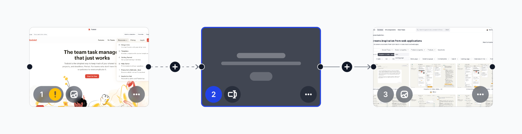
Arcade — Card component
Arcade logo
Arcade

A visual flow builder canvas showing three connected steps. The steps are represented by thumbnail cards with connection lines and 'add' buttons between them. The central card is selected, indicated by a blue border.

Arcade — Tooltip component
Arcade logo
Arcade

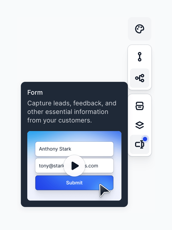
A dark-themed tooltip explaining a form feature, triggered by hovering over an icon in a vertical toolbar.

Arcade — Alert component
Arcade logo
Arcade

A small, rounded alert banner providing a helpful tip about pasting steps.

Arcade — Color picker component
Arcade logo
Arcade

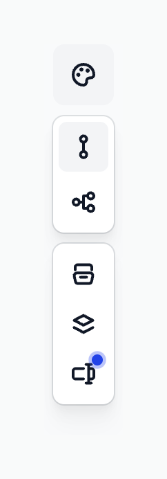
A vertical floating toolbar containing three distinct groups of icon buttons. The top group has a single palette icon. The middle group has two connection/sharing icons, with the top one selected. The bottom group has three icons for layout/layers, with the bottom one showing…


Arcade — Card component
Arcade logo
Arcade

A horizontal list item displaying a video collection with a checkbox, thumbnail, title, publish status dropdown, and an overflow menu.

Arcade — Breadcrumb component
Arcade logo
Arcade

A breadcrumb navigation component showing the current location within a workspace hierarchy. It features a folder icon button followed by the workspace name, a separator, and the current collection name.
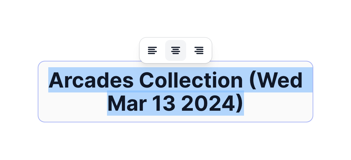
Arcade — Input text component
Arcade logo
Arcade

A floating toolbar with text alignment options positioned above a selected text input field.
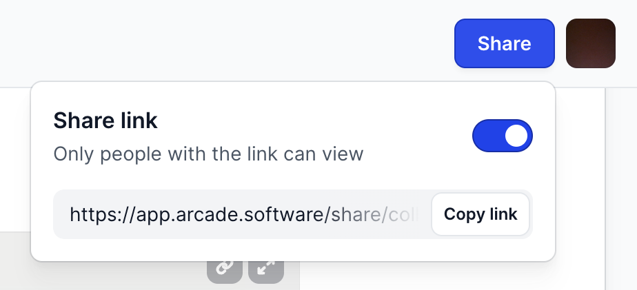
Arcade — Dropdown menu component
Arcade logo
Arcade

A popover menu triggered by a Share button, containing a toggle to enable link sharing and a read-only input field with a copy button.
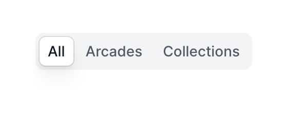
Arcade — Segmented control component
Arcade logo
Arcade

A segmented control with three options: All, Arcades, and Collections. The 'All' option is currently selected, indicated by a white background and border, while the unselected options have a transparent background.

Arcade — Progress indicator component
Arcade logo
Arcade

A card displaying the remaining days of a trial, a progress bar, and an upgrade button.
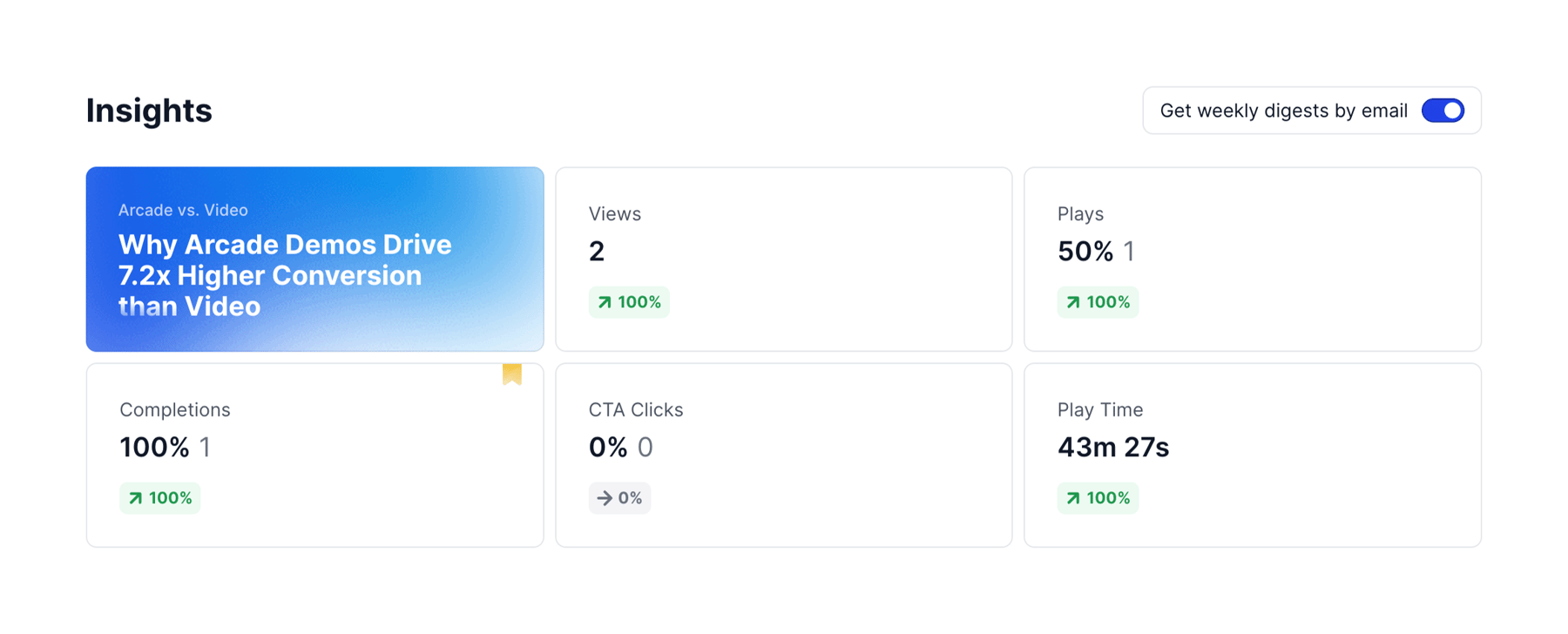
Arcade — Charts component
Arcade logo
Arcade

A grid of KPI cards displaying various metrics such as Views, Plays, Completions, CTA Clicks, and Play Time, alongside a prominent title card and a toggle for email digests.

Arcade — Accordion component
Arcade logo
Arcade

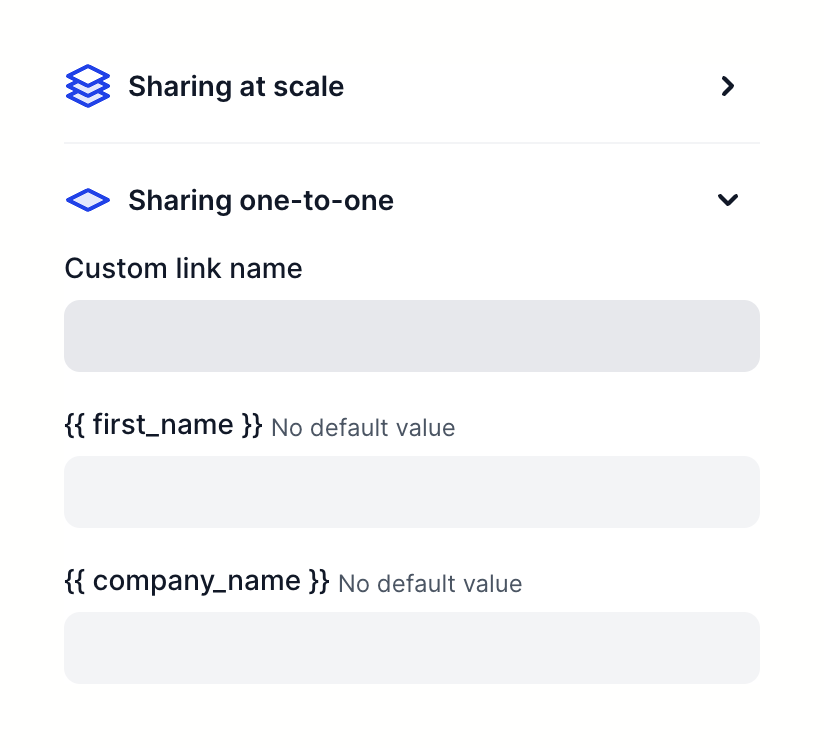
An accordion component with two sections for sharing settings. The first section is collapsed, and the second is expanded, revealing a form with three text inputs for custom link variables.

Browse the full component library

Browse the full UI component library.

Trusted by the best teams