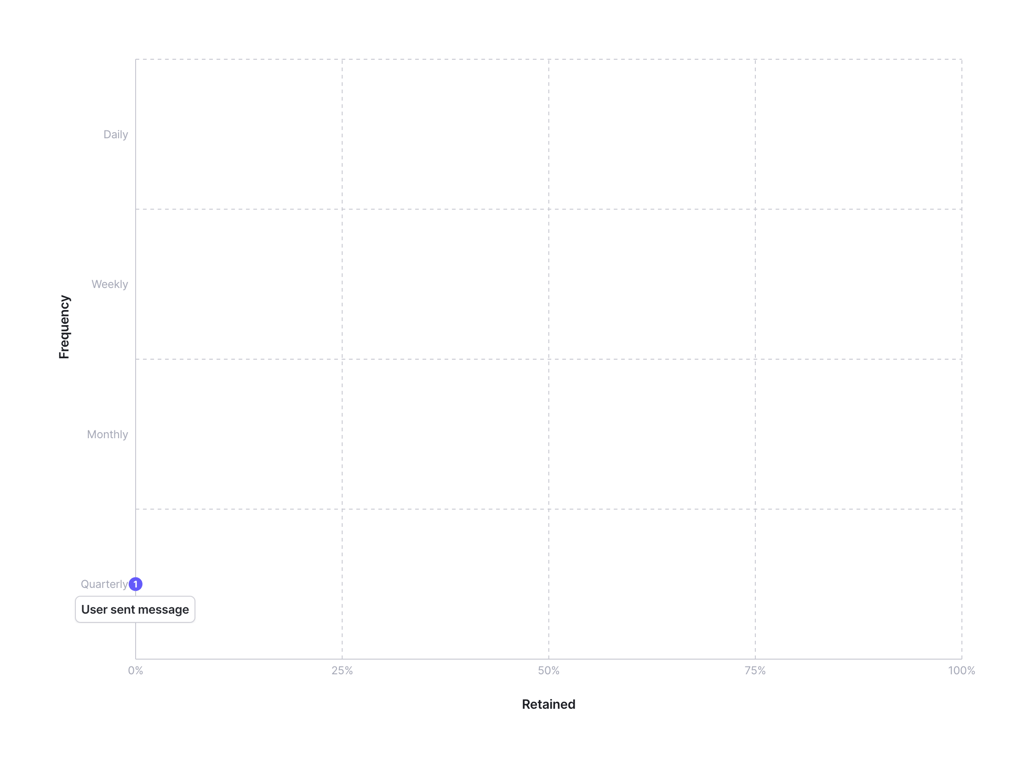
Feature Matrix Chart
A scatter plot or matrix chart visualizing feature usage frequency against retention. The y-axis represents frequency (Quarterly, Monthly, Weekly, Daily) and the x-axis represents retention percentage (0% to 100%). A single data point is visible, labeled 'User sent message' with a badge indicating '1'.
Explore the examples

Browse the full component library
Browse the full UI component library.
Trusted by the best teams