Skip to content

Scribe UI components examples

Browse Scribe UI component design examples. Preview individual interface elements and explore related component categories. Email signatures marketing on auto-pilot

Explore the examples
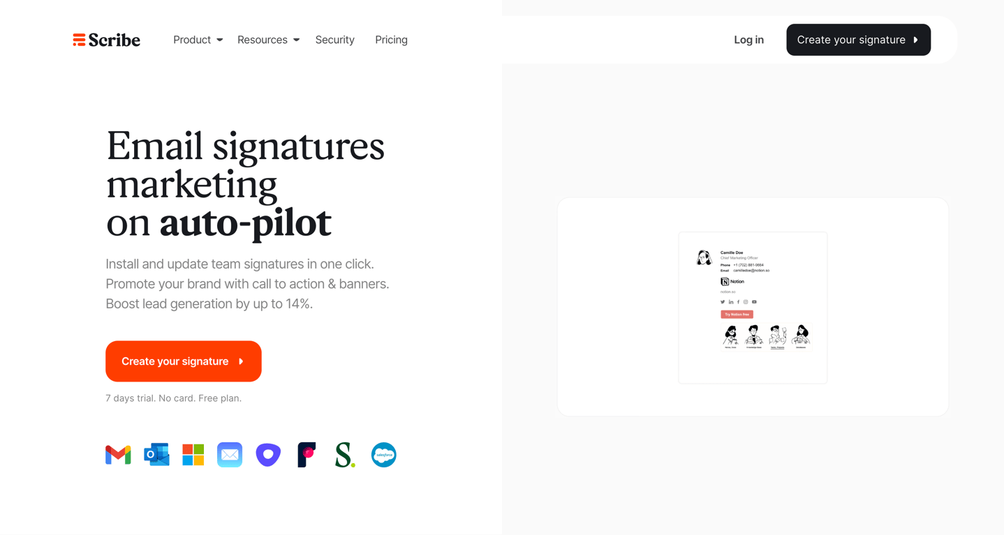
Scribe — Hero section component
Scribe logo
Scribe

A split-layout hero section featuring a large headline, descriptive subtext, a prominent call-to-action button, and a row of integration logos on the left. The right side displays a stylized preview of an email signature within a rounded container.
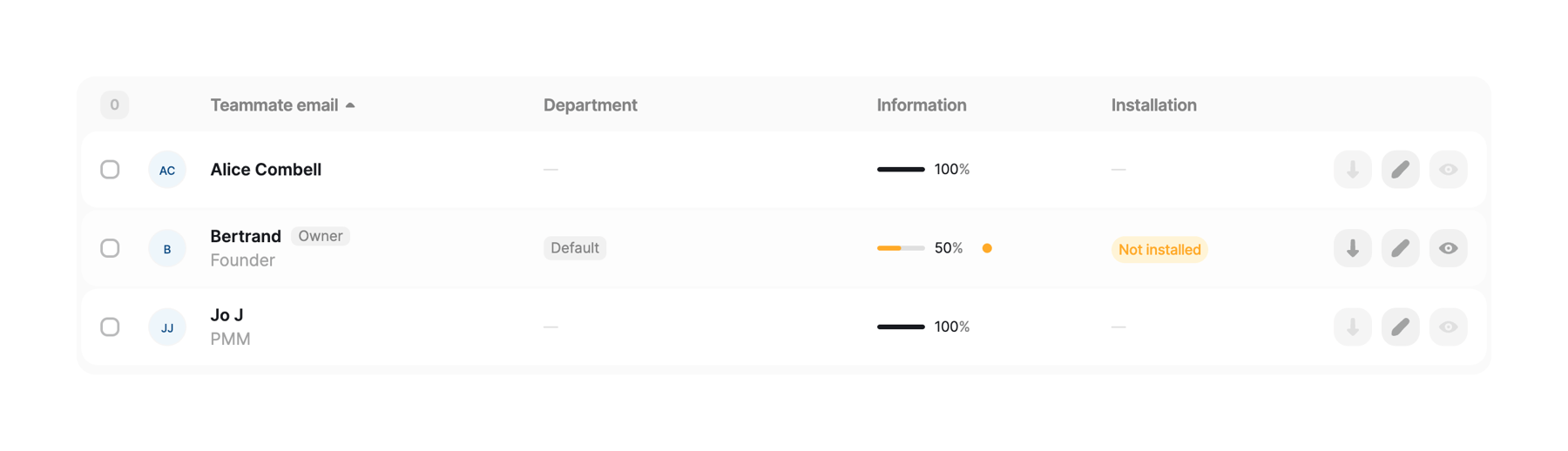

Scribe — Table component
Scribe logo
Scribe

A data table displaying a list of teammates with their email, department, information completion progress, and installation status. Each row includes a checkbox for selection, an avatar, and action icons for downloading, editing, and viewing.

Scribe — Charts component
Scribe logo
Scribe

A row of three KPI tiles displaying team statistics. Each tile shows a label and a large numeric value with a smaller denominator or percentage symbol.

Scribe — Alert component
Scribe logo
Scribe

A pill-shaped success toast notification confirming a teammate was created.

Scribe — Card component
Scribe logo
Scribe

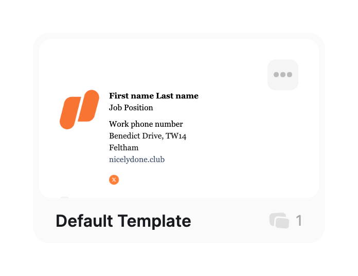
A card displaying a preview of an email signature template. It includes a logo, contact details, a more options menu, the template name, and a usage count.

Scribe — Bento box component
Scribe logo
Scribe

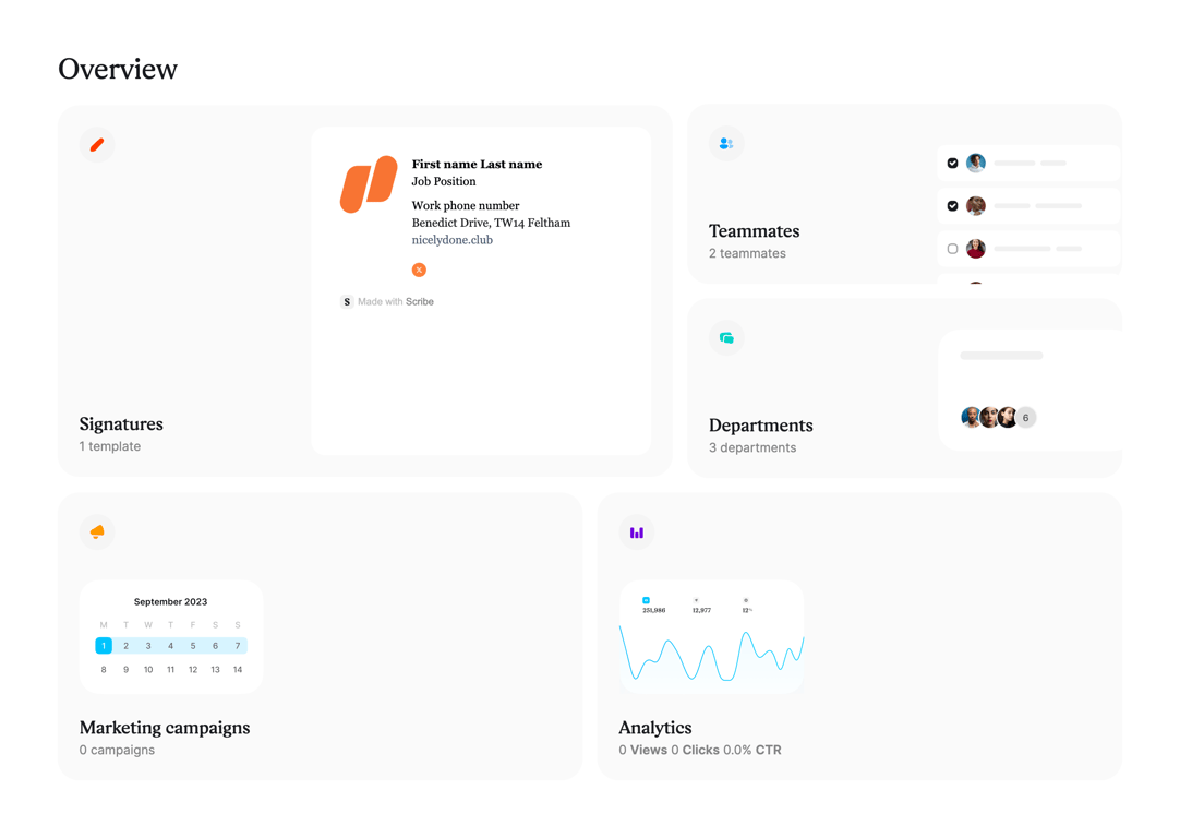
A bento grid layout displaying summary cards for Signatures, Teammates, Departments, Marketing campaigns, and Analytics. Each card features an icon, title, subtitle, and a visual preview of the content.

Scribe — Tabs component
Scribe logo
Scribe

A header section featuring a title, a time estimate badge, and a three-step horizontal progress indicator. The first step is currently active.

Scribe — Stepper component
Scribe logo
Scribe

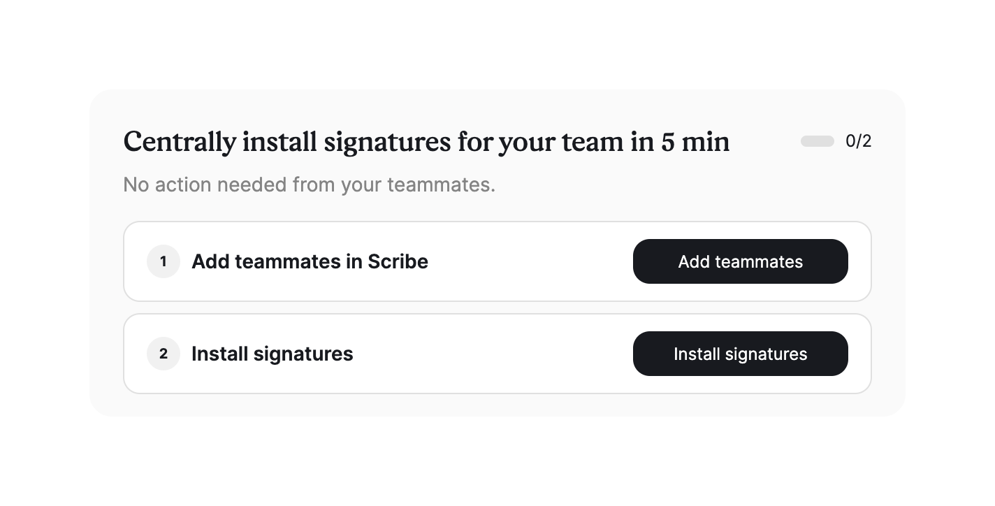
A card containing a two-step onboarding checklist. It features a header with a progress indicator and two distinct steps, each with a numbered badge, title, and an action button.

Scribe — Vertical navigation component
Scribe logo
Scribe

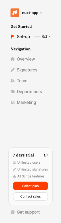
A vertical sidebar navigation menu featuring a workspace switcher, onboarding progress, main navigation links, a trial status card with upgrade options, and a support link.

Scribe — Social login button component
Scribe logo
Scribe

A sign-up section featuring a heading and two social login buttons for Google and Microsoft 365.
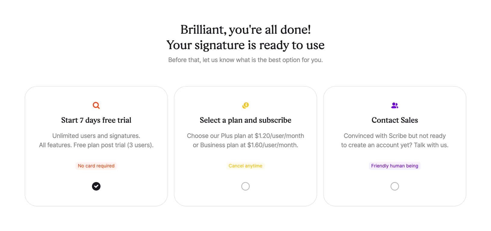
Scribe — Checkbox & radio component
Scribe logo
Scribe

A set of three selectable cards presenting different onboarding paths: starting a free trial, subscribing to a plan, or contacting sales. The first card is currently selected.
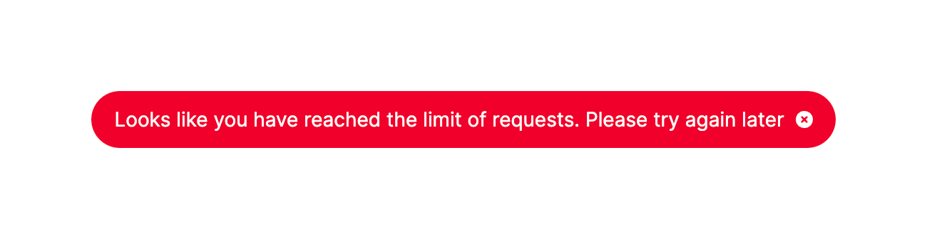
Scribe — Alert component
Scribe logo
Scribe

A pill-shaped error toast indicating a rate limit has been reached, with a close icon.

Browse the full component library

Browse the full UI component library.

Trusted by the best teams